Building a useful Customer Service dashboard can be bit of an art.
Whilst it might be fairly straightforward to get the first version of a dashboard up and running for your support team, it can take a lot of trial and error to find out what information is useful to have on there, and take things to the next level.
Getting it right is worth it though. Customer service teams that take the time to really think about what’s on their dashboard report significant improvements in their performance, from faster response times to increased CSAT scores.
So if you’re looking to build a great customer service dashboard for your team, we’ve put together five different customer service dashboard examples to draw inspiration from, spark some ideas and help you build or improve your own dashboards that get the results you're after.
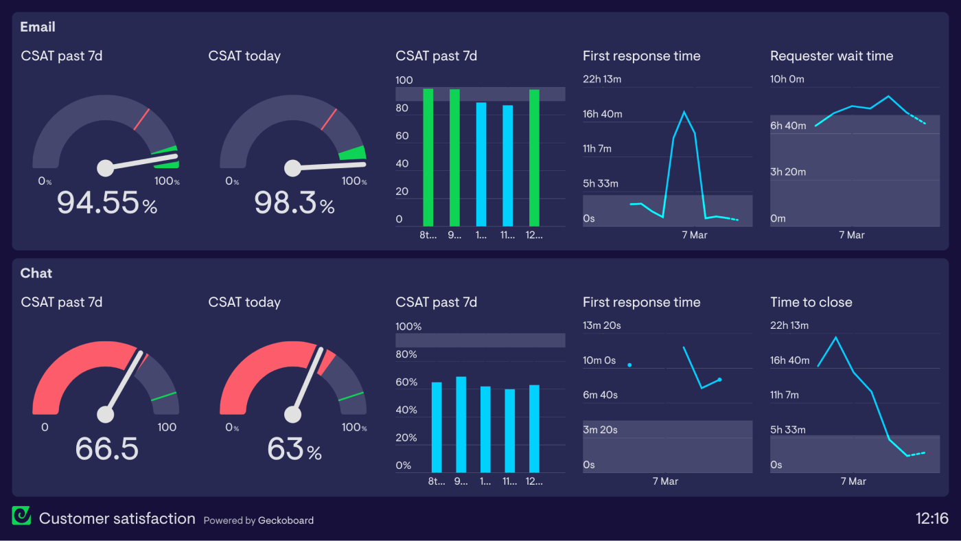
The Customer Satisfaction Dashboard
There’s a whole heap of things to monitor and optimise in Support, but if there’s one measure that defines what success looks like for a customer support team, it’s customer satisfaction.
Different organisations may have different takes on what a ‘satisfied customer’ looks like, compared to yours, but regardless of how you’re defining it, it makes sense to have a dashboard dedicated solely to monitoring customer satisfaction. A customer satisfaction dashboard like the one below is ideal for providing you, your team and other stakeholders in the organisation with a single, focused view of how satisfied your customers are with your support at any given moment.
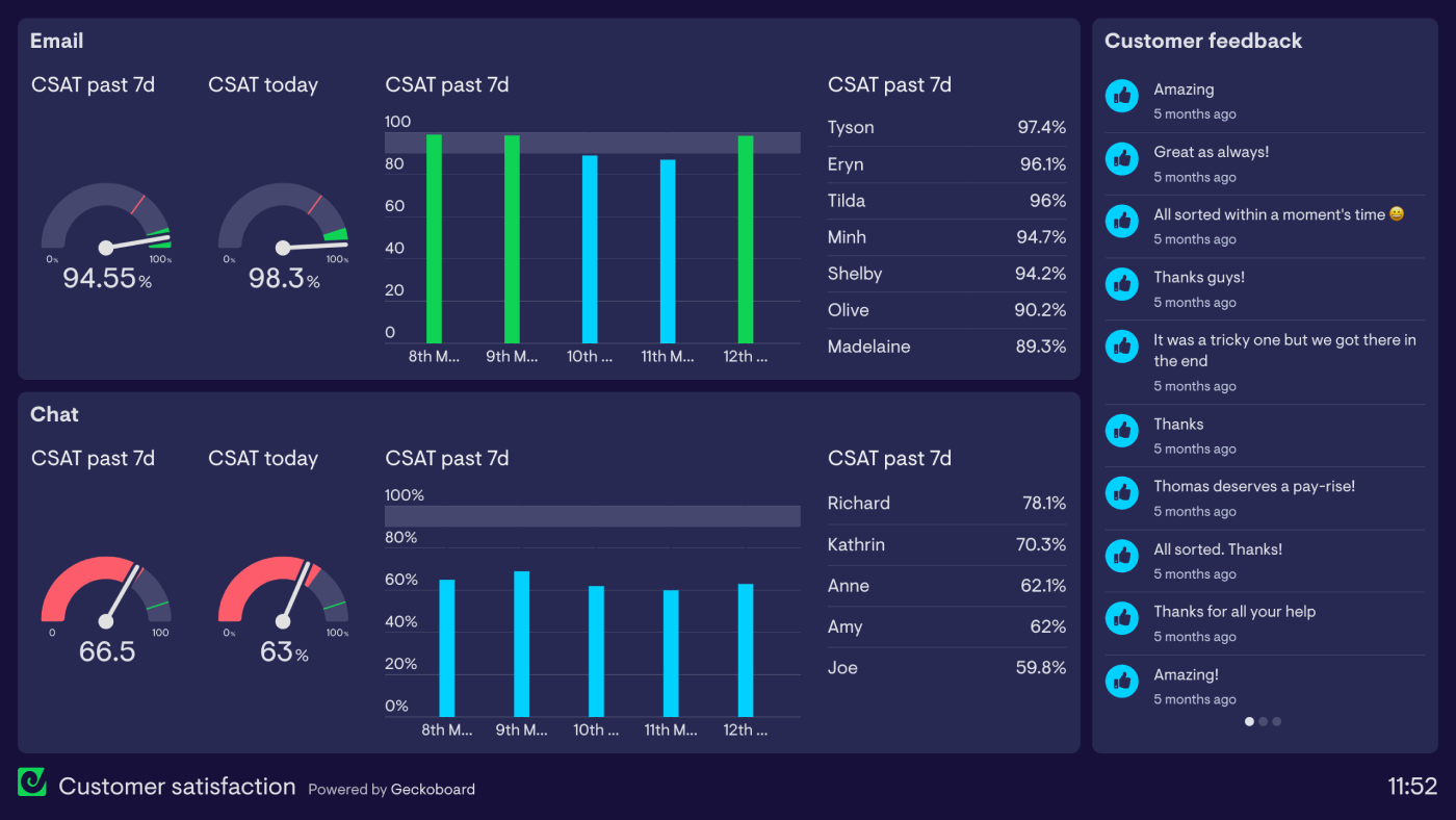
The most obvious metric to include on here is your customer satisfaction score, or CSAT. Whilst the jury may be out on how exactly to calculate CSAT, and CSAT methodology varies depending on which tools your team are using, the principle is the same; customers who have interacted with your support service are sent a survey shortly afterwards, and asked to rate on a scale how satisfied they were with their experience. Their responses make up a single score, most often expressed as a percentage, that represents how satisfied customers were during a specific period in time.
Depending on the tool you use to collect responses, you may also want to split CSAT out for specific channels or even individual agents, as is the case on this dashboard. This can be a useful, low effort way to closely monitor parts of your operation that aren’t delivering a great customer experience, or recognising when the team or specific agents have put in a stellar performance. It can also be useful to add some extra context with a feed of comments from customers who have filled out your satisfaction survey.
If you already have a pretty good idea of the areas your team needs to work on to improve customer experience, you could also consider adding some of these levers to your dashboard in a supporting role - first response time and requester wait time being common leading indicators for CSAT.
The Global Team Dashboard
Distributed customer support teams often struggle to stay in sync, particularly when different timezones, languages, cultures, SLAs for different territories and new hires are thrown into the mix. For a agents working on the other side of the world to the rest of the team, understanding where they fit in and feeling integrated with the rest of the team can sometimes be challenging.
This is where some carefully chosen data on a straightforward dashboard can help massively.
The dashboard example below focuses on providing agents working in different locations with a single point of reference to rally around. Most of the metrics are dialled in to show performance at the team level, with feel-good factor and camaraderie prioritised over anything more detailed or in the weeds. You can make more specialised dashboards for that information.
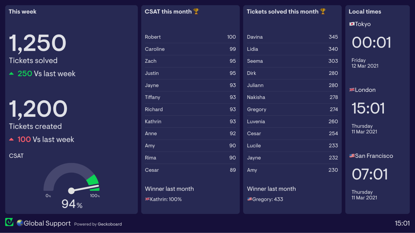
Instead, this dashboard gives agents a real time view of what the whole team is achieving, and helps everyone see their contribution towards that. This example also uses leaderboards not only to highlight individual performance, but also to help give team members visibility and standing within the wider team. We’ve also seen teams run competitions between offices to see who can top leaderboards for certain metrics month to month - great for injecting some friendly competition!
The Live Chat Dashboard
Teams who provide support over chat generally need to monitor slightly different metrics on their dashboards to teams who deal solely with tickets. Spotting spikes in chat volume before they become overwhelming and identifying bottlenecks is a critical part of making sure a team is able to deliver the best support possible. This example highlights live metrics like the number of chats in the queue, missed chats, and average wait time, as well as a live feed of which agents are currently online and able to serve customers.
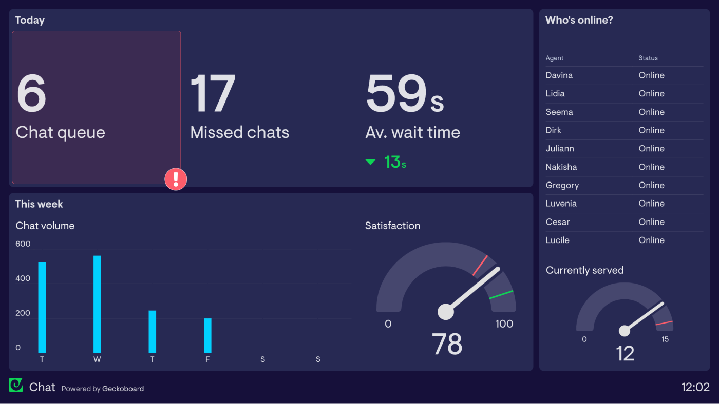
Metrics on the dashboard are grouped into three groups, so it’s easier to understand at a glance - “Today”, “This week”, and “Who’s online?”, which also includes how many customers are currently being served.
By having this dashboard up on a second screen or displayed on a wall, temas can quickly and easily keep on top of fluctuating chat volume through the day, and managers can ensure there are enough agents on call to help customers.
The Overview Dashboard
Having an ‘overview’ dashboard is useful in several ways. Its primary purpose is to give a customer service team a high-level overview of the most important top-line metrics that the team’s success is judged on. No more, no less.
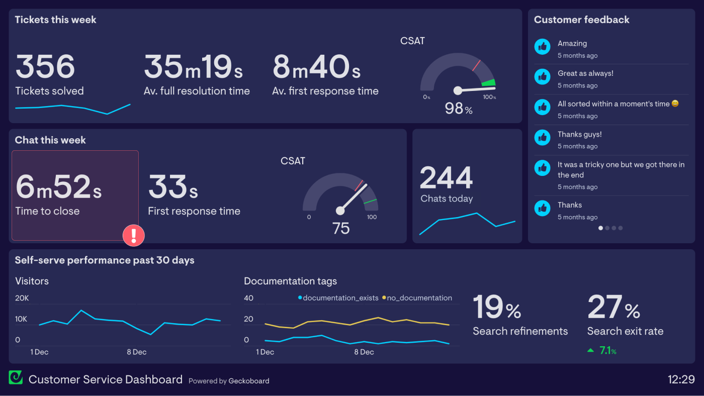
The main benefit of this sort of dashboard is to give support agents a quick, glanceable way to see how the team as a whole is performing throughout the day, using data pulled from your ticketing system. Using this information, agents have better situational awareness about things like how busy different channels are, where they need to spend their time, and how the team is performing against different targets or SLAs, without having to spend time finding these numbers themselves.
An overview like this is also extremely useful to display on a large screen in areas where other teams or upper management might catch a glance (in a corridor or next to a watercooler for example) - a great way to showcase a CS team’s hard work and to spark inter-team conversations.
The sorts of customer service metrics that make sense on this type of high-level dashboard include Customer Satisfaction (CSAT), First Response Time, and aggregated ticket metrics like the number of Tickets by Status and Tickets Created Vs Tickets Solved. Different emphasis can be given to specific metrics depending on what the department or company as a whole is working on at that time, but avoid going too specific if you intend to display this dashboard in a location that could draw attention from other teams.
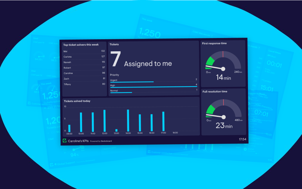
The Individual Agent Dashboard
Team-level dashboards are great for giving team members insight into how their performance compares to others, but breaking metrics down even further to the individual level is a great way for an agent to see the impact of their work, and regularly monitor more detailed information that’s perhaps not relevant to the rest of the team.
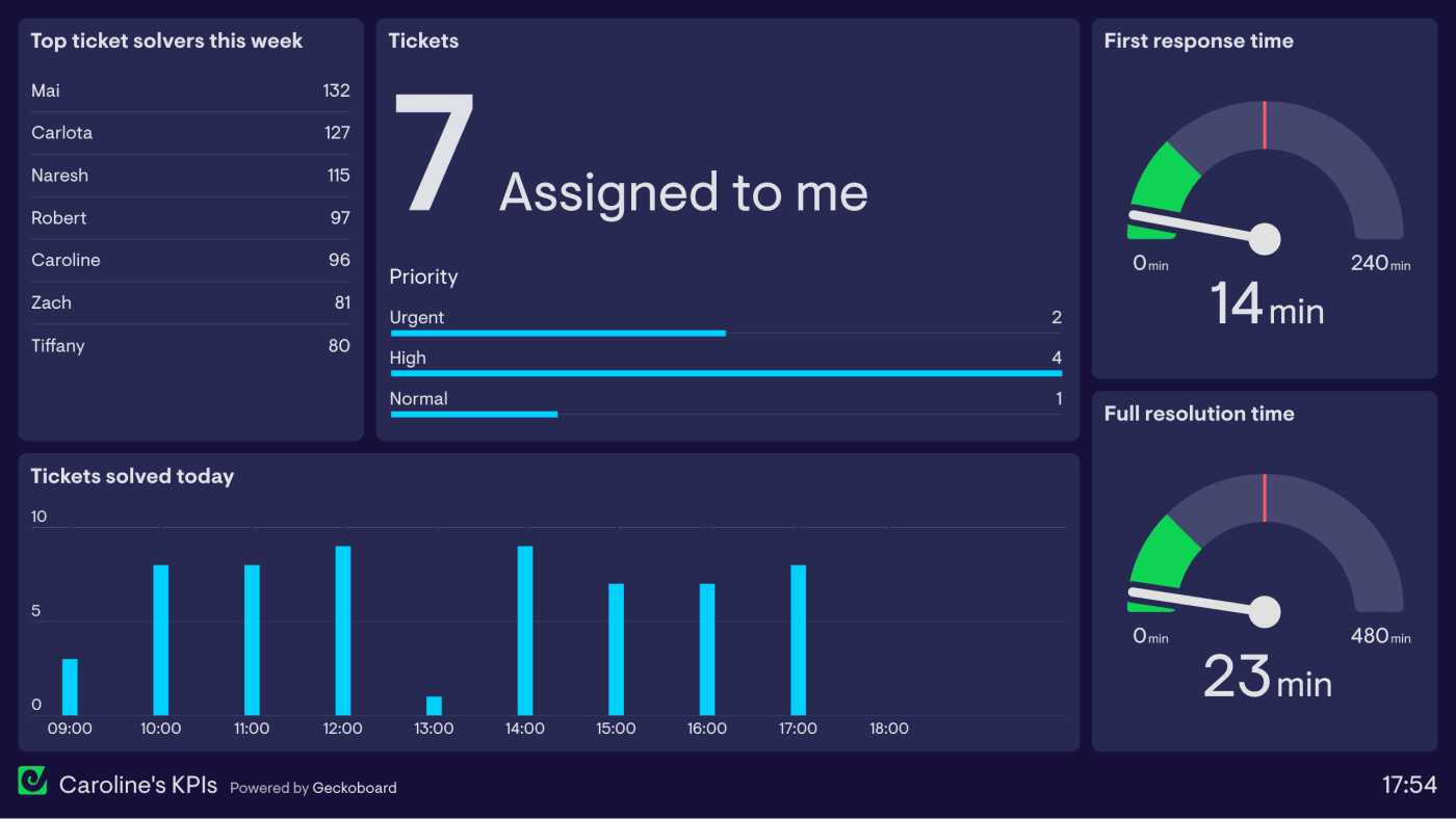
If resources allow, creating individual dashboards for each agent (or giving them a brief to create their own) provides them with a personalised view of the metrics they’re responsible for, and be a valuable point of reference in 1-1 coaching with them as they look to improve over time.
BONUS RESOURCES
Want to take things further? Check out the resources to help you build even better customer service dashboards.
- More Customer Service Dashboard Examples
- Dashboard Best Practice
- How to Design and Build a Great Dashboard
- Build Better Dashboards By Iterating
- Customer Support KPIs and Metrics
Want to see how a real-time dashboard can help your customer service team? Start your free trial today!
