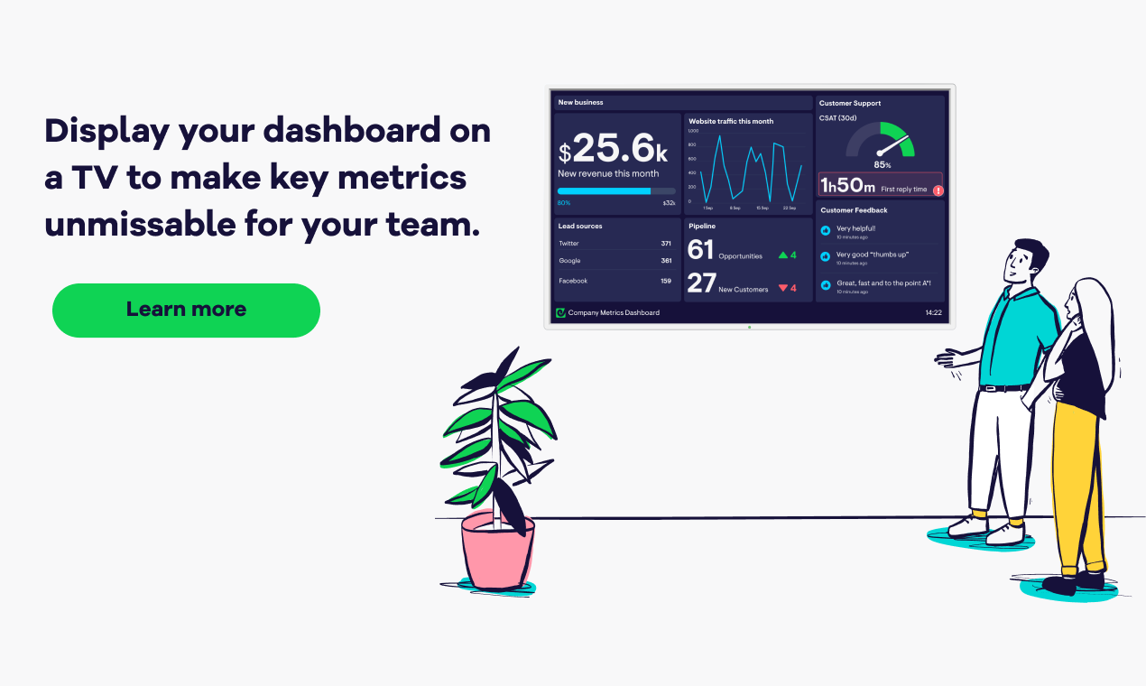
Dashboard design principles are all very well, but what do they look like in practice?
This blog will walk you through nine golden rules, with a real-life dashboard example for each. Here’s a preview:
By following these simple steps you can create a dashboard that's clear and effective. And you don't need to be a designer to make yours look great.
Enjoy building!
1. Decide what you want your dashboard to do
Before you start building your dashboard, decide what it’s for, and who it’s for.
Will the whole company be looking at it, or just one team? And what actions do you want people to take after looking at it?
Maybe you want to rally your team around a specific goal, and show them their impact. Perhaps you want problems to be spotted faster. Or maybe you just want to be more transparent about what’s happening in your business.
These are just some of the use-cases illustrated in this post. For more, check out our full gallery of dashboard examples.
2. Only include what matters
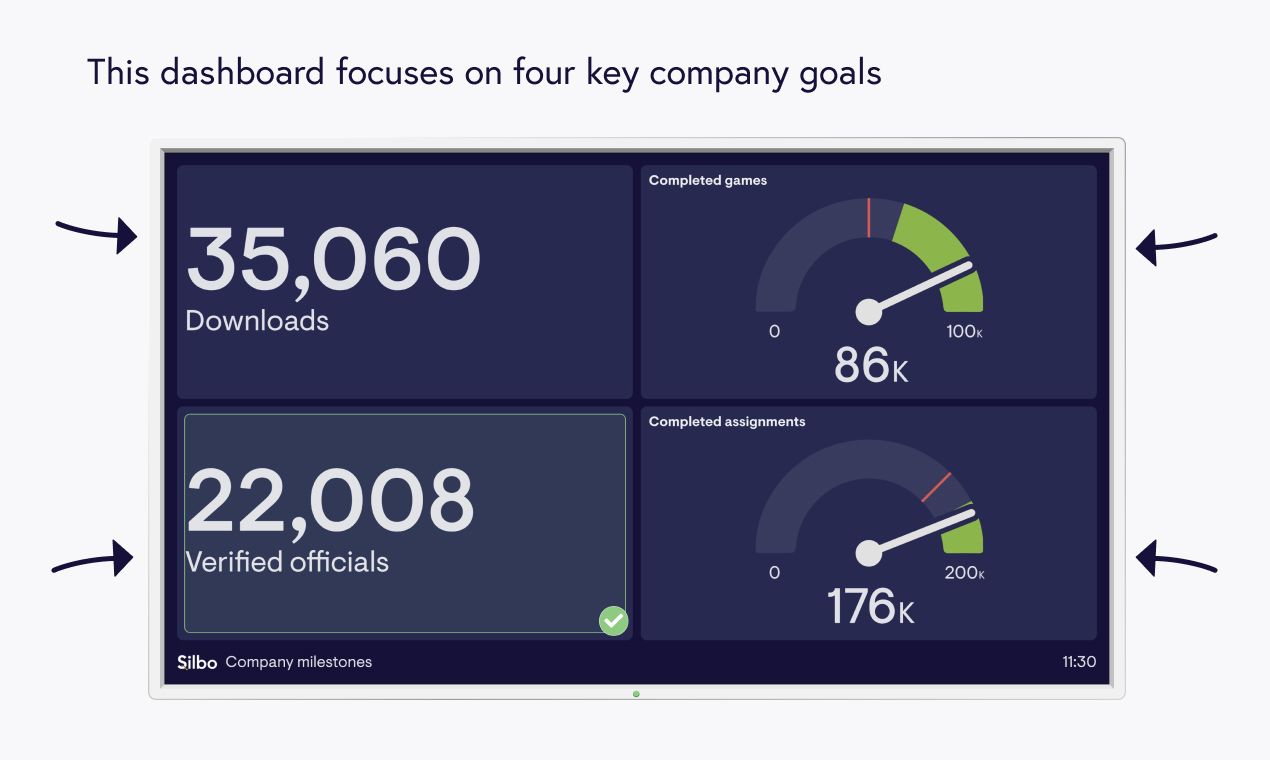
Learn more about this company milestones dashboard example and metrics
A dashboard isn’t like a noticeboard where you share anything interesting. It should only include things that really matter to your business.
If you have goals and KPIs then these are a great place to start. Just make sure that they support your overall objective (for detailed advice on this, see our articles on defining KPIs and SMART goal-setting).
Following this principle, Silbo’s dashboard example is super simple with four key goals that matter to the whole company. For other KPIs they have separate dashboards, rather than trying to squeeze them all onto one.
You might display more information than Silbo and that’s fine, as long as it’s important and reflects your overall purpose.
3. Use size and position to make priorities clear
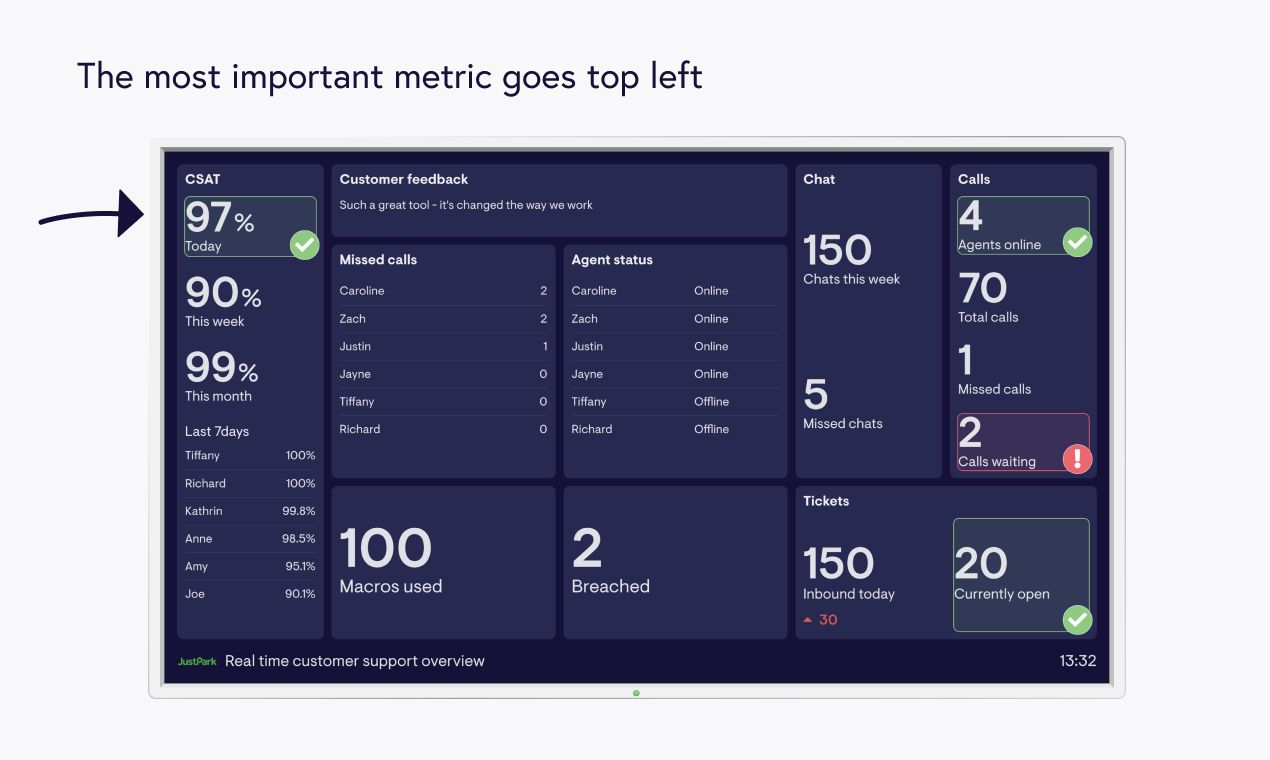
Learn more about this real-time customer support dashboard example and metrics
Anything you include on your dashboard should be important, but some things will be slightly less important than others. To make priorities clear to your team, you can use size and position.
Your most important metric should go in the top left corner where the eyes go first. If you have room, you can also make your most important metric bigger than the others.
In textbook style, JustPark displays Today’s CSAT (Customer Satisfaction) top left. And they’ve devoted an entire column to various aspects of Customer Satisfaction as this is the metric they’re most passionate about.
4. Give your numbers a frame of reference
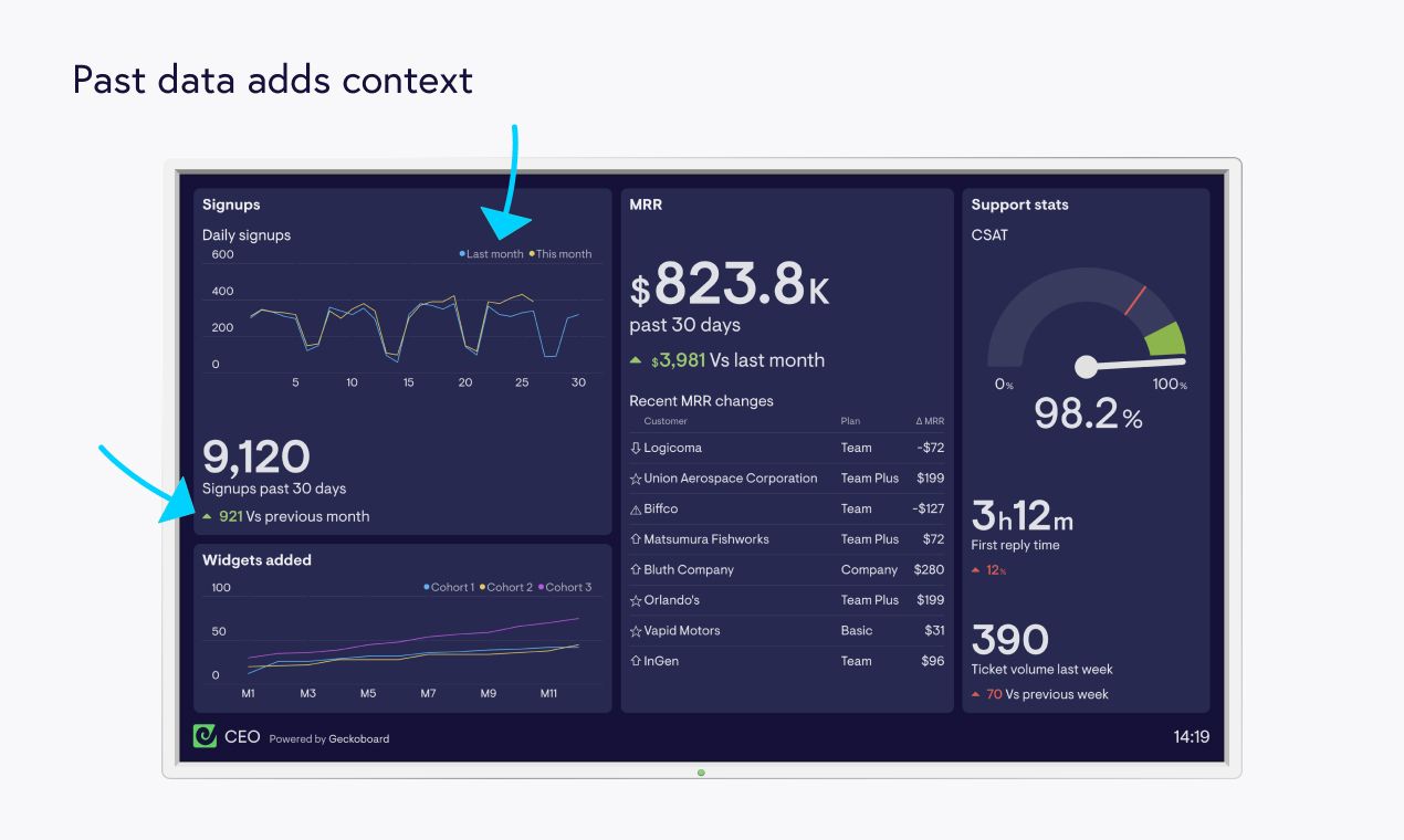
Learn more about this CEO dashboard example and metrics
Some numbers need a yardstick so your team can tell if they’re good or bad. An obvious one to add is past data.
Take the above dashboard example. To help teams understand Signups, we’ve added past data in the form of:
- A line graph showing Daily Signups for the past 30 days compared with the previous month
- A number widget showing Total Signups for the past 30 days – also with a comparison to the previous month
Aside from past data, you could also display an average for extra context. Or, if you’ve set a goal you could display the target as a yardstick, alongside your current progress.
We've given CSAT a target of 100% on our dashboard. And, for added context, we've set a warning state which alerts teams when CSAT is below a set threshold so they can spot problems faster.
5. Group connected metrics
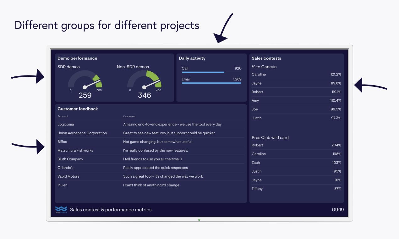
Grouping related metrics logically helps teams find what they need at a glance. It also gives your dashboard a pleasing zen-feel.
In Wordstream’s sales dashboard example, they’ve created groups for different projects, and they’ve given each a clear label so they’re easy to spot.
There are lots of different ways to group your data e.g. by metric, product, brand, campaign, region, or time period. Whatever makes the most sense for your team.
6. Keep it uniform
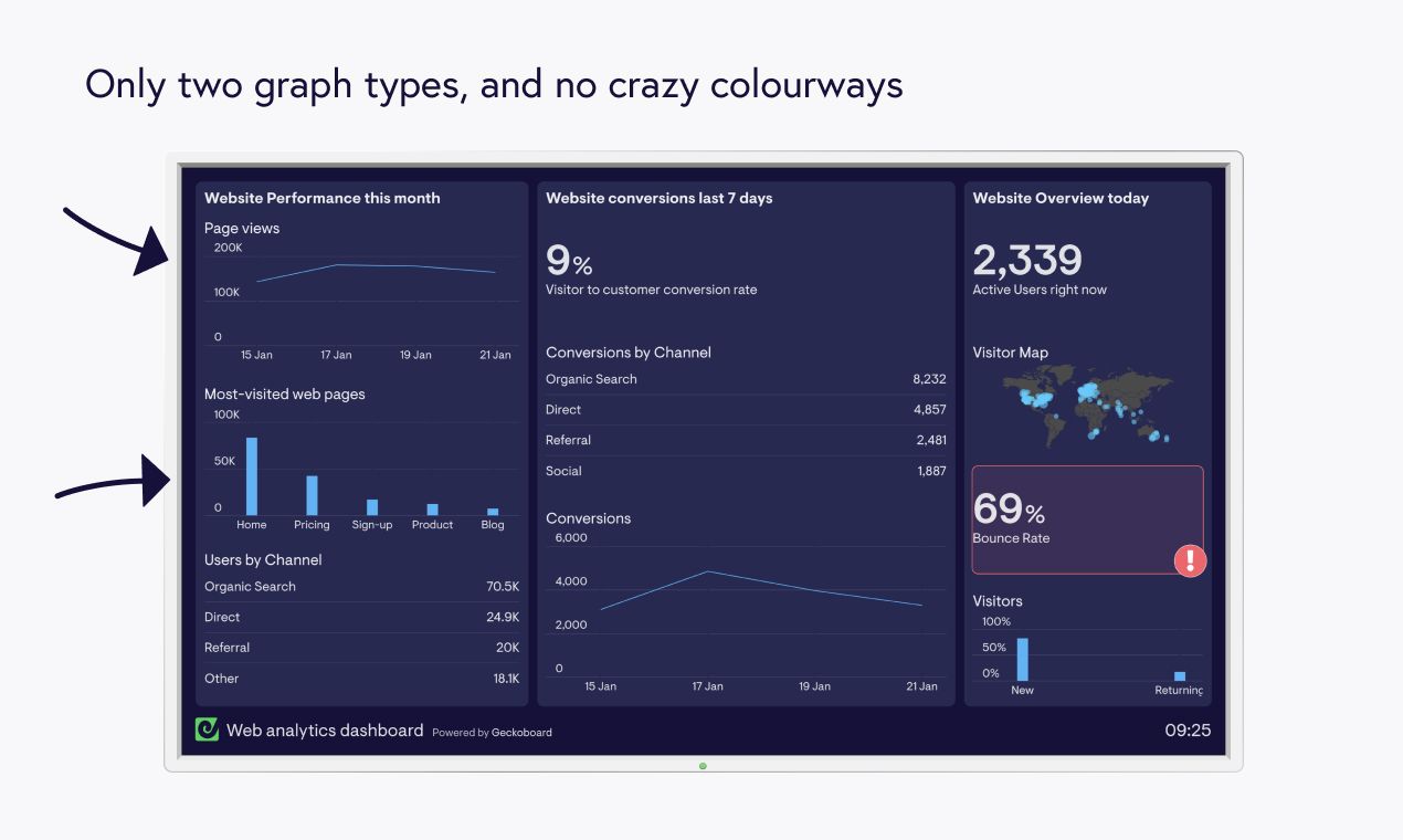
Learn more about this web analytics dashboard example and metrics
If you’re displaying slight variations on the same metric, your dashboard may feel slightly repetitive. It’s tempting to use different chart types and colours just to jazz things up – but try not to. Your dashboard will be clearer if you use three graph types max, a restrained colour palette, and a consistent layout. It will also look better.
This dashboard example sticks to line and bar charts – and there's a visitor map but only because that's the most appropriate visualization. For Users By Channel, we could have used The Chart That Must Not Be Mentioned (the pie chart) but instead we've used a table which is much easier to understand at a glance.
For more detailed advice on visualizations, check out our data visualization tips.
7. Label things clearly for your team
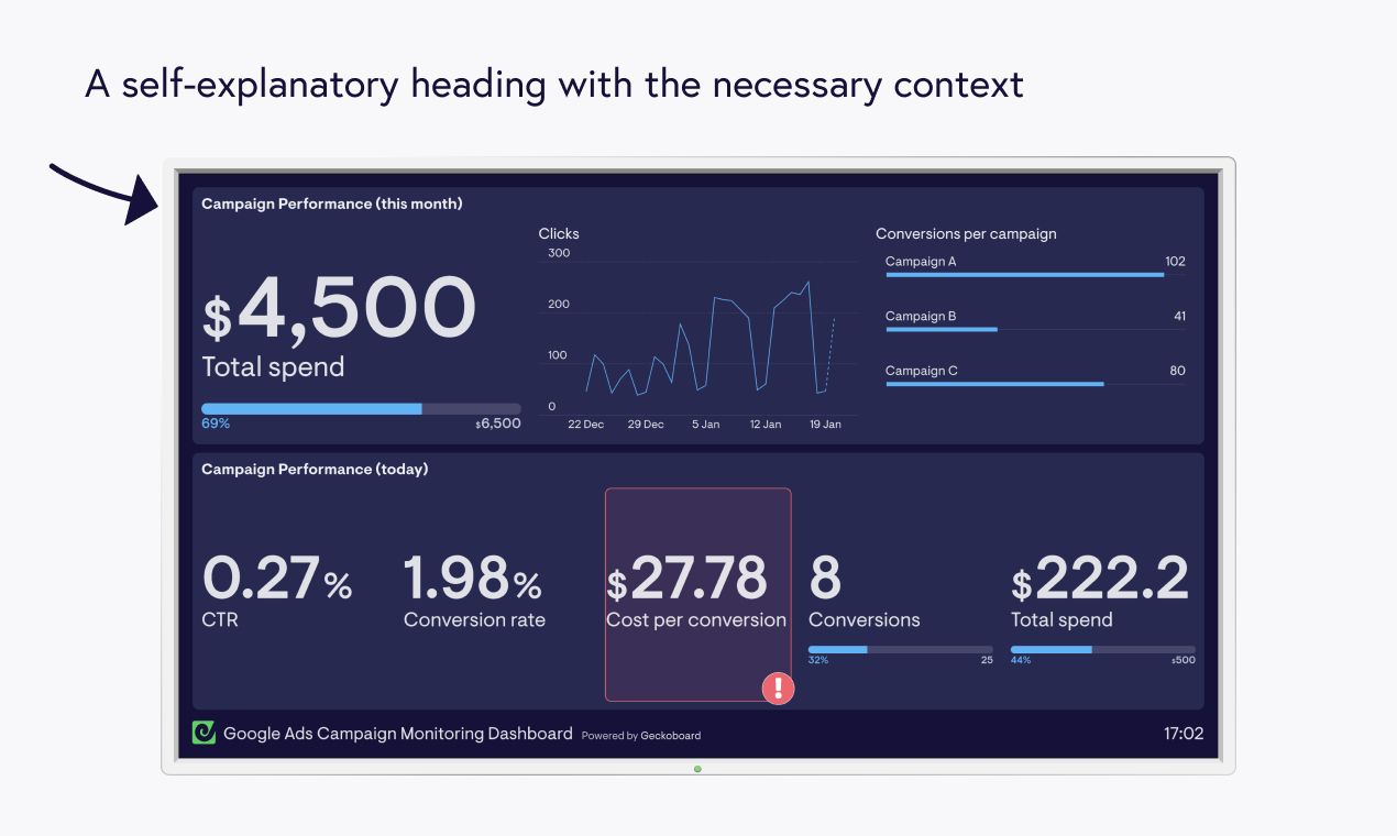
Learn more about this Google Ads campaign dashboard example and metrics
Labels are an easy way to make your metrics and charts instantly understandable for your team. They should give the necessary context – like Campaign Performance (this month) – and make the meaning obvious. But keep them short so they don’t take up useful space on your dashboard.
Abbreviations are also good (as long as your readers get them). For example, this dashboard has CTR instead of Click-through Rate as the marketing team obviously know this acronym.
Another tip is to give your groups headings to avoid repetition. For instance, if you had lots of different metrics for Signups you could group them under the heading ‘Signups’ rather than repeating the heading for each metric.
8. Round your numbers
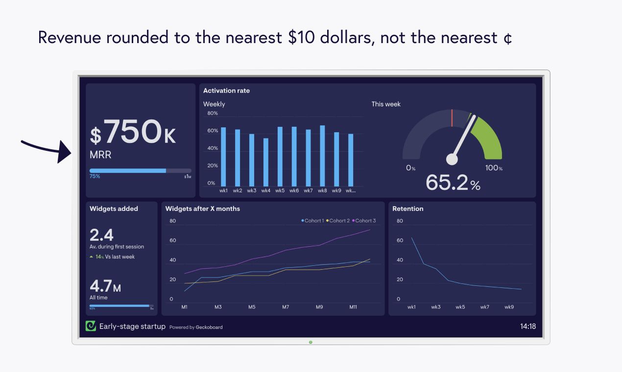
Learn more about this early-stage startup dashboard example and metrics
You want stakeholders to know that the information on your dashboard is accurate, so it’s tempting to be ultra-precise with your numbers. For example, you might display your Conversion Rate to 3 decimal places or Revenue to the nearest cent. But this kind of detail just isn’t necessary, and may exaggerate minor changes.
It’s generally best to round your numbers, like we’ve done on this dashboard example for MRR and Widgets Added.
9. Keep developing your dashboard
Building dashboards is easy, but finding the perfect combination of metrics that trigger positive changes is a never-ending quest.
That’s why evolving your dashboard is so important. Keep asking your team which numbers they find useful, and evaluate your approach. A technique that’s successful one day won’t necessarily work in the future.
As an example of dashboard-evolution, Survicate started off with this SaaS company overview dashboard, showing core metrics:
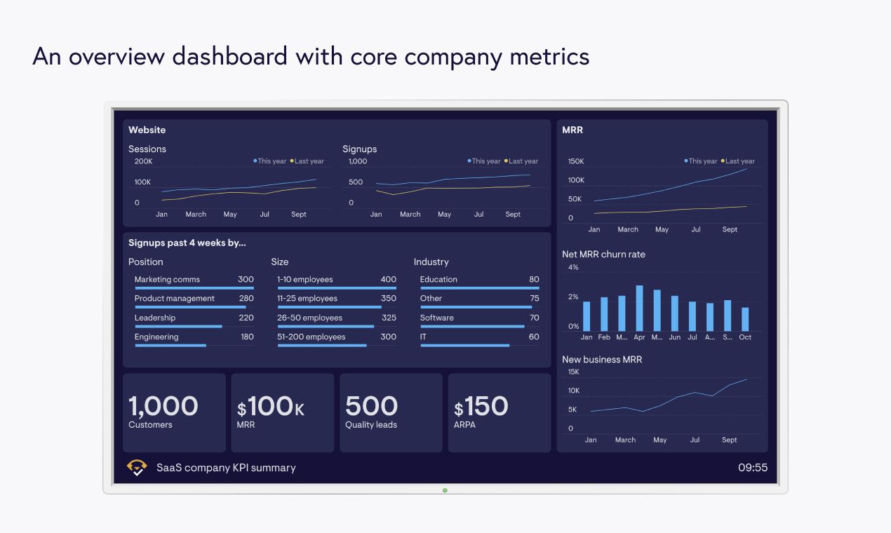
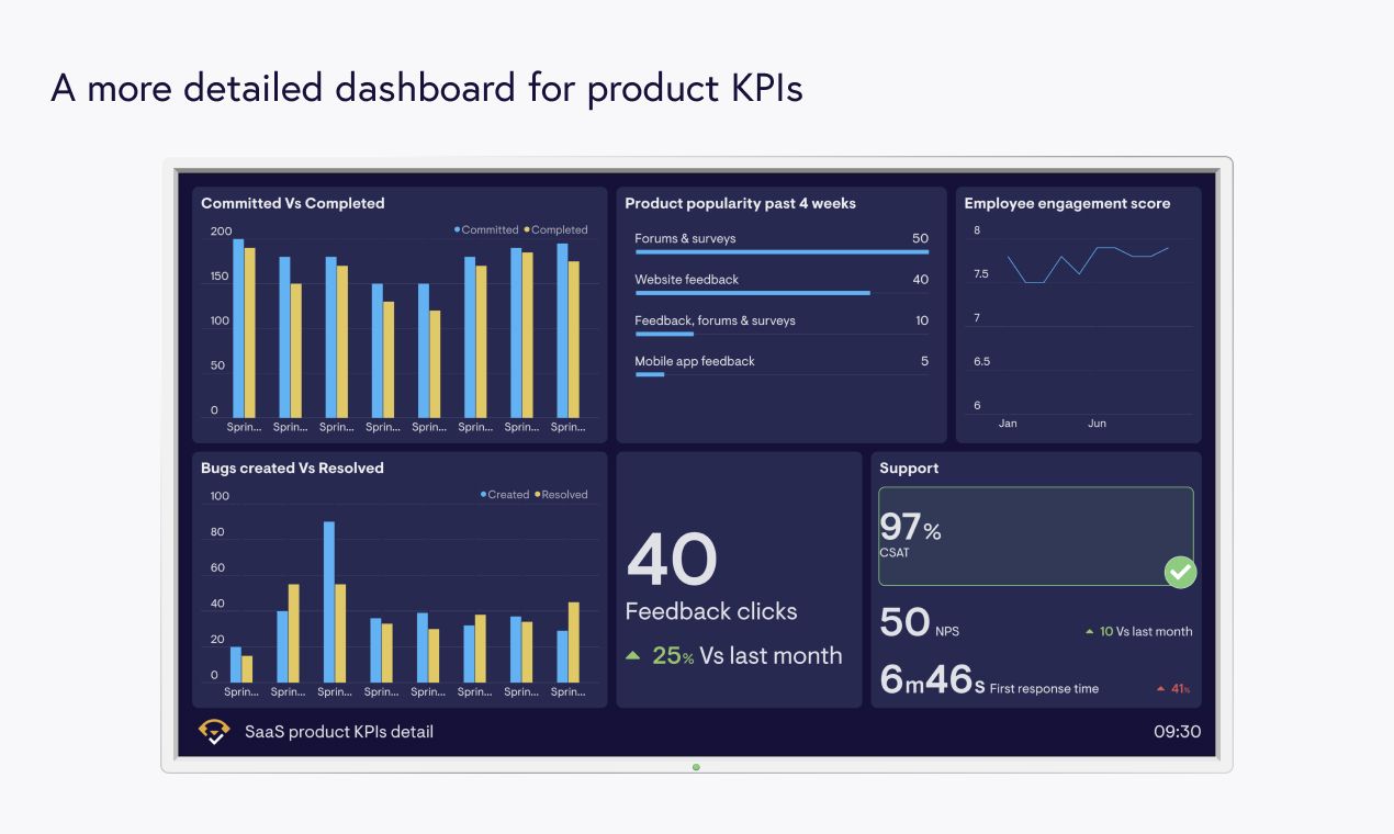
Then, as their team grew, they wanted more detailed product metrics so they created a dedicated dashboard for SaaS product KPIs:
Here are some other situations when you might want to rejig your dashboard or make new ones:
- Someone new has started
- Your team is easily hitting their goals, or struggling to
- You’ve kicked off a new campaign or project
- A new season is approaching and your business is seasonal
See dashboarding as a fluid process, and learn which metrics work and don't work along the way.
Extra resources
- Data visualization tips
- Geckoboard’s methodology for making dashboards work
- KPI examples
- A detailed guide to SMART goal-setting