
The dashboard is dead, long live the dashboard...
Over the past year, we’ve noticed that some companies and commentators have been declaring the death of the dashboard. Understandably, that got our attention.
Because here at Geckoboard, we quite like KPI dashboards. In our experience, they solve many problems and make people’s lives easier.
So why do we, very occasionally, keep hearing rumours that the dashboard has ceased to be?
Has the dashboard really died? Or has it merely joined a long list* of things to have been falsely declared dead (...usually as part of some thinly veiled marketing campaign for a new product or company.)
Let’s find out.
*A list that includes, but is not limited to: email, CRMs, project management software, HTML, literally all of the social media platforms, theatre, capitalism, ebay, jazz, and tie-dye shirts. (That’s right, Gen Z discovered tie-dye and they’re bringing it back.)
Claim 1: Dashboards take too long to produce
Let’s start with a new whitepaper, produced by a company called ThoughtSpot: Dashboards are Dead.
For context, ThoughtSpot is an analytics tool aiming to usurp traditional BI tools.
One of ThoughtSpot’s central arguments is that dashboards take too long to produce: 4-5 days which, as they deftly illustrate in the diagram below, is longer than both international air travel and the time it takes to hail an Uber.
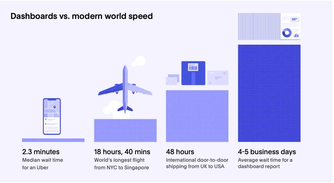
And, in case you were in any doubt, 4-5 days is bad because during 2020:
“Your demand for new, unforeseen analytics use-cases skyrocketed, dashboards were sidelined for manual data extracts and daily reports. Day-old data was useless, and only in-the-moment-insights became relevant, pushing analytics teams to their breaking point. But we don’t have to tell you this. You were there.”
Was I??
How long do dashboards take to produce?
The truth is that a data dashboard can take any amount of time to produce. It depends on:
- the tool you are using
- the overall state of your data
- the people involved
- knowing what it is you want to visualize
- knowing why you want to visualise it
In our experience, it’s nearly always those last two, and not the tool itself, which slow down the process.
Providing they have a clear idea of what they want to visualize, most Geckoboard customers can create their first dashboard in about 15 minutes.
What I think ThoughtSpot is getting at here is that for many companies, the lines of communication between the people who need to see the data (and therefore make decisions) – and the people responsible for creating the reports – are often long and fraught with challenges.
We don’t disagree with that - for many companies, accessing data can be unnecessarily frustrating.
That’s why one of our missions at Geckoboard is to help companies visualize their most valuable data, when it would otherwise be buried in different platforms or guarded by gatekeepers. We believe your most important metrics should be out there where you and your team can see them. We focus on making it quick and easy.
Dashboards or reports?
Additionally, implicit in Thoughtspot’s ‘4-5 day’ claim lies an unhelpful assumption. That you need to create a new dashboard, ad hoc, every time you want to view your KPIs.
Because if so, that’s not a dashboard, that’s a report. And what they’re actually describing are the problems associated with slow reporting.
Yes, having to wait on reports to see your data is very frustrating. But dashboards actually go some way to solving this problem. Dashboards provide a real-time view of your most important metrics, and can be monitored at a glance.
Even if every dashboard did take a long time to produce (and there’s no reason it should), if it was designed well, you would only need to build it once. It would then provide an instant view of your most important data, everytime you needed it.
Claim 2: You don’t need dashboards, you need ‘decision-support’
If you follow the world of UX design, you will likely already know about Jared Spool. He’s an excellent commentator and well worth a follow.
Dashboards are often what customers ask for.
— Jared Spool (@jmspool) August 11, 2020
They are rarely what customers need.
If you’re building a dashboard, it’s likely your user research wasn’t finished.
Last year, he asserted that dashboards 'are a failure before they happen’. You can click on the link above for the full thread. Essentially, his argument is:
- Dashboards report on current status
- By leaving users to interpret that status before acting, we are leaving room for error
- It would be better to automate the decision making process, or at least focus on designing ‘decision-making support’ features instead
We do respect Jared, but he’s wrong about this one. This is why.
Dashboards can already provide decision-making support
The thing is, a well-designed dashboard doesn't just report on current status, it also reports change in status. And in particular, status indicators and alerts are used to highlight areas needing urgent attention. In reality, dashboards and ‘decision support’ features are not mutually exclusive.
Not all decision-making can be pre-programmed
In Spool’s argument, he suggests that a car dashboard should be replaced by a system that, for example, simply tells you when it’s time to refuel.
The problem is that not all decision-making can be pre-programmed or automated. Often, when we make decisions using dashboards we are integrating data from the dashboard with other data (sometimes, data that lives in our own head… sometimes that data that will only ever live in our own head).
To take re-fueling as an example, there are nearly always other factors affecting the decision – do I have enough money in my bank to refuel right now? When will I next need to use the restroom? Is my sister borrowing the car this weekend (and am I still mad at her for leaving me with an empty tank last time?)
If a decision can genuinely be automated, then great. But if that decision still rests with a person, the aim should be to inform the person, not to displace their decision-making responsibilities.
Can I trust the data?
Anyone who works with data should be thinking critically about that data, all the time. ‘Questioning the numbers’ should be second nature.
By giving us a view of our metrics, dashboards don’t just aid decision making, they also help us to build up an awareness of the data itself. We develop an ability to spot irregular patterns and investigate potential errors. If we lose the dashboard, we lose the opportunity to develop that healthy skepticism.
Claim 3: Dashboards were only ever designed to be used by specialized data analysts
We’re heading back to ThoughtSpot for this next claim:
“BI tools were always intended to be used by highly specialized data analysts. Imagine being dropped into the cockpit of a Formula 1 car and told to race in a grand prix when you’ve only barely earned a driving permit. It would be a disaster. You might know where the gas pedal is, but would you really know how to drive it?”
I think we need to take a step back and make some important distinctions here.
Firstly, a dashboard and a BI tool are not the same thing. A BI tool amasses unstructured data from multiple sources, so the user can drill into that data through a series of queries. A dashboard is used to communicate data, so it can be understood at a glance.
Yes, a BI tool can be used to create dashboards, but so can other tools. If the contention is with BI tools (...it feels like it is), then the author should make that distinction.
Secondly, a Formula 1 cockpit is designed for a Formula 1 driver. The dashboard in my Citroen C1 is designed for me (and is much simpler as a consequence.)
If you are looking at a dashboard you cannot understand – then that doesn’t mean dashboards are bad, it means you are looking at a badly designed dashboard.
Claim 4: Dashboards don’t answer my queries, and when I design them to answer my queries they become too complex
We’re heading over to Taylor Brownlow now on the medium channel, towards data science, in an article titled: Dashboards are dead.
In it, she writes:
“Death by 1,000 filters: After a dashboard had gone live, we were immediately flooded with requests for new views, filters, fields, pages, everything (remind me to tell you about the time I saw a 67-page dashboard…#haunting). It was clear that the dashboards were not answering everyone’s questions, which was either a failure of the dashboard design step or a failure in other tools to provide the answers people needed. What’s worse, is we found out that people were using all these filters to export the data to Excel and do their own thing with it anyway 🤦♀️”
It sounds like a frustrating situation for anyone, maybe even a recognisable one? But essentially, there are two critiques here. 1. That dashboards are too complicated (see the previous point) and 2. dashboards are not good tools for in-depth data analysis.
And that’s true - dashboards aren’t good tools for in-depth data analysis.
This is probably quite a common misstep. It relates to a fatal flaw underpinning the way many companies think about data. And it can be avoided if you keep in mind one simple principle:
Data analysis and data communication are different things.
In no less the same way that cooking a meal is different to serving and eating it.
As Brownlow writes:
“The jump from spreadsheet to dashboard was a significant leap forward in analytical maturity for us. Dashboards’ thoughtful design and interactivity dramatically reduced the ‘cost of admission’ to data. Suddenly, you would walk around the office and see employees from any role and background fiddling with dashboards.”
Think about what’s happening here, particularly with regard to the distinction (or there lack of) between data analysis and communication.
Chiefly, a spreadsheet is a tool for data analysis (though it can obviously be used to communicate data in many different ways).
Whereas a dashboard is a tool for data communication.
So if you are using a dashboard in place of a spreadsheet (i.e. to run exploratory analysis and investigation), then you are using the wrong tool for the wrong job. Inevitably, you will end up with a highly complex, dysfunctional dashboard which fails to communicate data.
Again, I think some of the confusion arises when we use the word dashboard as shorthand for various analytical tools (such as BI tools). Although a BI tool can be used to create a dashboard (so can a spreadsheet) they are not the same thing.
In conclusion... are dashboards really dead?
No, they aren’t.
But then, despite the claims, I don’t believe anyone was really suggesting they were.
And the truth is, behind every critique lies one or many genuinely bad experiences with data and systems. No-one is perfect with data. And any attempt to take a new, hopefully better, approach is always to be applauded.
However, it does appear that in some cases, ‘dashboard’ has become shorthand to describe a company's general approach to data. Even if the real issues lie with specific analytical tools, processes or even people themselves. If dashboards have become the most visible tip of a company's entire approach, it’s perhaps unsurprising they have come in for some criticism.
On the whole, this is worrying, because the more we come to conflate data communication with the rest of the process, the less we will recognize and appreciate its necessity.
Progress isn’t going to happen by waiting for the next new tool to solve every single problem we have with our data. It will come when we understand the role(s) data can and should play within our wider systems. When, for example, we start to make the distinction between data analysis and data communication.
When we do that, we’re going to need far more than just a dashboard.
But we will, inevitably, still need a dashboard.
