
Avail is building a community of responsible landlords and tenants by providing them with education, end-to-end tools, such as tenant screening, and customer service to support them in their rental experience.
In this guest post, Co-founder and CTO Laurence Jankelow talks about how the Avail team went from pulling in different directions to uniting behind key KPIs and how that focus allowed them to scale.

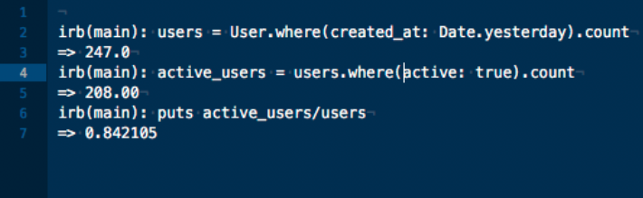
We had just raised two million dollars in a VC-backed seed round. My co-founder, Ryan, and I were sitting across from our new investors in our first board meeting. Their first question was, “How many landlords are using your software now?”. Without thought, we replied “50,000 landlords”, the number of landlords signed up to-date.
And then the follow-up question: “No, how many landlords are using your software? Active landlords”.
I gave Ryan a look, our eyebrows raised. Were they asking how many landlords had added properties to our system, how many published a vacant property listing or how many were collecting rent through the system? Although we had all those numbers, we had never really considered which would be considered an ‘active landlord’ so I went back to our team to find out what they considered was the definition of an active landlord.
Ryan said, "Someone who is generating revenue". Christine, our Community Manager, said, "Someone who has successfully on-boarded their tenant". Patrick, our User Experience Designer, said, "Someone who has received consecutive months of rent payments".
It seemed we had a bit of a disagreement.
Lack of focus around KPIs
Different team members were focusing on too many different Key Performance Indicators (KPIs):
- Our CEO, board, and investors focused on revenue growth.
- Customer Support watched for customers listing their properties for the first time or screening their first tenants.
- Engineering concentrated on getting customers to log in month-over-month.
As a result, all teams were pulling in different directions.
KPIs calculated differently across teams
As time went on, I also noticed discrepancies between how numbers for the same KPI were being calculated and discussed. Kyle, our Lead Engineer, and Patrick would both measure engagement rate but had different numbers and methodologies for calculating the rate – Patrick was using Mixpanel to track engagement and Kyle pulled the information directly from the database.
This led to doubt about our data and several occasions of us scrambling to reconcile two different data sources and formulas.
Figuring out the KPIs that matter
First, we needed to know which KPIs mattered. After all, if we weren’t focusing on the right KPIs, how could we improve the business?
We knew from reading lean methodology books, particularly The Four Steps to the Epiphany: Successful Strategies for Products that Win, that startups go through several phases and each phase has a set of KPIs that are relevant.
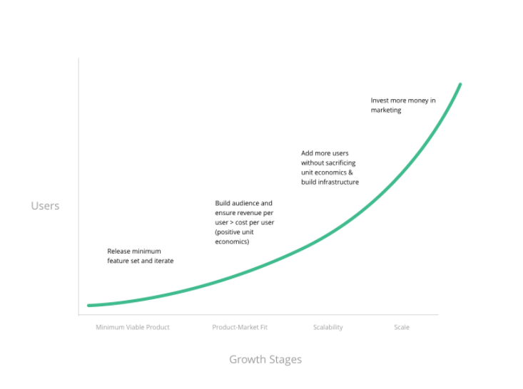
The four steps to the epiphany.
We completed the Minimum Viable Product (MVP) and Product-Market Fit stages and were entering the Scaling stage so KPIs to help us understand scalability were really important.
We held several meetings, which were initially just for the founders but then grew to include the whole team. Many discussions took place in our monthly HSIOW (Holy Smokes, It’s Only Wednesday) meeting. In these meetings, we talk about each team’s strategy and discuss how we’re doing. When we discussed which KPIs were important, it was a collaborative conversation with several back-and-forths.
Ultimately, we decided the important KPIs for proving scalability were Signup Rate, Activation Rate, Average Revenue per User, and Cost per Acquisition.
There were also some vanity KPIs we needed to remove. For example, we stopped paying attention to the number of people on the website at any given moment.
After nailing down the KPIs, we needed an accurate way to define and calculate each KPI. For us, this meant relying on events being captured in our system and making sure they were reflected properly in Mixpanel.
Next, we needed our team to see these numbers every day, updated in real time because, you know – in sight, in mind!
Keeping KPIs front and center
Geckoboard lets us create live dashboards that hook into our existing data sources. We can stream our live dashboards directly to our central TV that everyone in the office can see.
We started by hooking Geckoboard up to Google Analytics and Mixpanel, showing our 14-day trailing activation and engagement rates and more.
Even on day one of displaying our KPIs, I noticed it sparked conversation. Questions started emerging about how things were being calculated, which pushed us in the right direction of tweaking those calculations to be the most fitting for our goals. A week into it, I heard comments like, ‘Patrick, good job on re-designing Onboarding, I noticed our Activation Rate is up!’ It got the office talking and it kept us focused, too.
‘Are we moving toward our prioritized goals?’ has become a common question during our sprint meetings, which then immediately turns heads toward our Geckoboard livestream.
The Results
Two things happened for us: We now pay a lot more attention to our goals and we all agree on how these goals are being calculated and measured. This has people in the office excited and talking but also has tangible effects for us:
- Activation Rate increased 40% because everyone on the team could talk about what levers can be pulled.
- Engagement Rate more than doubled for the same reason as above.
- Motivation and collaboration spiked in the office.
Our team rallies around these numbers – we’re curious what impacts them and we’re driven to improve them. The dashboards help us keep on top of what’s going on, always.
