When building a TV dashboard, it’s tempting to focus on making something eye-catching.
Getting people to look at it feels like half the battle.
But if a dashboard is noisy or hard to read, people might glance once and then ignore it.
On a TV screen, clarity matters more than novelty.
A TV dashboard isn’t something people interact with. It’s something they glance at. Often from across a room, in passing, while doing something else.
That changes the job of the dashboard.
Instead of exploration, the goal is immediate understanding.
There are plenty of best practices for dashboards in general. In this post, we’ll focus specifically on how data visualizations get misused on TV dashboards, and what works better instead.
The gauge
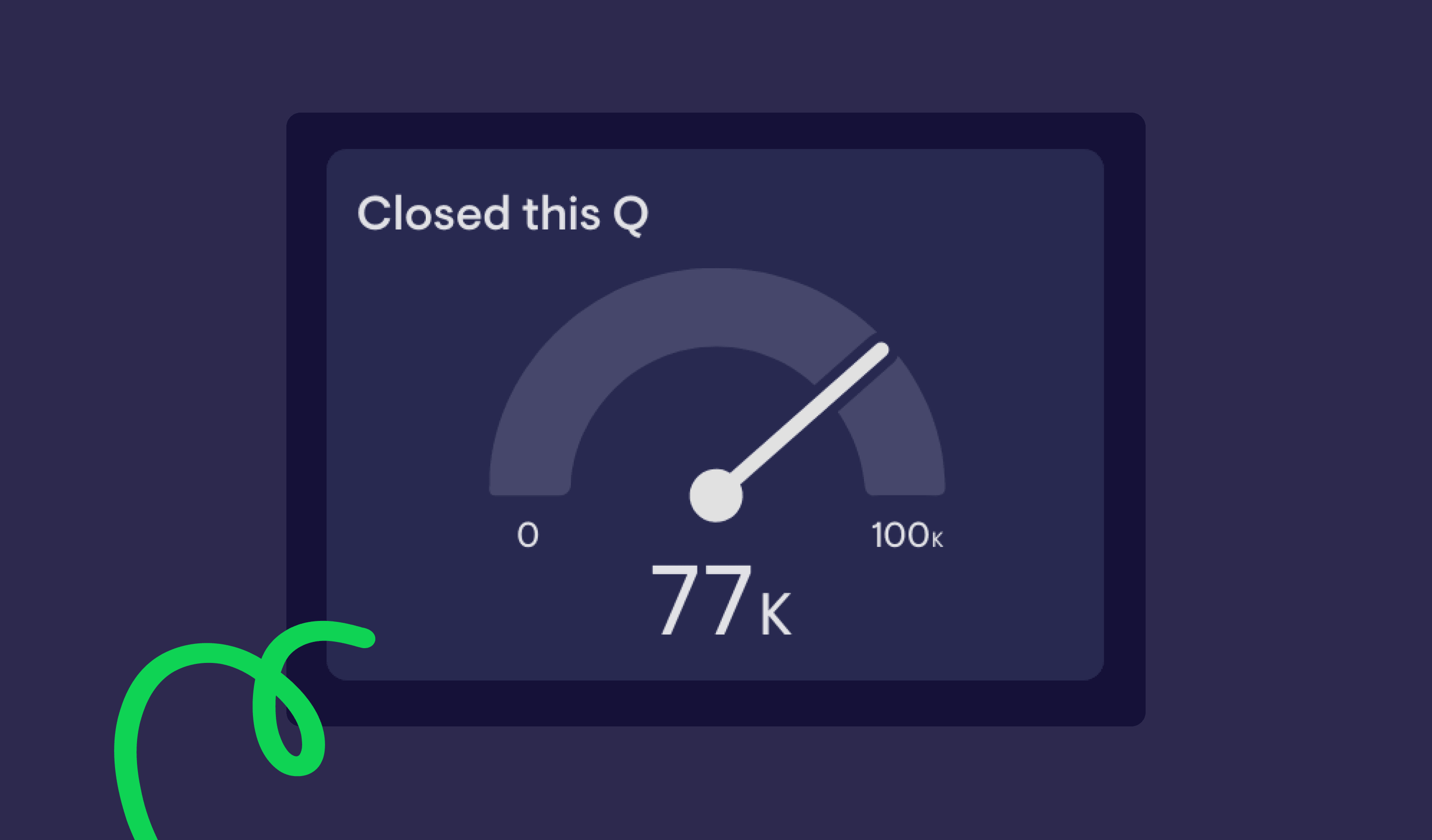
The gauge is one of the most popular visualization types at Geckoboard. Perhaps because it reminds us of the original car dashboard?
And in the right context, it works well.
But it’s often used for the wrong reasons:
- To make a number look more “interesting”
- Repeated across a dashboard, making a dashboard noisy
- Applied to metrics that don’t meaningfully fluctuate
Gauges rely on angles to communicate information. Research into graphical perception shows that people are better at comparing lengths than angles or areas (Cleveland and McGill, 1984).
That makes gauges harder to read quickly, especially at a distance.
They’re most effective when:
- Showing movement within a defined range
- Highlighting whether a metric is within or outside a target
For example, something like CSAT or Time to Close can work well, because the movement and thresholds matter.
But if you’re using multiple gauges, it’s often a sign that a simpler visualization would be clearer.
In many cases, a number with a comparison or status indicator will communicate the same information more directly, and create less distraction on your dashboard.
The column chart

There’s nothing inherently wrong with column charts on TV dashboards.
The problem comes when they try to show too much.
TV dashboards are viewed from further away than reports on a laptop. There’s no opportunity to hover, click, or zoom in. Everything needs to be readable at a glance.
When you include too many bars, labels, or categories, the chart becomes harder to interpret.
There’s also a cognitive limit at play. People can only process a small number of visual elements at once, and that limit drops further when viewing from a distance (often linked to Miller’s Law and broader cognitive load theory).
If you’re showing trends over time, a line chart will often work better. It reduces visual clutter and makes the overall direction easier to understand from across the room.
If you are using a column chart:
- Keep the number of bars low
- Avoid dense labelling
- Focus on one clear takeaway
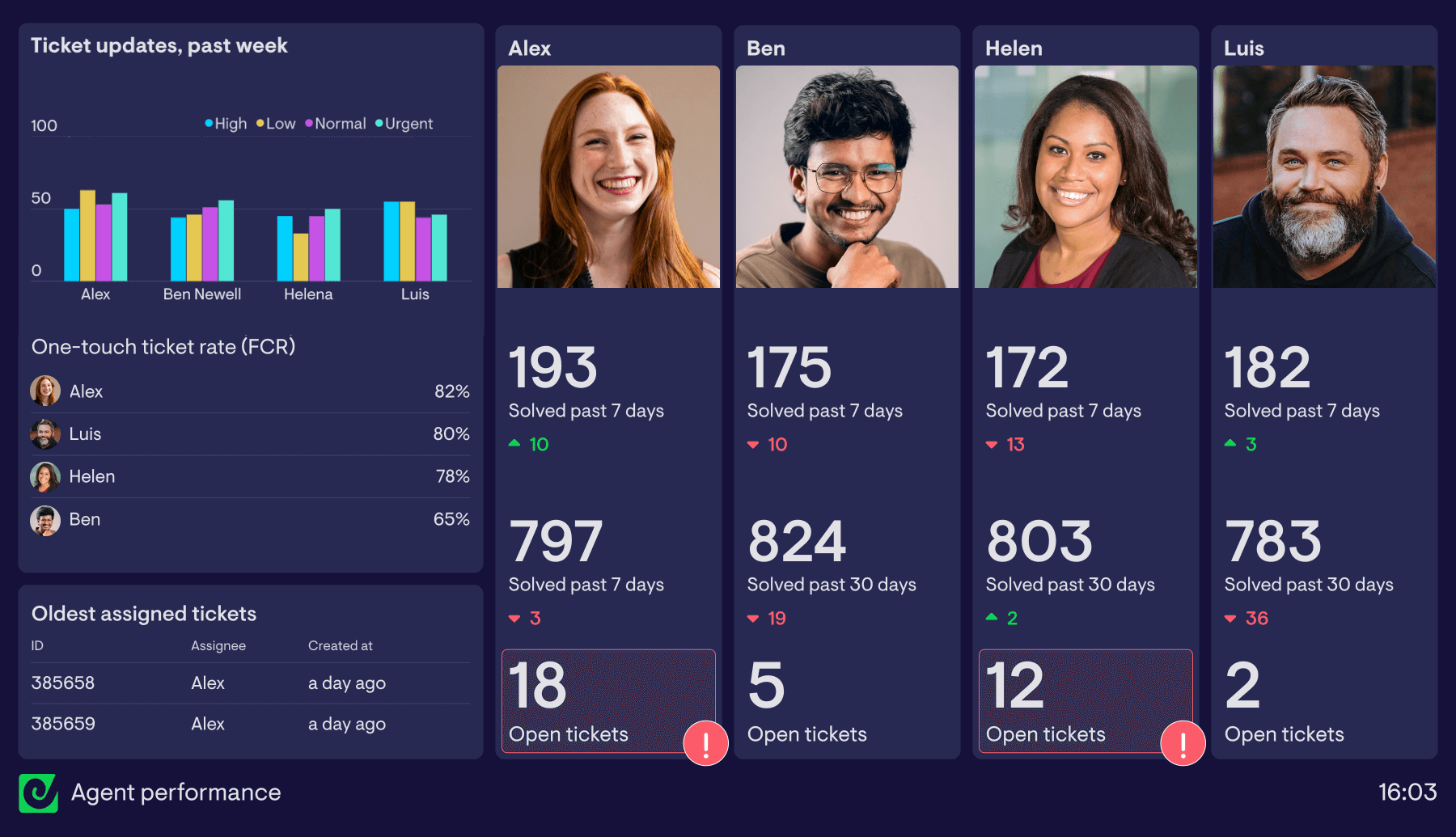
The table

Tables have their place on TV dashboards. But they’re often misused.
The key thing to understand is this:
Tables are good for looking up specific values, not for quickly understanding patterns.
On a TV dashboard, most people aren’t close enough, or focused enough, to scan rows and columns in detail.
Problems tend to show up when:
- Tables are used to cram in as much data as possible
- Rows and columns become too dense to read from a distance
- There’s no clear visual hierarchy
Tables work best when they’re used selectively, for example:
- Highlighting stale deals
- Showing overdue tickets
- Calling out exceptions that need attention
If you’re using a table to fit “everything” onto one screen, it’s usually a sign that the dashboard needs simplifying, or splitting across multiple screens.
The pie chart

It’s well documented that here at Geckoboard, we’re not the biggest pie fans.
There’s a good reason for that.
As we’ve mentioned, it’s been proven that people are significantly less accurate at comparing angles than they are at comparing lengths or positions.
Stephen Few, a leading voice in data visualization, has been particularly critical of pie charts for this reason. His argument is simple: pie charts make it harder to compare values, especially when slices are similar in size.
On a laptop, with time to focus, you can work with pie charts.
However, on a TV dashboard, viewed from a distance and in passing, it becomes much harder.
Pie charts make it difficult to:
- Compare similar values
- Spot small differences
- Quickly identify changes over time
That’s why, in most TV dashboard scenarios, a bar chart or column chart will communicate the same information more clearly.
Unfamiliar or “wacky” visualizations

This is the broad category where anything goes.
3D charts, radial layouts, novelty visuals. Anything that prioritises style over clarity.
They’re great for grabbing attention but are rarely able to deliver on communicating important information quickly and easily.
The issue is familiarity.
People rely on familiar patterns to interpret charts quickly. When a visualization breaks those patterns, it takes longer to understand.
On a TV dashboard, where viewers only have a few seconds, that extra effort is a problem.
If someone has to stop and figure out how a chart works, it’s already failed its job.
What good data visualization for TV dashboards looks like
Designing a dashboard for a TV screen is different from designing one for exploration.
Interactive dashboards, like those in HubSpot, Salesforce or Zendesk, are used up close. You can filter, hover, and dig into the data.
A TV dashboard is passive.
Someone should be able to glance at it and, within a few seconds, understand what’s going on.
Designing a TV dashboard starts with choosing the right metrics, then focuses on finding the simplest way to communicate them.
If you want a deeper look at layout, hierarchy, and structuring dashboards, it’s worth reading our dashboard design guide.
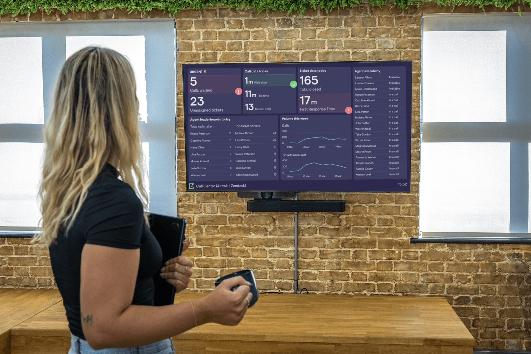
Example: support team TV dashboard
This dashboard prioritises clarity and consistency, it's not over crowded and key data is easy to skim.
Why it works:
- Simple, familiar visualizations
- Everything is large enough to read from a distance
- The column chart shows a limited, clear set of data
- A leaderboard introduces friendly competition and keeps engagement high
- Comparison metrics and status indicators add context
- Consistent use of visualizations makes it easier to interpret quickly
- Photos help draw attention and provide a visual anchor
Take a look at our catalogue of Customer Support dashboard examples for many more dashboard layouts and visualization options.
Example: sales TV dashboard
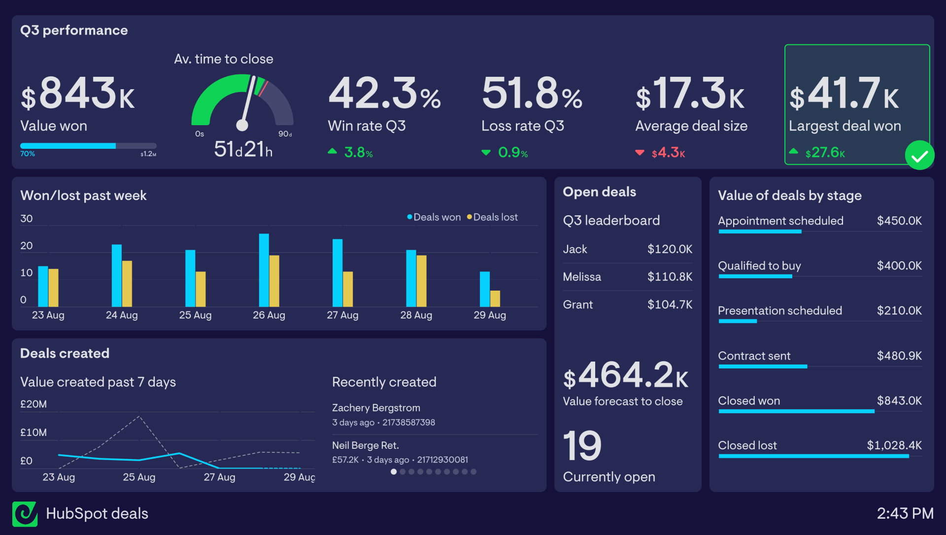
This dashboard groups related metrics and uses clear comparison metrics and visualizations for context.
Why it works:
- A clear view of performance through grouped headline metrics
- A single gauge used appropriately to show movement against a target
- The column chart is limited to a short time window, keeping it readable
- A bar chart highlights pipeline distribution and potential bottlenecks
- Leaderboards and recent activity create visibility and momentum
- Context is added through goals, comparisons, and status indicators
Take a look at our catalogue of Sales dashboard examples for many more dashboard layouts and visualization options.
How Geckoboard approaches data visualization
At Geckoboard, dashboards are designed with TV screens in mind.
That means focusing on clarity, not quantity.
Rather than offering every possible chart type, we focus on a key set of visualizations that are easy to read and work well at a distance.
We also limit how much you can fit onto a single dashboard. That encourages teams to prioritise what matters, and give those metrics the space they need.
The goal is to make dashboards easier to understand at a glance.
So whether you’re running a support team or a sales floor, you can build real-time dashboards that clearly communicate your most important KPIs.
FAQs about TV dashboard data visualization
What charts work best on TV dashboards?
Simple, familiar charts work best. Number widgets, bar charts, and line charts are usually the most effective because they’re easy to read at a glance and from a distance.
Why are pie charts hard to read on dashboards?
Pie charts rely on comparing angles, which research shows is harder for people to interpret than comparing lengths or positions. This becomes even more difficult when viewing from a distance.
How much data should a TV dashboard show?
Only the key metrics your team needs in order to see performance and take action if it's needed. If a dashboard feels crowded, it’s usually trying to show too much. It’s better to simplify or split across multiple dashboards.
What makes a dashboard glanceable?
Clear metrics, simple visualizations, context, strong hierarchy, and enough space for each element to be read easily from a distance.
