
So, you’ve just noticed a spike in your data. Maybe your trendline looks something like this?
Or if you’ve caught it early, it might even look something like this:
Now, obviously, I have no way of knowing if your y-axis represents something really good (like new customers) or something really bad (like system errors). And depending on which it is, you may be feeling a strong urge to pop the champagne or hit the panic button.
But as we know, data can be deceptive, so don’t jump to conclusions just yet. Instead, here are some simple steps to work through when you notice a spike in your data.
1. Is this metric important?
Before investigating any data anomaly, it’s important to triage the issue. This makes sure we respond to the most important issues quickly, without unnecessarily distracting ourselves from our current priorities. Ask yourself: if this spike was genuine and represented a real-world change:
- Would the consequences be significant?
- How urgently would they require attention?
Scenario A: It’s significant and needs urgent attention.
It’s potentially a critical issue, so you may need to begin a parallel process. Respond to the issue as if it was genuine, but also begin the process of investigation. Remember to clearly communicate to others the extent to which you have been able to verify the data.
Scenario B: It’s significant, but doesn’t need urgent attention.
If you responded to every blip in your data immediately, you would never get anything else done. But that’s okay. Schedule a time to investigate the issue (and make sure you follow through.)
Scenario C: There wouldn’t be any significant consequences.
Remember that not every anomaly requires detailed investigation. Of course, curiosity is a valuable quality for anyone working with data – but so is efficiency. And living in the ‘era of big data’ doesn't mean you have to be across every data point. Smart leaders choose to focus on the metrics that matter. Prioritize your investigations, or give them an appropriate time frame.
2. Is the spike just a natural variation?
Sometimes we see irregularities in data that are, in fact, completely normal. Ask yourself: how does the metric usually behave? Is it usually steady, or does it carry variance? (In other words, does it jump around a lot?)
A simple way to check this is by looking at how the trend changes over time. Have there ever been spikes this extreme before? Is the current spike consistent with any wider trends?
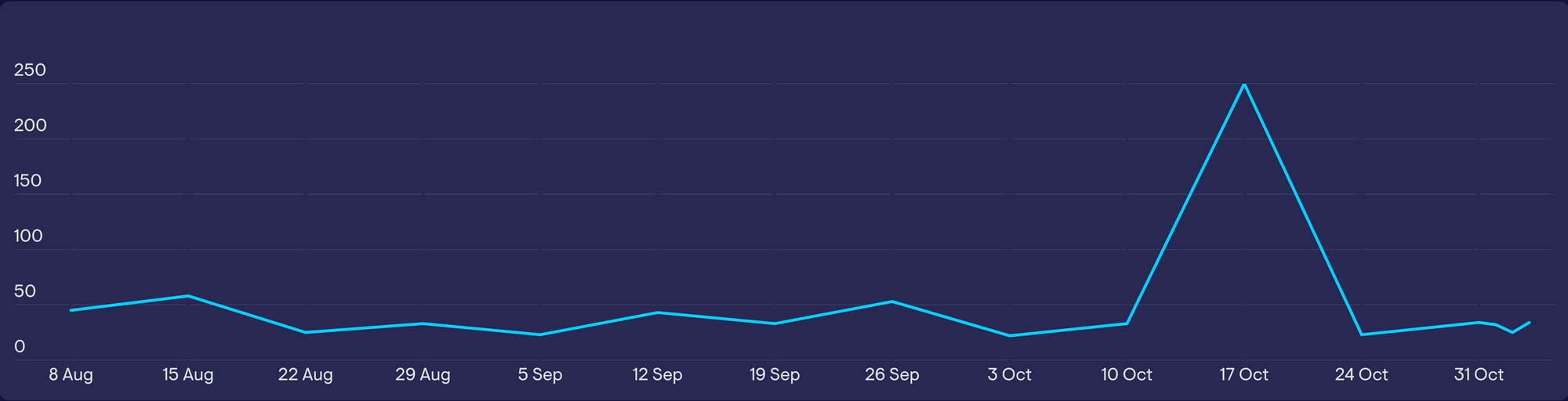
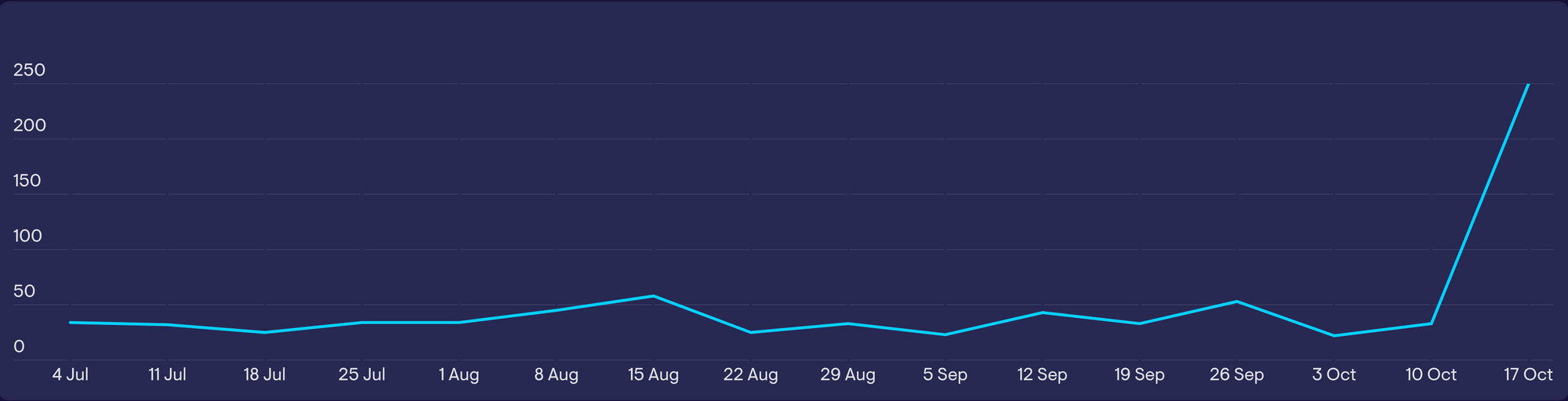
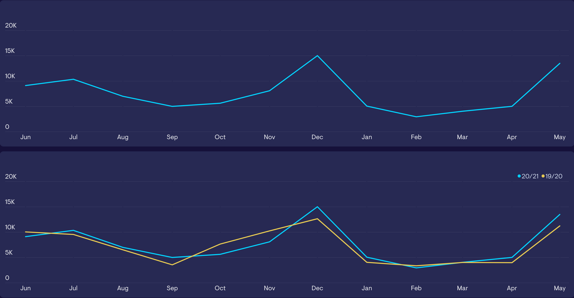
In the example below, a Customer Success Manager is looking at the average first response time over the past week. They’ve noticed what looks like a spike in their data.
But that’s because this metric carries a lot of variance, especially when calculated each day. By looking at the trendline over time (in this case, over the past month), the manager can see that this spike is completely normal.
Often, like with the example above, a quick look at the shape of the data over time will tell you if your spike is normal. However, if you want to be more rigorous, you can employ statistical process controls.
Statistical process controls (SPCs)
Statistical process controls are a more scientific way of determining whether a metric is behaving normally. Typically, the control would involve a series of tests; for example, do any of the data points fall outside of a defined ‘normal’ range. SPCs are also useful because they can be automated.
A common example of an SPC is an XmR chart – we’d recommend this guide to building your own XmR chart by Stacey Barr.
3. Consider seasonal trends and natural cycles
Some metrics vary according to natural cycles. Many sales patterns, for example, are tied to the calendar year. Think about consumer purchase behaviour around Black Friday and in the run up to Christmas, new gym memberships in January or ice-cream sales in summer.

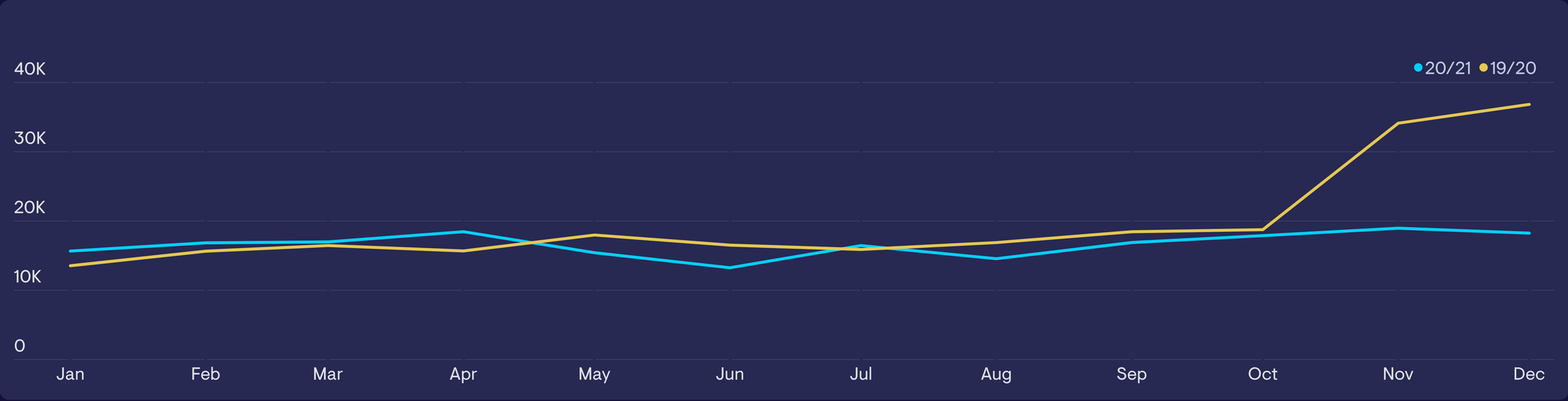
When we correctly determine natural cycles, we can use this to add valuable context to our data. For example, this ecommerce site has added a yearly comparison to their trendline. It helps you to determine whether the spikes in December and May are normal, or the result of a seasonal trend.
Similarly, awareness of cycles can help us discover whether irregularities are happening that would otherwise appear normal. In the example below – this product would usually experience an uptick in sales in the run up to Christmas, but this hasn’t happened this year. Without the comparison, we might incorrectly interpret the trendline as ‘normal’, with no cause for alarm.
Be careful when making cyclical or seasonal comparisons. Particularly as they can be prone to our own biases. Find a way to test or verify these assumptions.
4. Is there a data quality issue?
Your spike could be caused by a data quality issue, as opposed to a real-world change.
Data quality issues occur when there is a problem in the way data is collected or recorded, or because of non-genuine inputs. An example of a non-genuine input would be a member of your team testing a feature multiple times, without disabling the analytics, which then causes a usage spike.
Consider the obvious causes of data quality issues, and try to rule them out. Many common issues include:
- outages in tools
- internal testing
- broken code (such as event tracking)
- changes to your platform
- bots
- spam (such as spam signups)
- bugs that cause events to fire / not fire
- human error / manual steps not being completed
- SQL job not run
Once you’ve ruled out some of the more common causes of data quality issues, you should aim to verify or falsify the spike.
Use secondary data to verify or falsify the spike
If your KPIs have genuinely spiked, then the cause of that spike will likely have influenced other related metrics.
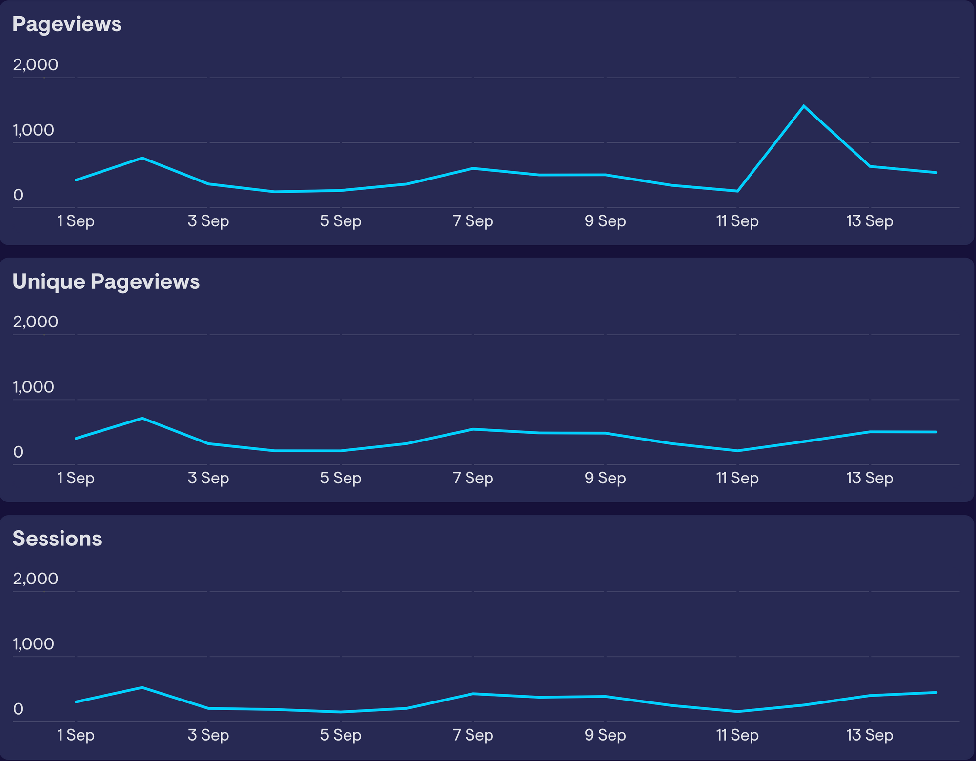
For example, in the example below, our pageviews have spiked, but two closely related metrics (sessions and unique pageviews) have not. If the spike was genuine (and our website had genuinely attracted many more visitors that day) you would expect all three to be affected in a similar way. The fact that only one metric has spiked would indicate a data quality issue.
Similarly, you may use different tools to track the same metrics. Discrepancies between data reported by different tools are a tell-tale sign of issues in data quality.
For example, if your analytics tool has recorded no website traffic to your payment pages, but your payment tool recorded consistent new payments, then it’s likely there's an issue with your data quality. However, if both tools recorded a dip, then it’s more likely something has genuinely happened within the user journey.
5. Segment the data, follow the breadcrumbs
Segmenting data is a great way of testing existing theories and prompting new ones.
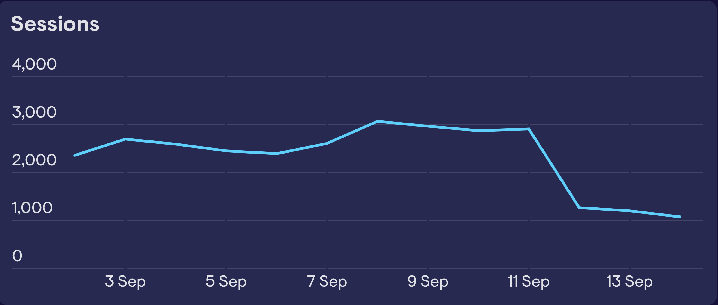
In the example below, we see a huge drop in traffic on September 12. If our hypothesis was that this was caused by a national holiday in one of the countries where we operate, you could easily test that theory by segmenting the data according to country. If it was true, you would see a drop in that country and normal activity in segments from other countries.
If you don’t have any working theories, then segmenting by different variables can present clues. Here, we’ve segmented the data by acquisition source. We can see that all segments have stayed normal apart from one – traffic from Google Ads.
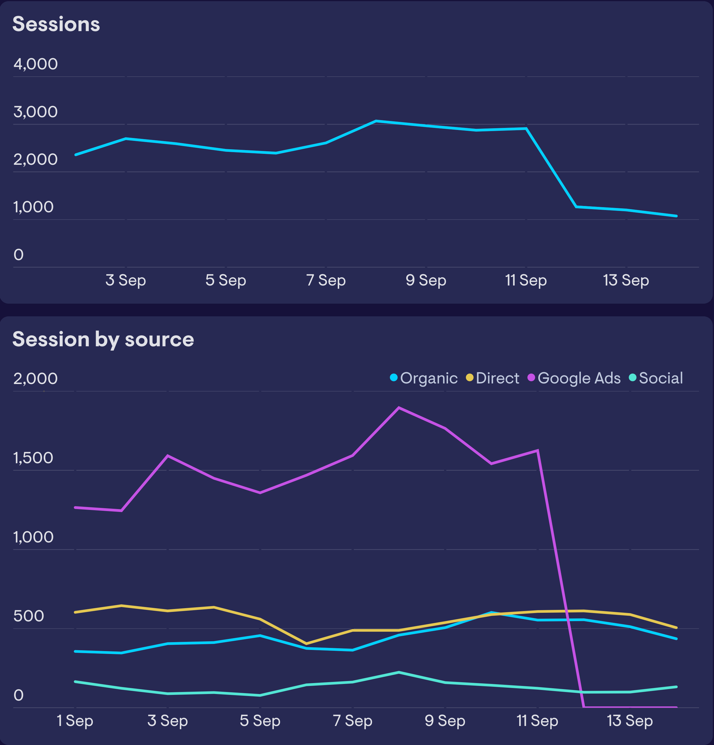
Of course, on its own, this doesn’t explain the underlying cause of the dip, but it does give us our next step (or breadcrumb) to investigate. You can repeat this process of segmentation as you zone in on the specific causes of your spike. But be careful, repeatedly segmenting can reduce the sample size, resulting in trends that may look irregular, but are not actually statistically unlikely.
6. Has anything changed?
Another way of generating theories, which you can then test, is by asking a very simple question - has anything changed?
Have we changed anything?
Start internally. Check for new updates, new features, areas of work. And pay very close attention to dates and sequences of events. This will allow you to rule out working theories if the sequences of events don’t match. It will also reveal coincidences, such as two unusual but seemingly unconnected things happening at the same time. Always interrogate these coincidences.
It’s important to keep a completely open mind. The cause of your spike may be an unintended consequence of something completely unrelated. Normally, it’s because something, somewhere, has changed.
Has anything changed in the outside world?
You can’t investigate everything, of course, but do start with the likely suspects. If your spike relates to web traffic, check to see if Google has updated their algorithm. If your spike relates to an IT system failure, check to see if the same thing has happened to other users.
7. Involve others
If you haven’t already, ask around.
Has anyone noticed data spikes of their own? Does anyone know if anything has changed? (Again, pay very close attention to dates and sequences of events)
Your team is one of the best resources you have for troubleshooting data issues. They contribute valuable knowledge and perspective. Use them!
8. Keep monitoring
As frustrating as it may be, you should accept it’s not always possible to get to the bottom of data spikes. At least not straight away.
But the worst thing we can do is forget about them…
Why?
Because it might happen again.
And if it happens again, then now you have a reoccurring issue, and that’s far more significant to you and your business.
Also, if it happens again, you have twice as many data points to investigate and compare.
So really, the best thing we can do is to keep monitoring. Because the greater level of awareness you can create, the more likely it is we will eventually spot the patterns and crack the case.
So be patient. Keep monitoring your KPIs. And good luck.
Monitor your KPIS with Geckoboard
Geckoboard integrates with 60 data sources and counting so you can create live KPI dashboards. Discover why 1000s of companies use Geckoboard to track the metrics that matter.
Start your free trial today.
