When it comes to presenting key metrics on a TV dashboard, it’s extremely easy to overcomplicate things.
Any distraction from the core message behind your numbers will dilute their meaning and make them far less effective, whether that’s a poorly chosen visualization, superfluous text, or simply displaying too many metrics on your dashboard.
In Geckoboard’s Product Team, we’re always striving to improve the design of our dashboards so that anyone can build dashboards that look great, and can communicate metrics as clearly as possible to an audience around a TV.
Over the past couple of months we’ve been working on a series of improvements to make building an effective, focused TV dashboard even easier, and we thought it was about time we share a quick rundown of what we’ve improved so far in 2016.
New Fine-tune controls
The biggest update so far is the new ‘Fine-tune’ tab in our Salesforce, Spreadsheets, and Custom Datasets integrations. For the first time, we’re giving you full control over what precision to show on your visualization, for example whether to use an abbreviation like ‘K’ for thousands, and what units to use, giving you many more options for customizing how your metrics are presented on your dashboard.
Units
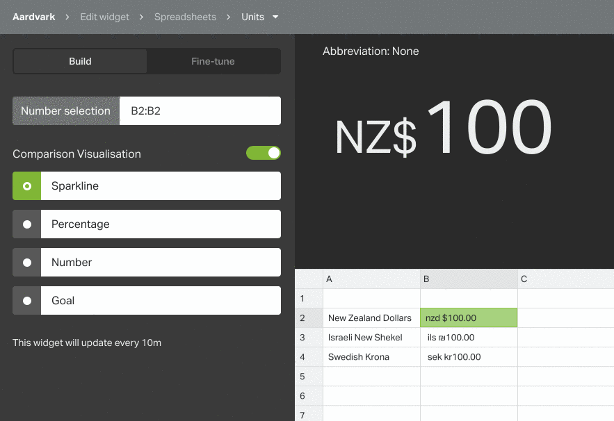
Up until now we’ve been relying on the browser to automatically decide how to render currencies. Most the time this works reliably, but occasionally the results aren’t so great.
Take a Swedish company dealing mostly in US dollars for example. In Chrome, dollars would be rendered as ‘US$’, when showing just a dollar sign could be more efficient. We could have opted to always use the short form of currencies e.g. ‘$’, but then if you were an Australian business handling Australian, New Zealand and US dollars this wouldn’t be enough information to distinguish between them.
We came to the realization that there’s not a fully automatic approach we could take that would always be right, so we decided to give you control. Now we always default to our best guess automatically, but also allow you to override that if you want to.
And this isn't just limited to currency data. Even if your Salesforce, Spreadsheet or Custom data comes into Geckoboard as just a number, you can now add any prefix or suffix up to 3 characters whilst setting up your visualization in Geckoboard itself, meaning it's now possible to show units like ‘kg’, ‘m’, and ‘°F’ in a few clicks.
Abbreviation and Precision
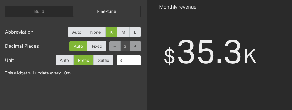
Another important change that gives you more control over how your metrics are displayed is what precision (number of decimal places to show) and what abbreviation to use.
What’s appropriate to show depends on many different factors and again, we aren’t always able to select the best option for you. Until now, our algorithms decided what to show based on your metric but don’t know what data to expect in the future, or how you’re used to thinking about the number.
Imagine for instance you’re tracking your Company’s Monthly Recurring Revenue (MRR) and $5 million is a big milestone. You’re currently at $4,991,001 and it’s growing at a rate of around $1K a day. To show the full precision requires 7 digits and a lot of screen real estate, so Geckoboard usually defaults to showing the number with the ‘M’ abbreviation, and limit the number of decimal places to show. While generally this leads to a less cluttered dashboard, in this case just showing ‘$5M’ wouldn’t give us the detail we’re after.
Now you have complete control. You can always opt to show the raw number or, if an abbreviation is appropriate, you now have the option to show ‘K’ for thousands, ‘M’ for millions or ‘B’ for billions. Control over precision allows you to adjust the number of decimal places shown, also useful for showing more detail when required.
Better image widgets
Images on dashboards are used for a variety of reasons:
- Adding logos for branding
- Display dynamic content (e.g. a photo of your best-selling product, photo of your top sales rep this month)
- Denoting different areas of the board (e.g. adding a US flag over the half of the board that displays US data)
To make our image visualization better at handling all these use cases we’ve made a series of enhancements. Firstly, we got rid of the padding around the image itself. Images now go full bleed and occupy the full widget - no more wasted space!
Secondly, we’ve made image widget backgrounds transparent. That means if you’re adding a transparent logo (.svg, .png or .gif) whatever is behind your image widget will show through. This makes adding images and branding such as your company’s logo to your dashboard much easier.
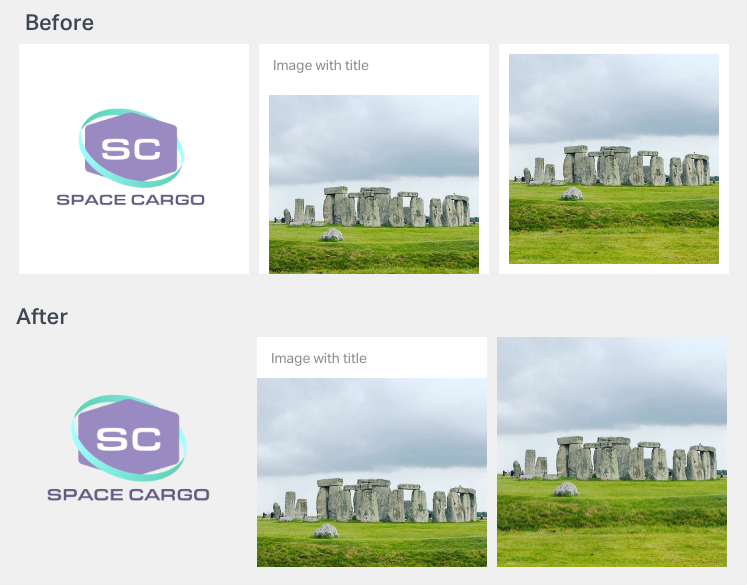
Finally, we’ve added some more widget size options to give you more flexibility over how big your images are.
Rolling out our latest generation visualizations
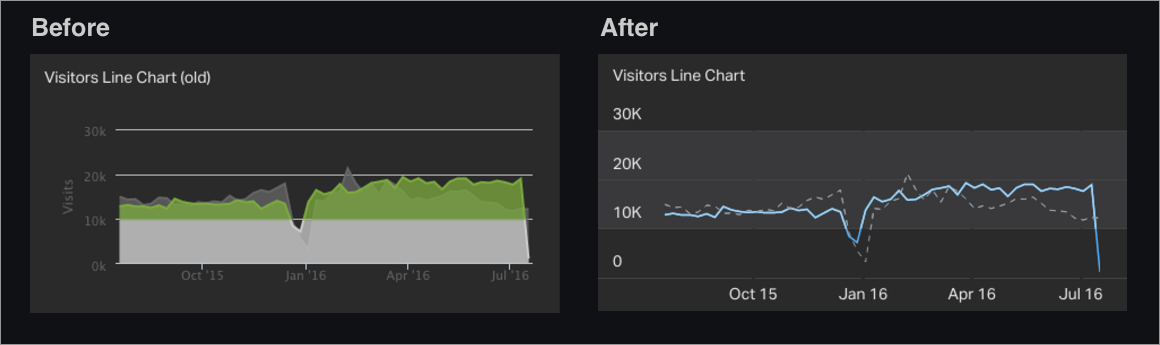
If you’ve been using our Spreadsheet and Salesforce integrations you’ll have noticed we introduced updated line, bar, and column chart visualizations last year.
As well as looking slicker, the new generation of visualizations have been designed specifically for the TV, with deeper contrast between lines and the widget background and more space used in the widget to convey your data. After seeing many users duplicate axis labels when writing their widget titles, we took the decision to remove labels from the X and Y axis.
In addition, we’ve added our new and improved tooltip to the line chart that supports multiple series and now also shows X-values, make it easier to read off values.
Starting this week, we’ll be rolling out updates to line charts across all our integrations, with bar and column charts to follow soon.
Smarter handling of infinite increases
Our number visualization gives you the ability to display a secondary number showing the relative increase of the current reading over the previous one (e.g. a current reading of 20, with a previous reading of 10, would show a 100% increase). If your previous value was 0, this presented us with a mathematical dilemma!
Before, we would show any change from zero as an infinite increase. Reviewing this decision, we decided what would actually be more useful and less ambiguous to always show the absolute change when changing from 0.
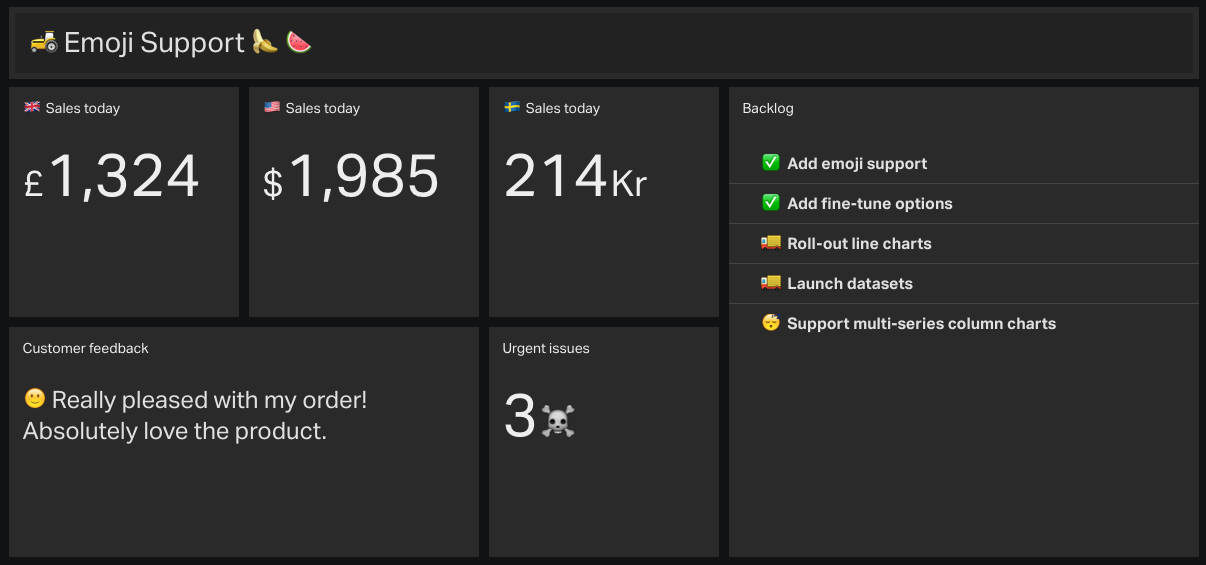
Emoji support
It’s with great 😃 that we can say that Geckoboard FINALLY supports emoji in widget titles and units. Aside from making us extremely 😎 , the addition serves a practical purpose. Instead of taking up valuable space on your dashboard with wordy titles or unit labels, it’s now much simpler to use a simple emoji to denote things like countries, sentiment, or almost anything! 👞 🚴 🦀 🍏 🏈
To try this out, if you’re on a Mac the easiest way is to open OSX’s built-in emoji keyboard with ctrl + cmd + space, otherwise just copy and paste the symbol you’re after from getemoji.com into your widget title.
More in the pipeline
These are just a few of the changes we’ve made recently to make it easier to build engaging, effective TV dashboards, and there are plenty more to come. To keep track of changes as we make them, make sure to check out our updates page.
As always, we really value your feedback, so if you have any comments, suggestions or questions don’t hesitate to drop us a line!
