Pie charts are completely ubiquitous - especially in business. It can therefore come as a shock to hear that in the data visualization world they’re considered bad practice. Some of the big names in the field like Edward Tufte and Stephen Few take very hardline approaches.
Pie chart users deserve same suspicion and skepticism as those who mix up its/it's, there/their...
Edward Tufte
There’s a multitude of articles railing against them with titles like “People, Please Stop Using Pie Charts” – pie charts are fast becoming the Comic Sans of the data visualization world.
The case against pie charts
The basic premise is that pie charts are poor at communicating data. They take up more space and are harder to read than the alternatives. The brain’s not very good at comparing the size of angles and because there’s no scale, reading accurate values is difficult. As you add more segments and colors, the problem gets worse. Labels can be hard to fit, especially to smaller segments, so often legends are required.
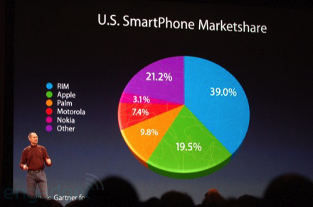
All these problems are exacerbated when people make them 3D - something Excel and other tools seem to lure us into! With the right perspective you can even trick people, like Apple did here:
If you're interested in reading a more comprehensive rebuttal we recommend Few’s 14-page article “Save the Pies for Dessert”.
The case for pie charts
There are a few defenders of pie charts with articles like
Why Tufte is flat out wrong about pie charts and In defense of pie charts but they don’t have any big-name champions.
One argument used in favor of pie charts is that their circular shape efficiently conveys to the viewer that they are looking at the proportion of a whole. With a bar chart, this can only be understood by reading the percentage sign in the axis labels.
Another argument in support of pie charts is that they make it easy to see whether different values combine together to be larger than another. For example, if Party A, B, and C formed a coalition would they be greater than Party D? Unlike in a table or bar chart where the viewer would have to do some form of mental arithmetic or visual juggling, the answer is often obvious by just looking.
Finally, there’s the joke that pie charts are the visualization of choice if you need to show the proportion of pie or other circular food items you have left!
What should you use?
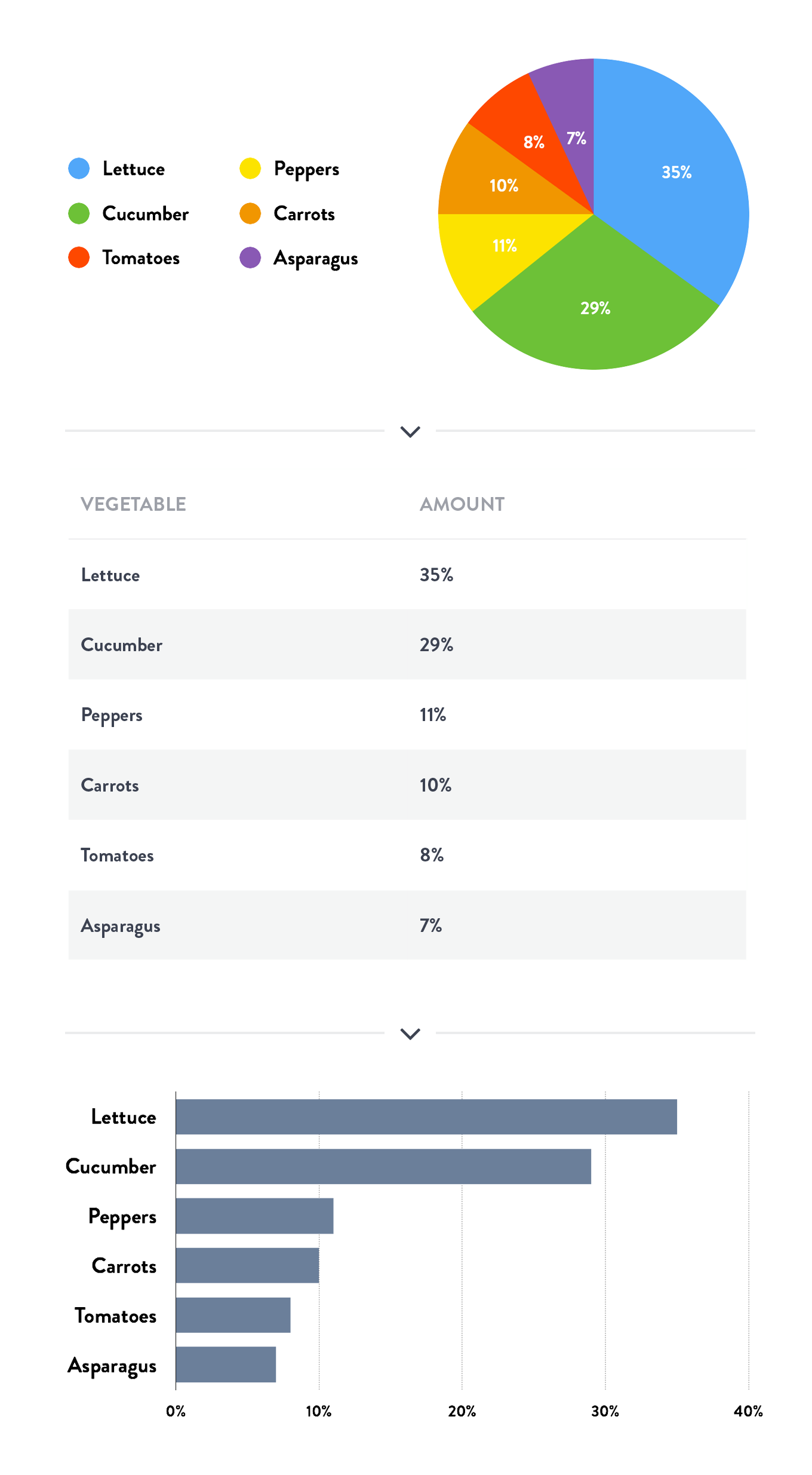
The recommendation is to always opt for an alternative – usually a table or bar chart. As you can see in the example below, when you present the same data in a bar chart without the distraction of color and clutter, it’s much easier to digest the data quickly and correctly.
The Geckoboard stance on pie charts
At Geckoboard we subscribe to the view that pie charts are very rarely the best choice for visualization and we don’t recommend their use. Many of the problems outlined above are much worse on a wall mounted dashboard where space is even more of a premium and readability even more important. However, we’re not fanatical about it and we even have some support for them from our early days.
There are far worse sins in the word of data communication than the use of pie charts, and maybe we’ll write a more extensive blog on some of those in the future! There’s also a human side to the equation and users of pie charts don’t deserve “suspicion and skepticism”. It’s not always possible or the right time to persuade your boss, team, or client that using a pie chart is bad. There’s something about the circular nature of a pie chart that can make it seem friendlier and easier to interpret than the alternatives, but in reality it's not.