I love data visualization and have spent a lot of time looking at charts across different vendors, BI tools, and libraries. One thing that keeps coming up for me is how animations are handled.
There’s a wide range of approaches. Some charts don’t animate at all, some do it poorly, and a few get it right. The difference isn’t just aesthetic. It has a direct impact on how easy it is to understand what’s happening in the data.
In this post, I want to look at when chart animation is useful, when it isn’t, and what tends to go wrong.
TL;DR
- Use animation to show how data changes, not to decorate charts
- Preserve context by transitioning between states instead of replacing them
- Animate properties that reflect meaning (for example, bar height, not position)
- Avoid unnecessary effects or too much simultaneous motion
- Respect reduced motion preferences for accessibility
If an animation doesn’t help the viewer track change, it’s noise.
What is chart animation?
Chart animation is the use of motion to transition between different states of data in a visualization. Rather than replacing one chart with another, animation shows how the data changes over time or between views.
Used well, it helps people understand change. Used poorly, it can confuse viewers.
When animation is just decoration
If you have a chart appear from nowhere on a page when you first load, this kind of animation is what I’d consider decoration.
They're introduced to try and make the chart look nice (which is great!) but don't add a huge amount of value (see example below). The data isn’t changing, and the user isn’t trying to compare states. The animation is just introducing the chart.
The same applies to static charts that never update. In those cases, animation rarely serves a purpose beyond presentation.

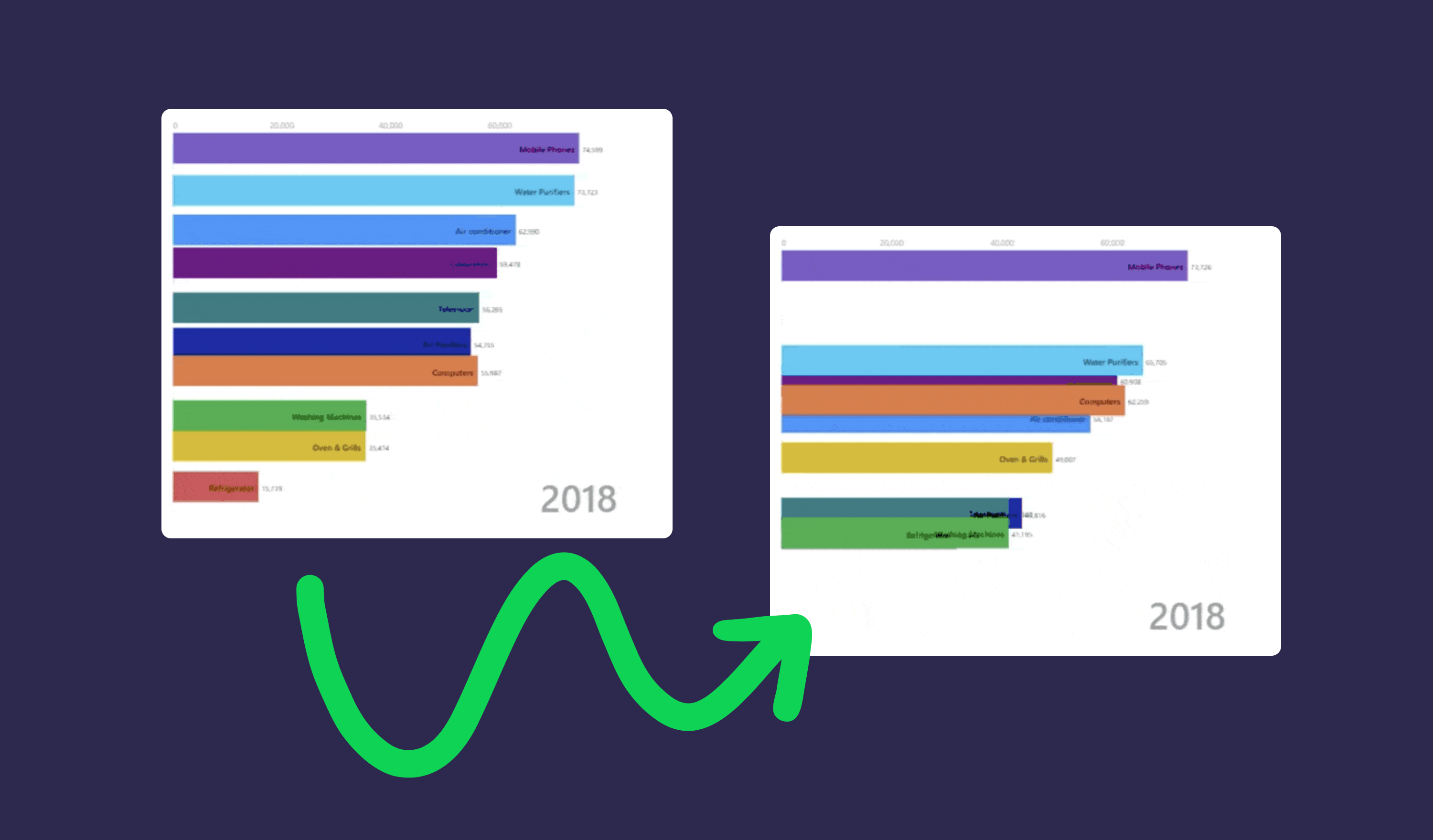
Why animation matters for data changes
Animation becomes much more valuable when the data itself changes.
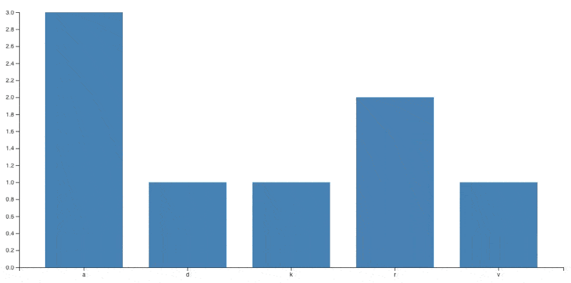
If you reload a chart with fresh data and no animation, it can be surprisingly difficult to see what’s changed. This is especially true for anything beyond a very simple chart. You’re effectively asking the viewer to compare two separate mental snapshots, which is where change blindness comes in.
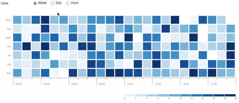
This becomes even more important for TV dashboards, where people are glancing at data from a distance and need to understand changes quickly.
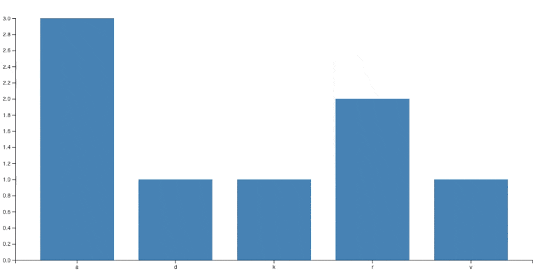
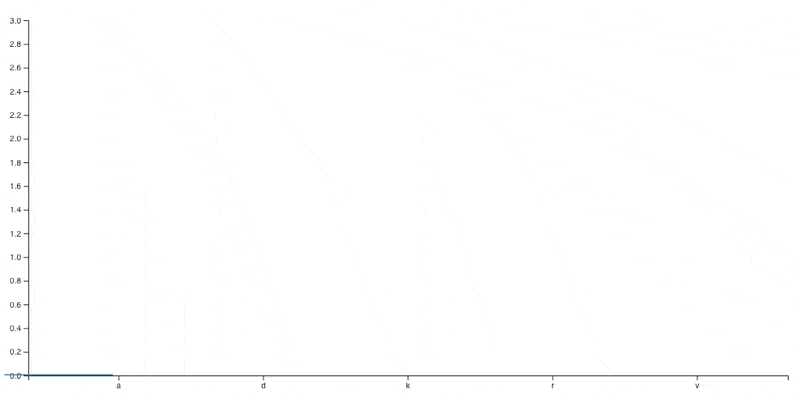
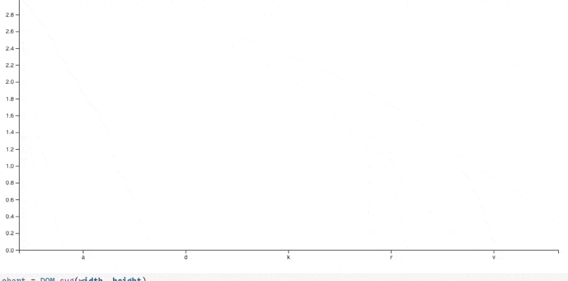
The example below is a simple chart, but even here it’s not easy to hold the previous state in your head and work out what changed. If you scale that up to dozens of data points, it quickly becomes unrealistic.
By introducing animation between states, you preserve context. Instead of replacing the chart, you show how each value moves from its previous position to its new one. That continuity makes it much easier to understand both the direction and magnitude of change.
You also remove the “loading” state where the chart disappears and reappears, making it much easier to focus on the changes.
Using animation when filtering or changing views
The same principle applies when the user changes how the data is presented, for example by applying a filter or switching dimensions.
Without animation, the user is presented with what looks like a completely new chart. They have to reorient themselves, understand the new structure, and then work out how it relates to what they were just looking at.
With animation, you can retain that context. Elements move, resize, or regroup in a way that makes the transition easier to follow. The user doesn’t need to start from scratch each time.
Filtering example without animation:
Filtering example with animation:
Common chart animation mistakes
The difficulty with animation is that it’s very easy to get wrong. In many cases, poor animation is worse than none at all.
Animating the wrong thing
One common issue is animating the wrong property.
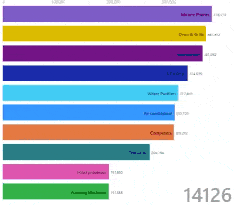
For example, in a column chart, bars should grow or shrink from the axis to reflect changes in value. Animating them sliding in from the side breaks that relationship and makes the data harder to interpret.
Over-the-top animations
Another problem is adding unnecessary effects.
Animations like bouncing or elastic transitions might look interesting, but they distort the data and make it harder to read. The viewer is no longer focused on the change itself, but on the movement.
Too many moving elements
It’s also easy to introduce too much motion.
If multiple elements are moving in different ways at the same time, it becomes difficult to follow what’s happening. Instead of preserving context, you overwhelm it.
In these cases, it’s often better to slow things down slightly or sequence animations so changes are easier to track.
What good chart animation looks like
In practice, effective chart animation tends to follow a few simple principles:
- It shows how data moves from one state to another, rather than replacing it
- It preserves position, scale, and relationships where possible
- It focuses on the properties that reflect meaning (for example, bar height rather than position)
- It avoids unnecessary effects or motion
- It remains subtle enough that the data, not the animation, is the focus
Here’s an example of what that can look like when done well, slowed down for clarity.
A lot of this comes down to the fundamentals of dashboard design best practices, where clarity should always take priority over decoration.
When to use chart animation
Chart animation is most useful when:
- Data updates frequently
- Using real-time dashboards where changes need to be understood quickly
- Users need to compare before and after states
- The structure of the chart changes through filtering or grouping
When to avoid it
It’s less useful when:
- The chart is static
- The animation is purely decorative
- The motion makes the data harder to interpret
Accessibility and reduced motion
It’s also important to consider accessibility.
Some users are sensitive to motion, so where possible you should respect reduced motion preferences (for example, using prefers-reduced-motion). This ensures that your charts remain readable and comfortable for everyone.
Conclusion
Animations in charts can be incredibly useful, particularly when they help people understand how data changes over time.
The key is to use them with intent. If an animation is there to preserve context or highlight change, it adds value. If it’s there to decorate or distract, it gets in the way.
If an animation doesn’t help the viewer track change, it’s just noise.
Ian is a Senior Software Engineer at Geckoboard with a long-standing interest in data visualization and how teams use it in practice. He’s been at Geckoboard since 2024 and is most proud of his work on improving some of our development tooling to improve quality, and ultimately prevent shipping bugs to customers.
