
Data analysis is critical for all employees, no matter what department or role you work in. Whether you’re a marketer analyzing the return on investment of your latest campaign or a product manager reviewing usage data, the ability to identify and explore trends and fluctuations in your data is an essential skill for decision-making.
Unfortunately, many companies today struggle with data organization and analysis. A global survey by Splunk found that 55% of all data collected by businesses is “dark data”: information that is collected but never used. Sometimes a company won’t even know that it has collected the information. Or, the data sits there because the team doesn’t know how to analyze it.
The same survey found that 76% of executives believe training current employees in data science will help solve their company’s dark data problem. If employees understand how to analyze different types of data, the company will be able to make better use of the information it collects.
Fortunately, data analysis is a skill you can learn. You don’t need to be a “numbers person,” have an advanced degree in statistics, or sit through hours of in-depth training modules to understand how to analyze data. Instead, we’ve put together this guide to help you master some basic data analysis skills – from cleaning data, choosing the right analysis tools, and analyzing patterns and trends to be able to draw accurate conclusions and actionable insights.
Define your goals
Before you start analyzing your data, you need to set some clear objectives. If you don’t have a clear idea of what you’re looking for, you’ll just spend hours staring at a spreadsheet or scrolling through countless support tickets, waiting for that lightbulb moment.
Your goals will vary depending on what team you’re on, the data you’re collecting, and your role within the business:
- The finance team wants to identify cost-saving opportunities by analyzing team expenses data
- The marketing team is looking for ways to improve free trial conversions by looking at changes in lead activity
- The engineering team needs to understand how many customers were affected by a recent service outage, so it will look through a lot of product usage data
- The product team needs to prioritize new features and bug fixes in the product roadmap, so it will analyze your recent support tickets to understand what’s most important to your customers
These goals will inform what data you collect, the analysis tools you use, and the insights you get from your data set.
Clean your data and remove anything you don’t need
Your data analysis is only as good as the data you start with. If the information you’ve got is patchy, inaccurate, or inconsistent, then the insights you get from your analysis will be incomplete or misleading. So once you’ve collected your data, take some time to clean it by making sure it’s consistent and doesn’t include duplicate information.
If you’re only looking at a small data set, you may find it easiest to clean your data manually in a spreadsheet. As a starting point, here are some simple things you can do to clean up your data before you start analyzing it:
- Add title rows to make it easy to understand what information you’ve got in your spreadsheet
- Remove duplicate rows or columns if you’ve ended up with multiple copies of the same record within your data set
- If you exported data, delete rows or columns that you’re not going to use. For example, many tools add an “ID” column or timestamps to data exports, which you won’t use in your analysis
- Standardize your data so that numerical values such as numbers, dates, or currency are all expressed in the same way
If you’re dealing with an extensive data set, it’s harder (or at least much more time-consuming!) to clean that data manually. Instead, consider using data cleaning tools like OpenRefine or Talend to speed up the process. Dedicated data cleaning tools clean up messy, inconsistent information quickly so that it’s ready to use.
You could also implement a data governance strategy to set clear guidelines for how your company manages and organizes data and cut down the amount of time you have to spend cleaning data in the future. A few data governance best practices include:
- Create a standard process for when and how to collect data
- Adopt standardized naming conventions to reduce inconsistencies in your data
- If you’ve automated any of your data collection processes, watch out for any error messages or incorrect data. If you see any error messages, investigate your setup to diagnose what’s causing those errors
- Edit and update data collected in the past so that it meets your new quality standards
Cleaning and standardizing your data is an essential preparatory step for analyzing your data. It makes it less likely you will draw incorrect conclusions based on inconsistent data and more likely that you’ll get helpful, usable insights.
Build your data analysis toolkit
Many companies rely on Excel or other spreadsheet tools to store and analyze their data, but there are many different platforms to help you analyze your data. The type of data analysis tool you use will depend on two things:
- The type of data you’re analyzing. Quantitative data is often numerical, which is ideal for presenting in spreadsheets and visualization tools. But qualitative data – such as answers to questionnaires, survey responses, support tickets, or social media messages – is unstructured, making it hard to draw out usable insights just in a spreadsheet. You need a way to categorize or structure your qualitative data to be able to analyze it effectively.
- The amount of data you’re analyzing. If you’re only analyzing a small data set each week or each month, you may be able to analyze information manually. But the more data you’re handling, the more likely it is that you’ll need to invest in tools that automate the data collection and analysis process for you. These platforms will reduce the likelihood of human error and speed up the analysis process.
Here are some suggested tools that may be a useful addition to your data analysis toolkit. Of course, you may not use all of them each time you analyze data, as each is best for a specific type of data.
- Spreadsheets like Excel or Google Sheets are the traditional tool for examining data. They’re great for analyzing small-to-medium batches of data without needing in-depth technical knowledge to get started
- Business Intelligence (BI) tools are used by companies that need to collect and analyze large data sets to spot trends, patterns, and insights
- Predictive analysis tools use your company’s historical data and machine learning to anticipate how performance changes will affect future outcomes
- Data modeling tools represent how information flows and is connected between various business systems. Companies use data modeling tools to see which departments hold which data and how those data sets interact
- Department-specific analytics tools are used by teams in different areas of the business to analyze data specific to their roles and responsibilities. For example, HR departments need to track lots of people data such as payroll, performance, and engagement data, so a people analytics tool like ChartHop will be easier to use than a spreadsheet
- Data visualization tools represent information in charts, graphs, and other graphics to make it easier to spot trends in your data set
Choose tools that will help you quickly analyze your data set and pull hard-to-find insights.
Look for patterns and trends in the data
Your data is clean and you’re set with a variety of tools. Now, you can start the data analysis process.
As a starting point, look for trends in your data set. If most of your data is numerical, it’s relatively easy to plot patterns on charts and other visualizations. But if you have unstructured data like emails or support tickets, you may need a different approach. Here are a few data analysis methods you can try if your information doesn’t fit neatly into a spreadsheet:
- Text analysis uses machine learning to extract information from unstructured text data, such as emails, social media messages, support tickets, and product reviews. It involves detecting and interpreting patterns within this unstructured data. Example text analysis tools: Thematic, Re:infer
- Sentiment analysis uses machine learning and natural language processing to detect positive or negative emotions in unstructured text data. Companies often use sentiment analysis to gauge brand perception in social media messages, product feedback, and support tickets. Example sentiment analysis tools: IBM Watson, MonkeyLearn
- Topic analysis uses natural language processing to assign pre-defined tags to free-text data. It’s useful for organizing and structuring text data. For example, you could use topic analysis to categorize support feedback to help you understand what areas of your company or product are causing customers the most problems. Example topic analysis tools: Datumbox, MonkeyLearn
- Cohort analysis involves examining data within groups of similar customers in specified time frames. You might look at changes in product usage by customers who signed up for your product during the same month. Example cohort analysis tools: Spreadsheets, Looker
As you spot patterns, don’t assume correlation means causation. For example, if you see a big increase in social media followers around the same time you saw a huge spike in product sign-ups, you might assume that all your new users are coming in from social media. But if you look at the source tracking data in Google Analytics, you’ll see that very few people even visit your website from social media – let alone sign up for your product.
Assuming that a correlation between two things means that one caused the other is called false causality, and it is one of the most common mistakes people make when analyzing data. There’s often another factor at play that’s caused the trend you’ve spotted, so take time to gather enough evidence and make sure your insights are accurate.
Compare current data against historical trends
If you’re finding it challenging to identify trends and patterns in your data, it may be because you’re looking at your data in isolation. You can’t spot changes over time because all you’re seeing is a single snapshot of your performance. What you’re missing is the context: how your current data compares to previous time frames.
Compare your current data against past performance to put your findings into context. But if that’s not possible – for example, if you’re looking at usage data for a completely new product feature, or you’re just starting to analyze your support performance – then you may find it helpful to look at industry benchmarks instead.
You can find performance benchmarks for different companies, departments, and industries. Often a quick Google search for “[department] performance statistics” or “[industry] [department] statistics” will uncover useful performance benchmarks. Alternatively, industry publications and research presented at conferences are good places to look for benchmark data.
For example, the Zendesk Benchmark allows companies to compare their customer support performance data against the average for their industry:
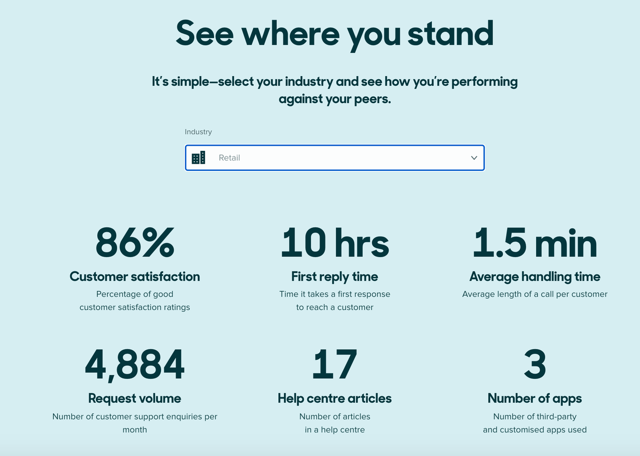
Zendesk Benchmark is an example of benchmark data that you can compare against your support team’s performance data to put your performance into context in relation to your industry.
One note of caution: If you’re using benchmark data, it may be difficult to find companies of similar size or stage to you. So remember to use these figures as a reference point rather than directly comparing your performance against those benchmarks.
Look for data that goes against your expectations
When you started analyzing your data, you set clear goals and expectations for what you wanted to learn and what insights you were expecting to find. But this can lead to confirmation bias, where you’re more likely to notice trends that support your existing assumptions or hypothesis.
Keep an open mind by looking for trends or data points that go against your expectations. You should also look for outliers in the raw data. This practice will help you avoid cherry-picking findings that support your existing beliefs.
If you find anomalies in your data, you should investigate them further, as there may be a simple explanation. For example, if your marketing team sent out a newsletter, but you’re not seeing any website traffic coming through, it could be that they sent it to an internal test list, or they forgot to add UTM parameters to the links in the newsletter.
You should also look at how much outliers in your data skew your results. Significant outliers can easily skew averages in your data, so you may need to track the median rather than the mean. The median uses the middle value of your numerical data set, so it’s less skewed by outliers. Alternatively, you may need to discount these outliers from your analysis altogether.
Visualize your data and interpret results
It’s often easier to understand and interpret your data when it’s presented visually instead of in a spreadsheet. Use tools like Google Data Studio or Tableau to represent your data in charts, graphs, or other graphics so that you can clearly explain your results to other team members.
If you’re working with large data sets, don’t try to communicate too much information at once in your visualizations. Simple charts make it easier for the viewer to understand your message and the findings from your data. We’ve put together a series of data visualization tips to help you communicate your data findings more clearly.
You can also use tools like Geckoboard to display your data on a dashboard that anyone on your team can view at any time. Geckoboard’s Send to Slack feature makes it easy to share your dashboards with your team for greater visibility by integrating with Slack, so even on remote teams, you can share your latest data insights. This feature is particularly useful for keeping key metrics top of mind by sending regular, automated updates.
Like data visualization, the way you design your dashboard will affect how useful it is for your team. Our dashboard design guide will help you create dashboards that clearly communicate your key metrics and give your team at-a-glance insights into your current performance data.
We explore the importance of visualising data – not just relying on summary metrics.
Next steps: What to do after analyzing your data
There’s no point collecting and analyzing all this data if you don’t do anything with the insights you form. Use your findings to:
- Set realistic targets and KPIs based on your current performance data
- Improve your customer experience, as your analysis gives you a better understanding of customer needs and behavior
- Make data-driven decisions about prioritizing in your product roadmap based on your analysis of product usage and support tickets
- Make better-informed, more confident business decisions, as you’ll have a clear understanding of what is and isn’t working
While data analysis can be a time-consuming task, it’s important to remember that it isn’t the end goal. You’re analyzing data to be able to make informed decisions moving forward.
