KPI dashboards are an essential tool for any business leader who wants to monitor how their business is performing, and stay on top of real time data.
There are many ways to create a KPI dashboard. We go into further detail on how to approach choosing the right KPI dashboard software in our 2024 Dashboard Buyer’s Guide.
In this article, we explore the four most common methods businesses use to create KPI dashboards. They include:
- Spreadsheets
- In-built analytics tools
- BI Tools
- Geckoboard
1. Using a Spreadsheet
Spreadsheets, such as Google Sheets or Excel, are the go-to tools for many when it comes to data management and visualization.
Although they are not specifically designed to be a KPI dashboard tool, it is possible to use them to create a high level overview of your key metrics.
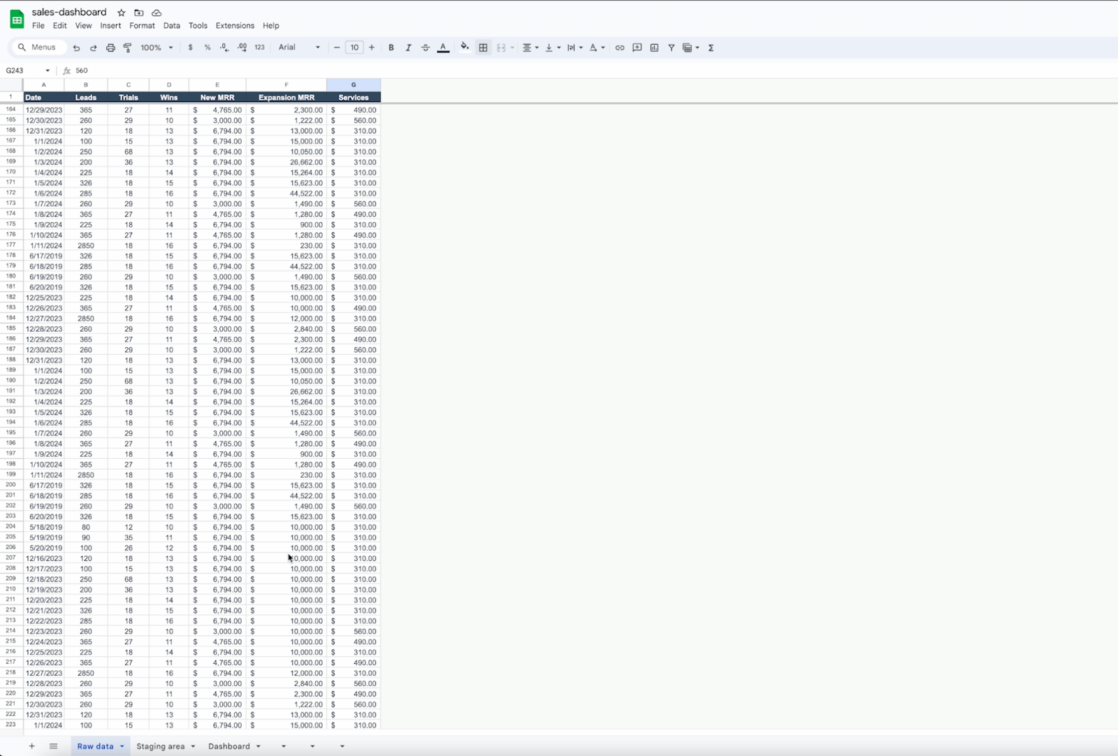
There are several approaches to building a KPI dashboard using a spreadsheet like Excel or Google Sheets, however the most common way involves three main steps.
Firstly, you need to collate all of your raw data into one sheet, in a format you will be able to work with.
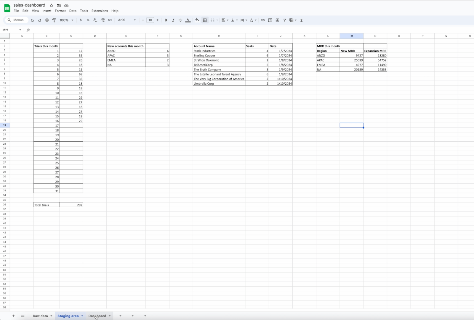
Secondly, on another sheet, create something called a staging area. Here you can use formulae to pull out and/or calculate the metrics you wish to visualize.
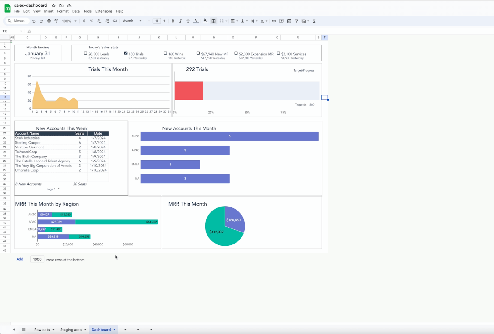
Finally, on a third sheet, create data visualizations which display the data from your staging area.
Pros and cons of using a spreadsheet as a dashboard tool
Using a spreadsheet to build your KPI dashboard is an attractive option because they are low cost and most people have basic knowledge of spreadsheets
However, spreadsheets do carry some major downsides.
Firstly, they are hard to keep up to date. If you want your dashboard to be useful, you need it to stay up to date. And because spreadsheet dashboards usually require some kind of manual input, this almost never happens.
Secondly, spreadsheets are hard to display in places where your team are going to see them. So unless your team remembers to keep opening the spreadsheet, it’s not going to be effective way of broadcasting your business goals.
Spreadsheets are great tools for analysis and reporting – particularly historical data. But as a KPI dashboard, they’re not the best tool available.
2. In-Built Analytics Tools
Many cloud-based business platforms like Salesforce, Shopify, or Zendesk offer built-in analytics tools. Therefore, it may be possible to build your dashboard without needing to use third-party software.
Pros and cons of using in-built analytics tools
In-built analytics platforms like Salesforce reports are particularly useful if all your KPIs are stored within that tool. The problem comes when your KPIs are stored in multiple tools.
For example, say you are a Business Manager who needs to track KPIs across the entire funnel, including sales metrics in Salesforce and marketing metrics in Google analytics. Neither Salesforce Reports, nor Google Analytics will allow you to bring that data together, so you are left logging into multiple platforms.
If you also need your team to monitor these metrics, it can quickly become messy and ineffective.
In-built analytics tools are also not a good solution if you need many wider stakeholders to be able to access that tool in order to see the data. Not only can extra user licenses be expensive, without further training, not everyone will know how to access the information they need.
3. Business Intelligence (BI) Tools
The third option for building a KPI dashboard is to use a Business Intelligence tool like Tableau or Power BI.
In order to use a BI tool you first need to get all of your data into one place – something called a data warehouse. Then you can use a BI tool to create your KPI dashboard.
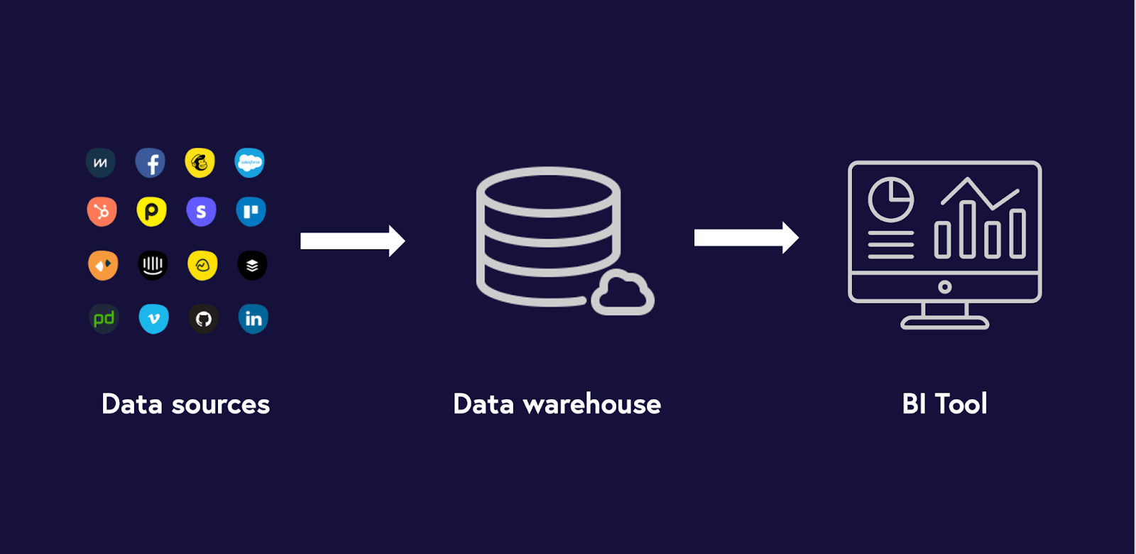
Pros and cons of using a BI tool to create KPI dashboards
BI tools are great because they provide you with an enormous amount of flexibility to build your dashboard exactly how you want it. You can also perform some pretty sophisticated data analysis.
However, the downside is that getting all your data in one place is easier said than done. You will need data specialists who understand how to write SQL and build a data warehouse. And even then, it’s not always straightforward.
Plus, BI tools themselves are pretty advanced pieces of software. They’re not something you can just pick up and use without training.
4. Geckoboard
The fourth option is to use a purpose-built KPI dashboard tool like Geckoboard.
Unlike a BI tool, Geckoboard connects directly to over 90 data sources such as Zendesk, Shopify and Salesforce, so the setup is much simpler. It then auto-refreshes your data in real-time, meaning it will always be up to date.
The payoff is that Geckoboard can’t perform analysis in the same way a BI tool can. But as a way of visualizing and sharing important live metrics, it’s much easier to set up and use.
It also has fantastic sharing options. You can display it on a TV. Create sharing links. And set up automatic reports and KPI alerts.
The best part about Geckoboard is that, unlike a BI Tool, you don’t need any training or specialist knowledge to use it.
You can try Geckoboard for free for 14 days
