Choosing the best dashboard software for your business: a buyer’s guide
Every day, tens of thousands of people type the word “dashboard” or “dashboard software” into a search engine like Google. Soon, they discover there are literally hundreds of different software tools you can use to create business dashboards. From the common spreadsheet, to the most sophisticated data platforms and BI tools.
For many, it’s at this point where their search grinds to a halt.
Not because they wouldn’t benefit from a dashboard… but because it’s so damned difficult to know where to start!
All you wanted to do was to make it super quick and easy for your colleagues to access important metrics… it shouldn’t take a degree in data science to understand which dashboard tool is right for you.
That’s why we’ve put together this short (but hopefully informative) guide to help you better understand the dashboard market, weigh up your options, and make the right choice.
If you take away one thing from this guide, it should be the following distinction:
- Some data solutions are designed to analyze data in a visual way.
- Some data solutions are designed to make Key Performance Indicators (KPIs) more visible and accessible.
Knowing which solution you’re looking for will save you time, money and many headaches along the way.
So let’s unpack them both.
Here are some signs you’re looking for a data analysis tool:
- You need to explore a data set to spot patterns, make comparisons and uncover hidden trends.
- You’ll continuously break down the data in different ways, as part of a longer process of investigation.
- Mostly, you're working with this data by yourself. But if you need to share your findings, you’ll choose which data visualizations to include as part of a report.
Here’s the thing.
If it’s data analysis you’re looking for, the word ‘dashboard’ isn’t a very helpful way to think about the problem you’re trying to solve.
Technically speaking, a dashboard is: a visual display of important information needed to achieve an objective(s), arranged on a single screen so it can be monitored at a glance.
Even though some of the tools used to perform this task (such as Business Intelligence (BI) tools like Tableau) are informally referred to as ‘dashboard’ tools, they have a broader set of functions, including data analysis.
If this is what you’re looking for, the best way to begin your search is by looking for data analysis tools, not dashboards.
Here’s a list of tools used for data analysis. If you’re looking for a solution which is accessible for non-specialists, we’d recommend sticking to spreadsheets like Excel or Google Sheets:
Here are some signs you’re looking for a tool that will deliver on KPI visibility:
- You need to make key metrics easily available to yourself and others
- You already have an idea which metrics are most important to visualize – aka your KPIs.
- You need to present these metrics in a way that is both meaningful and understandable.
- You’re thinking about how visibility of KPIs can improve performance, by helping people to be more responsive, accountable, aligned or motivated.
For example, you may be a founder who has set company KPIs, and wants to improve performance. Or a customer service manager who needs to see how important helpdesk metrics are changing in real-time, throughout the day.
If this sounds like you, then you are looking for a tool you can use to build a KPI dashboard. The rest of this guide will be focused on helping you understand your options.
Now we know what we’re looking for, let’s flesh out the options.
In general, there are four types of tools you can use to create a KPI dashboard.
- Spreadsheets (e.g. Excel)
- In-built analytics (e.g. Salesforce Reports)
- BI tools (e.g. Tableau)
- Geckoboard
(There is also secret option number 5 – build and maintain your own dashboard tool. We’re not going to cover this option because, frankly, we’d be here all day. Just know it’s there, if you have an engineering team and they fancy a challenge).
We’re going to assess each option based on five criteria:
Data
- How easy is it to import the data you care about?
- Can you automate the process?
- Will your metrics update in real-time?
Design
- How easy is it to design a dashboard that can be understood?
- How much flexibility will you have over your design?
Sharing
- Is your dashboard easy to access?
- Can you ‘broadcast’ the dashboard to the places people spend time (as opposed to it just being accessible)?
- Can you schedule reports and alerts automatically?
- Can you display it on a TV?
Specialism
- Can you set it up yourself?
- Do you need a data specialist?
Budget
- What is the price range?
- Pricing tactics to watch out for
Examples: Microsoft Excel | Google Sheets
If you’re anything like me, spreadsheets are your go-to option for an array of business (and personal) tasks – even if they’re not always the perfect tool for the job. Everything from budgeting, to project management, to planning your travel itinerary.
So can you use a spreadsheet to create a KPI dashboard? Of course you can. But with a few caveats.
Data: If you have the time (and the patience), it’s possible to input your data manually. However, if you want to automatically pull data from online tools like Salesforce, Facebook or Google Analytics, you will need to use scripts, plugins and/or connector tools like Supermetrics. This process can become quite messy, quite quickly.
Spreadsheets are also rarely a good option for building real-time dashboards (or even just dashboards that update more often than weekly). The manual steps involved are time-consuming and leave too much room for human error.
Design: Simple dashboard designs (i.e. basic tables, formatted to highlight important metrics) are within the skillset of your typical Excel user. Anything more complicated– data visualizations like graphs and charts – can be clunky to build and require a lot of work to design even the most mediocre-looking dashboards.
(Honestly, we’ve seen some horrorshow Excel templates online. Spreadsheet dashboards work best if you keep them simple.)
Sharing: Google Sheets has sharing links and user permissions which are relatively easy to manage, but only if you’re also happy for users to access any underlying data on the sheet. Other than that, spreadsheets are a pretty rubbish tool if you want your KPIs to get seen. Why? Because they’re reliant on your team proactively accessing the document.
Plus, you can’t set up notifications, schedule reports, or display very effectively on a TV.
Specialism: You only need basic spreadsheet skills to get started. More complicated dashboards require advanced knowledge (e.g. formulas).
Budget: Most people already have access to Excel and everyone has free access to Google Sheets.
Verdict: If you have a relatively simple set of KPIs, which you are happy to update manually, don’t need to see in real-time, and don’t mind if people sometimes miss, then Spreadsheets are a good low-tech, low-cost option.
Examples: Salesforce Reports | Zendesk Explore | Shopify Analytics
Here, we’re talking about the in-built analytics packages included in popular cloud tools like Salesforce, Zendesk, Google or Shopify.
How well these tools function as KPI dashboards will naturally vary from tool to tool. We’re including them in our list, because it makes sense to consider the platforms you already have.
Data: If your key data is in one place (eg Shopify) then there’s no extra setup needed to use its in-built analytics. However, if (like most people) your KPIs are spread across multiple platforms (or multiple accounts within the same platform) – then you and your team will need to use different platforms simultaneously. This can become a source of friction and inefficiency.
Plus, not all analytics packages support real-time data, or refresh automatically – for example, Zendesk Explore refreshes metrics daily or hourly depending on your plan.
Design: Some platforms are more flexible than others – how flexible can also depend on your pricing tier. For example a medium-tier Shopify plan will only provide out-of-the-box reports. Whereas with Google Analytics for example, you can build custom reports. But even then, it’s not always possible to bring high-level information together into a ‘single view’, which you can use to monitor your KPIs at a glance.
Sharing: Often the main issue with sharing these types of dashboards is that team members need to be motivated enough to access the platform on a regular basis. And when they do, they need enough platform knowledge to know where to look. For most colleagues, key metrics go unnoticed, like trees falling in the woods.
This is less of an issue if your platform supports broadcast mechanisms like ‘notifications’. Unfortunately, most in-built analytics tools don’t support TV display.
You should also bear in mind that many tools require you to be logged in to access their features. This means you will need to purchase extra user licenses for anyone who needs to access reports.
Specialism: Again, it varies. You don’t exactly need to be a data scientist to build a Salesforce or Google Ads report. But you do need a certain level of training and platform experience.
Budget: Although you're already paying for these tools, analytics features do not always come as standard, so check the fine print to see which reporting features are included at which price point.
Verdict: If you’re a small team who already spend most of your time in your cloud platforms and social media tools, then in-built analytics tools are a natural way to track and share KPIs. However, if you use multiple platforms, or you need to share KPIs with team members who don’t use these platforms much, you may want to consider a 3rd party KPI dashboard tool.
Examples: Microsoft Power BI | Tableau
Business Intelligence (BI) tools are the go-to dashboard choice for many businesses, because they also include powerful data analysis features. However, because they’re designed for analysts, they’re not the right tool for every business – particularly small to medium sized businesses with limited budgets, who don’t have access to data specialists.
Data: In order to use a BI tool like Power BI, you will first need to bring your data into one place – this means you will need to create and maintain a data warehouse. This task is usually performed by a team of data specialists – but even for specialists, it’s not straightforward. For example, they might be able to use APIs to pull and aggregate data from different sources, but the process is not the same (or even possible) for every data source.
Additionally, the complexity of this process means it’s rarely practical to support real-time refresh rates, especially for connections to 3rd party data sources which are both costly and time-consuming to set up and maintain.
Design: Most BI tools offer an array of data visualizations and design flexibility. However, this flexibility means it’s harder to produce effective dashboards for end users without data visualization training / skills.
Sharing: The design flexibility means it is possible to design good dashboards, optimized for TV display. However, other sharing features and access can be limited by the number of paid licenses you’ve purchased.
Specialism: Realistically, you will need specialists – including database engineers and data scientists – to set up, maintain and use your dashboard. This can also create bottlenecks when it comes to building and redesigning dashboards.
Budget: Many BI tools have an attractive starting price, some even have a free plan. But beware, these fees can quickly escalate based on features, support levels, data processing, number of data sources used, and user licenses. It’s not uncommon for larger businesses to pay tens (or even hundreds) of thousands of dollars a year for their BI stack. You will also need to budget for data warehouse fees, and staff costs.
Verdict: A good fit for bigger businesses, or businesses with specialist teams, who need a tool that will deliver on data analysis. If you’ve already invested in a data warehouse and BI tooling, it’s certainly possible to create dashboards that deliver on KPI visibility. But this might not always be the right choice if you need to visualize real-time data, or data outside your data warehouse.
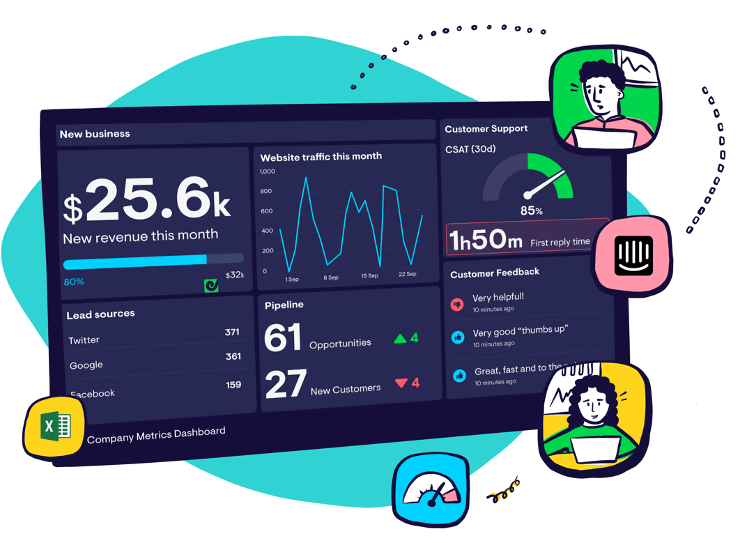
You’ll notice that so far we haven’t spoken about Geckoboard (and that’s kind of a big deal, because boy do we love to talk about Geckoboard…)
We’ve resisted the urge because, ultimately, this guide is about helping you understand the market, and how different types of solutions are better at serving different needs.
You should consider Geckoboard if you need to deliver on KPI visibility. Geckoboard is a purpose-built KPI dashboard tool, it’s therefore not surprising that it performs well against most of the key criteria. However, like all the tools we’ve covered, it does have its limitations.
Data: Geckoboard’s software directly integrates with most of the big cloud-based business tools like Salesforce, Zendesk and Google Analytics, as well as 90+ others. That means you can connect your live data in just a few clicks. Geckoboard will maintain the connection and refresh your data in as close to real-time as possible. It also connects to spreadsheets and databases.
The main downside is if your data is held in tools Geckoboard doesn’t support (such as Xero or X), then you will need to use workarounds like Zapier, Spreadsheets, databases, Zapier or Geckoboard’s custom API.
And although Geckoboard can display KPIs from different sources in one view, it’s not possible to use Geckoboard to combine data from different sources (for example, calculating new metrics). For this you will need a spreadsheet or BI tool.
Design: Geckoboard has a drag and drop interface, which anyone can pick up and use without training, in just a few minutes. It has fewer visualization options than a BI tool, but then it’s also much harder to design a bad dashboard. We optimize our dashboards with comprehension in mind, so they are clean, uncluttered and useful for end users.
Sharing: This is where Geckoboard really comes into its own. You can create sharing links which can be accessed by as many people as you wish.But more importantly, it’s also designed for broadcasting to the spaces your team spend time in – so your metrics will be unmissable. For example, you can create automated snapshots for email and Slack, and also set up KPI alerts. Plus our dashboards are optimized for permanent TV display.
Specialism: We built Geckoboard to be used by business leaders, not data scientists. You just need to know which metrics are important, and who needs to see them.
Budget: Geckoboard’s subscriptions start at $39 and the vast majority of our customers pay less than $199 per month.
Verdict: Perfect for companies who care about visualizing KPIs in a powerful way, but don’t have access to a specialist data team.