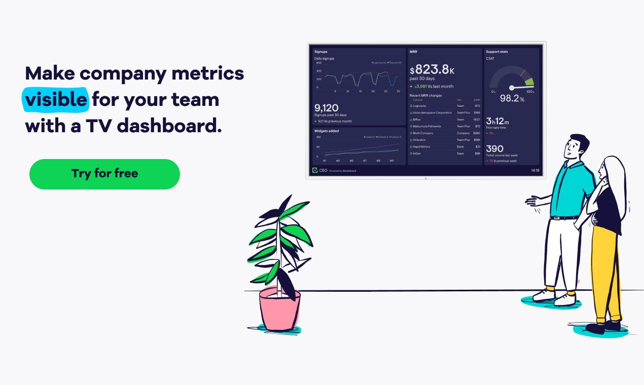
As your company grows, and departments become more specialized, teams can lose sight of overall performance.
A dashboard is a great way to present the “pulse” of your business, and keep your team in the loop. Plus, it saves you from creating reports, which are often overlooked or out of date by the time people read them.
But what aspects of company performance should you and your team be tracking?
Get inspiration from these real-life dashboard examples, which use different "lenses" to monitor success.
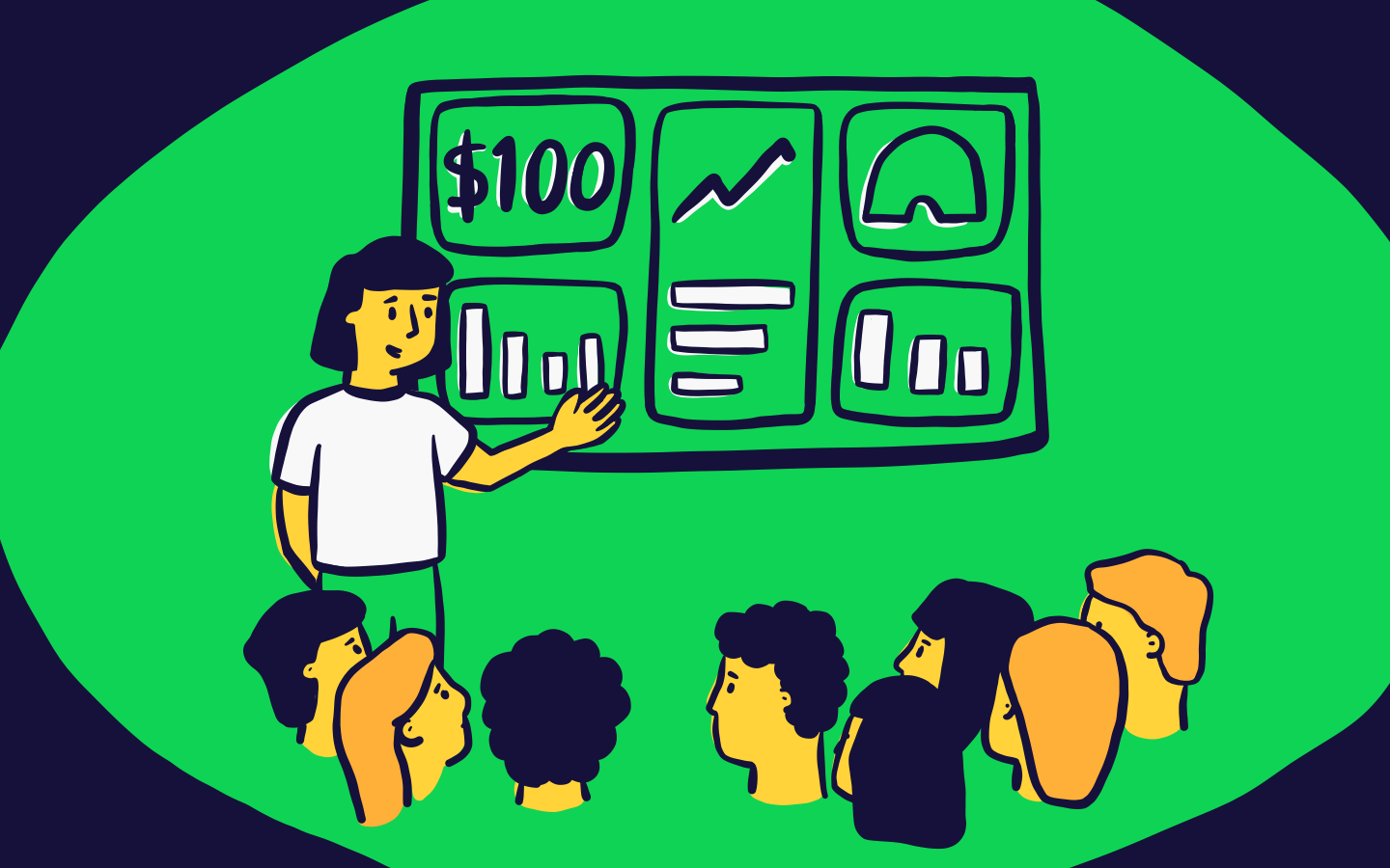
A company milestones dashboard example, from Silbo
Contains sample data
What's the purpose of this dashboard?
To keep everyone aligned around key company goals as you grow.
What makes this dashboard special?
Brutal simplicity. Rather than showing a comprehensive collection of KPIs for each department, it focuses on high-level KPIs that the whole company contributes to.
What’s on there?
Silbo’s KPIs are: Downloads, Verified Officials on their platform, Number of Games Completed and Number of Assignments Facilitated (their most important activity metric).
The KPIs you display on your dashboard could be anything, as long as they’re ones that the whole company cares about. Like Silbo, you can then display metrics for specific teams on separate dashboards. See team dashboard examples for Marketing, Sales, and Customer Support.
Other benefits
- Shows goal-progress over time with status indicators
- Keeps everyone focused on what really matters to the company
- Helps to motivate teams
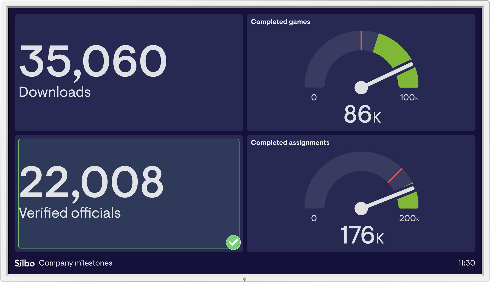
A customer-centric dashboard example, from Geckoboard
Contains sample data
What’s the purpose of this dashboard?
To share health metrics from across the business, and keep your team focused on the customer.
What makes this dashboard special?
It’s customer-centric. In a SaaS business like Geckoboard you’re naturally laser-focused on the product itself (we have a separate dashboard for this – see it here), but this can mean that you lose sight of the customer experience.
This CEO dashboard gives a glanceable overview of the full customer experience. And while this doesn't replace actual conversations with customers, it keeps the customer front of mind for your team.
What’s on there?
The dashboard shows metrics from multiple stages in the funnel, so different departments can see their impact on the customer.
On the left you can see key acquisition funnel metrics:
- Daily Signups This Month vs Last Month
- Total Signups This Month vs Last Month
Beneath this, we’ve got a very specific product-usage metric that’s crucial for Geckoboard:
- Widgets Added by Cohort
You could display any product or activation metric that's key for you.
In the middle are the monetization and retention metrics:
- MRR This Month vs Last Month
- Recent MRR Changes, which indicate when a customer has churned, upgraded, or downgraded on various plans
Finally, the right-hand side displays support metrics taken from Zendesk:
- Customer Satisfaction (CSAT)
- First Reply Time
- Ticket Volume This Week vs Last Week
These support metrics are what set this dashboard apart from something like the Pirate Metrics dashboard. The latter focuses solely on high-level funnel stuff, whereas this dashboard goes into a bit more detail on the customer experience.
Other benefits
- It stops you from being too myopic and focusing solely on the product
A SaaS-focused dashboard example, from Survicate
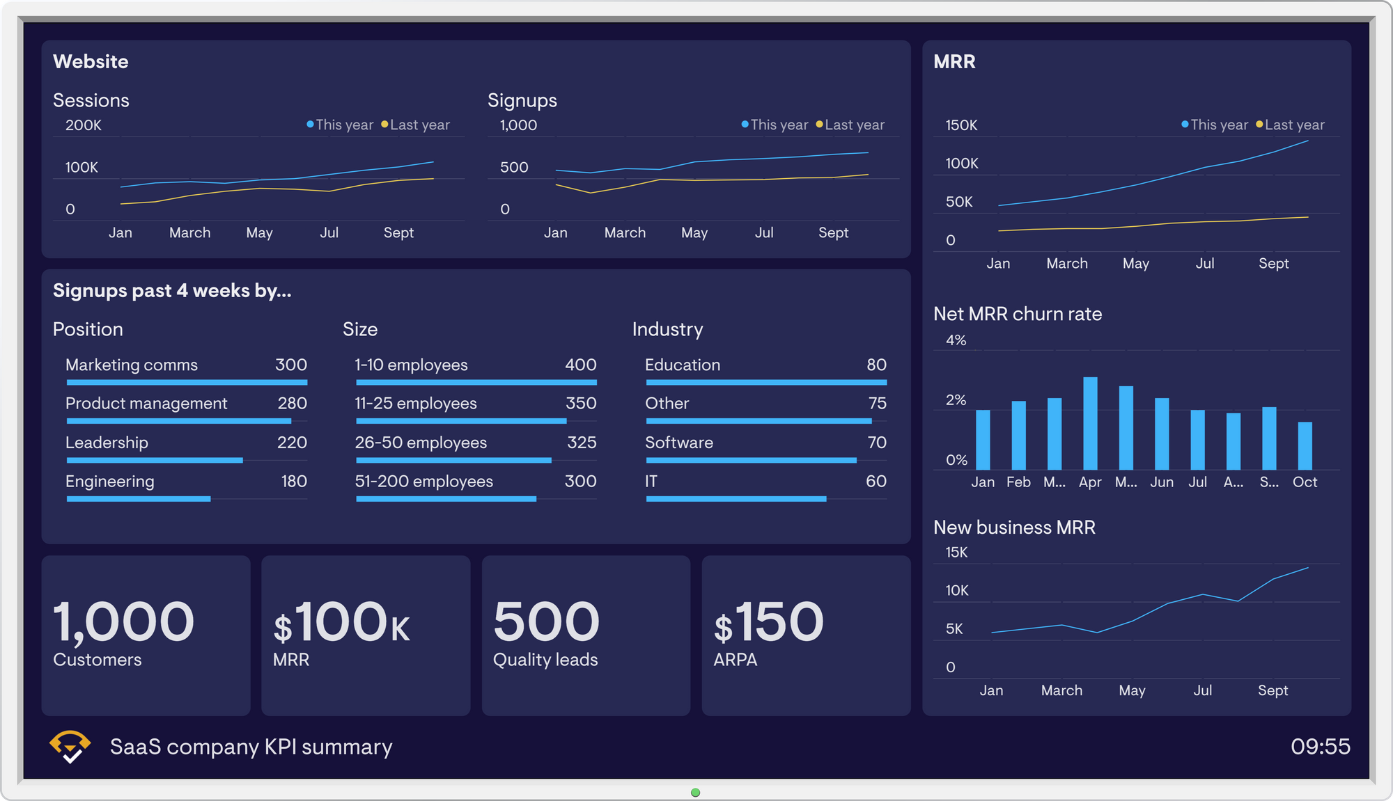
Contains sample data
What’s the purpose of this dashboard?
To boost your team’s awareness of SaaS KPIs and customer activity.
What makes it special?
It’s SaaS-focused, prioritizing the metrics that are crucial for growth.
What’s on there?
Starting from the top left, the dashboard outlines the customer’s journey throughout the acquisition funnel, which for Survicate looks like this:
- Website Sessions, which present the first stage in the customer journey (taken from Google Analytics)
- Signups This Year, which reflect changes throughout the year (taken from Mixpanel)
- Signups by Position, Size, and Industry, to help the marketing team tailor campaigns to different audiences (also from Mixpanel)
- Leads Generated (added by the marketing team in a Google Sheet)
- Monthly Recurring Revenue (MRR), the most important metric for many SaaS companies (pulled from Chartmogul)
- Average Revenue Per Account (also from Chartmogul)
- Churn Rate. N.B. Silbo tracks Net MRR Churn Rate rather than Customer Churn as they have a percentage they want to stay under
- New Business MRR
Other benefits
- Promotes a SaaS metrics mindset in the whole team
- Keeps remote workers informed
- Presents the entire acquisition funnel
- An alternative to numerous reports from all your different tools
A Pirate Metrics (AARRR) dashboard example, from Geckoboard
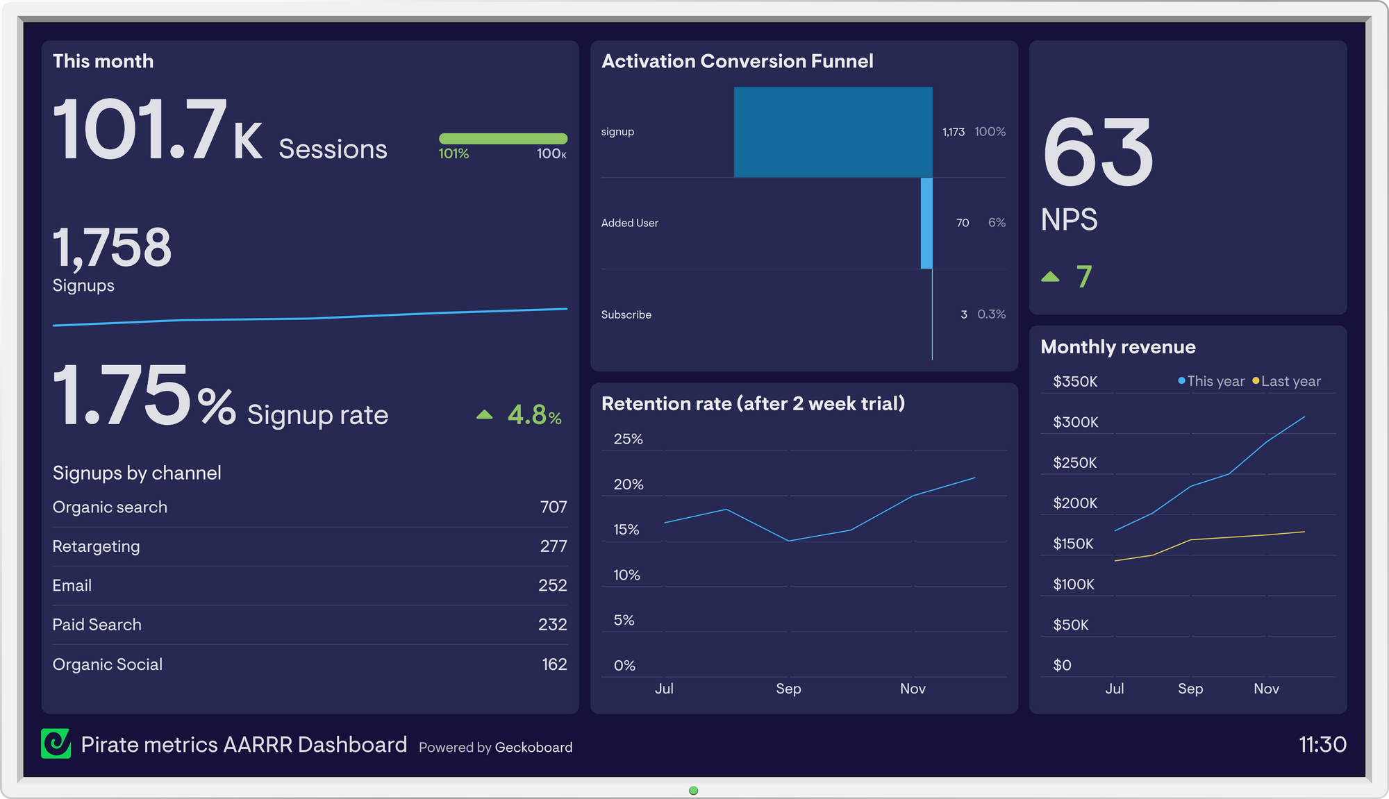
Contains sample data
What’s the purpose of this dashboard?
To give startup teams an insight into major stages of the customer lifecycle, and keep everyone focused on growth.
What’s special about this dashboard?
The Pirate Metrics framework. There are so many metrics you could be tracking on a startup dashboard, but this framework focuses everyone's attention on five areas key to growth: Acquisition, Activation, Retention, Referral, and Revenue (the AARRR funnel).
What’s on there?
The Pirate metrics on this dashboard cover each stage stage of the AARRR funnel, so teams can see the business' performance in all areas. For Geckoboard, the funnel looks like this:
Acquisition: Website Sessions, and Signups (from Google Analytics)
Activation: Conversion Rates for major stages in the user journey starting with Signups (from Mixpanel)
Retention: Retention Rate following two weeks in trial (from Mixpanel)
Referral: Net Promoter Score (from Delighted)
Revenue: Monthly Revenue (from our own database)
You may have slight variations of these metrics in your startup. The key is to cover every stage of your funnel, and only include metrics that will contribute to growth.
Other benefits
- You and your team can track all key stages of the customer life cycle in one place
- It highlights medium-term growth opportunities
A real-time company dashboard example, from Bestpass
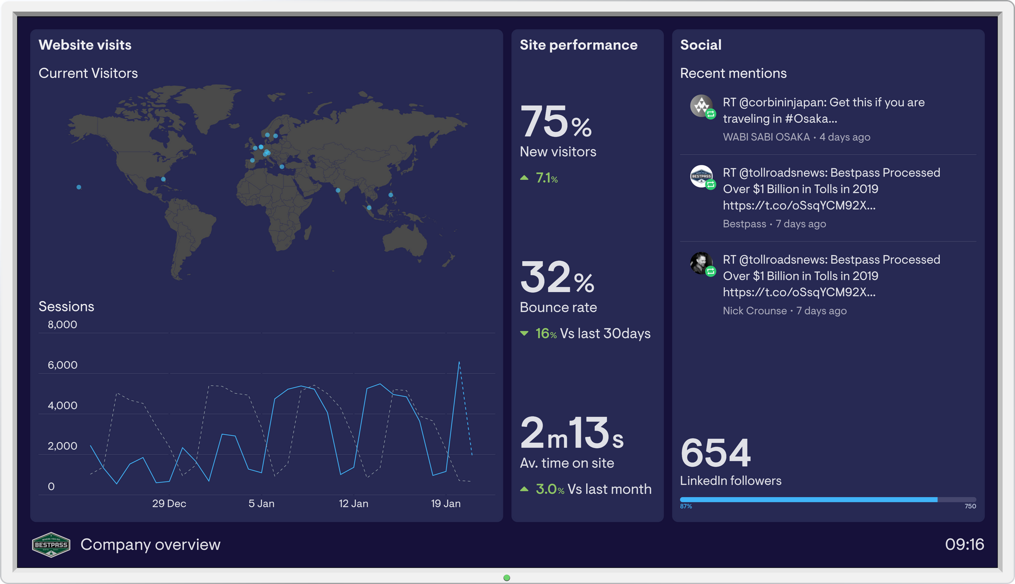
Contains sample data
What’s the purpose of this dashboard?
To give your team a real-time snapshot of the business, so they can make better, faster decisions.
What’s special about it?
The time frame. It has minute-by-minute information that updates automatically, to focus teams and spark action.
What’s on there?
This dashboard gives an overview of key areas of the business, showing what’s happening right now – or things that have happened very recently.
For Bestpass, critical metrics include:
- Current Visitors
- Sessions
- Site Performance
- Social Mentions
The idea is to give your team actionable information, so they can make quick and accurate decisions, prevent crises, and generally be more proactive.
Other benefits
- It inspires teams to take ownership
- It energizes teams and helps to motivate
Extra resources
If you're working out which company metrics to track, and considering a dashboard for your team, explore:
- KPI examples for the whole company and individual teams
- Advice for setting meaningful and effective KPIs
- SMART goal setting: a detailed guide
- How to design and build a great dashboard
- Everything you need to know about TV dashboards