
You may have noticed that things are looking a little different around here, as we’ve made the biggest changes to our brand and product since we launched over a decade ago.
Our old brand:
There were several motivations behind the rebrand.
Firstly, our visual identity was inconsistent. We’d last rebranded back in 2014, and since then our look and feel had moved on, but in an organic and un-codified way. As a result, we could never give a good answer for whether something was on or off-brand. The lack of rules was frustrating for designers, and leading to brand diffusion.
Secondly, we felt our website and key brand elements like colour and logo were beginning to look dated, and didn’t reflect our best aspects. Geckoboard is all about presenting information clearly, yet our old logo was barely readable on a TV and the repetition of the G seemed inefficient.
Thirdly, since 2014, we’ve become more self-assured about what we do. We were ready to be bolder.
And finally, the timing was right. We were making big changes within the product, and for the first time we had an opportunity to give the app and marketing website the same look and feel. We’d always wanted to do this, because the look and feel of our dashboards is so integral to our brand, but we’d never managed because of the huge effort involved.
How we went about rebranding
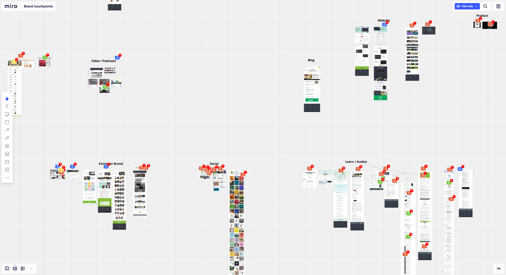
We kicked off by auditing all of our existing brand touch-points, using Miro.
Then we worked with branding agency Forever Beta to create a new brand that would make us more memorable and appealing, and better portray who we are.
The key message we arrived at with Forever Beta was ‘unwavering simplicity.’ This reflects our commitment to helping you build better, clearer and more actionable dashboards, as simply and effectively as possible, so you can achieve your goals with data.
Tada!
Bringing the brand into the 2020s
Our new brand is intentionally bold, colourful and welcoming using bright, solid colours – no gradients here. And, with our new focus on ‘unwavering simplicity’, we’re not afraid of big font sizes, bold font weights, and chunky buttons and shapes.
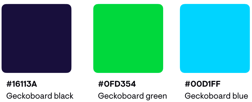
Green was already associated with us as a brand, so we’ve updated this to be brighter, and fresher. To complement the green, we’ve used Geckoboard Black – a soft black that’s great for background colours and copy alike.
To complement the core colours, we wanted a bright colour to guide people to key points in our messaging, in the same way we use colour within our dashboards to draw attention to key data. The neon blue is perfect for this, and it just so happens that it’s great for use in the product.
We’ve also ensured that our colours pass accessibility standards and work on both dark and light backgrounds. To check this, we used the Stark plugin from Figma.
Product redesign
Within the product, we’ve updated the design of our dashboards to make sure they look great on a wall-mounted TV, and so that it’s easy to monitor the metrics and goals you care about – at a glance.
To achieve this, we’ve made our visualizations bigger and bolder. We’ve also added the ability to group related metrics, which makes dashboards easier to consume.
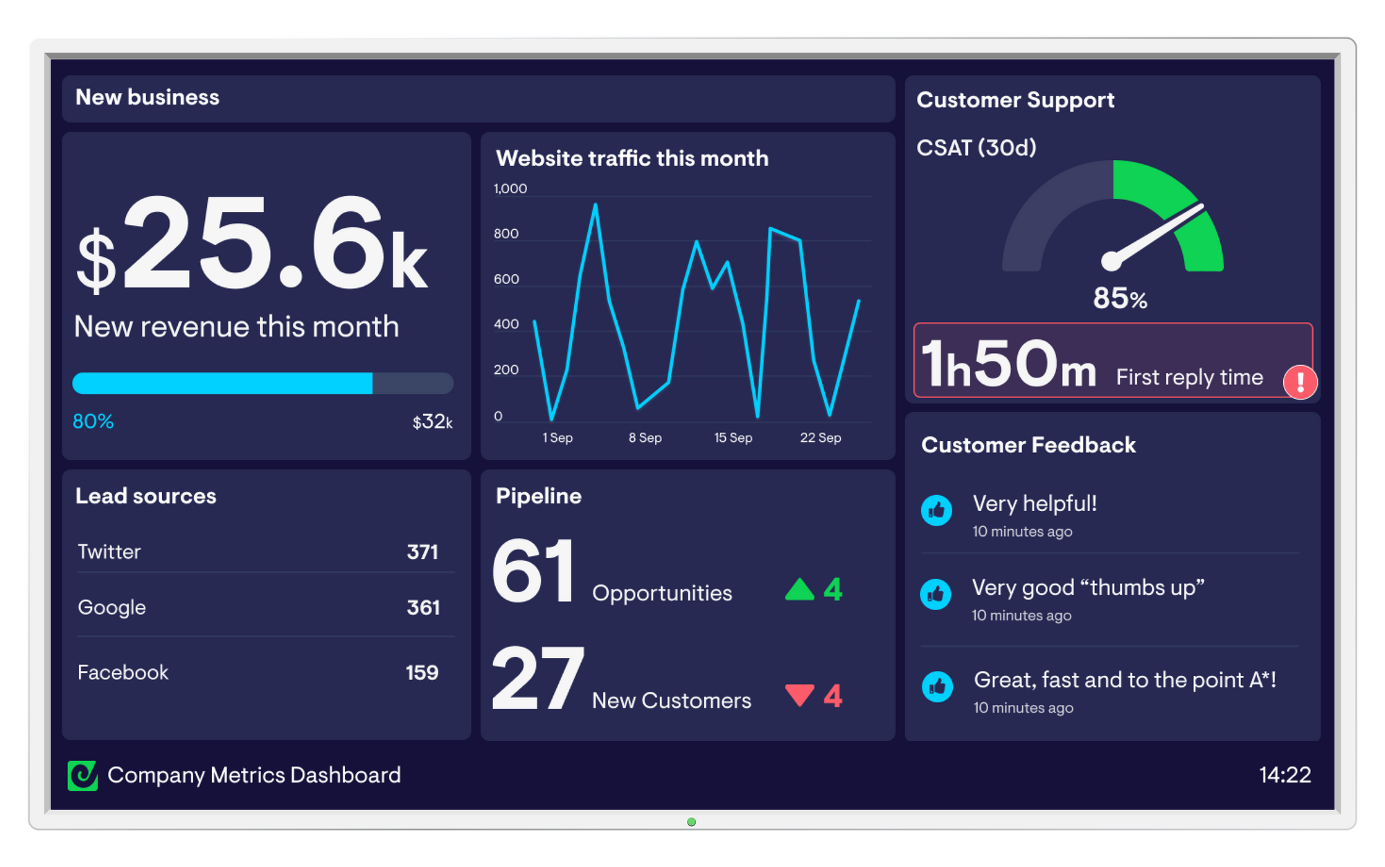
Lastly, rounded corners and a warmer colour palette make the dashboards friendlier, in a market of quite utilitarian dashboards.
All of these decisions are based on our three core design principles:
1. Works how you’d expect
We should always design as if someone's using Geckoboard for the first time, which means common interaction patterns, and familiar language.
2. Guides, but doesn’t limit
We’re dashboard experts, but our customers know their businesses better than we do. So, we're opinionated about visualization, and apply constraints where it’s useful, but we’re still accommodating to people's data requirements.
3. Focusses on the reader
Our dashboards are made for teams, not individuals, so it’s important that they're easily understood by everyone. To make sure it's always clear what you're looking at, we use colour sparingly to convey meaning, we keep charts simple, and we never use the dreaded pie chart.
Find out why pie charts aren’t the best for communicating data
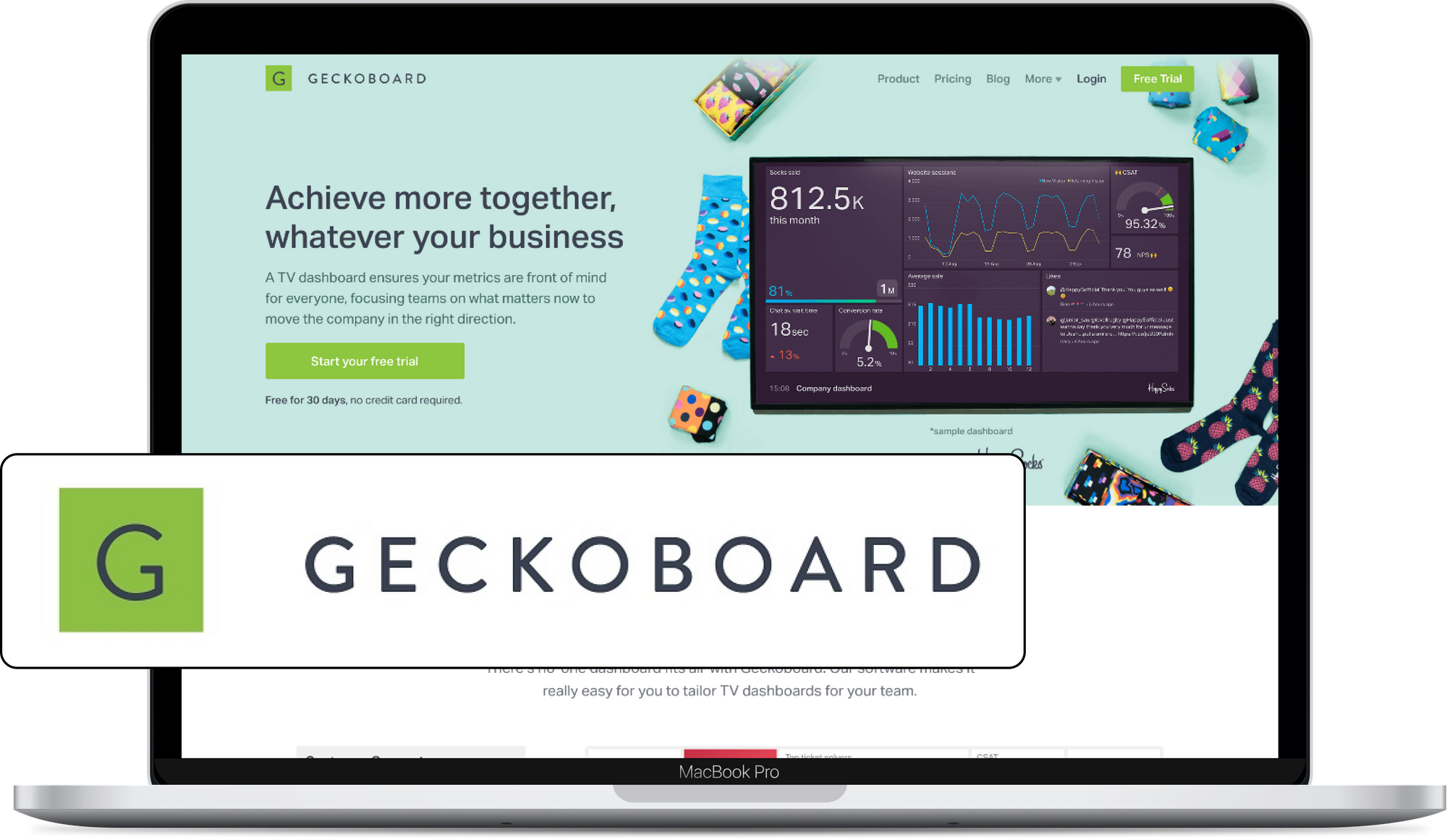
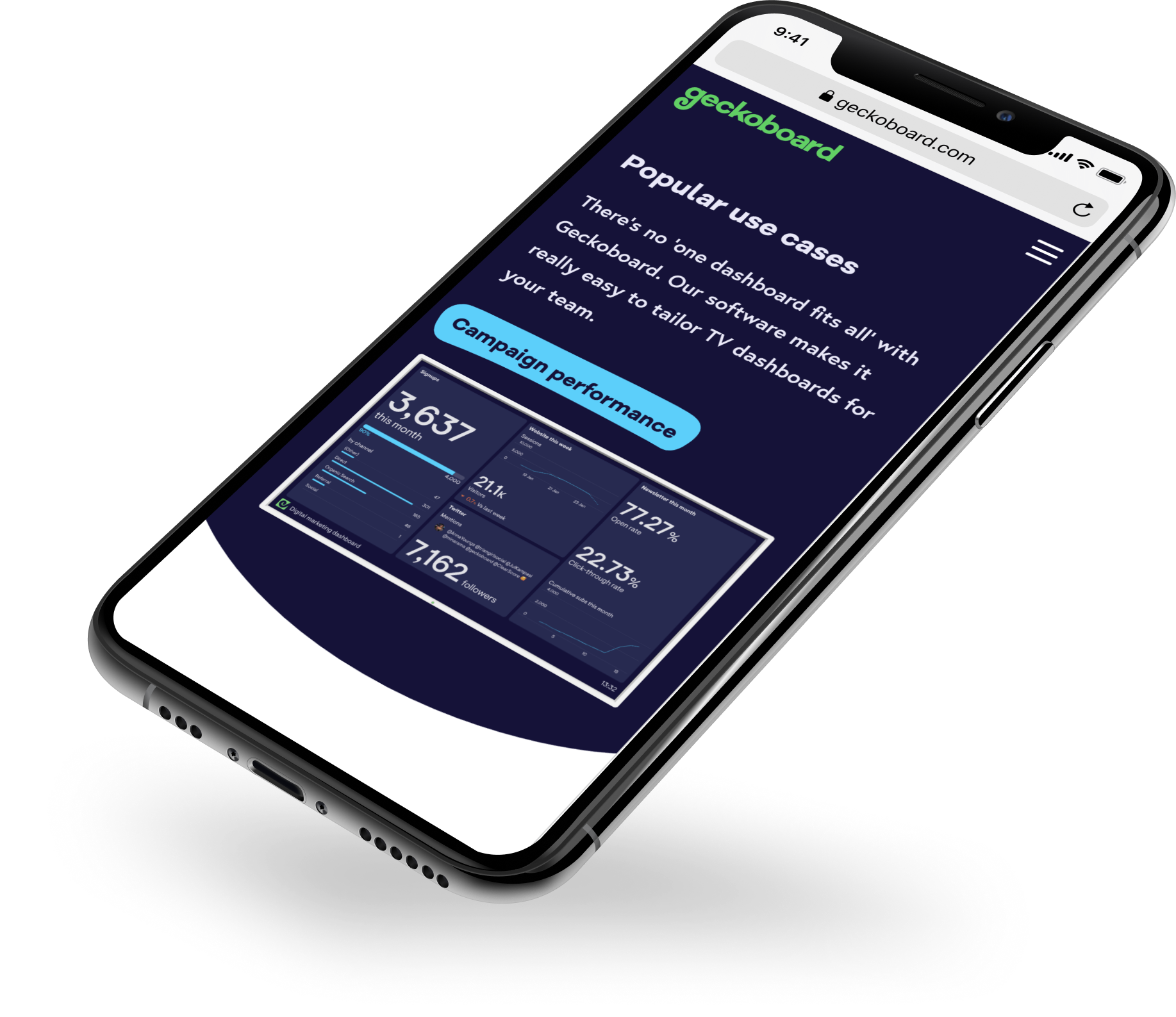
Introducing our new website
Once we’d designed the new dashboards, we needed a great website to show them off.
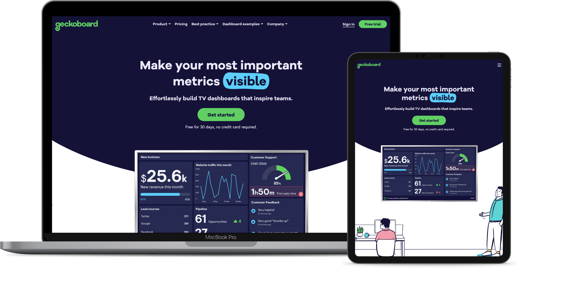
Key brand elements
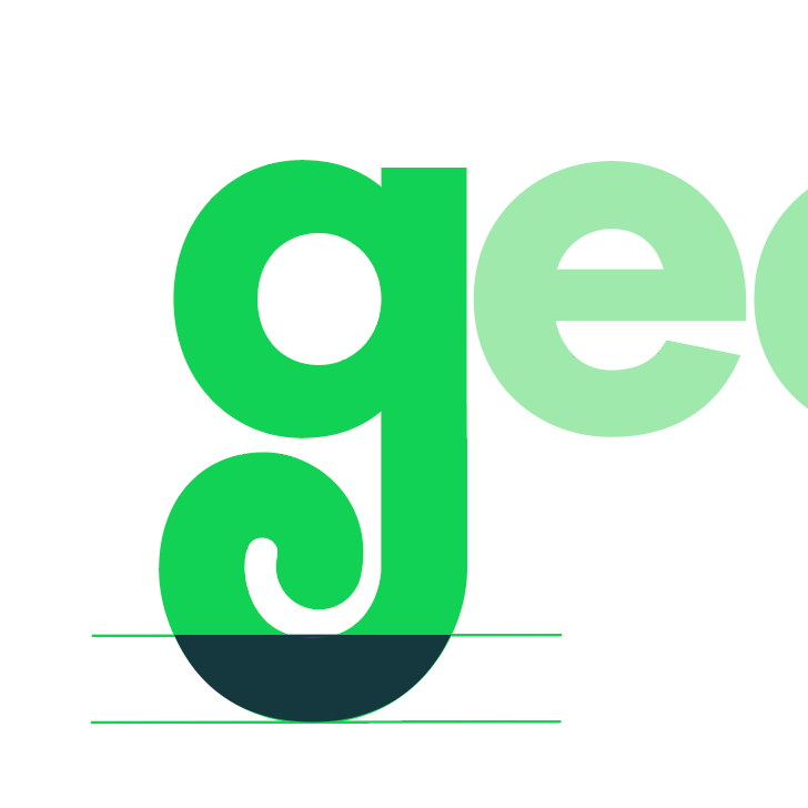
The ‘curve’
Continuing our theme of rounded corners and edges, we’ve made use of the curve of the ‘g’ descender to guide the eye down the page.
The 'blob'
The blob is a way to highlight key data on the website. Its organic shape reiterates Geckoboard’s friendly feel, and makes the website feel more alive and less rigid. No two blobs will ever be the same!
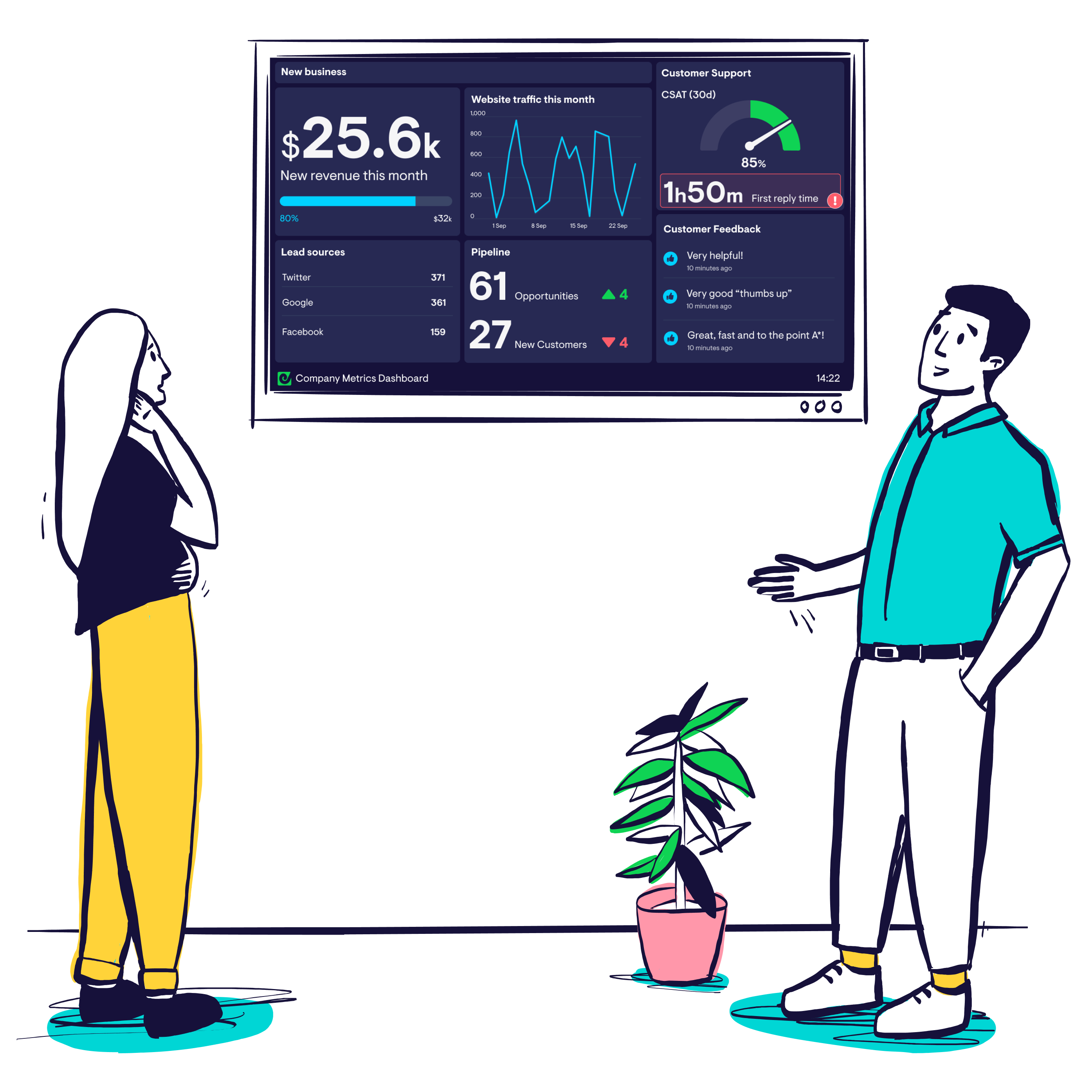
Illustrations
We wanted a unique style for our illustrations: something that suited our ethos of being welcoming, and non-corporate.
Our chosen style, by illustrator and Geckoboarder, Vicky Hughes, looks hand-drawn and human. The thick lines mirror our bigger, bolder look, and we encouraged colouring outside the lines to add more personality.
Typography
As with the dashboards, we’ve increased the size of the typography to make our messages easy to absorb at a glance. We’ve also worked hard to keep copy short and not clutter pages with too many elements.
This huge overhaul of our website took just three months from start to finish – something we’re really proud of. We’ve not only redesigned everything, we’ve also rewritten all major pages on our website in line with our new tone of voice.
