One of our engineers, Klara, was curious whether there was a set of guidelines to help people choose the best visualizations for their data. After researching various processes, she created a customized flowchart that makes it easy to identify the best visual for the metrics you have.
Rather than starting with different types of visuals (graph, line chart, bar chart, number, etc.) and working backward, the questions in the flowchart allow you to begin what you want to know from the data you have. Here’s how it works.
What type of data do you have?
Understanding what kind of data you’re dealing with is the first step in the process of choosing the best visualization. The three kinds of data you’ll most likely encounter when building a metrics dashboard are:
- Nominal Data: Any data that is segmented by categories or labels. In a detailed post on My Market Research Methods, nominal is “used for labeling variables, without any quantitative value." Examples of categories or labels include names, product types, traffic sources, etc.
- Ordinal Data: Any nominal data that is ranked against each other but the difference between each one isn’t really known (e.g. a scale ranging from happy to indifferent to unhappy). The order of values (first place, second place, third place, etc.) is the important distinction of ordinal data.
- Cardinal Numbers: Any numbers that express amount or quantity. Those numbers say how many of something there are, such as one, two, hundred, five hundred.
Olympic race results are a good example illustrating each type of data. Nominal data would be the name, gender or nation of the winner. Ordinal data would be the rankings of all the competitors. Cardinal data would be their race times.
If all of this sounds a bit nerdy to you, don’t worry - you’re not alone. This sampling of data research and exploration is what data experts study, discuss, and even disagree on. (If you want to dive deeper with these experts, read Data Representations, Transformations, and Statistics for Visual Reasoning.)
“The greatest value of a picture is when it forces us to notice what we never expected to see.” — John W. Tukey, Exploratory Data Analysis (from Data Points: Visualization that Means Something by Nathan Yau)
What do you want to know about your data?
The key reason for visualizing data is to prompt action. Answering the question - What do you want to know about your data? - is the second step in choosing a visualization. It’s really asking ‘What will help me take action?’ Do I need to see a trend? Would a ranking be better? What contextual information - like comparison to previous period or target goal - do I need so I can improve my key metrics and hit my goals? Learn more about how to choose metrics that inspire action here.
Flowchart for choosing visualizations
The flowchart Klara created helps apply your answers from above to actually choose the visualization that will most effectively inspire action.
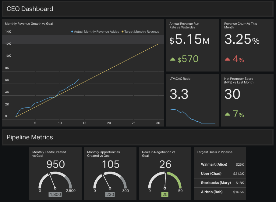
The chart below focuses on choosing a visualization to display on a TV dashboard in your office. The process begins by asking whether you have one type of data (i.e. a single row or column of text or numbers) or two types of data (i.e. multiple rows or columns of text and/or data such as revenue and dates or sales rep and closed revenue).
Pro tip: It’s much easier to understand this process if you read through it as you create your visualization. Create a free dashboard now so you can use these questions in practice.
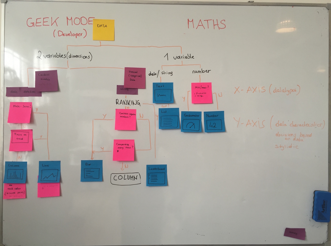
We don’t expect you to make sense of our super technical sticky note chart above (kidding), so we created this handy chart to use.
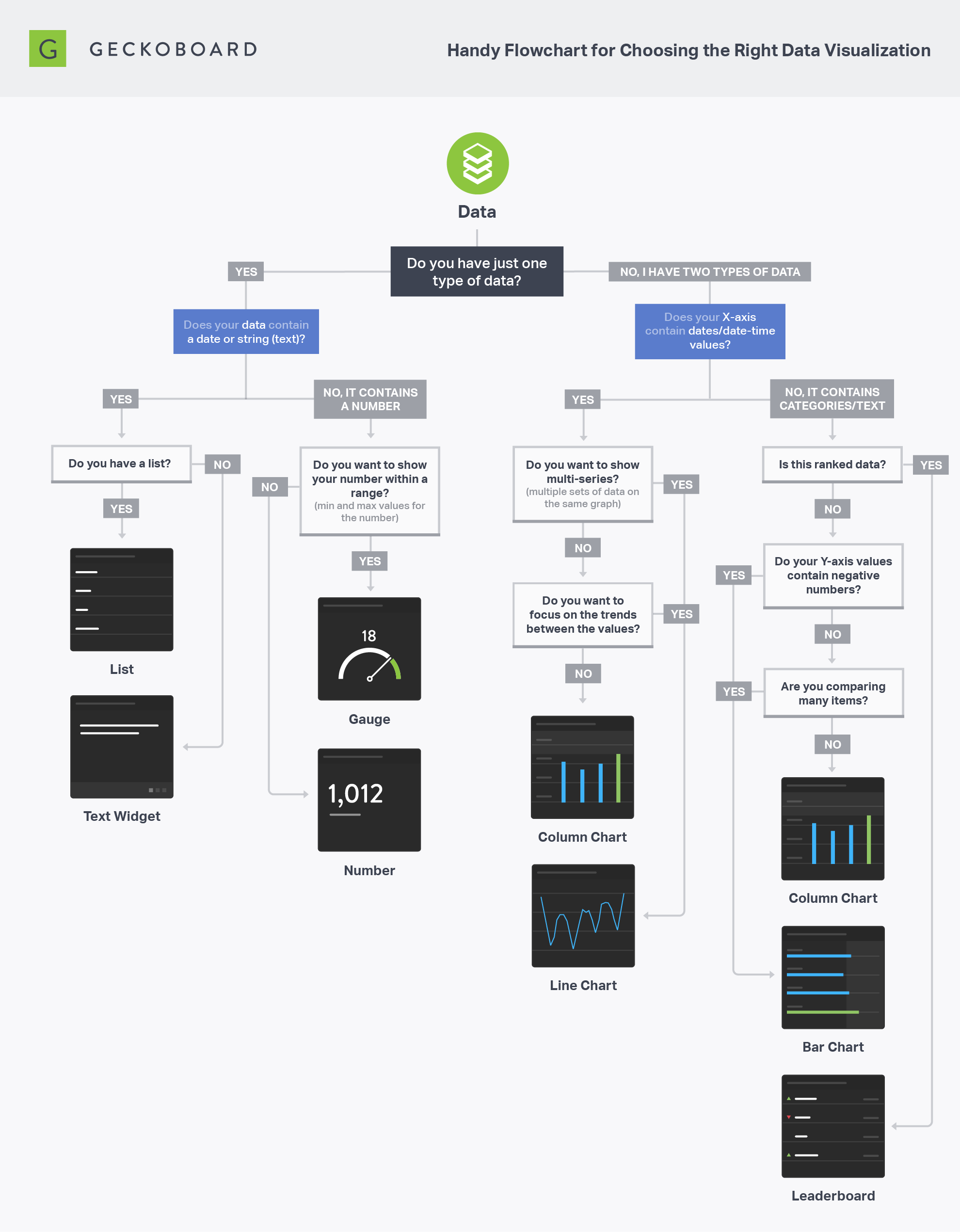
After distinguishing between one or two types of data, the flowchart separates into two distinct paths.
Path 1: If you have one type of data (i.e. a single row or column of text or numbers):
- Does your data contain either a date or string (text)? (Nominal Data)
- If yes, use a text widget.
- Do you have a list (multiple lines of text)?
- If yes, use a list
- If no, proceed to next question
- Does your data contain a number? (Cardinal Data)
- If yes, do you want to show your number within a range (i.e. minimum and maximum values for the number)?
- If yes, use a gauge
- If no, use a number widget
Path 2: If you have two types of data (i.e. multiple rows or columns of text and/or data such as sales rep and closed revenue):
- Does your X-axis contain dates/date-time values?
- If yes, do you want to show multi-series (multiple sets of data on the same graph)?
- If yes, use a line chart
- If no, proceed to next question
- Do you want to focus on the trends between the values?
- If yes, use a line chart (Note: A line chart is more useful if you want to see a trend between the numbers since patterns are more visible. It shows if the trend is different/same, expected/unexpected, etc.)
- If no, proceed to next question
- Do you want to focus on each distinct value in the series?
- If yes, use a column chart
- If no, proceed to next question
- If yes, do you want to show multi-series (multiple sets of data on the same graph)?
- Does your X-axis contain a string (categories or text)? (Nominal or Ordinal Data)
- If yes, is this ranked data?
- If yes, use a leaderboard
- If no, proceed to next question
- Do your Y-axis values contain negative numbers?
- If yes, use a bar chart (Note: Negative numbers are easier to spot on bar charts because there’s more space and the eye is used to a vertical line to distinguish between positive and negative values.)
- If no, proceed to next question
- Are you comparing many items?
- If yes, use a bar chart
- If no, use a column chart
- If yes, is this ranked data?
Start visualizing your data
Once you figure out what key metrics you need to track, choosing the visualization is the fun part. Take time to assess what data you have and then follow the questions in the flowchart to determine how to most effectively visualize your data.
When following this guideline always make sure the displayed data makes sense and visualizes what you actually want to know. Keep in mind this is just a guideline - it may not always generate the perfect visualization. Explore and experiment until the data is displayed in an actionable way.
If you don’t have a metric dashboard, test out this process and sign up for a free Geckoboard trial (no credit card required). Get started today!