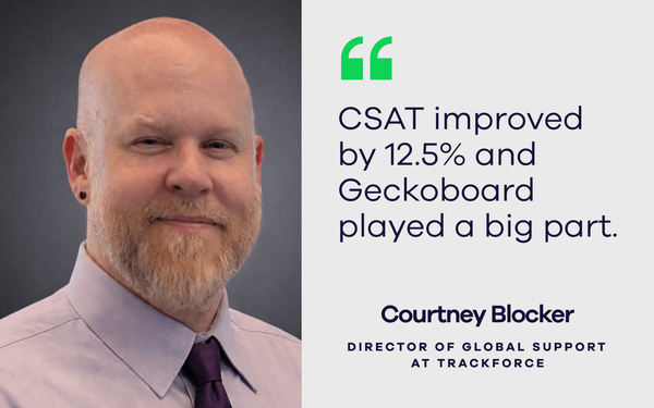
Trackforce brings real-time visibility to the whole business with Geckoboard by Sam Gane 18 February 2026
How Octopus Legacy improved customer experience with real-time visibility by Sam Gane 17 December 2025
How MTD Training brought hidden data into the open and shifted their culture by Sam Gane 11 December 2025
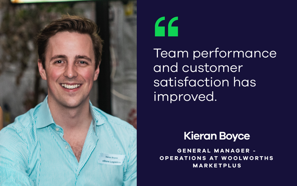
How Woolworths MarketPlus improved team performance and customer satisfaction with real-time data by Sam Gane 24 July 2025
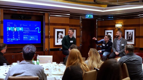
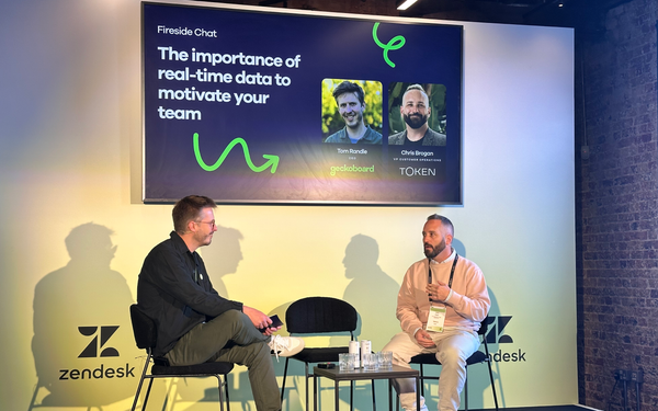
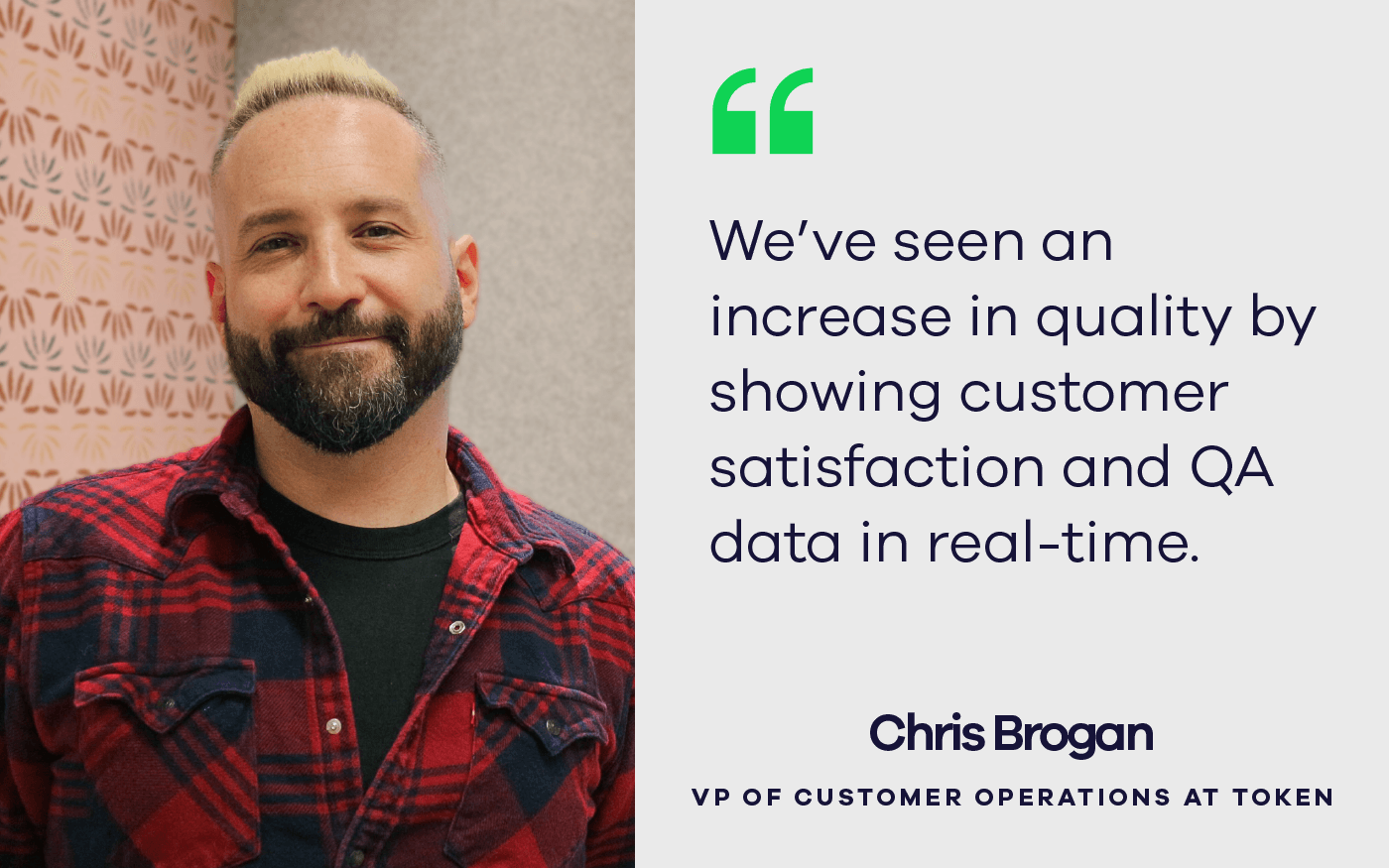
Fireside chat: How Token.io turned support data into a company-wide superpower by Sam Gane 28 May 2025