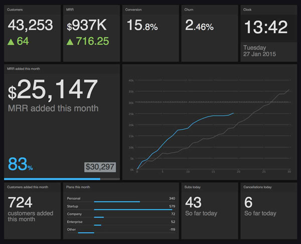
When we originally created Geckoboard, we knew that it was going to be primarily for large screens. In order for the dashboards to work in that environment, they needed to be designed in a way that your eyes would be instantly drawn to the most important things. No clutter, just the right numbers. That’s why colour was one of the most important factors that would determine the success of the dashboards.
The meaning behind colour
Colour is what's called a pre-attentive attribute. In other words, our brains can assign significance to colour very quickly and often without conscious thought. Colour, or absence of colour, can signify something important. The problem is that colour can also be completely overused. Colourful elements compete with each other, resulting in dilution of importance of everything. That’s why we need to use it sparingly and with caution. That's a part of the mistakes we’ve made in the past and continue to rectify. Decisions about colours, design and so on are constantly evolving as we learn more and more.

Choice of colour is really important. When we were designing the dashboards, we needed to take into consideration the fact that these dashboards would be viewed by people who may be colour blind to certain colour combinations, or even entirely colour blind. These people have to be able to distinguish between the saturation, for example. But for those who aren't, they also have to be able to distinguish what's good, what's bad, or simply knowing what’s important to look at and when.
Colour used sparingly is a wonderful tool to be able to bypass a lot of the processing in our brain. Our visual cortex and the backs of our retinas work in harmony to deliver a lot of information into the cognitive area of our brain extremely fast. Where possible, we should try to guide our brains to use that route instead of the more complex and serial language processing part of the brain.
Removing distractions
When you're designing for the visual cortex, there are certain constraints that you need to be aware of. Colour, shape and size all convey meaning that can be interpreted quickly if used well, but if there are too many competing elements it just becomes a confusing mess.
When we’re designing the dashboards, we need to strip away meaningless elements wherever possible. Too much colour, use of gradients or other unnecessary design elements around the widgets and the dashboards themselves get in the way of easy interpretation. Anything that might be seen as a distraction should be taken away. By doing so, we can create an experience that allows the user to access the data they want as quickly as possible and to understand that data as quickly as possible.
Now, instead of having to interpret the numbers every time you look at the dashboard, you're actually just glancing at it, similar to how you’d glance at the dashboard of your car. You don't interpret the information as you're driving along, you just want to be able to see it and process almost subconsciously, only taking action if needed.
If we design something that’s sympathetic to how we're wired, we remove the cognitive barriers between humans and the information they need in order to make better decisions. Also, people will actually enjoy looking at their data. Ultimately, digesting and understanding data stops being a chore and becomes a pleasurable experience. Data becomes something that’s easy to look at because it’s easy to understand because design and function are perfectly suited to our physiology and how we make sense of of the world visually.
Liked this article? Try these next:
