
Think of a set of data visualizations like the dashboard in your car. When you look at them, it should be easy-to-absorb information at a glance—your speed, fuel amount, and so on. Likewise, data visualization techniques help your teammates and managers grasp the significance of the metrics in seconds.
Speed isn’t the only advantage of data visualizations. A report found that people were, on average, 89% better at problem-solving when they looked at data represented visually. In a business setting, that translates to better decision-making.
Data visualization also allows us to see crucial trends which have been masked by summary metrics. You can find out more about why summary metrics lie in this episode of Data Smarties:
By using data visualizations, teams are empowered to quickly absorb information and make informed choices. Here are some of the top data visualization techniques to help your company turn raw data into action.
1. Line graphs
Line graphs illustrate change over time by connecting individual data points. The line’s movement and steepness reflect larger trends and how rapidly changes are occurring.
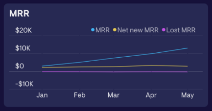
The sample line graph above illustrates the monthly change in monthly recurring revenue (MRR). Separate lines show changes in MRR, net new MRR, and lost MRR.
Best practices for using line graphs
Even the most common data visualization techniques can benefit from a little tweaking. Here are a few best practices to make the most of your line graph:
- Add multiple lines to make comparisons. If your graph shows the monthly change in revenue, you might have one line for the current year and one for the previous year. Don’t add extra lines unless they add relevant context to the data. The more lines you add, the more difficult the graph will be to read.
- Use different colors for each line. Studies show people recognize, identify, and remember images better when the images are colored. To improve retention, make each line a different color. You can make your graph accessible to people who are color-blind by using different types of lines. For example, last year’s data could be a grey dotted line, while this year’s data is a solid blue line. If someone can’t see the color difference, they can still see the unique line types.
Just remember: simple is not a bad thing for data visualization techniques. The goal of your line graph is to present your data in a way that’s easy to understand.
Survicate: Tracks monthly sessions and signups with line graphs
Survicate, a customer feedback platform, uses line graphs to track monthly website sessions and signups.
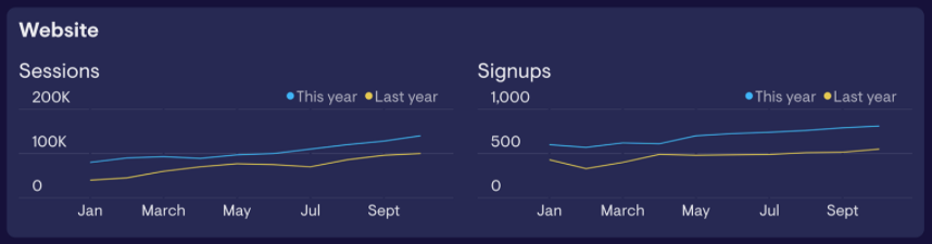
The company uses colored lines to compare yearly trends, so employees don’t have to dig through multiple graphs. Each graph has only two lines, so they’re easy to scan.
2. Gauges
For a less well-known data visualization technique, we turn to gauges. These charts use a pointer to show information as a reading on a dial. They look like speedometers: the needle moves towards or away from the “maximum” (the goal) on the right.
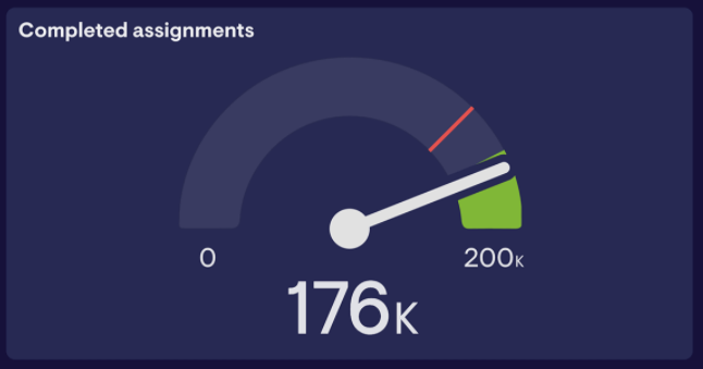
The speedometer design is both familiar and motivational. When the needle is on the right, you know you’re moving towards a goal, just like a car speedometer. It’s easy to see at a glance how close you are to your target.
Best practices for using gauge graphs
Make gauge charts as clear as possible by following these tips:
- Set goal thresholds below the maximum. The area between your goal and the maximum on the gauge will show up green. This makes it easy to see when you’ve passed your goal.
- Set a negative threshold. Define a range close to the minimum that turns red, alerting your team that they are off-track.
Make sure there is a gap between the red (negative) and green (positive) sections of your gauge. If the whole gauge is colored, the distinction between red and green becomes less meaningful.
Silbo: Shows closed deals and filled positions with gauge graphs
Silbo, a sports officiating company, uses gauge graphs to show progress towards their revenue goals and their filled position targets.
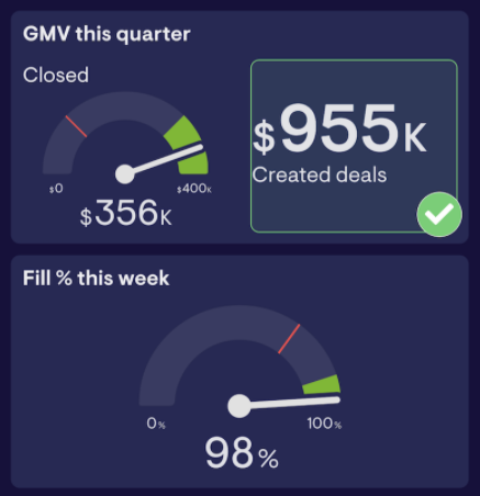
Silbo set a positive goal range to show up in green, so the team can see right away if they’re doing well. If possible, set the minimum on your gauge to zero, as Silbo did. Starting at zero is intuitive, so it requires less work from the viewer.
3. Bar Graphs
Bar graphs are one of the most versatile data visualization techniques for comparing categories. The bars are typically vertical, but sometimes they’re horizontal.
Best practices for using bar graphs
Elevate your bar graph with these ideas:
- Use color-coding to show different subcategories within individual bars. The Chartio example above uses color-coding to label whether documents are prepared, signed, or unsigned.
- Choose informative titles. In Chartio’s graph, it’s clear that the bars are referring to documents because of the title—"Document status by owner."
As with line graphs, simple is best for bar graphs. Having more than five or six subcategories will likely make your bars difficult to read.
Geckoboard: Visualizes recruitment costs with bar graphs
On our recruitment dashboard here at Geckoboard, we use a bar graph to display recruitment costs per month.
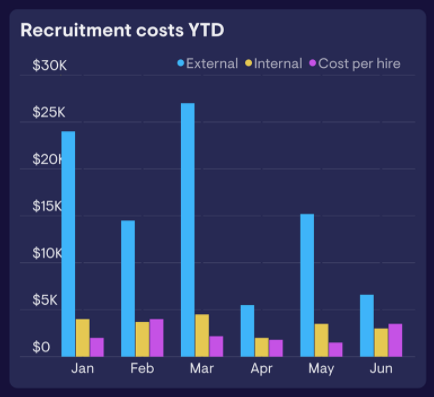
Different bar colors distinguish cost types: external, internal, and cost-per-hire. Because we only have three categories, the graph isn’t visually overwhelming.
Thaisa Money, our VP of people operations, loves how the graph makes it simple to see changing cost types month to month.
“[It] helps us keep an eye on costs without having to dig into our financials too frequently,” said Money.
4. Geographic maps
For showing location-based data, geographic maps are invaluable. This visualization shows geographic regions, with specific areas filled in or highlighted based on the data. For example, you might use a map to show where the majority of your customers are from. This visual will help your sales team target leads and clients without having to sort through lists of country or city names.
There are several different types of maps, but they all provide context for geographic data.
Best practices for using geographic maps
To make your map easy to interpret, follow these tips:
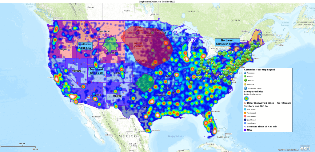
- Use a single map to illustrate only one or two data sets. Too much information will clutter the map and make it hard to read. Take a look at the example below. There are at least 11 different sets of data represented. It’s difficult to see what’s going on, much less use the data to make business decisions.
2. Choose colors that contrast with the base map’s color scheme. This helps your data sets stand out.
Only use maps for data sets that need location context. You wouldn’t need a map to visualize monthly numbers of page views, for example.
FiveThirtyEight: Adds voter location context with maps
FiveThirtyEight, a political and economics blog, used maps in 2018 to show projected midterm results if only women voted.
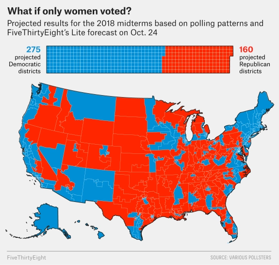
With this data visualization, FiveThirtyEight’s readers are able to identify location-based trends. They might notice, for example, that the country’s central area tends to be red, while the coasts tend to be blue. This trend would be less obvious with a non-visual record, like a spreadsheet.
5. Progress bars
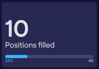
Much like gauges, progress bars show how close your team is to reaching their goal. They use a 0-100% scale, so teams can see their progress as a percentage. If the goal is 40 hires and you have 10, the bar will be 25% filled.
Progress bars are motivational with their game-like design. You can clearly see the goal you’re working towards, so you’re driven to fill the bar and meet your objective.
Best practices for using progress bars
Keep your team motivated by following these best practices when designing progress bars.
- Display progress bars in a location shared by the whole team. You could post bars on a shared TV dashboard or pin the bar in a communication channel like Slack. Use software that updates the bar in real-time, so teams can accurately track their progress.
- Only use progress bars for the key, fundamental team goals. Presenting every single metric as a progress bar might discourage employees. If all they see are partly filled progress bars, they might be overwhelmed by how much they have to do rather than being motivated to fill the bar.
When you display your progress bar, post the current key performance indicator (KPI) amount above the bar. This additional figure provides extra context around the percentage.
Lime: Tracks internal hiring with progress bars
The scooter rental company Lime uses progress bars to track their hiring goals.
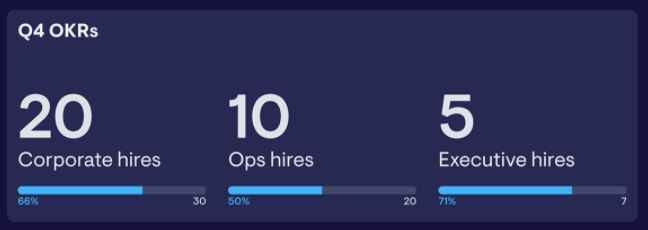
Lime’s bars display not just percentages but also the current and target amounts for the KPI. This data visualization gives their team a sense of their overall hiring growth and progress towards individual goals.
6. Color-coded alerts
Color-coded alerts highlight metrics in red or green to show employees where they’re exceeding and where they need to improve performance.

With warning thresholds, your team can tell at a glance if a number is good or bad without having to hunt down goals or previous data.
The process of setting thresholds will vary depending on the tool you use. In Excel, you use conditional formatting. But in a dashboard tool like Geckoboard, color-coded formatting is built-in.
Best practices for using alerts
A few simple tricks can help make your alerts even more effective:
- Only set alerts for critical metrics. Like progress bars, having alerts for every single metric could overwhelm employees. If every KPI is lit up in red or green, the colors lose their significance.
- Keep alerts accessible by pairing the color-coding with an image. If negative alerts have an exclamation point and positive ones have a checkmark, anyone can interpret the alert correctly, even if they’re color-blind.
Use these tips to create color-coded alerts that help employees gauge their performance, good or bad.
JustPark: Improves customer service with alerts
These color-coded alerts keep parking software JustPark’s customer service team on top of their performance.
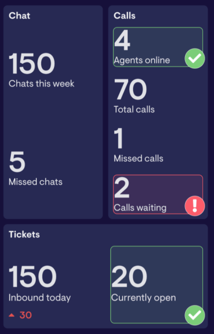
Looking at the red and green alerts, the team can see customer calls are waiting and inbound tickets are up from the previous day. They can address this by responding to more customer calls and focusing on fixing the current tickets in the queue.
Data visualization techniques help teams interpret data at a glance. They can spend less time trying to read spreadsheets or reports, and focus on making informed decisions.
For more best practices for data visualization techniques, check out this resource.
Make your data visualizations easy to access
You’ve done it—you combed through multiple data visualization techniquesand picked the best ones for sharing your information. Now what?
The next step is to make sure your newly visualized data is easy for the whole team to find. You might design a dashboard that shows sales per person and progress towards monthly revenue. With performance insights all in one place, sales reps are empowered to track their performance and focus their energy in the right places.
