
You spent the whole quarter collecting data about your new website design. You tracked a ton of KPIs, from traffic fluctuations to bounce rates. It's time to show your manager the success of your redesign.
How do you do that? With KPI reports.
A great KPI report doesn’t just showcase the data you collected; it also presents an argument for the next steps your organization should take. We'll show you how to design KPI reports that not only display your data but also illustrate the importance of your findings.
What is a KPI report?
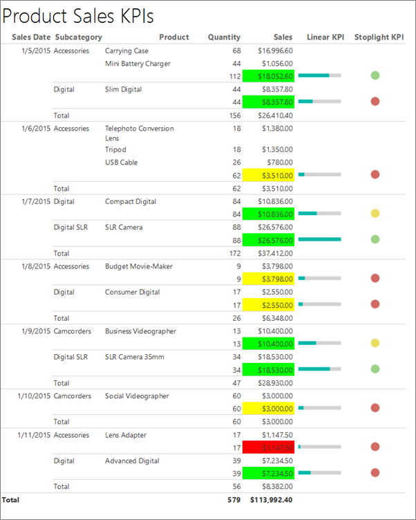
A KPI report is an organized collection of the key performance indicators (KPIs) that you’ve tracked over a set period. A sales KPI report, for example, might include quantity sold, total sales in dollars, and total net profit. Often, these reports use charts and graphs to make the data easier to read at a glance.
KPI reports are a convenient way to share data with your teammates, managers, and executives. There’s no need to pull information from multiple sources, because you have all of the data you need in one document.
KPI reports also provide a common reference point to discuss goals with co-workers. Instead of having abstract planning conversations, you can set objectives based on current, specific data.
How do you build a KPI report?
There’s no “one size fits all” model for KPI reports. Your design will depend on the reporting software you use, the KPIs you pick, and the data visualization techniques you use.
While each report may look different, the basic building blocks are the same. We’ll show the steps you need to create your next KPI report, no matter which specific KPIs you track.
Define your purpose and audience
Before you can put together the physical report, you have to know why you’re creating it and who it’s for. Start by defining what you hope to achieve with the document. With the example in the intro, the KPI report was meant to highlight the value of a website redesign.
The report’s objective determines what KPIs you’ll feature in it. Let’s say you’re justifying social media marketing spend. You would include metrics that show ad engagement, click-through rate, and conversion rate.
Along with purpose, you need to identify your audience. Who will be looking at the report? It might be your teammates, your manager, executives at your company, or company shareholders.
The audience will affect the way you present your findings. If you make a company-wide KPI report, it will need extra descriptions, labels, and notes because it has to be self-explanatory. But if you’re presenting the report to your manager in person, you will be able to provide that context yourself and can make a more streamlined report.
Pick your KPIs
The next step is to choose KPIs that support your report’s purpose. Be selective—too much information can overwhelm viewers. Focus on data that is directly related to the reason you’re making the report.
The website redesign report doesn’t need to include gross profit margin or customer acquisition cost. Those two metrics are broad and take into account spend and revenue coming from channels other than the website. Instead, focus on traffic- and conversion-related KPIs that show how the redesign attracted site visitors and sales.
Choose your reporting tool
Once you have your KPIs, pick the software you’ll use to make the report. Depending on how you’re sharing the report, you might use a spreadsheet or create a collaborative Google Doc.
Consider investing in data solutions that update in real time. With basic data entry taken care of, creating the final report will be much quicker.Real-time solutions are particularly useful for metrics that you track regularly and are likely to include in multiple KPI reports.
Create your KPI report
Use your chosen software and selected KPIs to build your report. Put your key data at the beginning. Even if readers look at only the first few metrics, they’ll still see the most important points.
Take your audience into account as you choose the structure of your report. How will they be looking at it? Will you be emailing a document or presenting it in person?
If the report has multiple pages, add a summary or key takeaway at the top of each page. Summaries are particularly useful for emailed or company-wide reports, when you won’t be explaining the information in person.
This organization makes the document more skimmable. It also helps readers know what to look for as they go through the numbers.
The data in each section should support the same claim. Say, for example, you’re trying to show that website traffic increased. You might create a report section that groups “total page views,” “pages viewed per session,” and “website traffic growth” together.
Start with a draft, and have a co-worker or manager look it over before finalizing it. Getting a second opinion will help you see if your intended message is clear. Ask your co-worker whether any points are confusing or boring, and use their input to revise your report.
3 tips for designing better KPI reports
To make your KPI report stand out, you have to go beyond simply turning your KPIs into charts and collecting them in a document. Follow these tips to create reports that are both informative and eye-catching.
1. Add context to each KPI.
A single metric in your report doesn’t tell the whole story. Use titles, notes, and labels to give readers more information about each KPI.
Connect metrics to broader company goals. You could do this by showing benchmarks alongside current data in your charts or graphs. Or you might add a positive or negative change indicator, so readers can see right away if there is an issue.
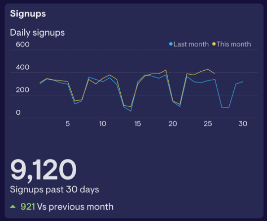
In the example above, the comparison line and the green upward arrow make it clear that sign-ups are growing.
Add relevant details around KPIs in your reports so readers understand why they should care about each metric.
2. Make your report skimmable.
Not everyone is going to read your KPI report cover to cover. This is especially true if you’re sending your report to busy executives. Format your data so that your main message comes across, even if your readers are only skimming.
One method is to put key takeaways in your header. Instead of labeling a section with “Change in monthly traffic,” you might write, “Traffic increased 25% MOM.” Readers can see the main point of the section right away. It also might encourage them to read more closely to see how you accomplished the goal stated in the header.
Color-coded alerts also help draw readers’ attention to the most essential pieces of data. You might highlight a positive change with a green check mark, and a negative change with a red exclamation point. Use symbols to make these alerts accessible to color-blind people or readers viewing the document in black-and-white.

When listing data, opt for bullet points over paragraphs. Bullet points break up large blocks of text and add white space between each item, which makes the list easier to scan.
Follow these techniques to help skimming readers quickly find key data points and understand your report’s overall message.
3. Share mini KPI reports frequently.
You may create full KPI reports only once a month or once a quarter—but that doesn’t have to be the only time you share data with your team.
Share condensed KPI reports on a more frequent basis to make it easier to create your full report later on. Mini reports take less time to create. You can make multiple small reports over the course of the quarter. Then, creating your full report is simply a matter of collecting and organizing data from the mini reports.
If possible, use real-time reporting tools to make your short KPI reports. That way, the information will still be up to date when you’re ready to add it to a full-length report.
Mini reports will also show your team right away if their performance is lagging. Then they can work to correct any problems as quickly as possible.
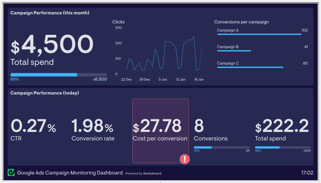
A dashboard tool is one way to share regular updates on your KPIs. It functions like a mini KPI report by displaying your team’s most important metrics and updating them in real time.
Display your dashboard where it will be highly visible. If you’re working in an office, a TV might be a good solution. Remote teams can share dashboards in Slack or in weekly update emails.
Encourage managers and team members to ask questions about the KPIs you’ve included. Based on their responses, you can adjust the KPIs and supporting details you include in your full KPI report.
Go from data-blind to data-driven with KPI reports
A long KPI report that’s full of complicated metrics and formulas isn’t impressive. The data you share is valuable only if your audience understands it.
Add context to your metrics to help people read your report. Make the importance of each KPI crystal clear. The more digestible the report, the more team members can use it to make informed, data-driven decisions.
