Imagine having a dashboard with beautiful, easy-to-read visualizations and data from five years ago that’s for a different team at your company. Pretty pointless for driving action today, right? This might be obvious in retrospect, but the underlying concept of keeping data relevant can be easy to forget in our day-to-day work as products, services, customers, and businesses change.
Thankfully, an effective, albeit little known solution is available and easy to implement. It’s called iterative design.
Understanding Iterative Design
Iterative design is a highly effective process for making incremental changes based on an initial prototype and user feedback. Wikipedia defines it this way:
“Iterative design is a design methodology based on a cyclic process of prototyping, testing, analyzing, and refining a product or process. Based on the results of testing the most recent iteration of a design, changes and refinements are made.”
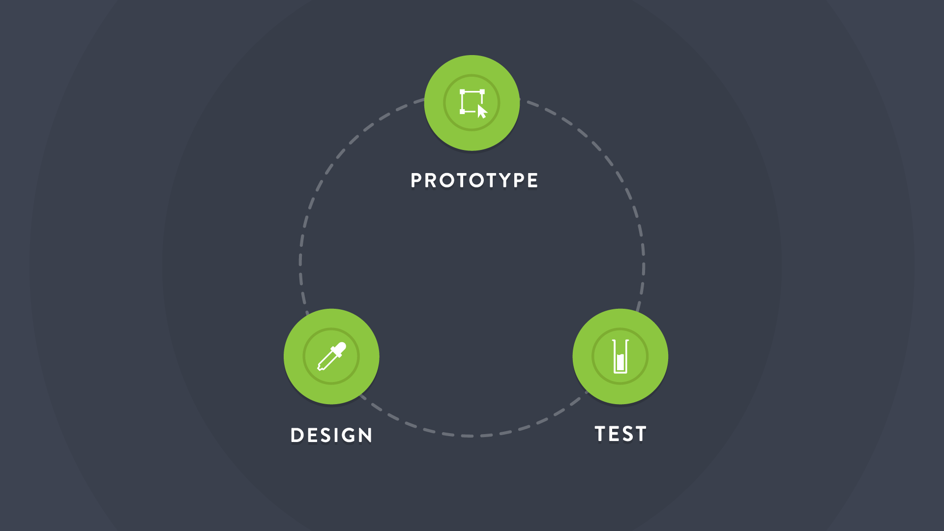
This continuous process begins with a minimal viable product or a prototype that has only the most basic elements necessary to function. The prototype is then tested and feedback is gathered. The third step closing the iterative loop is to design incremental changes that prepare you to begin the process again.
Applying Iterative Design to Dashboards
So what does iterative design look like when you’re building a dashboard? Here are the steps for iterative dashboard design along with helpful questions to ensure your data stays relevant.
1. Build your dashboard (Prototype stage). Start with only the most essential key performance indicators for you and your team. I recommend having no more than 7-10 KPIs on your dashboard at the beginning. Before adding metrics at random, ask yourself, ‘Should this KPI be on my dashboard?’
It’s important to realize the dashboard won’t be perfect. In fact, after several iterations your dashboard may look completely different. And that’s okay. The point is to start with the essentials and then learn over time what works and what doesn’t.
2. Ask questions and gather feedback (Test Stage). Get your dashboard up on a screen and begin referencing it as you work. Is the data actionable? Do you have the necessary context for the KPIs displayed? Are any of the numbers just vanity metrics? Is the dashboard easy to read at a glance?
Ask your team for specific feedback and see what suggestions they have for improving the dashboard to make it more actionable in their day-to-day work.
3. Figure out what to change (Design Stage). Now that you’ve collected feedback on the dashboard, it’s time to determine exactly what to change. Select a handful of incremental edits to make. Try to avoid any dashboard overhauls or complete re-designs. Remember to keep it clean. Resist the urge to clutter your dashboard with every possible widget. Eliminate vanity metrics identified in the previous step adjust visualizations that are unclear.
4. Rinse and repeat. The beautiful part of iterative design is that it keeps going - it fosters perpetual improvement. Get in the habit of continually working through the various stages to keep your dashboard relevant and actionable. Over time your KPIs will change, your products/services may change, and your audience will evolve. Iteration helps you stay sharp and push the limits of what’s possible.
Some of our most successful dashboard clients say they iterate on at least one of their dashboards every two weeks to a month. This doesn’t mean you have to complete a full cycle within a certain time period - do whatever makes sense for your team. Whatever the timing, just make sure you don’t stop. Keep iterating.
Implementing Iterative Design
So now you know the best kept secret of dashboard design. And you have no excuse for displaying outdated or irrelevant data on your dashboard.
Need some dashboard inspiration to get started? Check out these dashboard examples.
