This may be a popular, or an unpopular opinion. I wouldn’t know as I’ve never shared it in my near 7 years at Geckoboard.
But I think light themed dashboards are a bit rubbish.
It might just be one of those things where you’re a light theme person, or a dark theme person. Strangely though, I have my phone in dark mode and Mac in light…
So why do I have such an aversion to a light themed dashboard?
Let’s just point out that in movies, they only ever use dark themed dashboards. Why? Obviously because they’re better.
Opinions aside, there are some real reasons behind this preference.
Let’s break it down.
Alerts can be missed on white
It’s much harder to spot colour coded visual alerts on a white background.
When you set up a dashboard that flags red, amber or green to let viewers know something needs attention, I find it much less obvious on white.
There’s something about the reds and greens on white. The contrast just isn’t vast enough for me.
And this isn’t just personal taste.
The Web Content Accessibility Guidelines (WCAG 2.1) require a minimum contrast ratio of 4.5:1 for normal text and 3:1 for large text and graphical elements. Many bright alert colours, especially reds and greens, struggle to hit those ratios on white backgrounds unless they’re darkened significantly.
On darker backgrounds, those same colours can achieve stronger contrast without losing vibrancy.
That matters because contrast directly affects detection speed. Decades of vision research show that higher contrast signals are detected faster and more reliably. In simple terms, when the signal stands out more clearly from the background, we notice it quicker.
If you care about metrics enough to have alerts on them, then you want it to be clear as day when they’re being flagged.
In my experience, darker themes allow for much more obvious contrast between a neutral state and when something is being alerted in a colour. The background recedes. The alert stands out.
There is so much that comes into play when it comes to data visualization in general, but we’ve already written a bunch of content on this so I won’t go into it now.
Light themed dashboards feel cheap and default
Free tools for building dashboards or building something to substitute a dashboard (hello Google Sheets) are nearly always white. They don’t offer much scope to adequately adapt the theme in a way that’s practical and tasteful.
In-built dashboards that exist within your every day tools such as CRMs are nearly always light themed. It’s almost never the case that these platforms are cheap, but they are generally focusing more of their attention on other areas of functionality. Reporting and dashboarding design tends not to be an area for regular consideration.
So when you see yet another white dashboard, it feels… default.
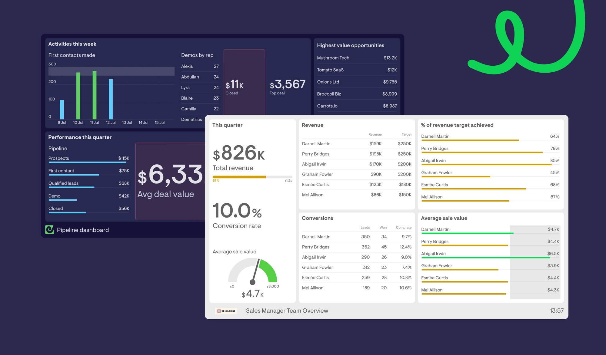
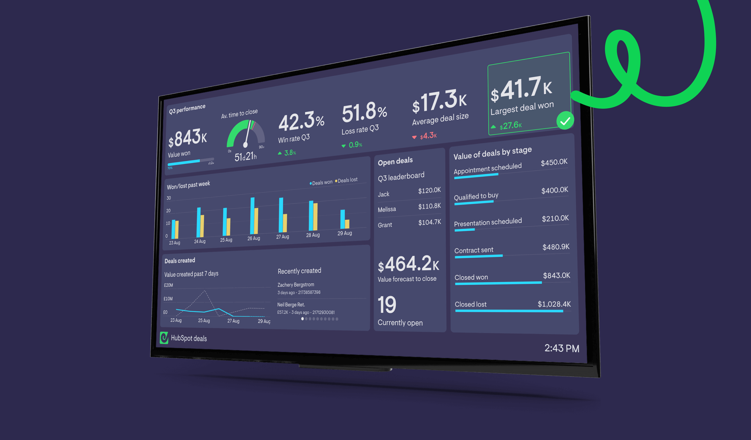
Something we often hear at Geckoboard is how people love the way our dashboards look, because they are different from the reports that they’re looking at every day in tools like Salesforce, HubSpot and Zendesk.
Dark themed dashboards stand out
A light themed dashboard doesn’t excite me. It makes me think of stuffy old reports that no one looks at.
Of which, I’ve seen plenty.
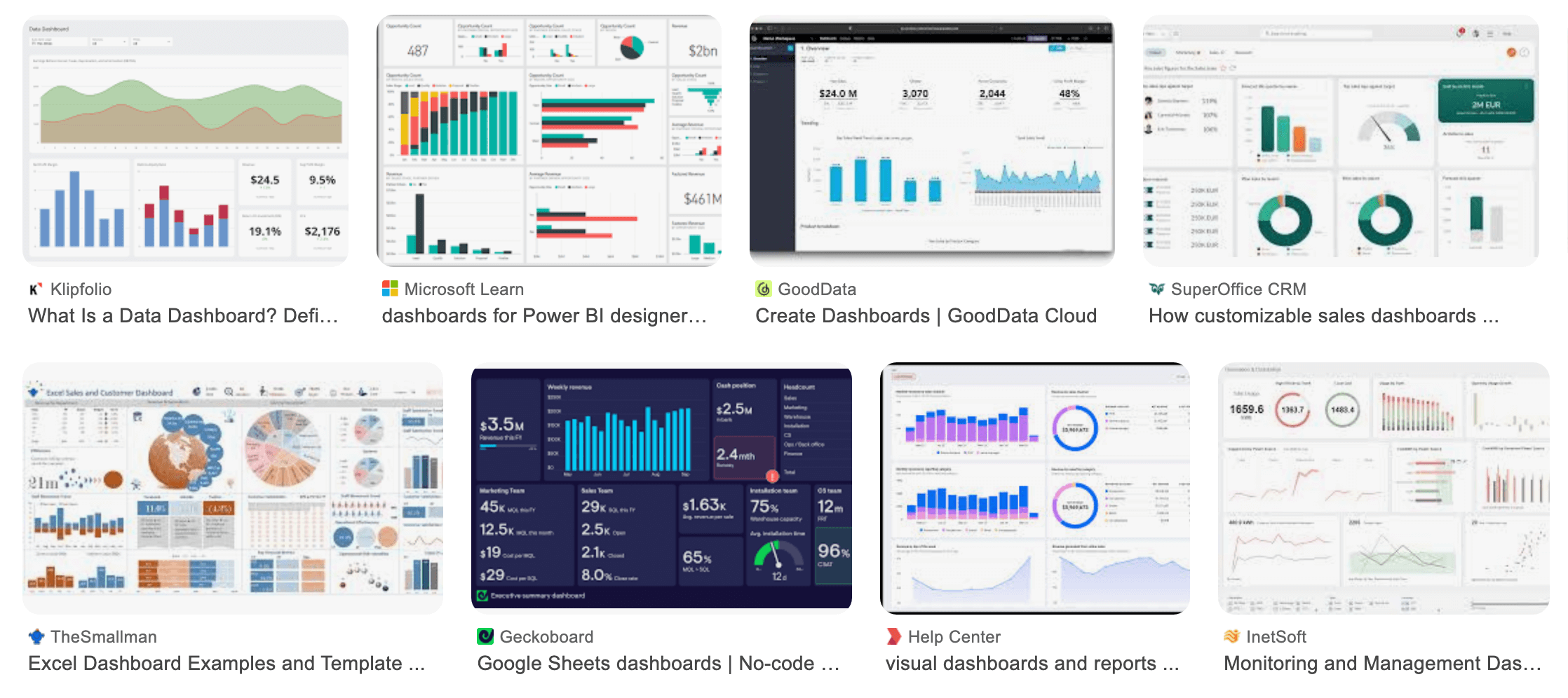
If you image search dashboards you’ll see swathes of light themed dashboards and the handful of dark themed ones really stand out.
That’s not accidental.
Dashboards are often glanceable systems. They sit on walls, on second monitors, within Slack. People look at them in passing. Research into ambient and peripheral displays has shown that high contrast state changes are more noticeable in glanceable systems, especially in peripheral vision.
Subtle colour shifts on bright backgrounds are easier to miss.
Dark backgrounds reduce overall visual dominance and allow key elements to stand forward. For a dashboard that’s meant to be monitored rather than a report that’s read line by line, the difference matters.
Personally, I find darker themed dashboards more engaging, more exciting and like something I want to keep an eye on.
Think of dashboarding like dating…
Initially, catching someone’s attention visually is very important. First impressions make or break whether you’ll be interested.
So when you see a fine looking dashboard, it catches your eye. You’re interested.
You’ll be happy to date this dashboard and focus on the data. Age. Location. Cats vs dogs? Brief dating history. How many kids do they want?
You’ll happily engage with the dashboard. They’re easy to look at, easy to extract data from. You might find over time the data that’s important to you changes but you’re comfortable with the dashboard and can easily interpret what it’s sharing with you.
There’s real cognitive bias behind this too. When something looks better, we assume it works better. In UX research, what’s known as the aesthetic–usability effect shows that users consistently perceive more visually appealing interfaces as easier to use, even when the functionality is identical. The effect influences trust and engagement before we’ve even analysed the numbers.
If your goal is to get teams to engage with their data, that first impression is doing more work than most people realise.
So often we hear, “I was in XXX’s office and I saw they were using Geckoboard.”
It’s one of the bonuses of leading with distinct dark themed dashboards. They’re instantly recognisable in a sea of white.
If you were speed dating, you’d remember the dark themed dashboards at the end.
Is this just a plug for Geckoboard?
Well, yes and no.
Geckoboard defaults to the dark theme but we offer an out-of-the-box light theme (if you really must) and the ability to apply your own brand colors.
Am I conditioned to enjoy dark themed dashboards because I work here? Quite probably. But if you consider the research included above and then Google image search KPI dashboards, you might just agree with me.
If your dashboard is meant to be noticed, monitored, and reacted to, the evidence around contrast, detection speed, the aesthetic–usability effect and glanceability gives dark themes a pretty strong case.
