The Salesforce reporting feature is really powerful. However, if you’re just starting out, it can also be quite daunting.
Lots of resources explain how to create various reports, but before you even create a report, it’s useful to wrap your head around Salesforce reporting tools and formats so you’ll understand what’s happening and why!
Your Salesforce account offers a wealth of data. Behind the scenes it’s just a database containing information about your leads, accounts, opportunities etc. But getting that data into a useful format to answer important business questions requires some manipulation. Reporting is what makes your data useful.
Salesforce reporting example
Imagine you want to track the number of opportunities your West Coast US Sales team is creating each week.
You need to first choose what type of object you want to report in Salesforce report builder. We’ll select ‘opportunities’ for our example, but other common options include leads, accounts and contacts. You might have your own custom objects you’re interested in too.
By default, Salesforce displays the records for this object in a simple table format (more on Salesforce reporting formats below). The opportunities report we just created will look something like the example below.
Example Salesforce report view (tabular format):
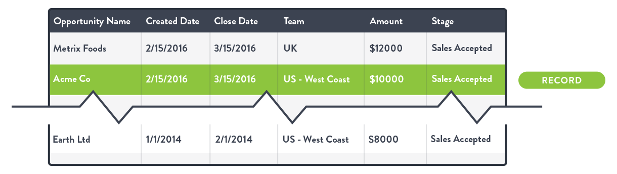
Each row is an individual record - a single opportunity. By adding or removing columns you can control what information is shown for each record.
Salesforce reporting options
Filtering
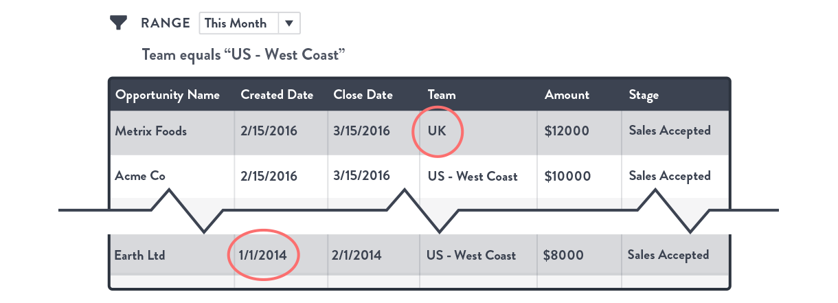
Filtering allows you to control what records are pulled back in the report. In our simple case the only filter we need to apply is to limit the report to show only opportunities created by the West Coast US Sales team. We might also want to restrict the report to this month’s data. Again we’d use a filter to do this.
Our filtered report would now look like this with the first and last rows hidden because they do not match the filter:
 .
.
At this point, our data is still not in a very useful format for analysis. We can look at the total record count (how many opportunities there were in total), but really that’s it. Each row is still an individual record.
Grouping
To make the data useful you need to apply grouping. If you’ve used Pivot Tables in Excel or Google Sheets, it’s a similar concept. Grouping tells Salesforce to look through your records and collect them together based on a particular property.
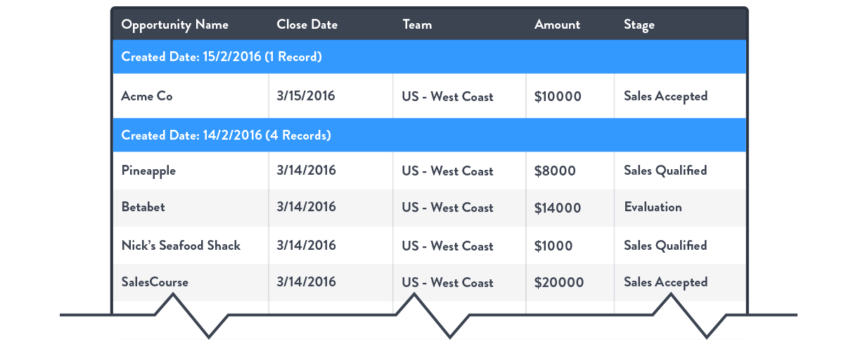
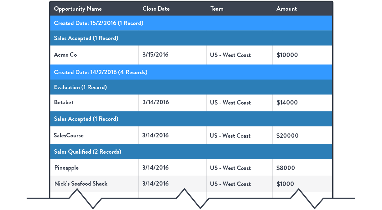
In our case, we care about opportunities per week so we need to group by date created. This puts all the records with the same created date into their own group and gives us the record count for each day. The default grouping is daily, but Salesforce gives control over grouping granularity with dates, so it can easily be swapped to weeks.
Our report now filtered and grouped by Created Date would look like this (example of summary format):
To change granularity for other values (such as dollar amount) you need to use Bucketing. If you’re interested in deal size for instance, rather than grouping by individual values like $5491, $5550, $5553 you might want to bucket these into <$5000, $5000 - $10,000 and >$10,000
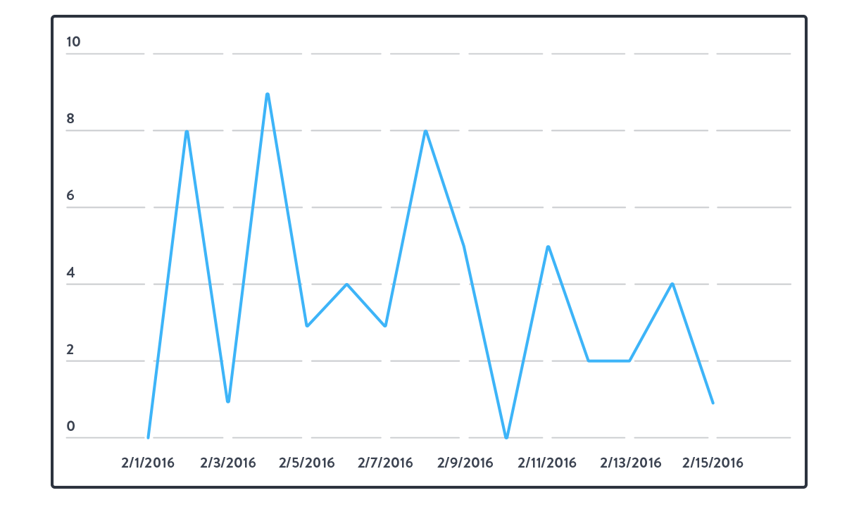
The report is now in the desired format and we can plot a chart of Opportunities by date created (example of summary format):
Multiple groupings
Now imagine rather than just showing opportunities created by the West Coast US we wanted to break down these opportunities by stage.
Grouping by stage means that each date grouping is now also broken into stage. Up to 3 groups can be applied in a summary report - each group breaking down the data further.
Our example report now grouped by stage as well as created date:
Summary metrics
Showing the record count (number of items) for each group is good, but often you’re interested in a different metric. For opportunities we might want to know the total value or average probability. Any numeric property for an object can be added as a summary metric. The report builder in Salesforce gives you the choice Total, Average, Min or Max.
Here we’ve added total amount as a summary metric.
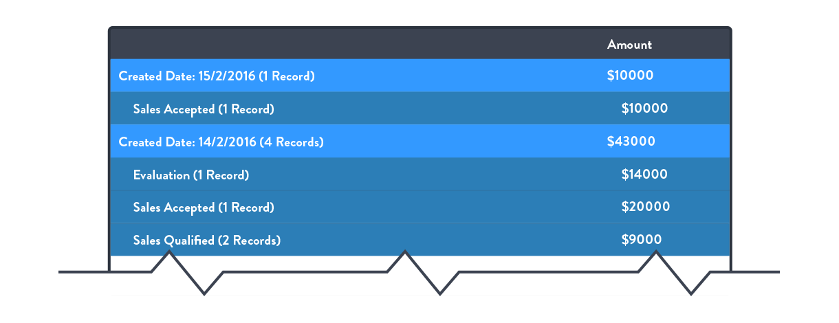
By hiding the details in the report, the individual records are removed and it’s easier to see the underlying data that’s powering the chart.
Salesforce report formats
At this point it’s worth quickly touching on the different report formats in Salesforce.
Tabular format
Tabular reports are for showing ungrouped data - they’re just a list of records.
Summary format
Summary reports show your grouped data in a nested list.
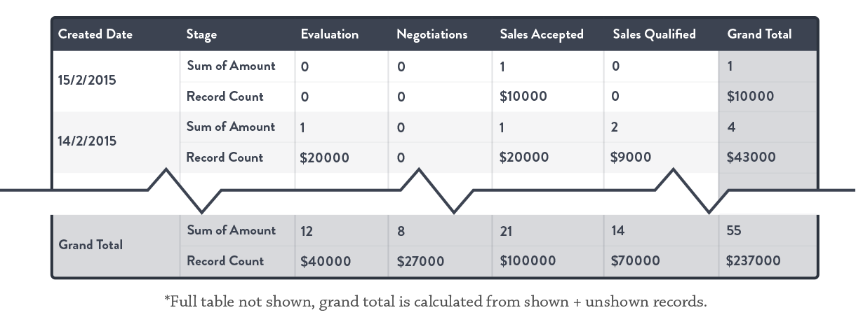
Matrix format
Another format for grouped data is the matrix report which uses a table layout and makes it possible to read off the intersections between groups.
In our example, a matrix report would allow us to easily read off Opportunities by Team for each week. This wouldn’t be as easy in a Summary report.
Example of a matrix format:
Joined format
The joined format allows more complex reports to be created (i.e. reports that require information from more than one type of object). When setting up a joined report, identify the common column (e.g. AccountID) on which you wish to join the reports. This joining column acts as a key. Joined reports warrant a whole article in themselves!
Salesforce reporting in a nutshell
1. Build a report
You need to build a report to get your Salesforce data into a useful state. First, choose what object (e.g Opportunities) you want to report on. By default this data is displayed in a flat tabular report with an individual row for each record. The report can be filtered to restrict results shown and can be further controlled by adding and removing columns.
2. Aggregate data in groups and summary metrics
The data needs to be aggregated using groups in order to be useful and plottable in a chart. Summary metrics for different properties (e.g. Sum of Total Price, Average Probability) can be added in addition to the record count for each group (number of records in the group).
3. Segment groups as necessary
Data can be grouped into various timeframes (e.g. day, week, month, year) as well as other numeric fields which you can set up as custom groups. Non-date groups are called Buckets.
4. Select optimal reporting format
Salesforce report builder offers 4 report formats. Tabular reports are the most basic and show ungrouped data. Summary and Matrix reports are different ways of displaying grouped data. The table format of Matrix reports make them better suited to highlight how different groups intersect.
Joined reports are a special kind of report that allow you to pull together data from more than one object if they have a common property that can be used as a key.
Now that you’re equipped with the key elements of Salesforce reporting, you can make your data actionable by filtering, grouping, and formatting it. Stay tuned for a more in-depth look at creating reports in Salesforce.
Want to learn more about selecting the right sales metrics to monitor?
Define your Sales KPIs and build a sales dashboard of your own using our Salesforce integration.
Try the Salesforce integration
Related Posts:
