
In 2007, toothpaste company Colgate ran an ad stating that 80% of dentists recommend their product. Based on the promotion, many shoppers assumed Colgate was the best choice for their dental health.
But this wasn’t necessarily true. In reality, this is a famous example of misleading statistics.
The ad suggested that dentists preferred Colgate over other toothpaste brands. But the survey asked them to list several brands of toothpaste they would recommend. The data only showed that Colgate was one of a number of different brands that dentists liked. Not quite the same claim, was it?
Businesses use information from surveys and other sources every day to make critical business decisions. But sometimes data can be deceiving. Understand the common sources of misleading statistics so you’re prepared to avoid faulty data in your own organization.
What are misleading statistics?
Misleading statistics are data points or sets that lead readers to believe something that isn’t true. There are three main stages in the data analysis process where issues can occur:
- Collection: When you gather raw data
- Processing: When you analyze the raw data and determine its implications for your business
- Presentation: When you share the results of your analysis
In the Colgate example above, the problem was at the presentation stage. The company left out critical information when they revealed the results of their study.
Misleading statistics pose a serious concern with internal operations, not just external promotions. Since faulty data can appear legitimate, it’s critical to assess data quality before using it to make business decisions.
Source #1: A small sample size
Collecting data from too small a group can skew your survey and test results. Small samples underrepresent your target audience. They can lead to misleading statistics that give you a faulty idea of customer satisfaction and product preferences.
Sample size is especially important if you analyze results in terms of percentages instead of exact numbers. Say you’re A/B testing a potential new feature. You see in a report that 60% of survey respondents prefer Version A over Version B.
If you tested 10,000 people, that percentage is a pretty convincing reason to develop that version. But if you tested only 20 people, that means only 12 are interested in the idea. If you’re using this data for major business decisions, you want to be sure a significant number of people prefer Version A. Twelve is too small a group to show you that the new feature will be worth your investment.
Small group sizes can also lead to biased sampling. The smaller the group, the less likely it is to represent the diverse demographics of your customer base.
Key takeaway: Use a statistically significant sample size
An ideal sample size depends on many factors, like your company and the goals for your project. Using a third-party tool helps you reliably assess your sample size without having to figure out the calculations on your own.
Use a tool like Optimizely’s sample size calculator to figure out the ideal sample size for your goals. Users enter their expected conversion rate and the percent change they are looking for. They can set a preferred standard of statistical significance or go with the calculator’s default 95%.
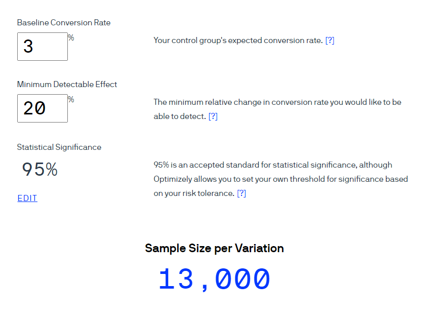
Then, it gives you an approximate ideal sample size based on your needs.
Source #2: Leading survey questions
The way you word survey questions can also be a source of misleading statistics. A recent UK study shows that the way you phrase a question directly affects how a person answers.
One example is survey questions that ask for confirmation. Your survey might say, “Wouldn’t you agree that data visualization tools lead to higher productivity?”
By asking, “wouldn’t you agree,” you’re restricting the respondent to answer yes or no, and you’re leading them to say yes. Essentially, you are including the answer in the question.
Leading questions might confirm what you hope to see, but they don’t result in accurate data.
Key takeaway: Remove leading words from survey questions
Check your surveys for manipulative wording that might lead respondents to give a particular answer. A few examples of influential phrasing include:
- Phrases that ask for confirmation
- Loaded or emotionally charged words, such as “disaster” or “amazing”
- Absolute terms, like “all” or “none”
Check for leading language by asking co-workers to review surveys before sending to customers. Ask what parts of your questions, if any, suggest how they should respond.
Source #3: Confirmation bias
Confirmation bias is when you have a set result you want or expect to see, so you look at only data that affirms your belief.
Companies are most susceptible to this phenomenon when a single employee is giving a presentation. Whether the employee realizes it or not, they may not be providing a full picture of the data due to their own views—and that can lead to poorly informed decisions.
Say a product manager is arguing that their travel app’s Favorites feature doesn’t need to be updated. To support her claim, she shows that very few customer support calls mention this feature. As it turns out, she was looking at calls from only the last six months.
When analyzing support calls from long-term customers, the product team sees a much higher percentage bringing up issues with the Favorites feature. Newer customers weren’t using the feature enough to have problems with it. The product manager’s confirmation bias led to misleading statistics that could have resulted in customer concerns going unresolved.
Key takeaway: Encourage third-party review
Everyone has unconscious biases. But not everyone has the same ones. So to minimize confirmation biases, push employees to review each other’s ideas.
If an employee comes to you with a proposal, have another team member review the project idea and the presentation. Each person will approach the data differently, so someone will likely realize whether the data is skewed toward one perspective.
Offer training to help employees become aware of their biases. This is especially important when it comes to internal hiring and employee development decisions. Training can help teams avoid misleading statistics that could negatively affect business decisions ranging from product features to team diversity.
Source #4: Confusing graph and chart labels
When most people see a data visualization, they immediately draw conclusions about the information. If the visualization’s labels are unclear, those conclusions might be completely different from what the data really shows.
Unusual graph intervals, for example, can skew results and make them look especially dramatic. The two graphs below present the same data. But the graph on the right starts at zero, and the one on the left starts at 3.14.
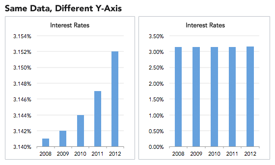
The left graph paints a picture of rapidly rising interest rates. Yet in reality, rates rose only a fraction of a percent over five years.
Charts and graphs are also misleading when they have irregular intervals. In the chart below, it looks at first glance as though whatever is being measured is rising relatively quickly, but at a fairly steady rate.
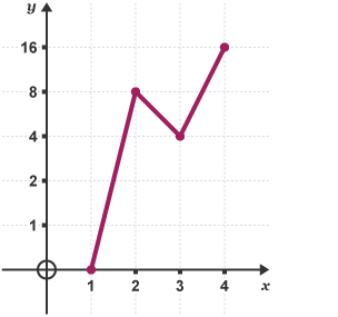
But if you look at the y-axis, you’ll see the intervals are doubling. The data is actually increasing at an exponential rate. The non-standard y-axis intervals understate the change, and make it appear to be increasing less quickly than it really is. If you saw this chart in a report, it might lead you to make decisions based on growth rates that weren’t really happening.
Omitting labels is just as confusing (if not more) to the viewer. In the graph below, it looks initially like Central College pays its adjunct faculty significantly more than other colleges.
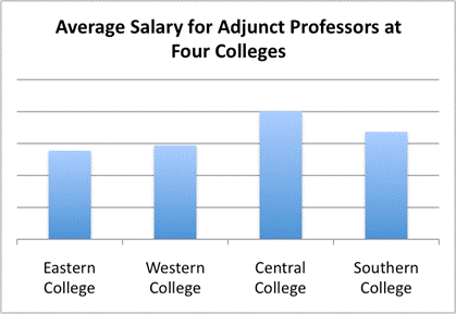
But with no y-axis, there is no scale to see how much more.
For comparison, consider a similar graph:
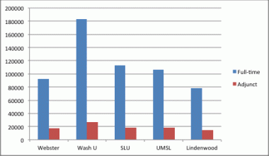
Because the axes are clearly labeled, you can accurately compare full-time and adjunct professor salaries across colleges.
Key takeaway: Check visualizations for readability and accuracy
After you make graphs and charts, ask your teammates for a second opinion. Have them look at your chart and tell you what they get from it at first glance. If it’s not what you intended, you may need to revise the labels or intervals for sense and consistency.
For more help with checking the accuracy of your presentations and avoiding visually misleading statistics, check out our data visualization tips.
Source #5: Mistaking correlation for causation
Just because two sets of data seem to be related doesn’t mean one variable is causing the other to change.
For example, you might see that sales went up around the same time you released your marketing campaign around a new product feature. But you have to dive deeper into the data before assuming causation. Was the spike in sales just because of the promotion, or was it related to your reduced pricing that happened at the same time?
Assuming one variable caused another can lead to misguided business decisions. You might focus your ad spend around highlighting your new feature, when you should be promoting your competitive pricing plans.
Key takeaway: Run A/B tests to check for causation
After you find correlations in your data,take a close look at why those two variables might be related. One method of checking for causation is running an A/B test. A controlled test allows you to check how changing one variable affects the other.
Say you think your new Facebook ad led to higher conversion rates. Run a test where you show half of Facebook users the new version of your ad, and half the old version.If all other factors are the same, a lower conversion rate for the old ad group will support your assumption.
WATCH: Why summary metrics lie
We explore why Summary Metrics can be misleading in this episode of Data Smarties.
Minimize misleading statistics by educating your team
To keep misleading statistics from jeopardizing your company, make sure your co-workers understand how this data develops. Teach employees, including managers and executives, about the common sources of misleading statistics and how to keep their data clean and accurate. If everyone understands these points, your company as a whole can make better, more accurate data-driven decisions.
Interested in learning more about misleading statistics? Check the examples and best practices in our statistical fallacies resource.
