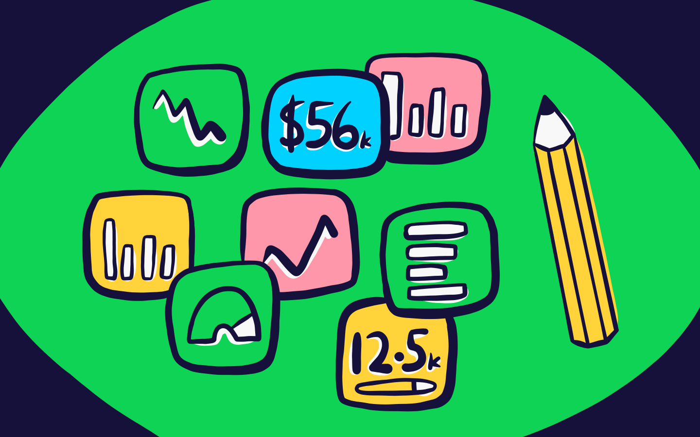
A data visualization dashboard provides decision makers with a high-level view of their most important metrics. It combines numbers, charts, graphs, and other graphics designed to focus an audience on the metrics that matter. They can be helpful for spotting problems early, making decisions about where to allocate resources, and measuring progress over time.

What is the difference between a data visualization and a dashboard?
A data visualization is a graphical representation of information, which uses visual elements like charts, graphs and maps. They can be used in a variety of situations, such as presenting data to clients or shareholders, communicating research findings to colleagues, or analyzing data for personal use.
A dashboard, on the other hand, is a deliberate collection of data visualizations, organized onto one screen. Dashboards are designed to support a specific process or a set of goals. By surfacing data using appropriate, easy-to-digest visualizations, the dashboard provides key information at a glance, without the need for extensive interactivity.
What makes a good data visualization?
The right data visualization will always be the one which most clearly and efficiently communicates your data. As our eyes are naturally drawn to colors, shapes and patterns, using visual elements like charts, graphs and maps means data is presented in a more easily understandable format.
Data visualizations can be static or dynamic. Static visualizations are typically used to display data in a clear and concise way. This is especially helpful when presenting large amounts of data, or when the data is complex in nature. Interactive visualizations allow users to explore data in more depth. They also allow viewers to manipulate the data in order to better understand it. This can be especially helpful when trying to uncover new patterns or trends. While static visualizations are best for quickly conveying key information, interactive visualizations are more suited for analysis and exploration.
In the context of a dashboard, where several visualizations are arranged in close proximity, your visualizations should support the overall purpose of the dashboard. Logically grouping related metrics next to each other makes them easier to find. And though it’s tempting to choose different visualizations for the sake of visual variety, it’s important to choose the visualization which is the most logical, understandable and efficient.
See our guide to data visualization techniques to help your company turn raw data into action.
How do I choose the right visualization for my data?
Choosing the right visualization for a given set of data is crucial to conveying the information effectively. The wrong choice of visualization can obscure important patterns and make it difficult to understand the data, which can lead to incorrect conclusions. Depending on the type of data being represented and the message that you want to communicate, there are different visualizations that you can use.
In the following section, we’ll take a look at some of the options you have available when creating a data visualization dashboard with Geckoboard.
Number visualization
The number visualization displays metrics that can be represented by a single number, including percentages and currencies. Further context can be added to number metrics in the form of progress bars, trend lines, comparisons or status indicators. Although single number visualizations seem simple, they are often the most efficient and effective way to communicate high-level KPIs. Use this visualization when the number is the most important aspect of the metric you're displaying, such as today's sales or yesterday's website unique visitors.

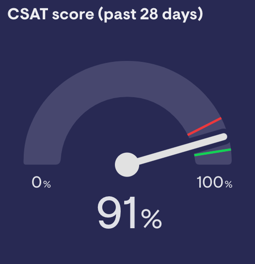
Gauge visualization
The gauge visualization represents a single data point that fluctuates over time. It’s helpful when there’s an expected operating range. The gauge displays a target range by setting an upper or lower bound, and a needle that makes it easier to spot significant changes. Use this visualization when you need to track a metric that moves within a range, and you need to see when it has moved beyond that range.
Line chart
Line charts display information as a series of data points, often using equal intervals, connected by straight line segments on an X-Y axis. They offer a clear and accurate assessment of the trend, acceleration, deceleration, and volatility of the data. Use this visualization when you want to see how your data changes over time and to help make predictions about future data points.

Column chart
Column charts represent data with vertical rectangular bars with lengths proportional to their values. Use this visualization when you need to compare more than four categories and, as a general rule, fewer than 12. They are also useful when you have negative values in your data, as we associate negative values more with downward direction.

Bar chart
Like column charts, bar charts represent data with rectangular bars with lengths proportional to their values, but the bars are plotted horizontally. Use this visualization when comparing the values of data that can be broken down categorically. Bar charts are suitable when the number of categories is higher than four and lower than 15. Bar graphs also offer more space for your category labels, which can also make them easier to read than column charts.

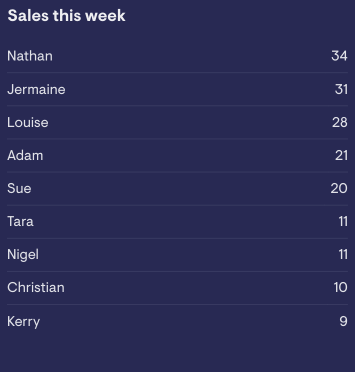
Leaderboard visualization
The leaderboard visualization consists of a ranked list of items, each with a label or value. Additionally, the leaderboard may show how the ranking has changed with upward and downward arrows. Use this visualization when you want to incentivise competition within your team.
Once you’ve selected the appropriate visualization, it’s also important to ensure that the data is presented in an accurate and meaningful way. This means using the right scale, labeling the axes correctly, and choosing appropriate colors and styles. For more on creating charts that effectively get across the meaning of your data, we’ve put together a series of data visualization tips.
Like data visualization, the design of your dashboard will affect how useful it is for team members. Our dashboard design guide will help you create dashboards that clearly communicate your key metrics and give your team at-a-glance insights into your current performance data.
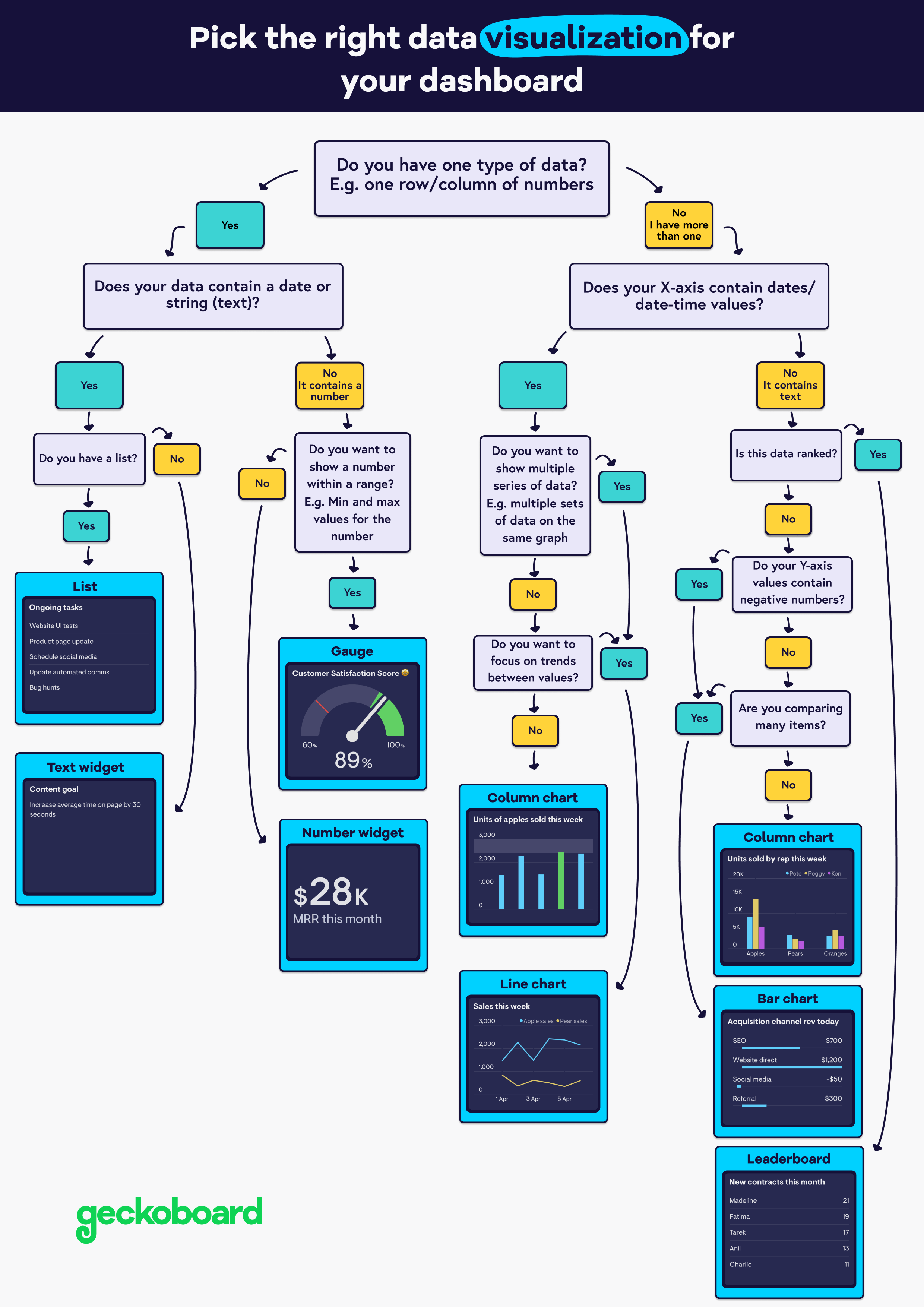
INFOGRAPHIC: Choosing the right visualization
Still need some help choosing the right data visualization for your dashboard? Check out our handy decision tree...
How many data visualizations should be on a dashboard?
There is no hard rule about how many visualizations a dashboard should include – it depends on the dashboard and its purpose. For example, some dashboards are perfectly effective with just a single visualization.
However, at the upper end, you should be careful about overloading your dashboard with information. Don’t include more visualizations than a user can comprehend at a glance. Our dashboard examples should give you a good idea of how other companies are designing their dashboards.
Can Excel be used to create a data visualization dashboard?
Excel is a very popular data visualization tool because it’s easy to use, versatile and widely available. It’s a great tool for collecting, analyzing and cleaning up your key metrics, but it's not the best way to communicate them with team members and stakeholders.
First, data in a spreadsheet can quickly become outdated, leading to decision making based on inaccurate information. Second, it can be difficult to format data in a way that is easy to understand at a glance. Lastly, downloading and opening a spreadsheet takes time and effort.
With dashboard software like Geckoboard you can turn your Excel spreadsheet into an effective wall-mounted Excel dashboard, where changes to the Excel file are displayed on the dashboard automatically.
