Recently we shipped a new Interactive View - currently in beta - that makes it much quicker to investigate interesting changes to your metrics in Geckoboard, without jumping into more complicated tools. It’s currently available on Zendesk Support, Intercom, Facebook Ads, Google Analytics 4, Google Search Console, Shopify and Stripe widgets, on all plans.
One thing that we’ve heard time and time again is that as good as Geckoboard is at drawing attention to certain mission-critical metrics, when some additional investigation is needed - perhaps a number is out of its normal range, or you need deeper context - then things can get a little more complicated.
Depending on the data you’re looking at, you might need to open up another browser tab and navigate various filters and dropdowns in the original source before you’re able to get a layer deeper than what you see in Geckoboard. Sometimes that data isn’t even available for you in the tool.
In any case, leaving your dashboard and jumping into another space can be a pain, especially if it’s just a straightforward insight you’re looking for.
This is exactly where the Interactive View shines - quickly investigating and diagnosing changes in your numbers that might represent a developing trend, opportunity or developing issue.
The sort of insights you can glean using Interactive View will depend on the metrics you’re keeping track of on your dashboards, but for a spot of inspiration, here are five examples of the beta in action across a few different data sources.
Give it a spin yourself and let us know how you’re using it!
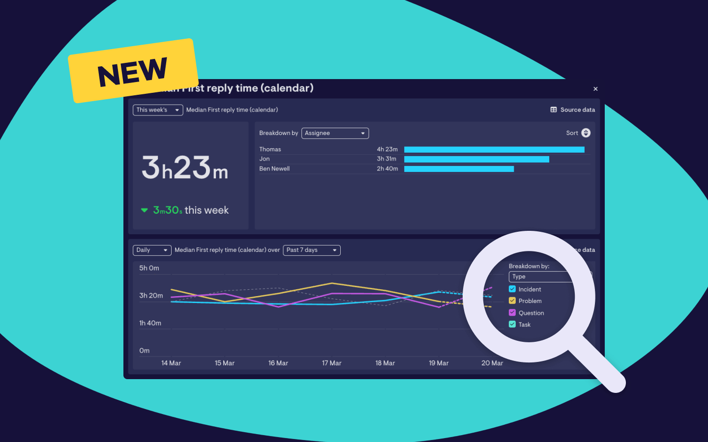
Digging into first reply time [Zendesk Support]
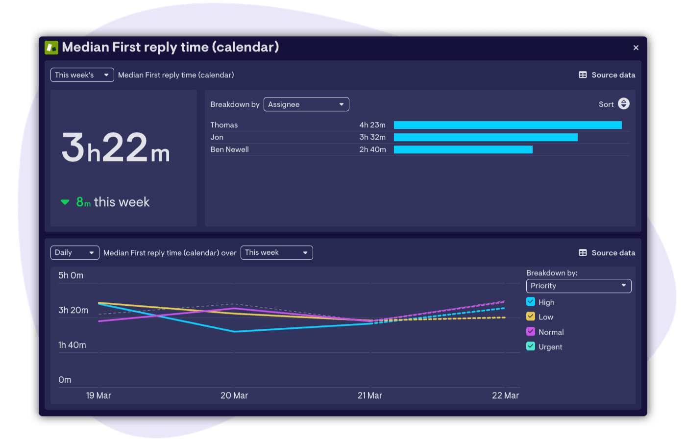
When it comes to customer support, many of the metrics that typically represent the standard of support customers are receiving, and the performance of the team, are rolled up aggregations or averages from across the whole team. These are useful to keep an eye on, but often they don’t tell the whole story. Behind an innocuous metric like first reply time, for example, there can be huge variations in the speed at which different agent are responding to tickets - which a single rolled up number can’t show.
Thankfully we can now quickly break this down in Geckoboard without having to do any further analysis in Zendesk itself, and in a click we can see which agents are responding quickly and which ones might need some help.
Balancing workload [Zendesk Support]
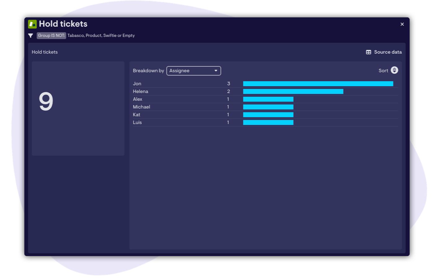
Speaking of helping support agents, one of the most important jobs we’ve learnt Geckoboard can help with is helping customer-facing teams to balance their workload, particularly when juggling multiple channels or queues. In this scenario, not only are we able to see how many tickets in the queue are currently on hold, but using Interactive View we can quickly see who they’re assigned to as well - something that ordinarily doesn’t make sense to have on our dashboard, but becomes useful when a certain number of on hold tickets is reached.
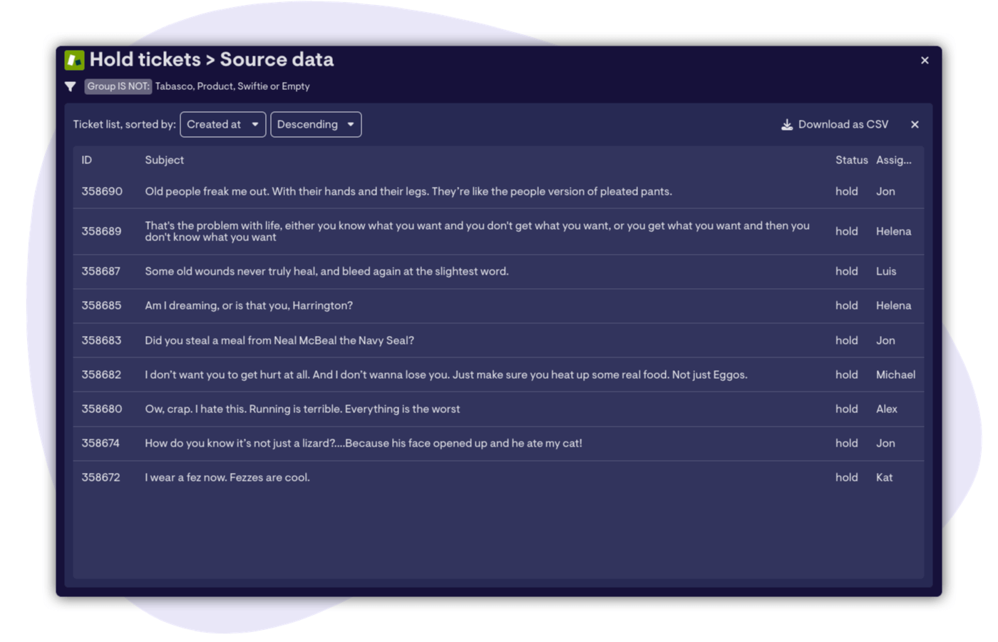
Something we’ve added that’s specific to Zendesk Support is the ability to open up a Source Data view for certain metrics, which lists the specific tickets that make up that metric. Ideal for quickly identifying specific tickets that need attention or spotting patterns.
Clicking a ticket in this view will also take you directly to the ticket in Zendesk in a new tab for further action. Handy.
Explore website traffic without opening up GA4 [Google Analytics 4]
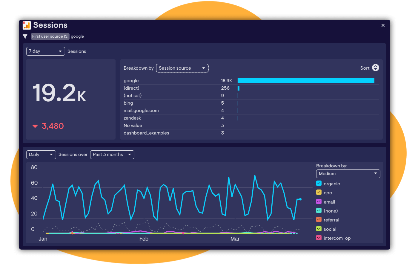
If, like us, you’ve recently moved over to Google Analytics 4, and “enjoyed” the “adventure” of learning a whole new way to get lost in your Google Analytics data, then Interactive View may make life a little easier. Answering a quick question about traffic sources that have been driving sessions on a website took under five seconds vs five minutes in GA4 in this example.
Checking a change in keyword ranking [Google Search Console]
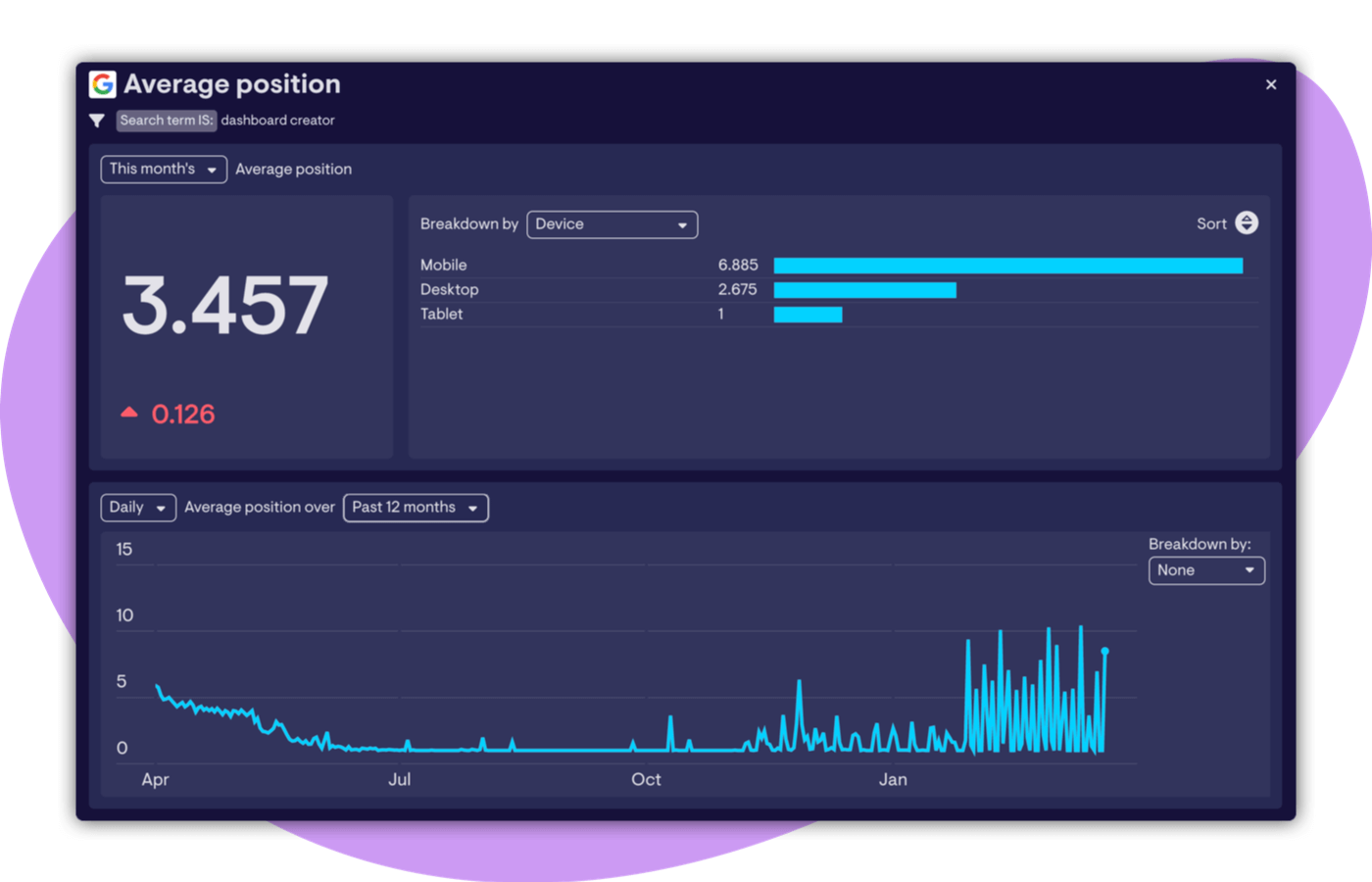
If your marketing mix leans heavily on organic search traffic, you’ll know that keeping track of all the hundreds of keywords that contribute to your marketing goals can be tricky to say the least. Monitoring your commercially important keywords on your dashboard using Google Search Console can give you peace of mind that you’re going to spot changes in position quickly - for better or worse…
In this example we’ve noticed a change in average position of “only” around 0.126 positions over the past week for this important keyword. But unpacking this has revealed that several weeks ago we lost what was a solid first place on Google for this keyword, and are now hovering around positions 3-4. Useful context that we can now plan some deeper analysis and improvements around.
Quickly add up the number of conversations closed [Intercom]
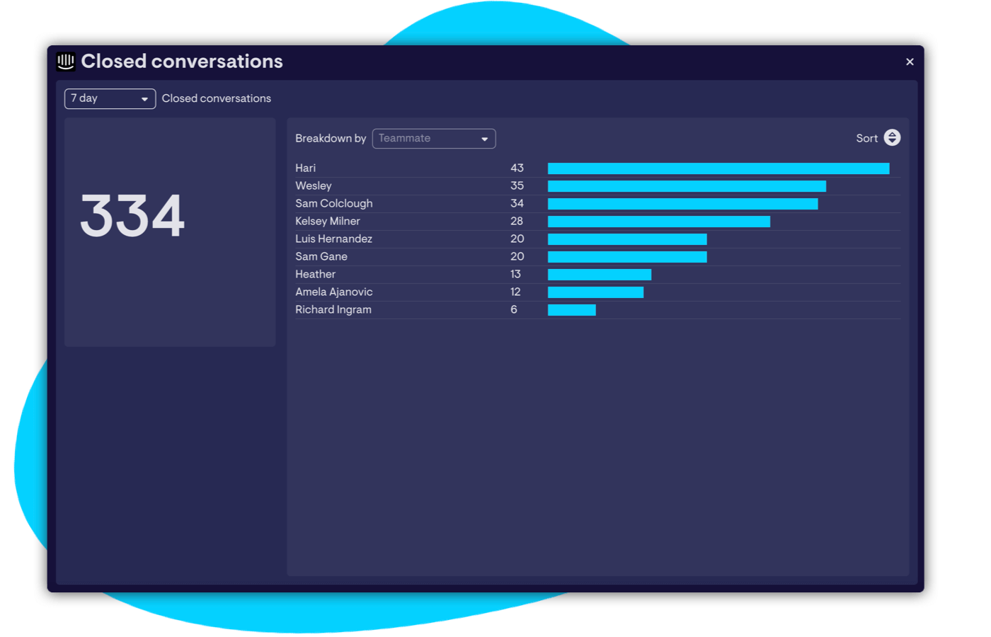
Whilst it’s useful to unpack an aggregated metric like we did in an earlier example, sometimes rolling several data points up into a single metric can be equally useful.
The data in this example is normally displayed on our CS dashboard as a leaderboard, showing which individuals have closed the most conversations in the past week. To get a total for the whole team, rather than building another widget or going into Intercom, the Interactive View has done this automatically. At the same time it's also let me quickly change the period from 7 days to 30 days to see if Hari’s week at the top is just a blip, or if he really is on an incredible run (spoiler: he is - bravo Hari!).
Want to try it yourself? Log in or create a Geckoboard account, and hover over widgets from the following sources: Zendesk Support, Intercom, Facebook Ads, Google Analytics 4, Google Search Console, Shopify and Stripe.
