This is the second of two posts where we look at the most effective data visualizations and describe how and when to use each one. The three visualizations we’ll discuss in this post are Number, Bar Chart, and Column Chart.
A well-designed dashboard displays actionable metrics and KPIs that are easy to understand at a glance. This means that the visuals for every key performance indicator (KPI) should inspire action.
As we discussed in Part 1 of this data visualization series, there are a finite number of appropriate data visualizations. Here are three more of the most common and effective ways to visualize data (sometimes referred to as widgets): Number, Bar Chart, and Column Chart.
Number Visualization
As we all know, a number is an arithmetical value, expressed by a word, symbol, or figure, representing a particular quantity. It is used in counting and making calculations.
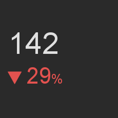
The number visualization is focused on the display of a metric that can be represented by a single number, along with optional associated secondary metrics, such as a change or trend indication.
Anatomy of the number
The number consists of a principal metric which can use a prefix like a currency symbol or a suffix such as a percentage symbol. For more context, the number can be shown with a secondary metric compared to the primary number through a visual indicator of a red down arrow or green up arrow. The second metric can be either absolute or compared to the principal metric as a percentage.
Labelling the number is optional, but recommended for clarity and context.
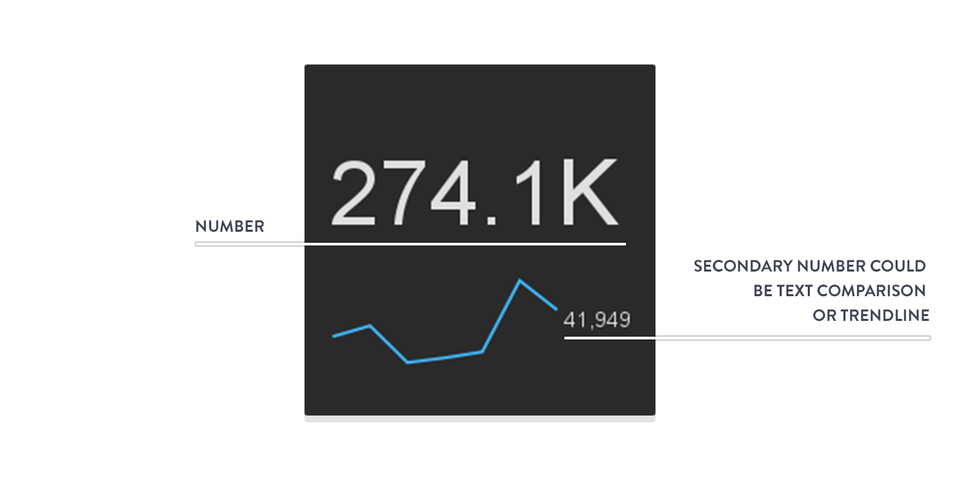
This visualization can also have an array of numbers displayed as a trendline below the primary metric (as the secondary stat).
When to use a number
Use this visualization when the number is the most important aspect of the metric you're displaying, such as today's sales or yesterday's website unique visitors.
The secondary statistic should be used to give context to the current value.
Example uses of a number
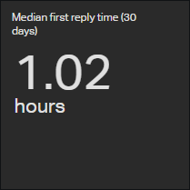
The number is very versatile and has a variety of configurations. We recommend using it for KPIs and metrics where the numerical value is of the utmost importance. For example, a key metric among customer support teams is first response time. A number associated with it is immediately understandable, hence a number is ideal.
Tips for creating numbers
- Decide on a clear title. The title should be a brief description of the data that you want to show.
- Add a secondary statistic to give context to the numerical value. For example, if your metric is "MRR added in the last 7 days", having a reference of how much MRR was added on the previous 7 days can serve as a barometer of how good or bad the number is.
Bar Chart Visualization
Bar Charts are a straightforward to convey the message behind the numbers with impact and meaningful clarity, hence making complex data easy to understand at a glance.
Both bar charts and column charts display data using rectangular bars where the length of the bar is proportional to the data value. Simply put, longer bars equal bigger numbers. Both are used to compare two or more values. However, their difference lies in their orientation. A bar chart is oriented horizontally whereas the column chart is oriented vertically.
The bar chart's discrete data is categorical and answers the question of "how many?" in each category.
Anatomy of the bar chart
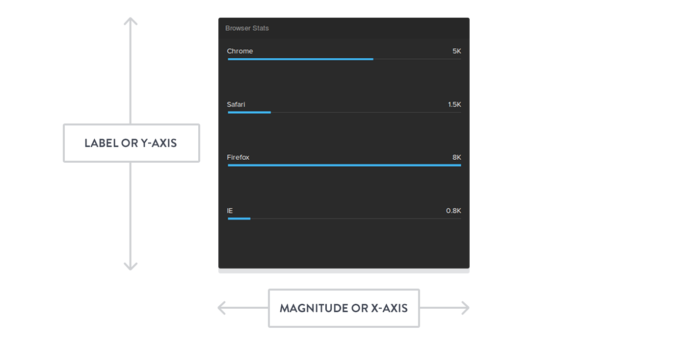
The bar chart is a diagram with numerical values of different variables represented by the length of bars. (Note that each bar is of equal width.) The bars are drawn horizontally (along the x-axis) while the data labels that describe them are situated on the y-axis.
When to use a bar chart
Bar charts are ideal for comparing the values of data that can be broken down categorically.
Bar charts are suitable when the number of categories is higher than four and lower than 15.
Column charts (discussed below) have limited space in the category axis. So, when your data labels are long, the category axis may look cluttered. Using a bar chart will improve the readability of your visualization.
Example uses of a bar chart
If you are building a sales dashboard, bar charts are great to visualize sales by region, sales by team or any other categorized KPI.
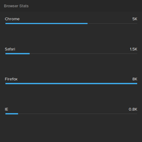
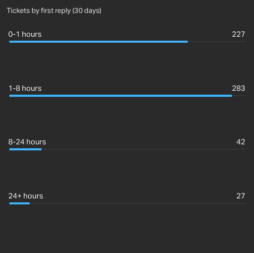
If you are building a customer support dashboard, bar charts are great to visualize support tickets by category, tickets solved per agent or even response times, assuming you have defined clear categories like in the following visualization.
Tips for creating bar charts
- Decide on a clear title. The title should be a brief description of the data that you want to show.
- Use the bar chart for a maximum of 10-15 data sets. When the number of data sets is larger than that, using a bar chart is probably not the best way forward.
- If possible, arrange the data sets in a descending order. This makes the comprehension of data much easier as your eyes follow a decreasing pattern. With the pattern, they can connect shape to value much quicker.
Column Chart Visualization
A column chart is similar to a bar chart, but the bars are plotted vertically. Data is represented by vertical rectangular bars with lengths proportional to the values that they represent.
The column chart's discrete data is categorical and answers the question of "how many?" in each category.
Anatomy of the column chart
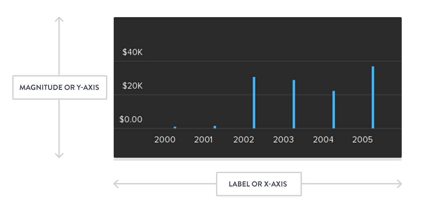
The column chart is a diagram with numerical values of different variables represented by the height of bars. (Note that each bar is of equal width.) The bars are drawn vertically (along the y-axis) while the data labels that describe them are situated on the x-axis.
When to use a column chart
A column chart can be used to facilitate all comparison-based analysis.
Column charts are suitable when the number of categories is higher than four and lower than 12.
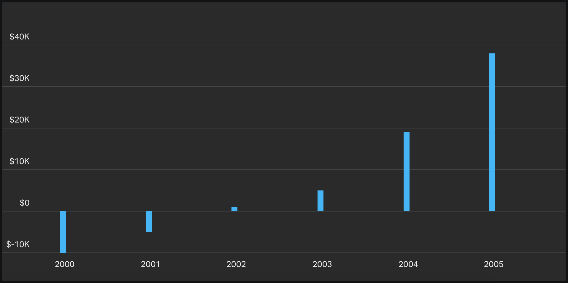
In a bar chart, negative values are displayed as bars on the left. Because we associate negative values more with downward direction (as used by the column chart) than leftward (as used by the bar chart) - we recommend using the column chart when you have negative values in your data set.
Example uses of a column chart
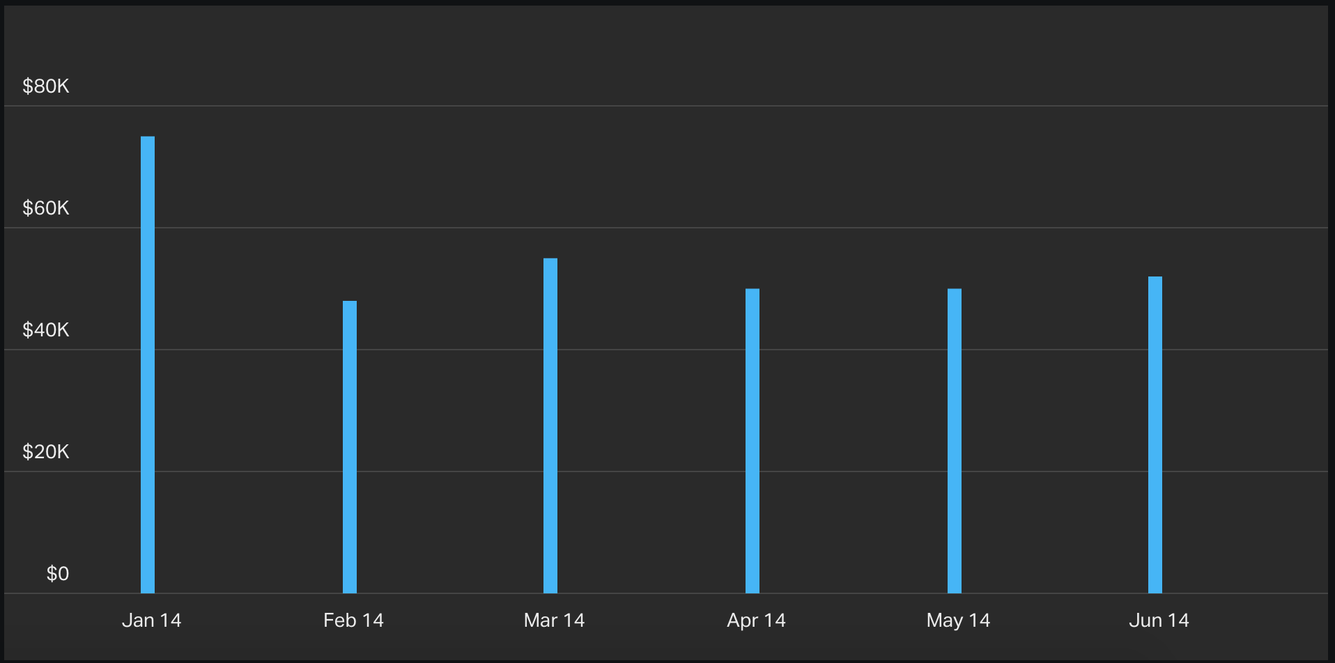
A typical use-case for a column chart is comparing values (i.e. a monetary value) over a period of time.
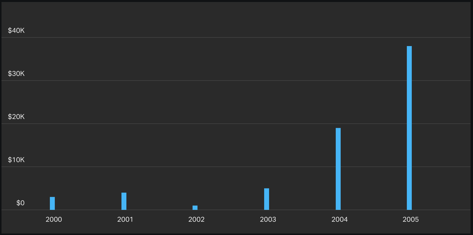
If you want to keep track of MRR added every month, the column chart is a great option because you can see at a glance if March was a better month than February. Or you had a special campaign to drive sales in January and you want to know if it paid off.
The following example shows MRR added on individual months:
If your data labels aren't long, you could use column charts in the exact same cases that you would use a bar chart.
Tips for creating column charts
- Decide on a clear title. The title should be a brief description of the data that you want to show.
- Use the column chart for a maximum of 10-12 data sets. When the number of data sets is larger than that, using a column chart is probably not the best visualization.
Start visualizing your key metrics
Now that you’re familiar with some of the most effective data visualizations, you can display your key metrics in a way that’s easy to understand and inspires action.
Create your own live dashboard to keep your team goal-focused and motivated. Need some dashboard inspiration? Check out these data dashboard examples.
