
Most business folks have (at least) a vague understanding of what a KPI dashboard is. But when it comes to creating your own – it’s not always so easy to know where to start.
All of a sudden, what you thought was a simple business practice presents lots of questions, which you don’t necessarily have answers to.
How do I know what metrics to include? How do I design my dashboard? What tools and software will I use to build my KPI dashboard? How will I manage my data? How will the dashboard actually improve our performance?
If that sounds like you, then this article is written for you.
We will cover what a KPI dashboard is, as well as the main types of management KPI dashboard, including examples.
We’ll also include some helpful resources to related topics such as setting KPIs, choosing dashboard software and dashboard design.
What is a KPI dashboard?
A KPI dashboard is a visual display of metrics and other information that helps you monitor your business performance at a glance. Ideally, a KPI dashboard should fit onto one screen, be easy to access and understand, and always be up to date (because you never know when you might need to check it).
A KPI dashboard is so called because it displays Key Performance Indicators (KPIs). A KPI is simply a metric that measures performance, which you have deemed to be important.
How is a dashboard different from reporting?
Perhaps the best way to convey what we mean by a KPI dashboard, is to understand how they are different from reporting.
With reporting, we normally undergo a set process.
- We collect data from a specific time period
- We then process and analyze that data
- Before presenting our findings in the form of a KPI report.
Even though you may automate parts of this process, reporting usually takes place at set intervals. Reports generally help you make medium to long-term decisions.
A dashboard, on the other hand, should always be available – giving you important high level information on how your business is performing right now. (Just think about a dashboard in a car – if it wasn’t up to date, it wouldn’t be very useful.)
Everything about a KPI dashboard is designed to work ‘at a glance’ – from the design (clear, efficient data visualizations and layout) to the refresh rate (as close to real-time as possible) to the choice of information (only the most important metrics).
Businesses use two main types of dashboard – performance dashboards and monitoring dashboards.
What is a performance dashboard?
A performance dashboard is designed to help you or your team understand how you are currently performing against your targets, so you know how to improve.
Normally, managers set up these dashboards during (or shortly after) a period of goal setting. For example, you’ve just set your annual sales targets, or you’ve introduced an OKR framework, and you want a dashboard that reflects your current OKR progress.
Performance dashboards are useful because they promote accountability, motivation and a sense of friendly competition. They also help to reiterate your business goals, long after you've set them. (Because what’s the point of goals that get forgotten after a few weeks?)
What’s more, by visualizing the metrics that matter, you can help your team focus on the areas that will create the most impact. Typically, a performance dashboard doesn’t just include overall targets – it can also include metrics you want your team to focus on improving. For example, a sales dashboard that includes conversion rate, as well as overall sales.
What is a monitoring dashboard?
A monitoring dashboard on the other hand is something we use to check the health of a system, and instantly flag if something has changed or needs attention. It doesn’t include goals necessarily, but it might include benchmarks for when KPIs are good, normal, or need urgent attention.
Monitoring dashboards are good for staying on top of important processes and speeding up your reaction times.
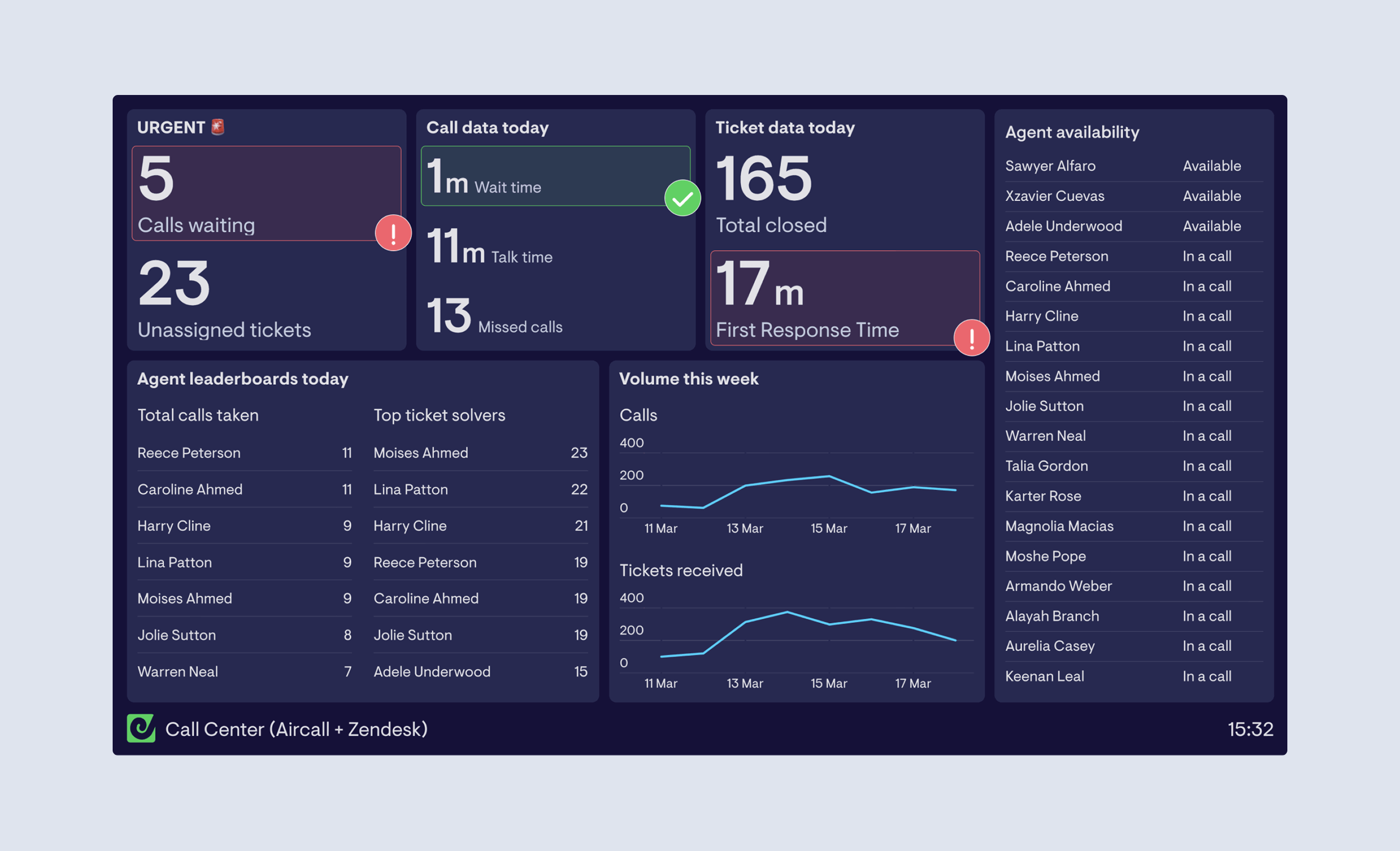
A call center dashboard is a typical example of a monitoring dashboard. At a glance, this shows you important information, which is helpful for managing your day to day operations.
You can see how many customers are waiting to be connected, and what the average wait time is. And if your KPIs ever rise above, or fall below a certain level, you can react quickly to address the situation.
Dashboard examples
You can browse over 70 dashboard templates and examples on the Geckoboard website. We’ll include a few of our most popular examples here.
Customer Service Dashboard
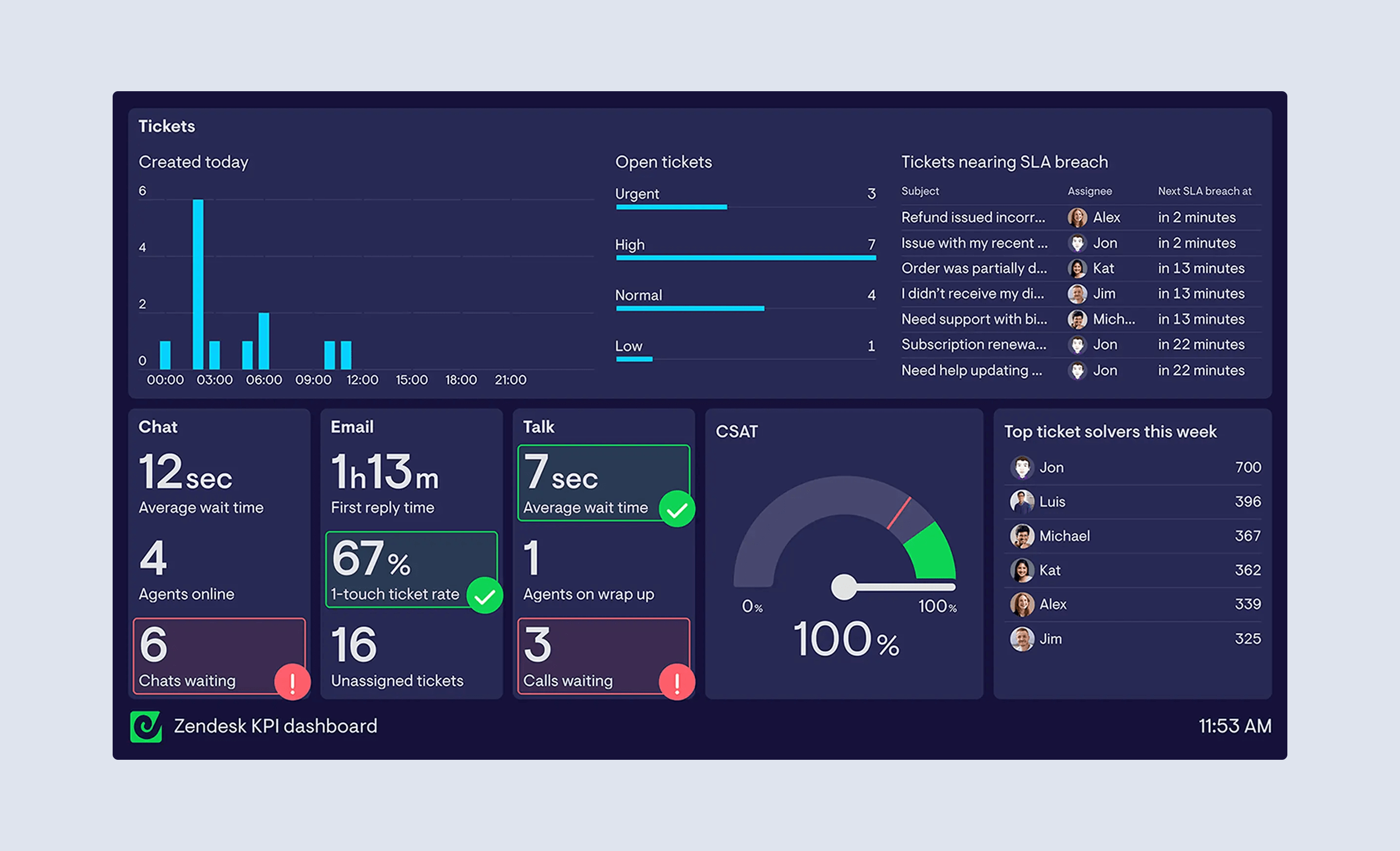
This customer service dashboard is a good example of a monitoring dashboard. It’s designed to be used by a Customer Service manager who is responsible for multiple support channels – Live chat, Calls and Email.
If the support manager notices that one particular channel is becoming overwhelmed by customers, the dashboard will alert them, allowing them to quickly reassign members of the support team to provide the best customer experience.
More Support dashboard examples
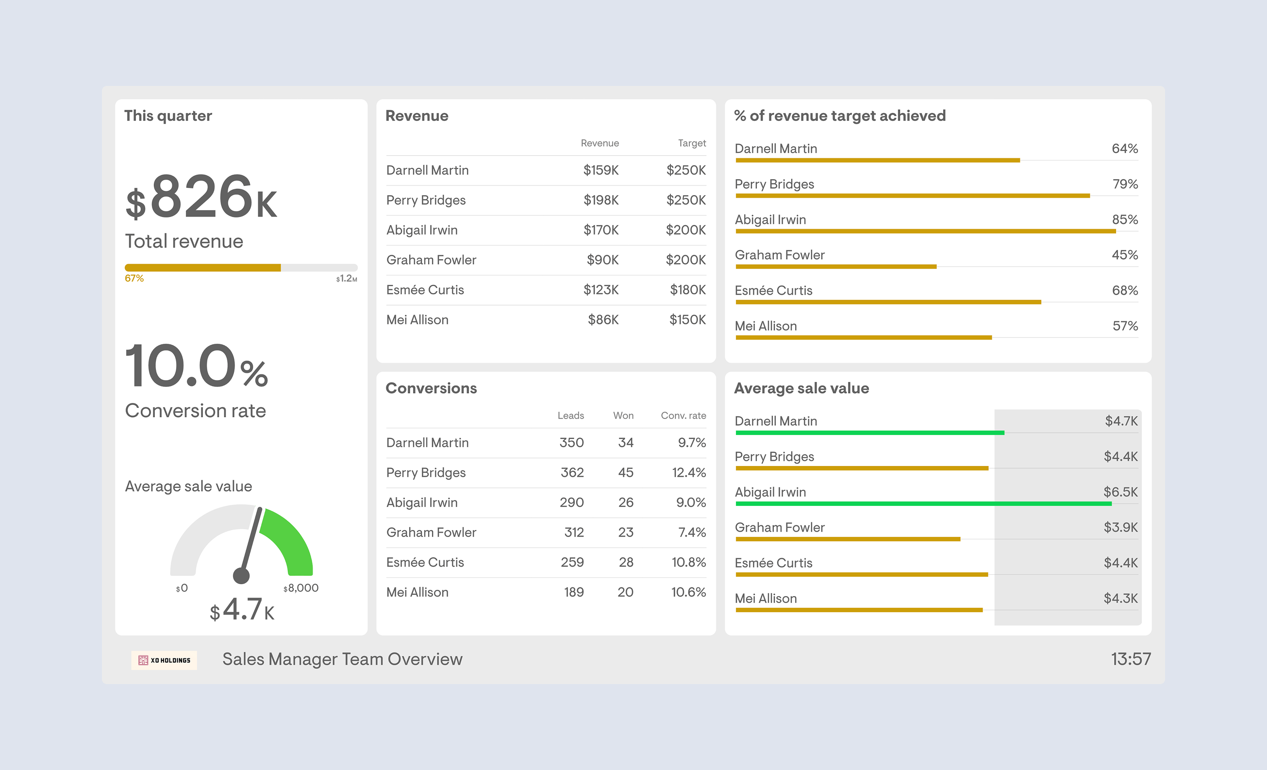
Sales Dashboard
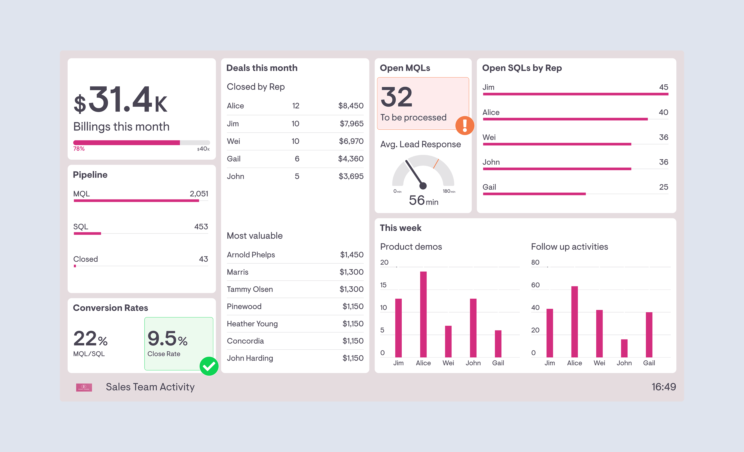
This sales dashboard is an example of a performance dashboard. Not only does it show the sales team how they are performing in relation to their overall target, it shows several supporting sales performance metrics. These include close rate, customer acquisitions and activity in the pipeline. This helps the sales team members take ownership and accountability of the full sales pipeline performance.
Ecommerce dashboard
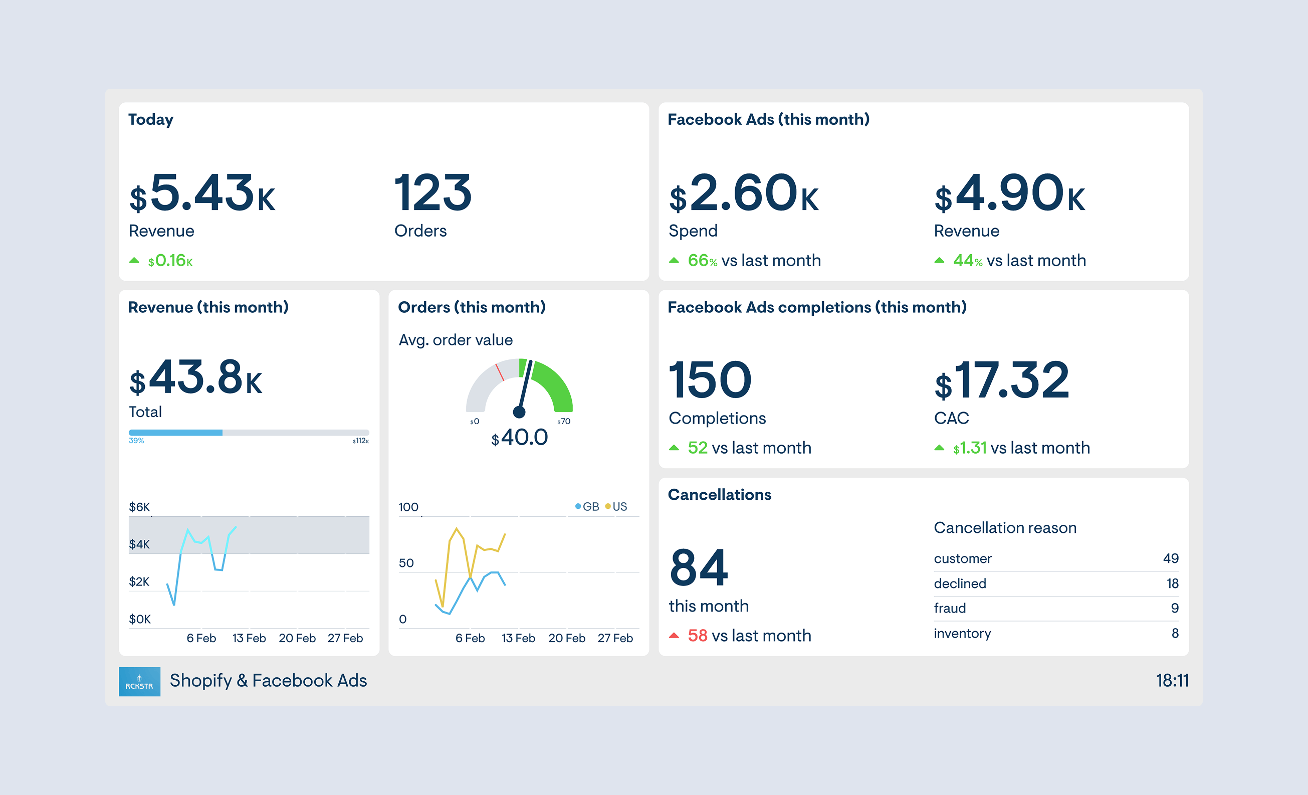
This dashboard has been designed to monitor KPIs, set by an ecommerce store owner. It displays metrics from different data sources – Shopify and Facebook ads. These are platforms which can be quite time consuming to access via their reporting tools. By visualizing real-time metrics from both platforms on one dashboard, you can save time and increase your responsiveness to important changes.
More Ecommerce dashboard examples
OKR dashboard
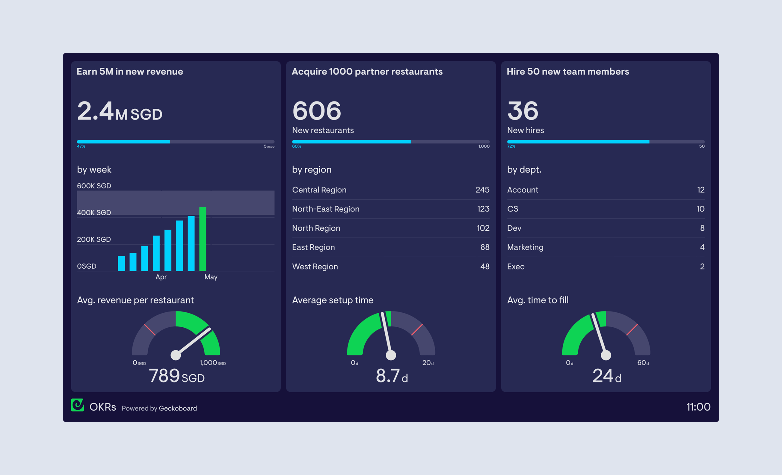
This OKR dashboard is an example of a performance dashboard. Specifically, it has been designed to support a goal setting process known as Objectives and Key Results (OKRs).
More Executive dashboard examples
How to design an effective dashboard?
Designing your own dashboard can be a tricky process. That’s because the best dashboards are, to a large extent, unique to the business or team they are intended to support.
We’ve put together a simple guide to designing an effective dashboard, which breaks the whole process down to 12 simple points.
- Be clear about what you're trying to achieve – your dashboard’s purpose will inform its design
- Only include what’s important – everything should support your board’s intent
- Consider data ink ratio – avoid decorative elements that don’t communicate data
- Round your numbers – being overly precise can get in the way of important changes
- Use the most efficient visualization – a good visualization should be understood quickly
- Group your related metrics – make your metrics easy to find
- Be consistent – using the same visualizations and layouts makes comparing easier
- Use size and position to show hierarchy – make it clear to the viewer what’s most important
- Give your numbers context – help your viewers know if a number is good, bad, normal or unusual
- Use clear labels for your audience – keep them short and self explanatory
- Remember it’s for people – it’s ok to break the rules if it increases engagement
- Keep evolving your dashboards – check that your dashboard is encouraging the right behavior
Read our full dashboard design guide
How to choose the right dashboard software?
Choosing the right software to build your dashboard can be an overwhelming process. There are countless different tools and software which offer KPI dashboards, from the humble spreadsheet to the most sophisticated BI tools and data platforms.
That’s why we put together this dashboard software buyer’s guide, which is designed to help you choose the right dashboard software for your own business needs.
