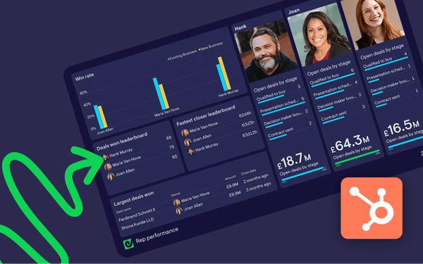
With easy access to more data than we’ve ever had before, it’s important we don’t make logical errors that lead us to false conclusions.

“We’ve noticed that people who share during their trial tend to be more likely to convert. How can we get more people to share during their trial?”

“It looks like people who use the product at least twice in their first week have higher levels of retention. How do we get more people to come back?”

“People who use this feature end up subscribing to more expensive plans. How do we get more people to use it?”

Have you ever started a project based on an observation like this?

On the face of it, these seem like data-informed insights: we’ve noticed a link between user behavior and a desirable outcome, and want to increase the behavior to increase the outcome.

But it’s not quite as simple as that.

While each of the observations is factually correct, there’s an implicit assumption that’s been made before posing the question. Let’s look at the first example in more detail:

We’ve noticed that people who share during their trial tend to be more likely to convert.

Cool. Seems reasonable.

How can we get more people to share during their trial?

Danger!

Why are we asking this question? Because we want more people to convert, of course. But in asking this question, we’re making a big leap: we’re assuming that getting more people to share during their trial will directly lead to more people converting. We’ve assumed causation — that A causes B to happen — where the data only gives us correlation — that there is a relationship between A and B. This is known as the post hoc fallacy.

Finding and proving causality is hard, so in all likelihood if we were to use this observation as evidence to embark on a project where the measure of success is “increased sharing during trial” we won’t see a corresponding increase in conversion. In fact, assuming that we do manage to increase sharing, we’d see the strength of the relationship between sharing and conversion decrease if there’s not a causal relationship between the two.

I’ve been guilty of making this mistake early in my career, and I continue to hear it from others to this day. It’s a problem that seems to have become more prevalent as data collection gets easier and tools to analyze it become more accessible to everyone. It can be easy to get caught up in the excitement of thinking that you’ve uncovered a pattern and that because it comes from data it must be objectively true. But the ability to step back and analyze the situation is crucial to avoid making this kind of mistake.

Why it worked for Facebook

Facebook’s ‘7 friends in 10 days’ is probably the most famous example of the type of observation I’ve described above. However, contrary to what I’ve suggested, by doubling down on improving this metric Facebook did see massive success. How can this be?

To recap, the social media giant found that people who reached 7 friends in 10 days were far more likely to remain engaged with the product than those who didn’t. So they asked the question “How can we get more people to reach 7 friends in 10 days?”, and spent a lot of time and effort increasing the number of people who met this condition.

Superficially, this set-up looks similar to the ones that I trashed above, but there’s a crucial difference: there’s a causal explanation as to why Facebook’s observation might cause the behavior they want to see.

Think about the implications of reaching 7 friends in 10 days: it means that your Newsfeed is likely to have fresh cat videos, baby photos, and fake news each time you log in, several times a day. It’s directly linked to the progress that Facebook is trying to help users make: to never be bored while stuck in a queue.

Of course, you could argue that I’ve just provided an after-the-fact explanation. Was the team at Facebook thinking about whether there was a causal explanation? Who knows! Even if they had, how would you be able to distinguish between a genuine cause and a compelling story that makes logical sense but has no basis in reality?

It’s here where cold, hard numbers play their part. By forming a hypothesis — for example, that helping more users to reach 7 friends in 10 days will result in a corresponding increase in engagement — then carrying out experiments to impact this metric and measuring the result, you can verify whether or not there’s any causal link between the two, or whether you’ve overlooked a more fundamental issue.

A better source of inspiration

At the end of the day, it’s important to remember that our role as product builders is to help people make progress in their lives. Once you understand what success looks like for your users, it’s much easier to get a feel for whether a pattern in the data is likely to be causal or correlative. Data is important —and  necessary! — to help us to assess the success and impact of our efforts, but rarely do great features that users love come from asking “How can we make people do X more?”