
When setting out to build a dashboard to display key metrics, there are several different approaches you can take - each with their own pros and cons to consider. Here we’ll walk you through some of the most popular approaches to help you decide which type of dashboard will best serve your needs.
First though a quick caveat.
What is a KPI dashboard anyway?
When you think about what a dashboard is, a few things likely come to mind. You probably imagine it’s something you can look at, that shows some useful data. Nothing controversial there. Data might be presented using a few different visualizations. You might also imagine being able to change or define what data is presented on the dashboard.
But dig a little deeper and you’ll start to realise that there’s more to dashboards than simply visualizing data. Consider the following questions:
How is the dashboard consumed? Is it designed for a big screen, a PC monitor or a phone screen? Or is it embedded in a bigger tool or product?
How interactive does it need to be? Do you need to ‘interrogate’ the dashboard by drilling down into the data to get something useful or can you see most of what you need just by looking at it?
Does the dashboard surface real-time data for use throughout the day, or is it more for identifying and analysing long term trends?
Who is looking at the dashboard? Will it just be you or close colleagues, or does your dashboard need to appeal to other stakeholders?
The nature of a dashboard can change radically based on the answers to these questions. Nick Desbarats, a thought leader on the subject, reckons there are 13 different types of dashboard that all serve different use cases and business scenarios, and we think there might even be a few more.
So, to avoid any confusion, in this guide we’re specifically focusing on dashboards that:
- Help you and others in your business monitor important business metrics and KPIs
- Focus mainly on fast-moving data that changes throughout the day or week
- Are intended to spark action quickly
What does building a dashboard involve?
In order to compare the different approaches to building dashboards, it’s worth quickly touching upon the key tasks a dashboard has to perform:
- Getting hold of the data you want to display
- Making the data accessible
Getting hold of your data is almost always the biggest challenge. More often than not, the data that’s useful to look at is spread across multiple 3rd party software tools like Google Analytics, Zendesk, Salesforce, Shopify, and Mixpanel, as well as services specific to your industry or niche. The challenge of accessing your data is more acute the more sources you use and the faster you need your data to update.
When it comes to making your data accessible, the dashboard’s job first and foremost is to display your data using appropriate, easy-to-digest visualizations. Here, simple is always best - even something as seemingly straightforward as a line chart or bar chart can cloud the message if certain dashboard design principles aren’t followed.
In addition, there’s also a question of logistics. If dashboards aren’t easy for your intended audience to access, then it’s unlikely they will be looked at frequently enough (or at all!), making the whole exercise of building them a pointless waste of resources. “Build it, and they will come” rarely applies to dashboards, especially if you’re sharing them with colleagues for whom data is a secondary part of their job.
Building dashboards: some approaches
With all this in mind then, let’s look at some of the ways you can create a useful dashboard and share it with others.
Using built-in reports
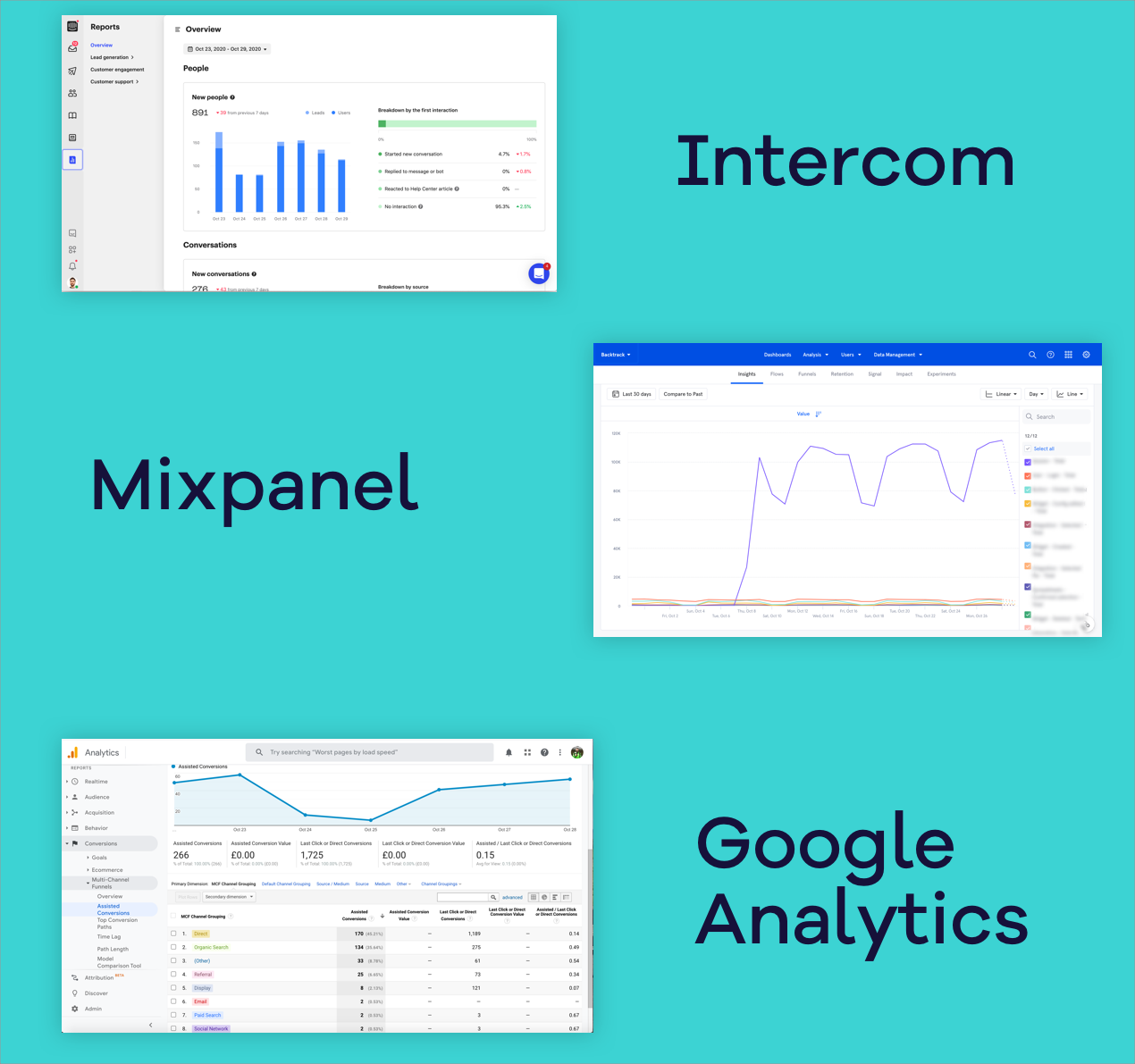
The first port of call for most people when it comes to visualizing data from a specific service is to use the reports provided by the service itself. Almost all tools now offer some kind of built-in reporting and some, like Mixpanel, are very advanced.
A big advantage to built-in reports is there’s no work to extract the data because it’s already there, and you’ll normally have access to the full range of metrics and filters available. And, because the dashboards are provided by the service itself there shouldn’t be any issues with data discrepancies (although this can happen!). Built-in dashboards may also be free to access if you’re already paying for the service, although it’s becoming increasingly common for platforms to charge a premium or require you to subscribe to a more expensive plan to access reporting features.
The main disadvantage though with using the stock dashboards built in to your software is that they’re limited to just showing you data that just comes from that one tool. If you’re a marketing team you can’t see your social media stats alongside your email open rates, paid ad spend, and web analytics for example.
Another big disadvantage is providing access to the reports. Typically you need to be a user of the service with your own log in to access the reports, and often an administrator at that. Depending on the service, this can work out to be prohibitively expensive - you don’t want to be buying extra Salesforce seats just so your execs can access the dashboards for example. Also, if you're trying to expand who looks at the dashboards, the friction of them having to log in to multiple unfamiliar tools and navigate to the right dashboards, is likely to prevent them from doing so regularly.
Finally, for many services, built-in reporting is only a secondary concern, meaning the extent to which you’re able to customise the dashboard can be quite limited, both aesthetically and in terms of the data you can show. Some services also limit how often dashboards can be refreshed making them unsuitable for real-time dashboards.
Pros:
- Often free (although can be expensive if you need to pay for more users)
- Data is already there
- Usually simple to set up
Cons:
- Limited to just data from that service
- Quality and flexibility dependent on the service
- Limited sharing options (usually you’ll need to be a user of the service)
Building a spreadsheet-powered dashboard
Spreadsheets are the simplest and most common method for building a custom dashboard. They’re also incredibly versatile.
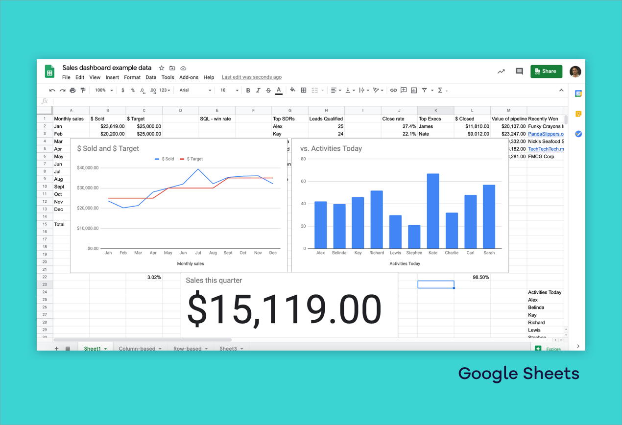
The beauty of using Excel or Google Sheets to build your dashboard is there’s no coding required, no learning curve, no added cost, and almost no limits on what’s possible. With a little effort, data from multiple sources can be fed into your spreadsheet, and it’s easy to use calculations to clean up the numbers you want to show.
It’s also frequently the case that some of your data only exists in a spreadsheet. This is true of both large enterprises and smaller companies. Startups often use spreadsheets as a basic CRM or CMS before implementing a dedicated tool. Larger organizations use spreadsheets, even when there’s a wealth of other BI tooling available, because they allow teams to make progress themselves without specialist help.
There are some excellent tutorials on how to turn your spreadsheet into an attractive dashboard, and although they're fiddly, the results can be good if you have an eye for design and some time on your hands.
The big drawback of the spreadsheet approach is the effort required to get data in from your cloud tools and keeping it up to date. Often this requires someone to do some manual copying and pasting of data, which can be workable as a temporary solution if your dashboards only need to update weekly or monthly. But if whoever does the updating is off then you’re going to be stuck with out of date reports. It’s also quite easy to make mistakes. To help with the workload some companies hire Virtual Assistants for the task. Even then though it’s not practical to use spreadsheets if you need your dashboard to update frequently.
There are some solutions though like Supermetrics and Zapier that can be used to automatically import data from some sources, however, they can be a little fiddly to set up, and other similar ‘workflow-building platforms’ struggle with importing useful data from more complex APIs.
The second main drawback with using spreadsheets is that sharing the final dashboard can be awkward. If the spreadsheet is hosted in the cloud you can just provide a link - but presenting someone with a spreadsheet generally doesn't make for a good user experience. It can be overwhelming and hard to know what to look at, and providing access to raw data in the spreadsheet can be an invitation for misinterpretation or breakages to creep in. To avoid this people often resort to emailing a screenshot. This can be effective, but is another manual process, and whatever your numbers might be, the result can look underwhelming.
Pros:
- Free
- No learning curve
- Highly customizable
- Easy data manipulation
Cons:
- Data usually has to be entered manually so not suitable for real-time dashboards
- Difficult to make attractive dashboards
- Limited sharing options
Coding your own dashboard from scratch
If you are a software engineer, or work with some, one option that’s available to you is to code your own dashboard from scratch. Developing your own dashboard offers the ultimate flexibility when it comes to how your dashboard looks and behaves - you can pretty much do anything if you’ve the skill, time, and effort. However, unless you have very simple requirements, time on your hands, or your in-house developers have time to dedicate to it, it’s likely to be prohibitively expensive.
Tip: if you’re considering building your own dashboard from scratch (or any other internal tooling for that matter), it’s worth playing with this Build Vs Buy calculator from Baremetrics to weigh up whether it’s worth the effort
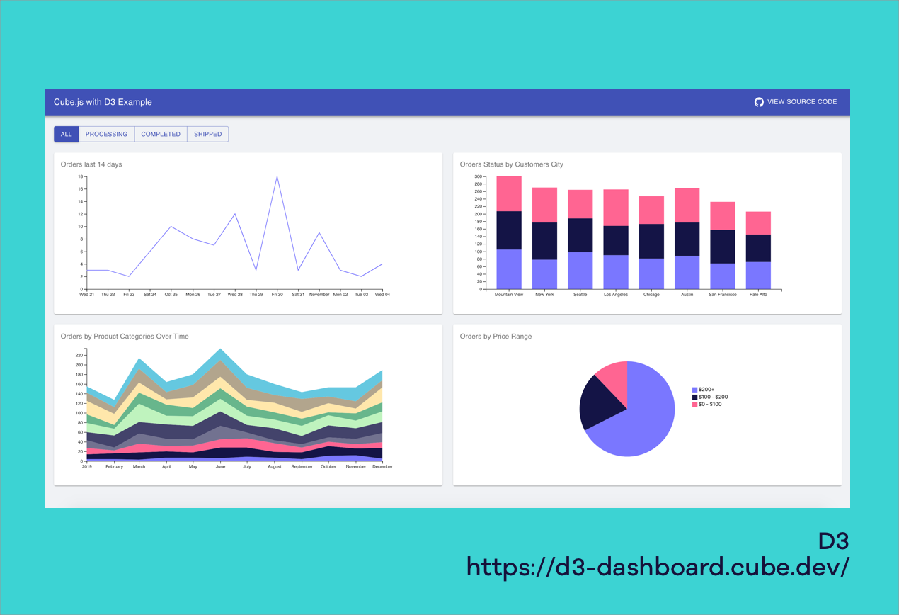
On the data visualization side of things there are some great libraries like D3 that will do much of the heavy lifting for you. There are also more comprehensive open source dashboard solutions like Grafana.
If all your data is already available in your own databases then stitching something together should be achievable in a couple of days. You’ll need to work out where to host your application and ideally add some layer of security, but usually this isn’t too challenging.
The difficulties come when you need to extract data from 3rd party services though. How much effort this adds varies hugely depending on the service, but you could be looking at several weeks upfront, with ongoing maintenance on top of that. In addition, some data may be prohibitively difficult to obtain due to limitations of the APIs you’re working with, and APIs often change (or break) with little warning.
Also it’s important to remember that most successful KPI dashboards never stay the same for very long. KPIs change as business goals shift and learning which metrics are useful to keep track of and how to visualize them can take many iterations to get right. This places extra importance on being able to quickly swap KPIs in or out on your dashboard - something that can be cumbersome unless you’ve taken this into account from the off.
Pros:
- No extra software costs
- Full flexibility - anything’s possible
Cons:
- Likely to require significant engineering time to set up and maintain if working with 3rd party APIs
- Cannot easily be edited by non engineers
- Must be self hosted
- Likely to lack functionality as everything must be implemented from scratch.
Business Intelligence (BI) Tools
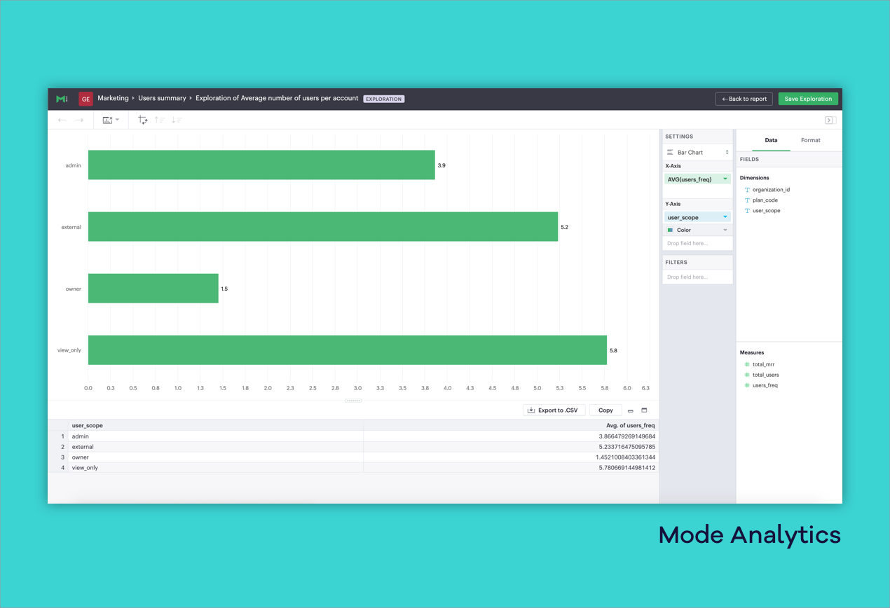
If you’re a more mature organization you may have a dedicated business intelligence team that uses dedicated BI software like Tableau or Looker. On face value it may seem these tools have everything you could possibly need when it comes to presenting data. However, they’re rarely an appropriate choice for building KPI dashboards, starting with the cost involved.
BI tools cater for analysts doing complex data investigations on a daily basis, and can produce game-changing insights in the right hands. But the cost involved can be considerable, with licenses often running into tens of thousands of dollars a year. On top of this, to get the most out of these tools, companies often need to hire considerable expertise to build and maintain reports.
BI tools tend to focus on integrating with database tools, rather than cloud software. And whilst technically they are able to produce advanced interactive dashboards, the fact they’re primarily intended for analysing big datasets and longer term trends makes them unsuitable for KPI monitoring dashboards in almost all cases - especially so if you’re a small business. It’s just not what they’re intended for.
If you’re already shelling out for a BI Tool you may face internal resistance to using a separate tool, but once an exec has seen how much faster and simpler it is to achieve what they need with a purpose built dashboarding product, it might change their mind.
Pros:
- Powerful data visualization and processing
- Can answer complex business questions
Cons:
- Very expensive
- Difficult to set up
- Overly-complicated data visualizations
- Limited integrations with cloud-based services
- Data is rarely real-time
Dedicated KPI dashboard software
If you’re looking to build a KPI dashboard using any of the approaches so far, you’re likely to have to compromise on something, whether it’s time, cost, ease of integrating your data or how the dashboard is accessed.
However there is a whole new category of software emerging that specialises in the sort of cost-effective, quick-to-build, real time KPI dashboards we outlined at the beginning of the article, and that’s dedicated KPI dashboard software.
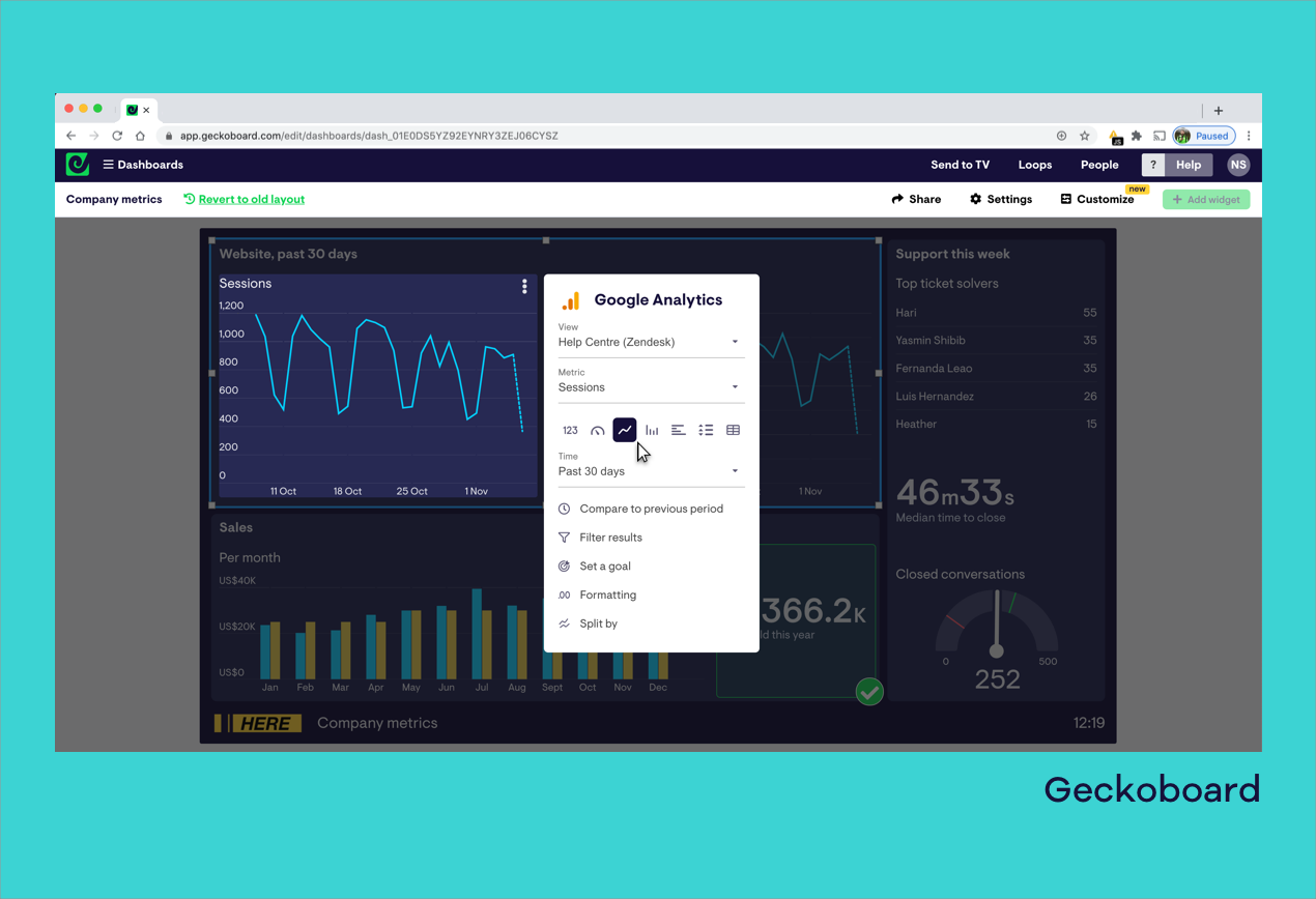
Geckoboard, the tool we make, fits into this emerging category. It’s designed from the ground up to make building and sharing live KPI dashboards as simple as possible, from pulling in data from the different tools and services you’re using, to visualizing it, and then making that accessible for others.
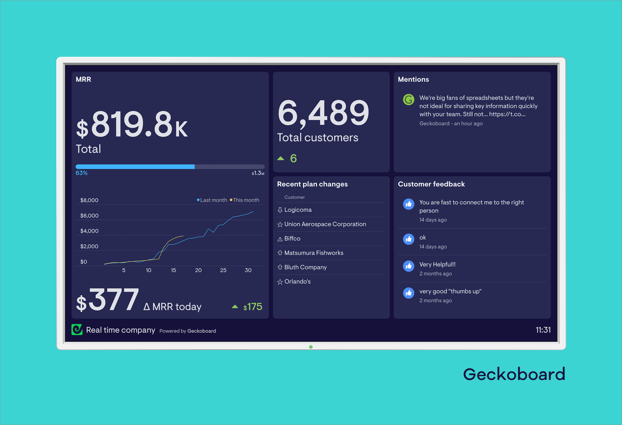
One of the most powerful features of platforms like Geckoboard are integrations with popular tools and services that make it easy to pull real time data into your dashboard, even if you’re not a developer. Different KPI dashboard software platforms tend to skew towards integrating with data sources that fit specific departments in a business, for example marketing or sales. Geckoboard takes a broader approach, and integrates with data sources that are useful for teams across the whole organisation, with data sources like Google Analytics, Zendesk, Intercom and Salesforce getting equal treatment.
Dedicated KPI dashboard software tends to give you a straightforward interface to build your dashboard, meaning you can generally go from nothing to a finished dashboard in minutes, with no-coding. In addition, when you want to update the metrics, KPIs or goals on your dashboard, it’s just a matter of logging in and quickly swapping things out or tweaking a setting, without having to go through lots of extra setup. Some platforms are trickier to use though; Geckoboard puts a particular emphasis on ease-of-use, meaning you won’t have to adjust to new concepts or spend hours watching tutorials.
Another huge advantage of dedicated KPI dashboard software is the lack of maintenance required. Once you’ve made a dashboard, all the heavy lifting of making sure data is up-to-date and reliable is taken care of. If there are any changes to an API, that’s also handled behind the scenes without you having to update the connection to the service yourself.
One final advantage of using dedicated KPI dashboard software is the variety of ways you can make your dashboards accessible to others on your team or elsewhere in the organisation. With no extra effort, the same dashboard can be shared by inviting colleagues to your account or by sending them a link to a live dashboard in an email or chat. In the case of Geckoboard, you can also give colleagues access to view dashboards on their mobile devices, post your dashboards automatically to Slack every day, or for maximum visibility, display your live dashboard on wall mounted screens in the office.

If there are any downsides to using dedicated KPI dashboard software to build your dashboard, it’s the level of flexibility they offer. If there’s functionality you specifically want that isn’t part of the service, you can’t just assign your own developers to build it (although Geckoboard’s API means you can integrate your own data sources if you want). You’re also more limited in terms of visualization and aesthetics.
On the flipside, you get a lot more out of the box like goal visualizations, status indicators and even custom dashboard theming, and because things are ‘on rails’ it’s easier to avoid common dashboard design fails.
Pros:
- You can be set up in minutes
- No coding required
- Pre-built integrations make real-time dashboards possible
- Quick and easy to make changes or spin up new dashboards
- Several ways to share with your team eg. on big screens
- Dedicated support team
Cons:
- Not as flexible as building your own
- Requires monthly or annual subscription
If you’re looking to build your own KPI dashboard, it’s easy to get started with Geckoboard’s free trial. Connect your data sources, build and share as many dashboards as you want completely free for 14 days, then pick a plan that works for you, starting at just $28/month. Get started.
