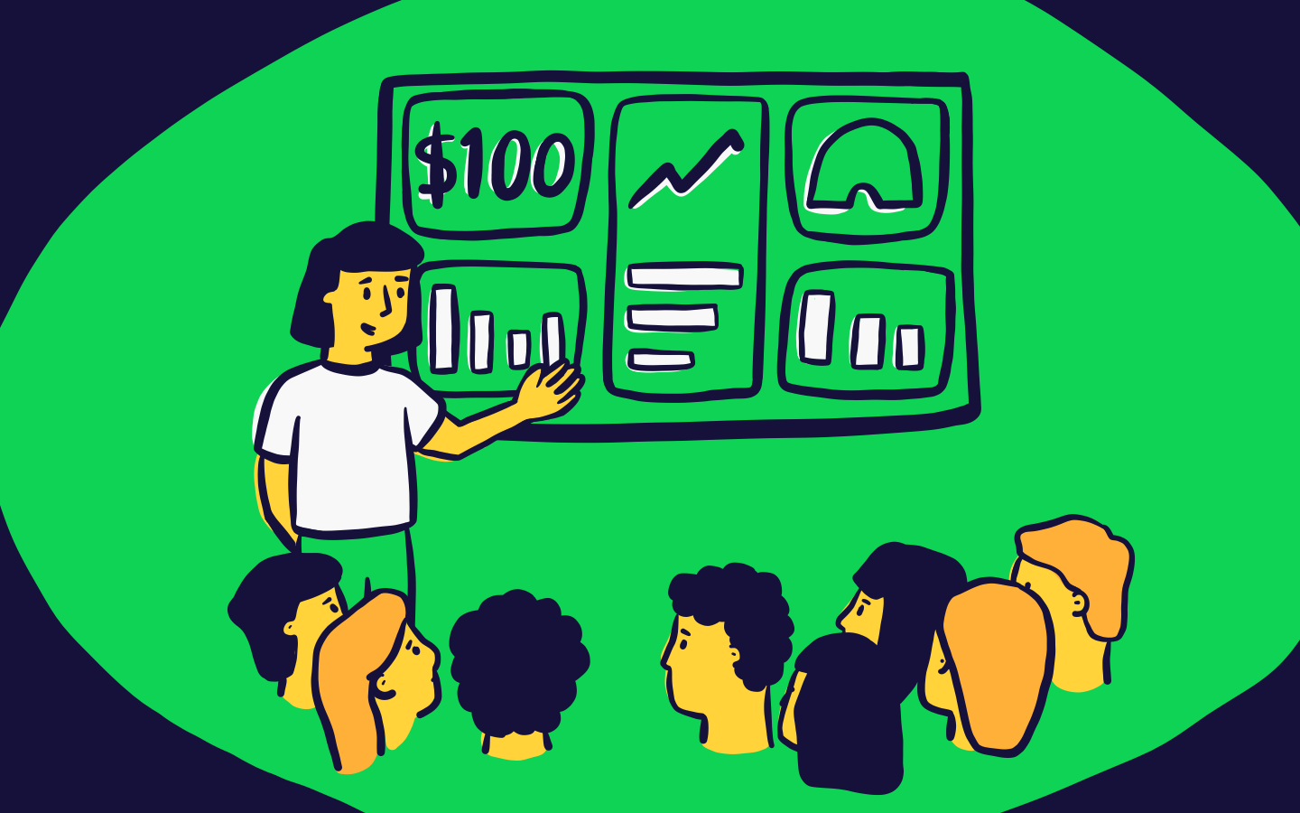
We don’t think it’s an overstatement to say that an effective dashboard can genuinely change how a business operates.
We live in an age where even small companies can be sitting on millions of data points. Yet too often, valuable information goes unseen (or at least – unseen by the right people at the right time). Dashboards make sure your most important data – the data that can shape decisions and drive action – remain in sight and front of mind.
What is a dashboard?
A Business Dashboard (or a Management Dashboard) provides a high level view of your most important metrics. Decision makers and teams use them to track progress toward targets and identify issues as they come up.
There are a few definitions of the term ‘dashboard’ available – our favourite is by Stephen Few in his book Information Dashboard Design, in which he defines it as “a visual display of the most important information needed to achieve one or more objectives, consolidated and arranged on a single screen so the information can be monitored at a glance.”
Basically, that means…
- if you need to scroll
- if you need to click between different pages, filters or views
- if you’re spending large amounts of time working out what the visuals are actually trying to tell you
…then it’s not a dashboard, or not a dashboard that works.
Do I need a data dashboard?
In our experience, most data-driven businesses benefit hugely from setting up a system of live dashboards. As for those who haven’t, many say it’s on the to-do list. But often, it’s only once a business has introduced a dashboard, they realize just how much they needed it, after all.
Imagine going a day without a device for telling the time – no clocks, no phone, no wristwatch. Most of us would just about manage, but it would likely result in a lot of stress and wasted energy. We’d be continuously having to ask others for help. And we’d make poor decisions when we couldn’t access that information quickly – or at all.
Dashboards are similar. Many people looking for a dashboard tool have found themselves doing one (or many) of the following on a regular basis:
- Asking colleagues to pull data that’s stored in a platform they can’t access
- Spending too many hours in meetings trying to track progress against KPIs
- Manually screenshotting charts and sending them over email
- Answering basic questions that teammates should really already know the answer to (We’re looking at you, Steve…)
Like the unfortunate person without a wristwatch, most can manage like this for a while, but there usually comes a point when dashboards become high priority for your company. Maybe you are scaling up. Maybe you were hit with a crisis that could have been avoided if you only saw the warning signs sooner. We say it’s better to get on top of your data display needs early, which is why building a dashboard with our tool, Geckoboard, requires no coding knowledge and can be set up and running in minutes.
How is a dashboard different to a report?
Some people will try to tell you that a dashboard is just a shorter, real-time version of a report. There is overlap for sure, but we don’t think this is a very helpful way to think about it. Especially when you’re in the process of designing one.
Yes, they both communicate information to an audience. But often, the purpose of that communication is very different.
Reports are good for depth and reflection, whereas dashboards are much better at communicating progress in real-time, or alerting you to areas that need immediate attention. As a result, there are things you might choose to emphasize in one and not the other, and other metrics you may leave out entirely.
Another area where a dashboard is likely to be more useful than a report is when you are trying to orientate a team culture around a set of Key Performance Indicators (KPIs) or Objectives and Key Results (OKRs).
For example, a monthly sales report may reveal strengths and weaknesses in a team’s performance and overall approach. But a dashboard can empower teams to take ownership of these KPIs in their day-to-day work.
Think of it as providing a well-timed nudge, when the reality of a hectic workday would otherwise begin to pull your focus away from what matters.
What are the different types of dashboards?
Nick Desbarats gives a comprehensive breakdown of what he considers to be the 13 types of dashboards. Though in most cases, it’s likely you will only need to understand the distinction between the main two – ‘monitoring’ and ‘performance’.
What is a Monitoring Dashboard?
Monitoring Dashboards give you clear sight of the areas that immediately need action or further attention because something has recently changed.
We must have all seen at least one Hollywood disaster movie where a man in a swivel chair is looking at a large panel of screens and LEDs, then suddenly, there’s a blip, then a light. Then two. Then three. Before you know it, the whole room is flashing and he’s shouting down the phone to the President.
Hollywood dramatics aside, what you’re seeing in these scenes is a type of Monitoring Dashboard. Good Monitoring Dashboards are designed to be looked at regularly. And rather than being used as a tool for analysis, they are designed to draw your attention to anything that wouldn’t be considered ‘normal’ – typically by using a system of alerts or status indicators to draw your attention to different areas, as things change.
Below is an example of a Monitoring Dashboard you might use for your ecommerce site – it’s pulling data from Shopify and Google Analytics. It’s designed to highlight anything abnormal like a sudden spike in traffic. There is also a system of alerts in place for the most important health metrics that would otherwise be buried in your analytics platforms.
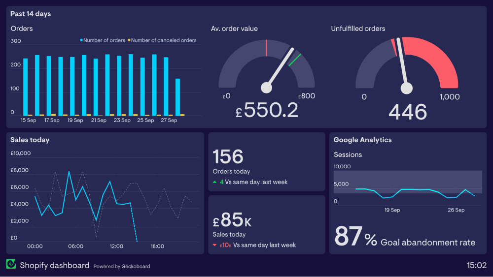
You can also see Unfulfilled Orders has increased above the normal range because the status dial has turned to red. Of course, the dashboard doesn’t tell us what has caused this to happen – this would require further analysis. But we are immediately alerted to the change and can start the process of investigation much sooner.
What is a Performance Dashboard?
Performance Dashboards (sometimes called KPI Dashboards) visualize your current progress toward longer-term strategic goals.
Whereas Monitoring Dashboards help you to be more reactive, Performance Dashboards help you to be more proactive about the things you want to achieve in the future. Typically, you would include your company or team’s most important KPIs, with contextual information (like targets) which allows colleagues to quickly determine whether those goals are being met.
Performance Dashboards are generally used by teams or groups of people. They can have many benefits including:
- Keeping the team focused on the most important KPIs. In other words, avoiding ‘mission drift’
- Highlighting areas in need of improvement, so you can take action straight away.
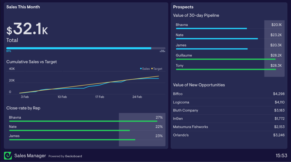
Below is an example of a Performance Dashboard used by a sales team. They have identified the most important KPI for them (monthly revenue) and have given it greater prominence – both in terms of its relative size and by being placed in the top left-hand corner. (The top left-hand corner is where our eyes are naturally drawn, in cultures that read left to right).
We can also easily see the most important supporting metrics in real-time. This includes the line chart showing the progress against the target over time. And bar charts that show the Value of 30-day Pipeline and the Close-rate by Rep. This is all valuable information, which the Sales Manager can use to determine where to place her efforts, in order to meet the overall target.
What’s the difference between a dashboard tool and a Business Intelligence (BI) tool?
If you are researching dashboards, you may be considering a BI tool. Fundamentally, BI tools are designed to amass unstructured data from multiple sources, so the user can drill into that data through a series of queries. Most will also include data visualization features that can be used to create dashboards.
A purpose-built dashboard tool will also pull data from multiple sources. However, it differs from a BI tool in that it is exclusively focused on the communication of that data.
If you need to create a company dashboard, and are considering BI tools as part of the mix, you might be thinking: “well, if BI tools can create dashboards in addition to other data analytics features, is that not the better option?”
In reality, it doesn’t always work out this way.
For one, most BI tools have a steep learning curve. You could probably acquire a working knowledge of Microsoft’s Power BI in about 6 weeks (…perhaps shorter or longer depending on your data science skills.) Additionally, you will need to set aside time for setup and data configuration – a task normally completed by data specialists in larger businesses. This might well be a worthwhile investment, but if you’re on a tight schedule, with limited resources, and your main priority is data communication (as opposed to data analysis), then a dashboard tool is potentially a much better option.
For example, providing they already know what they want to visualize, we’ve found the typical Geckoboard user can create their first dashboard in around 15 minutes.
Secondly, most people don’t fully appreciate that data visualization is a skill in its own right. Yes, a BI tool gives you more options for data visualization, but without a solid understanding of the design principles underpinning it, it’s much more likely you will build hard-to-digest displays that can’t be monitored ‘at a glance’ – and therefore don’t work as dashboards.
To summarize, if you are genuinely finding yourself needing to run regular data analysis, and spreadsheet software like Excel has become limiting, it’s probably time to graduate to a BI tool. But if your main priority is pulling data from one or more sources to create an easy-to-digest dashboard, you’re much better off with a specialist, easy-to-use tool like Geckoboard. (Or, like some teams, you might even decide you need both.)
How can I build my first dashboard?
So if you’re ready to build a custom dashboard for your business, then Geckoboard is probably the best place to start. We’re trusted by thousands of organizations globally, and have pre-built integrations with over 60 data sources and counting.
What’s more, with our quick-sharing links and sharing features for TV, Slack and mobile, you can be sure that Geckoboard dashboards are made to be seen. No more hidden data. Perfect.
