The best sales leaders know how important it is to stay on top of metrics and sales KPIs. In fact, McKinsey research from 2022 showed how taking a robust, data-driven approach to B2B sales can increase sales growth as much as 25%.
Choosing the right sales dashboard software is not always easy, with many different tools on the market which are better (and worse) for different business types. This guide will help you navigate the current sales dashboard market and understand which dashboard tool is right for you.
Important considerations for choosing sales dashboard software
Setting up a sales dashboard to track key metrics like Revenue, SQLs and Lead Conversion Rates can have many benefits for you and your team.
A dashboard will help your colleagues stay accountable for how they are performing against their sales targets, develop a better understanding of their sales pipeline, and promote a healthy sense of competition between individual sales reps.
But not all sales KPI dashboards work in the same way. Recently, we published our guide to buying dashboard software, in which we explored the five most important considerations to bear in mind when choosing a dashboard tool:
Data
How will your dashboard connect to your data? In other words, will you need to first store your data in a data warehouse? Or will your dashboard tool plug directly into CRMs like Hubspot, Salesforce and Pipedrive? Will this process pull data automatically and will your metrics update in real-time?
Design
Is it easy to design a dashboard that can be understood by your teammates? Can you highlight certain goals and targets?
Sharing
KPI dashboards are only effective if they are seen by the people who actually need to see them. Different tools have different sharing features and access limitations. Ideally you should be able to ‘broadcast’ your dashboard in spaces where your team spends time – i.e. via Slack notifications or via a large TV screen on the wall (a wallboard).
Specialism
Different tools are built for different expertise-levels. Some dashboard tools can be used by anyone, others will require analysts and data specialists.
Budget
What is the pricing structure, and does your budget match the pricing tier you will need?
Best sales dashboard tools for businesses today
Next we’ll explore the best dashboard tools for different situations:
- Best for KPI visibility: Geckoboard
- Best for sales analysis: Tableau
- Best for gamification and engagement: Plecto
- Best for Microsoft users: Power BI
- Best free software for technical users: Looker studio
- Best free software for non-technical users: Google Sheets
- Best software for engineers and data specialists: Grafana
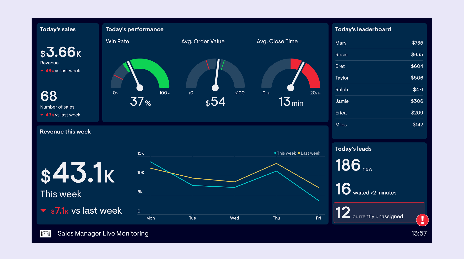
Geckoboard
Best tool for KPI visibility
If you need to promote data-driven decisions in your team by surfacing key sales metrics, then Geckoboard is, hands down, the best tool you can use.
It connects directly to over 90 data sources like Salesforce, Pipedrive, Google Sheets and Hubspot Sales in just a few clicks. Geckoboard’s drag and drop dashboard creator makes it easy to design a dashboard that will motivate your team and keep everyone aligned around their sales goals and the overall sales process.
The best part about Geckoboard is how good it is at increasing the visibility of the metrics you care about. It looks great on a TV display, and integrates with Slack so you can set up automatic reports and alerts. It also auto-refreshes using real-time data so you can react quickly to important changes.
Core strengths
- Saves time by instantly connecting to over 90 online data sources
- Professional dashboard design made easy
- Display on a TV
- Real-time data
- Sharing features make your sales goals unmissable
Tableau
Best tool for sales analysis
If you're less interested in KPI visibility, and more interested in sales analytics and reporting, then you might consider a Business Intelligence (BI) Tool like Tableau. Tableau is perhaps the leading BI tool on the market. With Tableau, it’s possible to create sophisticated reports and advanced visualizations.
However, connecting your sales data to Tableau will require you to first store your data in a data warehouse. Although this is costly, time-consuming and requires a certain level of specialist expertise, it can be worth the investment for businesses who are serious about in-depth reporting.
Core strengths
- Wide range of advanced visualization options available
- Attractive, professional-looking dashboards
- Predictive analytics for sales forecasts
Plecto
Best tool for gamification and engagement
Plecto offers a range of real-time reporting options for sales teams, including the ability to build dashboards. However, where Plecto really excels is in its gamification features. With live leaderboards and other engagement tools, it’s designed to boost motivation and improve performance by making a fanfare out of individual and team wins.
The downside of Plecto is that it can be costly, particularly for smaller businesses. If you’re looking for other ways to create a sense of engagement (for a fraction of the price) you could consider building one of our sales competition dashboards.
Core Strengths
- Team leaderboards and gamification features
- Real-time data
- Individual reporting and scorecards
Power BI
Best tool for Microsoft users
Power BI is a smart choice for Microsoft users, thanks to how well it works with other Microsoft products like Excel and Dynamics 365. This makes it super easy to bring all your data and tools under one roof. It's good at breaking down complex sales funnel data into visuals and charts.
Power BI does come with a steep learning curve so you may need to involve the help of an analyst or data specialist.
Core strengths
- Integration with Microsoft Products like Excel.
- Interactive Visualizations:
- Active user community and 3rd party resources.
Looker Studio
Best free software for technical users
Looker Studio is Google’s answer information dashboard design. Previously Looker was the premium paid service, with Google Data Studio as the free alternative. But in 2022, Google merged the two brands with Google Data Studio becoming Looker Studio.
It’s a great free option to consider, however, although the product plays nicely with Google products like BigQuery, be aware that 3rd party data sources like Salesforce and HubSpot are not always so easy to integrate. You may need to use 3rd party connector tools.
Core Strengths
- Extensive free plan
- Flexible visualization options
- Easy to collaborate and share
Google Sheets
Best free software for non-technical users
If you’re looking for a tool that’s easier to use, but really don’t have any budget for dashboard then the best tool to use is a spreadsheet like Google Sheets.
Google sheets is a perfectly good tool for creating simple dashboards and KPI reports. However, because it relies on manual input, it’s not such a practical tool for keeping track of metrics in real-time.
Core Strengths
- Free
- Easy to access and share
- Easy to perform computation and analysis
Grafana
Best tool for engineers and data specialists
Grafana makes the list because of the sheer number of different visualizations and dashboards you can create. If your data is stored in a SQL database, (and are experienced writing SQL code), then Grafana may be the tool for you.
Core Strengths
- Integrates with SQL databases
- Many visualization options
