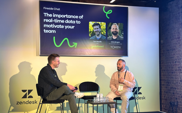
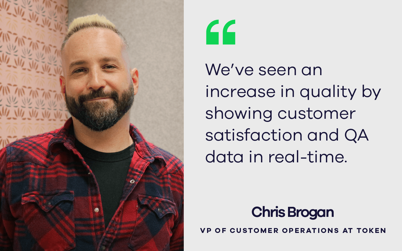
Podio, part of Citrix, is the new way for teams to organize, communicate and get work done together. By enabling anyone to fit work apps on Podio to their specific needs, it gives people more power than ever before to manage their work in their own way. We had the opportunity to talk to Adrian Young-San Roessler, Product Manager at Podio. Adrian shares with us how Podio is using data to focus on what matters and bring teams closers across multiple countries.

So what is Podio and what do you do there?

Podio is kind of a new way to help teams organize, track, and get work done, all in one place. And the way that's done is that anyone can build and change what we call a Podio App, on the fly, to structure any kind of work, could be projects, tracking leads, recruiting, or design work approvals. And then anyone involved can interact around that work, comment, relate tasks, approve stuff, or simply change the status from "in work" to "done".

So it's been around two-and-a-half years now since Podio came out of the Beta. And we have really set out to put people back into the center, empower them to shape their own tools and modify them as they see fit. And to bring back more transparency to work, because it's very lost in e-mails and documents that are flying around.

My specific role at Podio, I actually used to do marketing. I shifted about half a year ago, to be a product manager, where I currently work with a small team of designers and developers to remake everything from Homepage to Sign-up flow, the first UX and the onboarding experience. Yes, just better, to reach our metric goals and make it a really good experience.

So when did you start using data communications tools and why?

We started out with choosing Geckoboard, because a white board is good if you want to share insights. But it's a bit of a problem, especially when you have part of the team working out of San Francisco. Most of us are working out of Copenhagen. And we already know, what everyone is working on because we use Podio for almost anything. But we kind of missed what's the impact of the work and how we're doing as a business.

So we started to share some of the core metrics, and we're a SaaS business, so of course, we would have KPIs around user growth, new customers, daily active users, MRR, churn, etc. But then we also started mixing in some things like the response time and satisfaction, how we are doing on support. Because that's actually really important to us - everyone on the team is kind of rotating on support.

We have that in a kind of central dashboard, two screens set up in the office, where we visualize that stuff. And we also distribute the link to the remote team members. So, we started out with one board, tried to fit in quite many things on one board. And a few months ago, we started to set up a few more boards to focus on more specific areas.

So now, for example, we have what we call the ‘beat-the-numbers’ board, where we look at some very important, first-time user metrics. And that really helps us in the product team to also get closer to being informed by data and see the impact of our work. So we can see for example the cohorts of how many of the sign-ups return on the next weekday. How many do create their first app, or fill in some content, because we know that's quite important. How many do invite team members and so forth.

I found the loop feature quite handy because we only have one screen. So we're just rotating different boards every minute or so. And it was cool to see that people suddenly stopped when passing by. "Oh, I haven't seen that." And then they stand in front of it and watch at the board for a couple minutes, and then they talk about it. And that's just really great.

Did you face any challenges or reactions when you guys decided to make data freely available in the office by publishing your metrics on a big screen on the wall?

Well, that's actually a very good question. I think that, especially with on-boarding new hires, it's probably something that's easy to forget. So, informing them about the metrics that we as a business track, and the more detailed metrics that might be more relevant to them for their daily work, should be a core part of anyone’s onboarding.

I think Geckoboard definitely helps to raise awareness for that, and we have one place to go to, and to kind of get some idea, and then maybe ask for more drill down. And I think to have those boards provides some very good first entry points.

And I think what's important is how you present it, how you make it kind of self-explainable. What you call the widgets there, and how you describe the axes. Not everyone comes out of the data knowledge or analytics area. So they might definitely prefer the graphs over some Excel row numbers. But still, for example, something like returning sign-ups on the next weekday: there will be a big drop in the end of the graph, because it might not be next week day yet. Things like that could raise some questions, when people don't have a proper introduction to it.

What would be your advice for any organization trying to gain more focus on the things that matter?

I think I would probably recommend two things. One is the type of metrics, choosing them very specifically, so that they together form a coherent story that is easy to explain. And it's not just a random set of core KPIs clustered together, but something that people could abstract a story from.

And you know, it could be just setting it up in a way that it follows the usage funnel, from the top of the funnel, then there's the signup flow, then maybe drop-off rates there. And then there's the first "yes", and then there's retention, then there's maybe the revenue at the end, or something like that.

And the second thing is making the graphs trend over time. It's great to have a snapshot. So it's great to know, okay, "Yesterday we had X new users, or we had X visitors," but those daily snapshots, or weekly snapshots, lose relevance over time. Because it's very difficult for people to remember what it was over time.

So I will definitely always recommend using some sort of cohorts, or trended lines, so people can see the actual changes. And also catch things potentially early on, if suddenly the graph strucks them. Either something in the database's queries is messed up, or there is a serious issue.

Download case Study PDF here

Podio case study