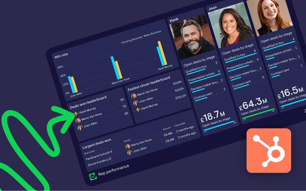
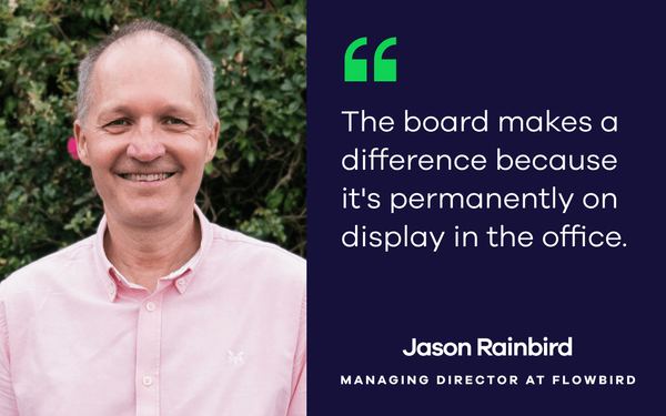
This is a blog series where we explore the dashboards at Geckoboard HQ. First up, our Customer Success Manager, Luis, explains the rationale behind his customer services dashboard.

There’s nothing wrong with clichés when used properly and with conviction, so I’d like to start with a phrase we have all heard: ‘You can’t manage what you don’t measure.’

Regardless of how the customer service team is set up (localised or distributed, in-house or outsourced) and where it sits in the organisation (marketing, IT, operations, other), I’m convinced that measuring is essential for success.

There are many ways of measuring. I find reports and alerts a great ally for staying on top of the day to day. But when it comes to sharing information across different teams, or with specific people who don’t have access to your support tools (or don’t know how to use them as well as you do), there’s nothing better than a dashboard.

So, what’s on our dashboard? The short answer is: What’s relevant to us at the moment. The long answer is as long as this article so keep reading to find out.

Although I stated the obvious, I wanted to highlight that our dashboard shows what’s relevant to us at the moment to touch upon the fact that its content is subject to change. For example, when I joined Geckoboard, I used to monitor the ticket backlog very closely to get a pulse to the health of support and identify trends in inbound tickets that could be solved through the Help Centre. And as the team is evolving and becoming more proactive, some of our KPIs are changing too.

I should also mention that we don’t have one single dashboard but several. The one I will describe here is up on our wall for everyone in the office to see and its data can be divided into two categories:

  1. Monitoring that we are delivering an effective customer experience
  2. Shedding light on what our tickets are about

Customer Success Dashboard
Geckoboard's Customer Success dashboard. Note: It's a replica. Data displayed is fictional.

1. Monitoring

Tickets created (last 30 days)

Why it’s important: Ticket volume is a good barometer of changes and can also help you staff appropriately to deliver an effective customer experience. The raw number tends to hover around a particular amount and when there are trend changes, they normally correlate to or mirror other trends. Spikes usually come hand in hand with specific events such as new releases.

Best way to visualise: As a number with a comparison secondary stat that adds some context to it.

Unknown-2

Median first reply time (last 30 days)

Why it’s important: It helps you see whether your customer queries are being followed up within a timely manner. Slow service is viewed by customers as uncaring and incompetent. Moreover, poor response time, especially if done repeatedly, results in loss of customers and revenue, hence the importance of tracking your ability to answer a ticket within 24 hours (or in accordance with your internal SLAs).

Tip: Benchmarking helps put this metric into a relevant context so you might find Zendesk’s benchmark tool useful.

Best way to visualise: As a number with a comparison secondary stat that adds some context to it.

Unknown-4

Tickets by first reply (last 30 days)

Why it’s important: It adds granularity to the ‘Median first reply time (last 30 days)’ metric. While providing timely responses is a goal in itself, providing quick replies just for the sake of it or overwhelming requesters with unnecessary questions just because we didn’t spend as much time as we should making sure we understood the query is just as bad (if not worse). Sometimes it’s better to read the request again, make sure it’s fully understood, do some research or even try to replicate what the customer is describing, but all of that requires time. Dissecting tickets by first reply can give a better overview of what’s really going on. Needless to say you want to see most of your tickets showing quick responses. If they don’t, it might pay off to find out why.

Best way to visualise: As a column chart. I classify first response times in four different categories: 0-1 hours, 1-8 hours, 8-24 hours and 24+ hours

Unknown-3-1

Tickets by full resolve (last 30 days)

Why it’s important: Providing an initial response in a timely manner is a good step in the right direction, but the ultimate goal is to swiftly sort things out for customers. Just like ‘first response’ metrics can shed some light on whether or not you are staffed appropriately, ‘full resolve’ metrics can drill down to analyse the handle on other elements. For example: Is your team able to help customers with the tools and processes currently available to them? Are there certain training needs to allow your team to work more efficiently?

Best way to visualise: As a column chart. I classify full resolution times in four different categories: 0-8 hours, 8-24 hours, 24-48 hours and 48+ hours

Unknown-7

Customer Satisfaction score (last 30 days)

Why it’s important: Arguably, the CSAT score (defined as the percentage of customers whose experience was positive against all customers who underwent the experience) is the best measurement of how your service organisation continues to perform. Although I don’t fully agree with this generalised idea, I still consider it a great indicator of how you can improve the customer experience and optimise your internal processes.

Best way to visualise: As a number with a comparison secondary stat that adds some context to it.

Unknown-6

2. Tickets#

I’ll only mention two of these metrics as they tend to be very specific and the idea (classifying) is always the same.

Tickets by category (last 30 days)

Why it’s important: This allows you to identify patterns around topics or things that are relevant to you and your organisation.

Tip: Instead of categorising or tagging everything, choose only certain types of interactions. I’d suggest keeping it as simple as categorising only what’s truly relevant to you or your organisation.

Best way to visualise: As a leaderboard to quickly identify what most tickets are about.

Unknown-1

Tickets by integration (last 30 days)

Why it’s important: if like Geckoboard, the app that you support has a variety of integrations with other services, this would allow you to identify your most sought after integrations. In theory this should match your records of usage, if not , it might be useful to find out why.

Best way to visualise: As a column chart, but a leaderboard could be just as good (if not better).

Unknown-5

There you have it. Now that you know what’s on our dashboard, why not tell us what’s on yours? Leave a comment below. But most importantly, make sure you share your dashboard with everyone in your team and with your stakeholders!

Luis is Customer Success Manager at Geckoboard, working with a team of five customer success champions spread across the globe, from Hawaii to New Zealand. He loves taking best possible care of our customers and when he's not at work, Luis is either running around the house with his tool belt or cooking up a mean paella for his missus.

Look out for the next instalment in this series, when VP Marketing, Simon, reveals what’s on Geckoboard's marketing dashboard.