How dashboards can help SaaS companies gain investment and grow, with Kristian Marquez of Finstrat Management by Sam Gane 19 January 2021
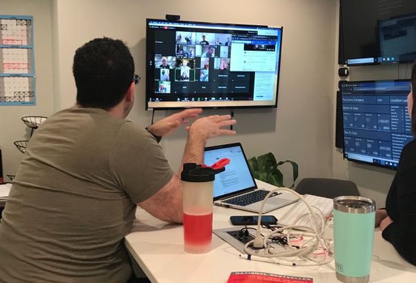
From consultant to Dir. of Customer Care at Maisonette: How Geckoboard helps Logan Grooms supercharge support teams by Sam Gane 29 October 2020
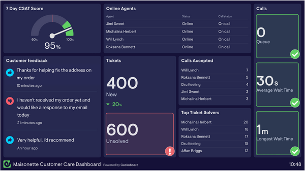
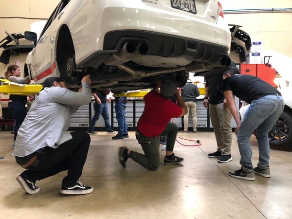
How simplicity and focus has helped COBB Tuning maintain a CSAT score of 95% with 10,000 tickets per month by Sam Gane 21 September 2020