4 ways you can use our new Bannerbear integration to create even better dashboards by Nick Smith 5 September 2022
Zendesk certifies Geckoboard as Suite Ready - get three months of Geckoboard free by Nick Smith 29 May 2019
New SQL databases integration - easily add metrics from MySQL, PostgreSQL and Redshift databases to your dashboard For all the many, many tools and services your business might be using day-to-day, there’s a good... by Nick Smith 21 March 2019
Zendesk & Geckoboard: Some Suite Improvements At Geckoboard we’re big fans of removing complexity where it’s not needed, so we were particularly... by Nick Smith 23 May 2018
New: Faster, smarter, happier customer support with Zendesk Chat & Geckoboard Customer service is changing. Gone are the days when it was perfectly acceptable to respond to a customer... by Nick Smith 7 March 2018
New Freshdesk integration - deliver better, faster service with Geckoboard and Freshdesk Today we’re excited to announce a brand new integration with Freshdesk that makes it easier than ever... by Nick Smith 6 February 2018
New Zendesk Talk integration: Provide more efficient phone support with a live TV dashboard Hot on the heels of our recent Zendesk Support integration launch we’re thrilled to announce a brand... by Nick Smith 25 October 2017
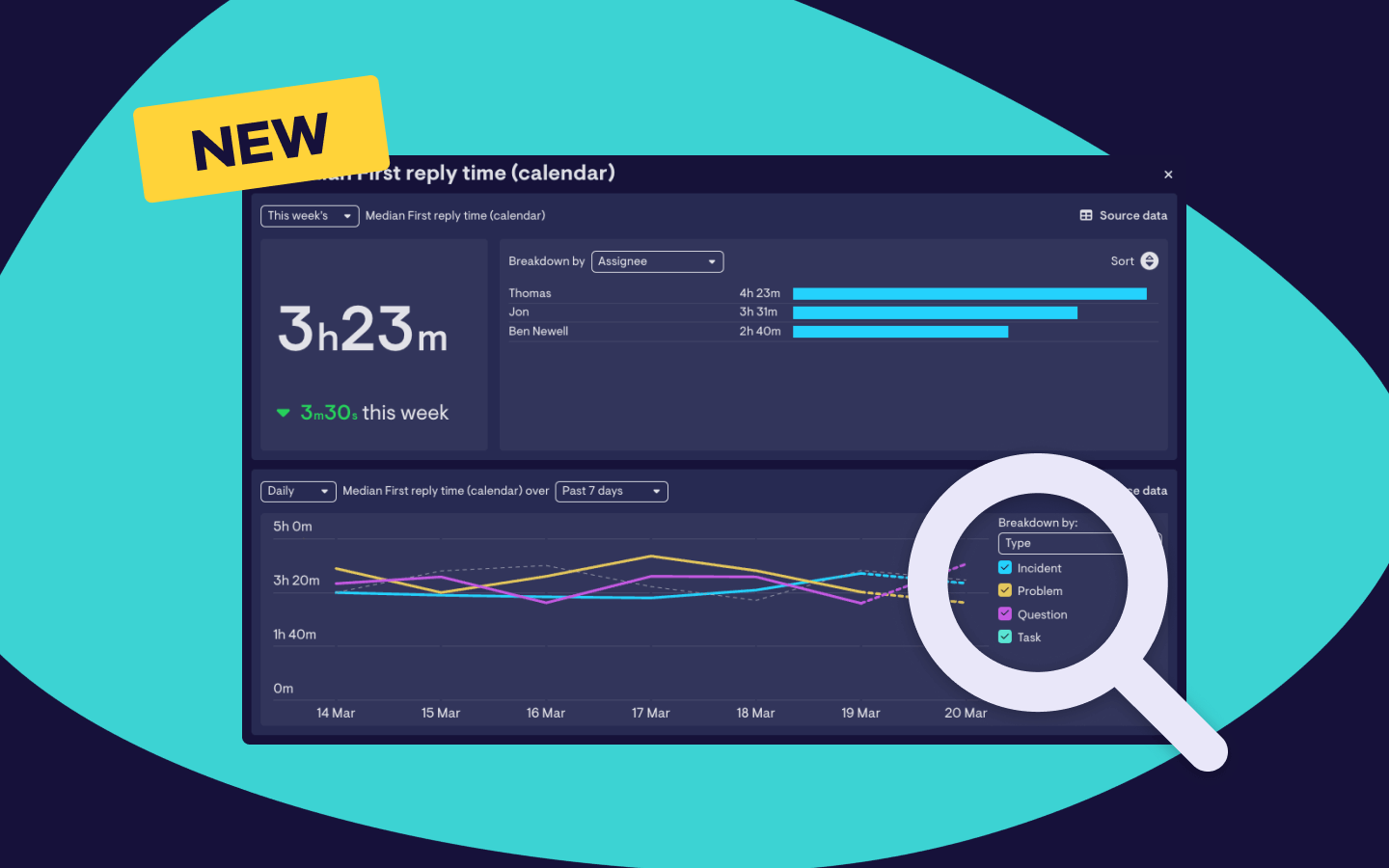
New Zendesk integration - Build the perfect TV dashboard to improve key support metrics If you’re using Zendesk for customer support then you’re in luck! Today we’re launching a... by Nick Smith 20 September 2017
New Feature: Visualizing key metrics from any source just got easier with our Datasets API Today we’re really excited to announce the launch of our brand new Datasets API, which makes it... by Nick Smith 18 October 2016