Executive dashboard examples
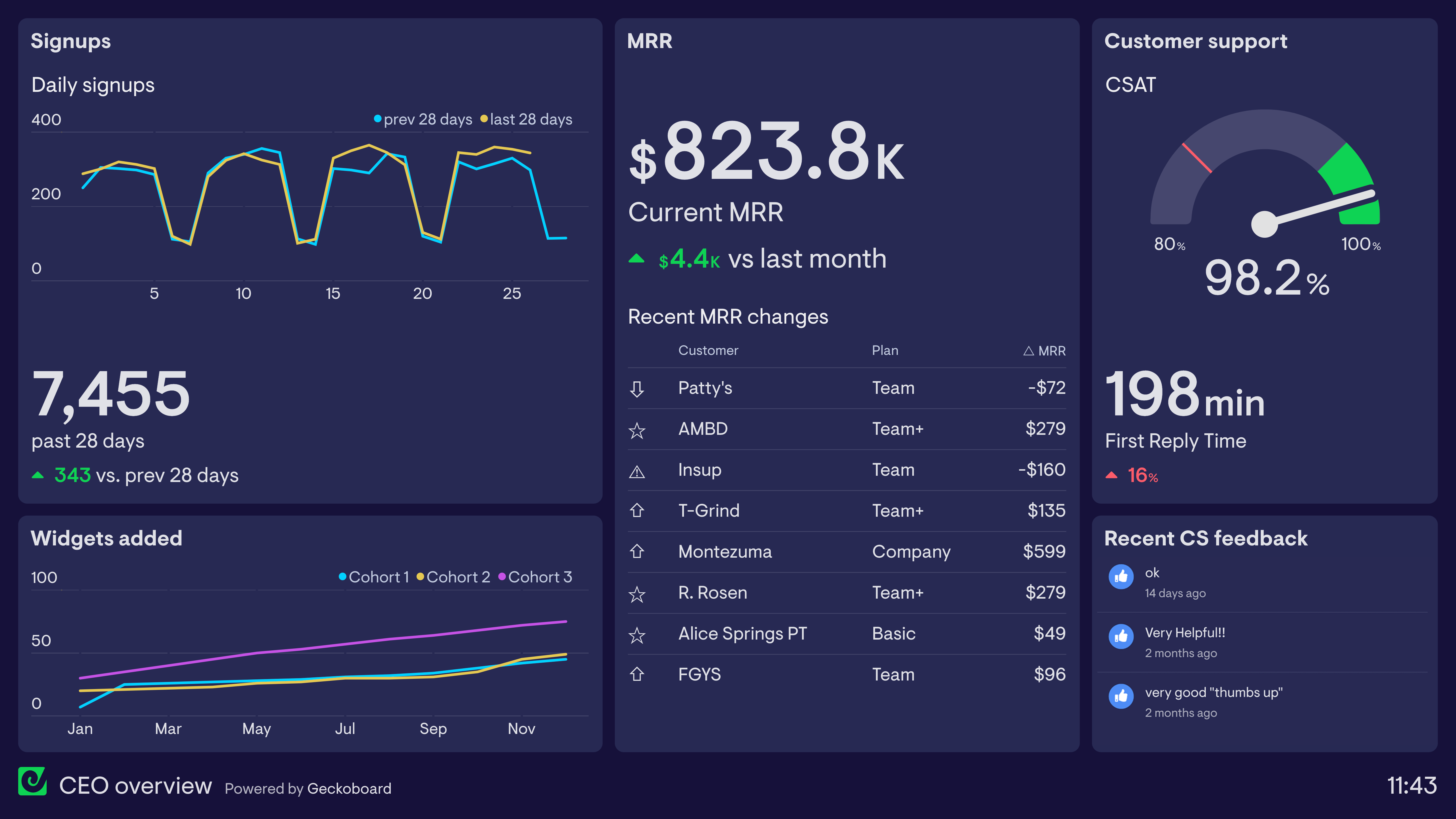
CEO dashboard
CEO dashboards help Chief Executive Officers (CEOs) maintain an overview of their business KPIs and reinforce their own priorities within the company.
Want to see two more examples of CEO dashboards?
Read moreManagement dashboard
Management dashboards are used by managers and team leaders to track projects and team performance.
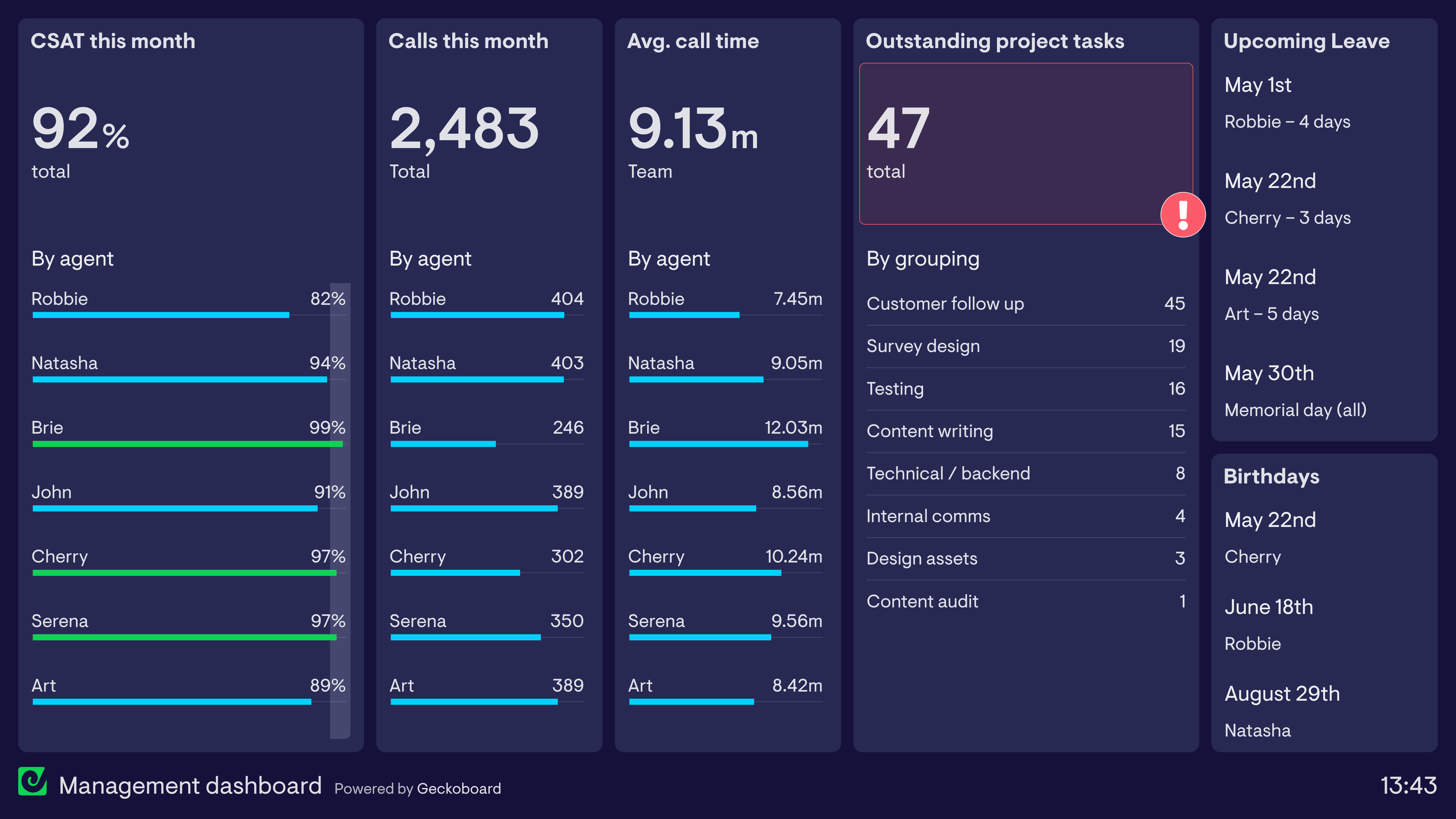
Learn more about this dashboard and how it’s used.
Read moreCompany dashboard
Company dashboards are designed to be seen by everyone in the organization. They can help to build a common understanding of the company’s mission and their progress toward it.
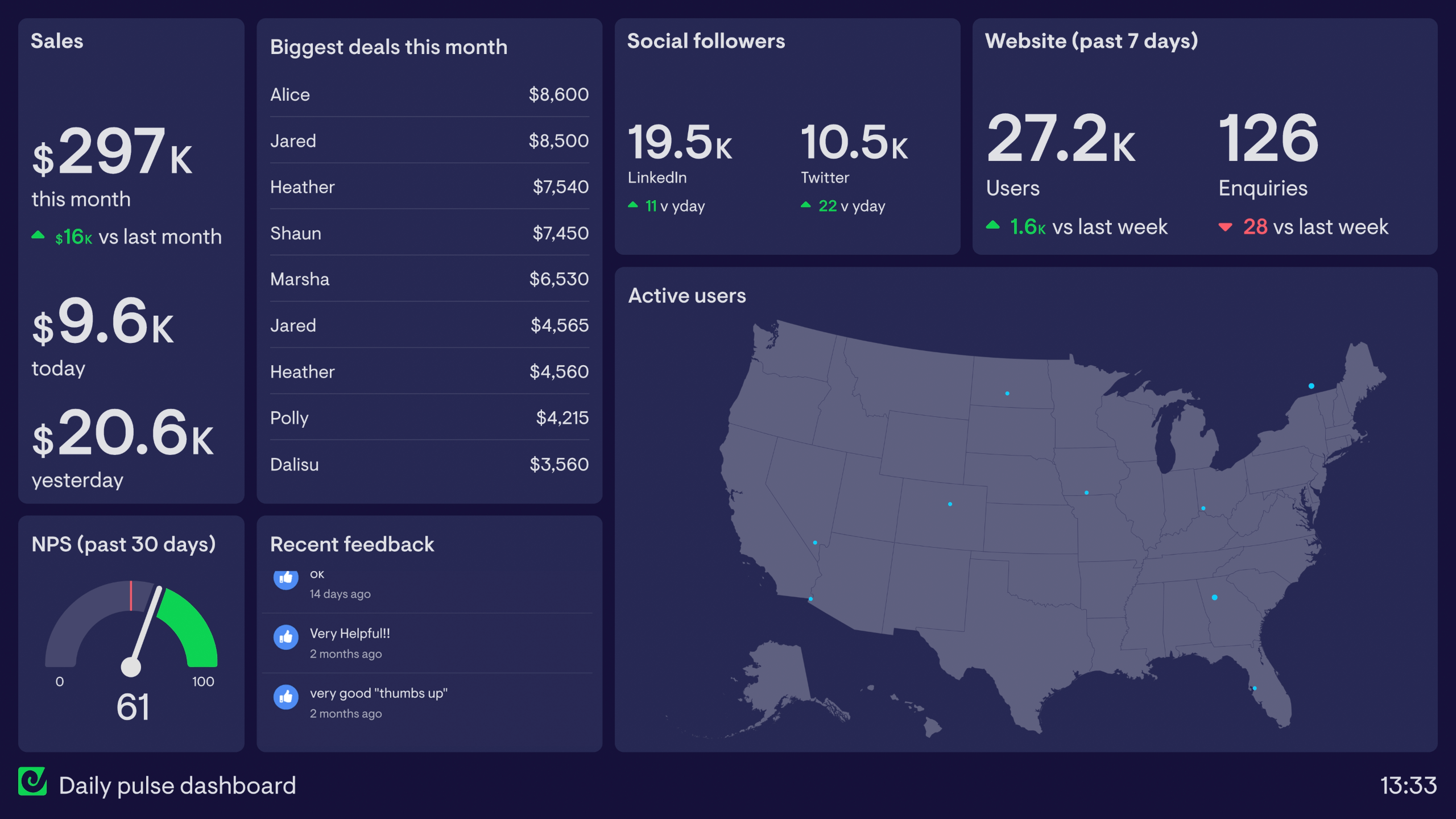
Want to see two more examples of company dashboards?
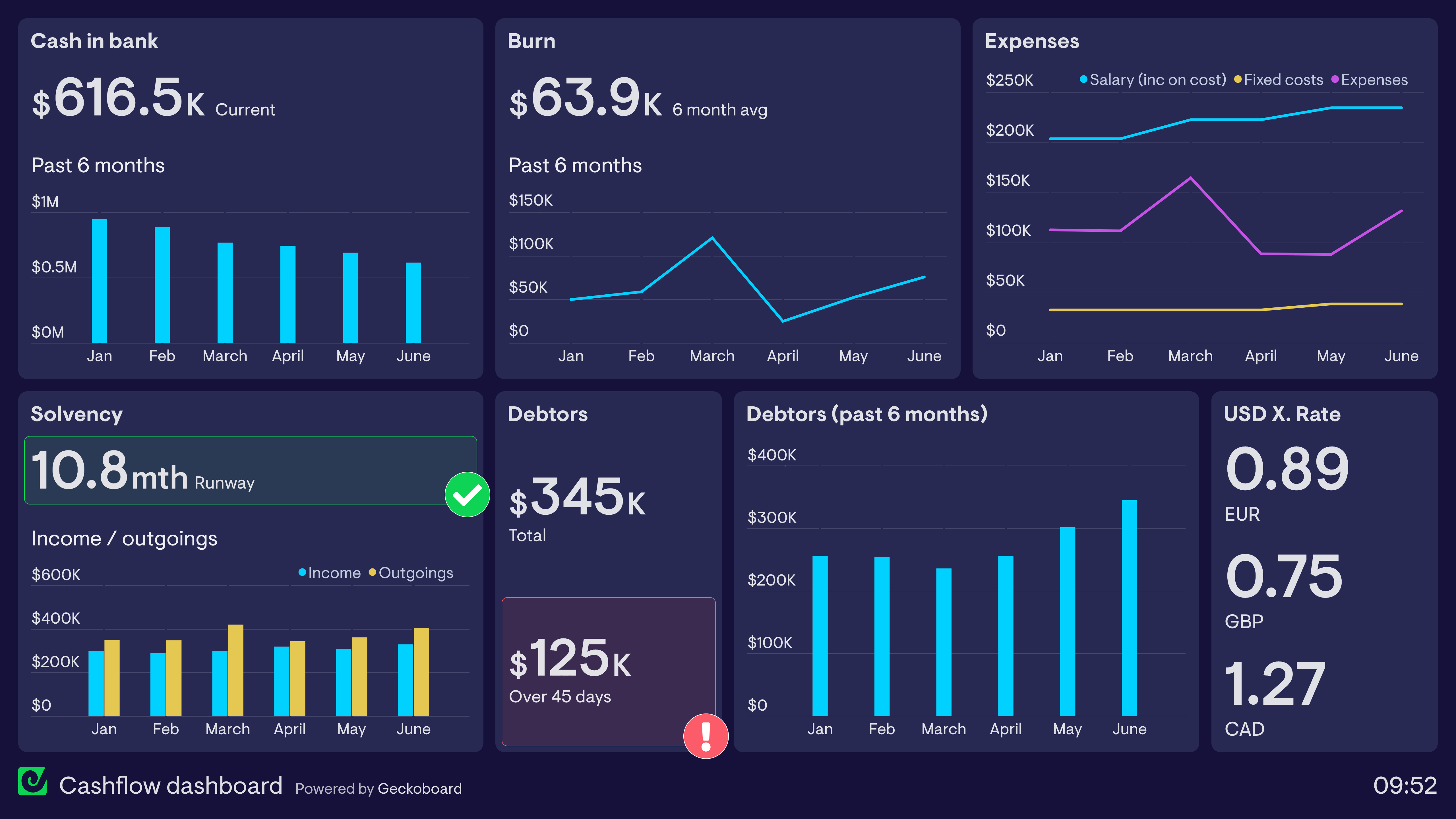
Read moreCFO dashboard
CFO dashboards are used by CFOs (Chief Financial Officers) or Finance Directors to maintain a high-level overview of company financial health and overall performance.
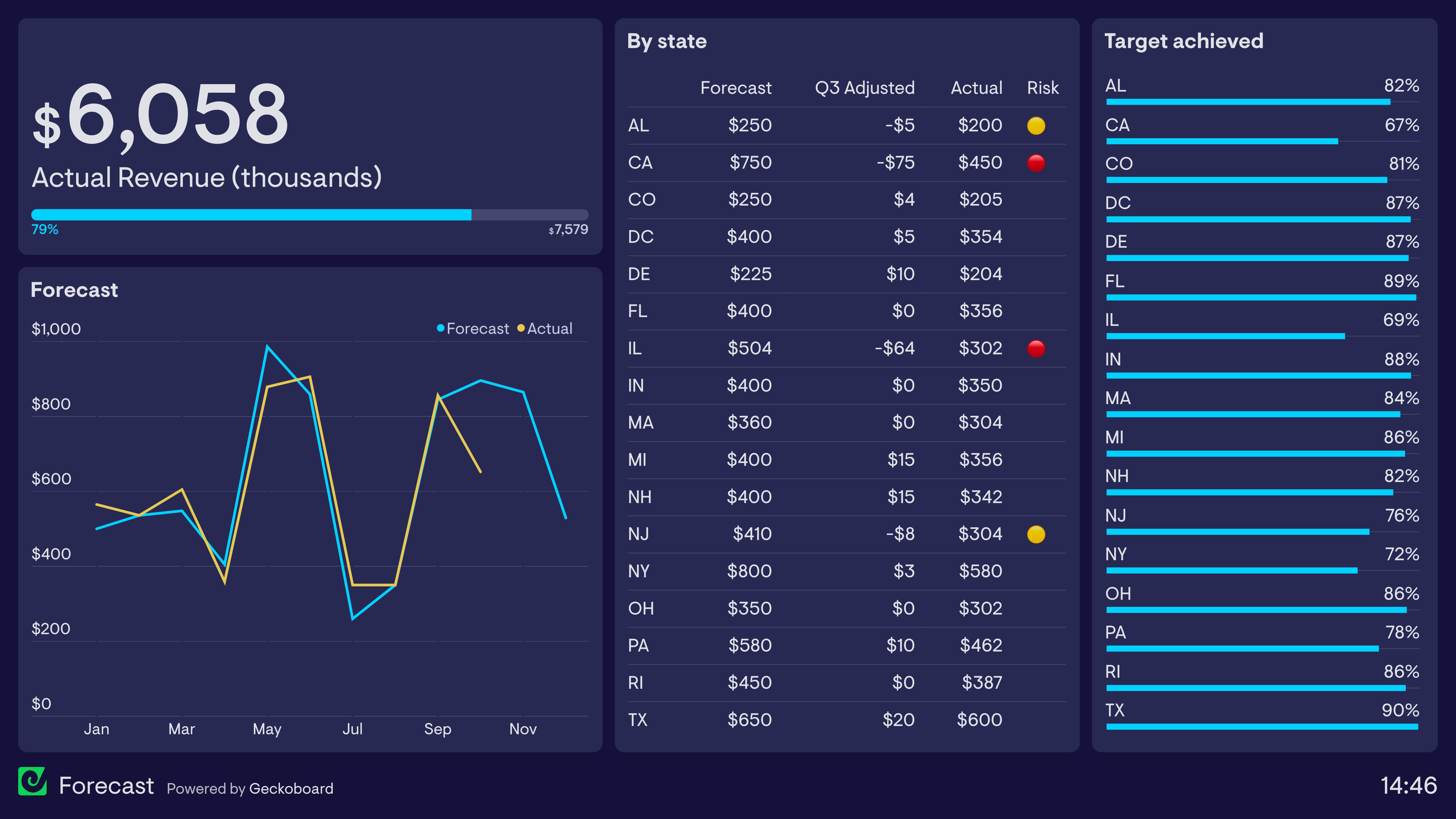
Learn more about this dashboard and how it’s used.
Read moreSaaS company dashboard
SaaS companies use dashboards to understand important metrics related to their subscription-based business model.
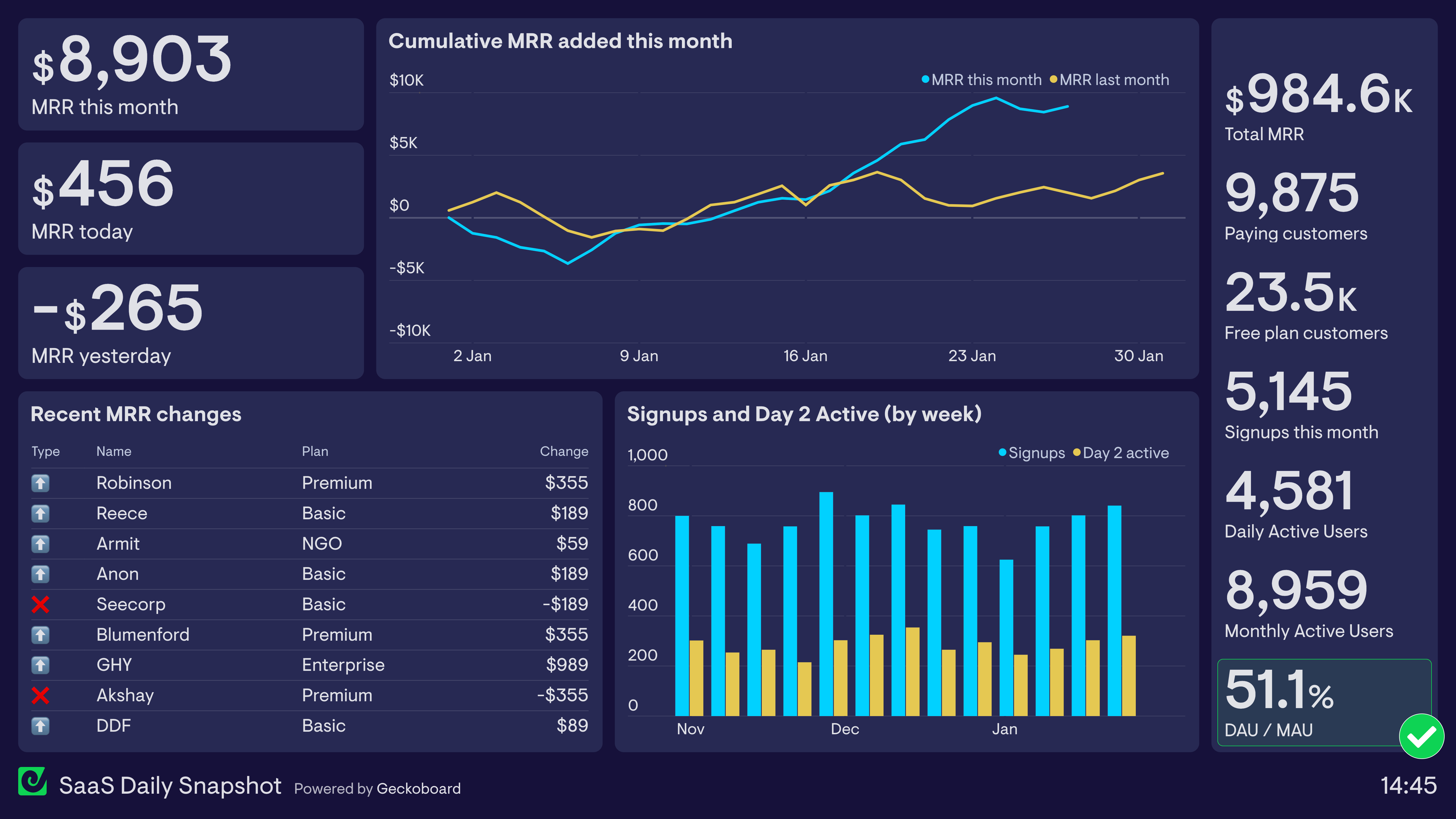
Want to see two more examples of SaaS company dashboards?
Read moreCMO dashboard
Chief Marketing Officers use CMO dashboards to maintain a high level overview of marketing performance.
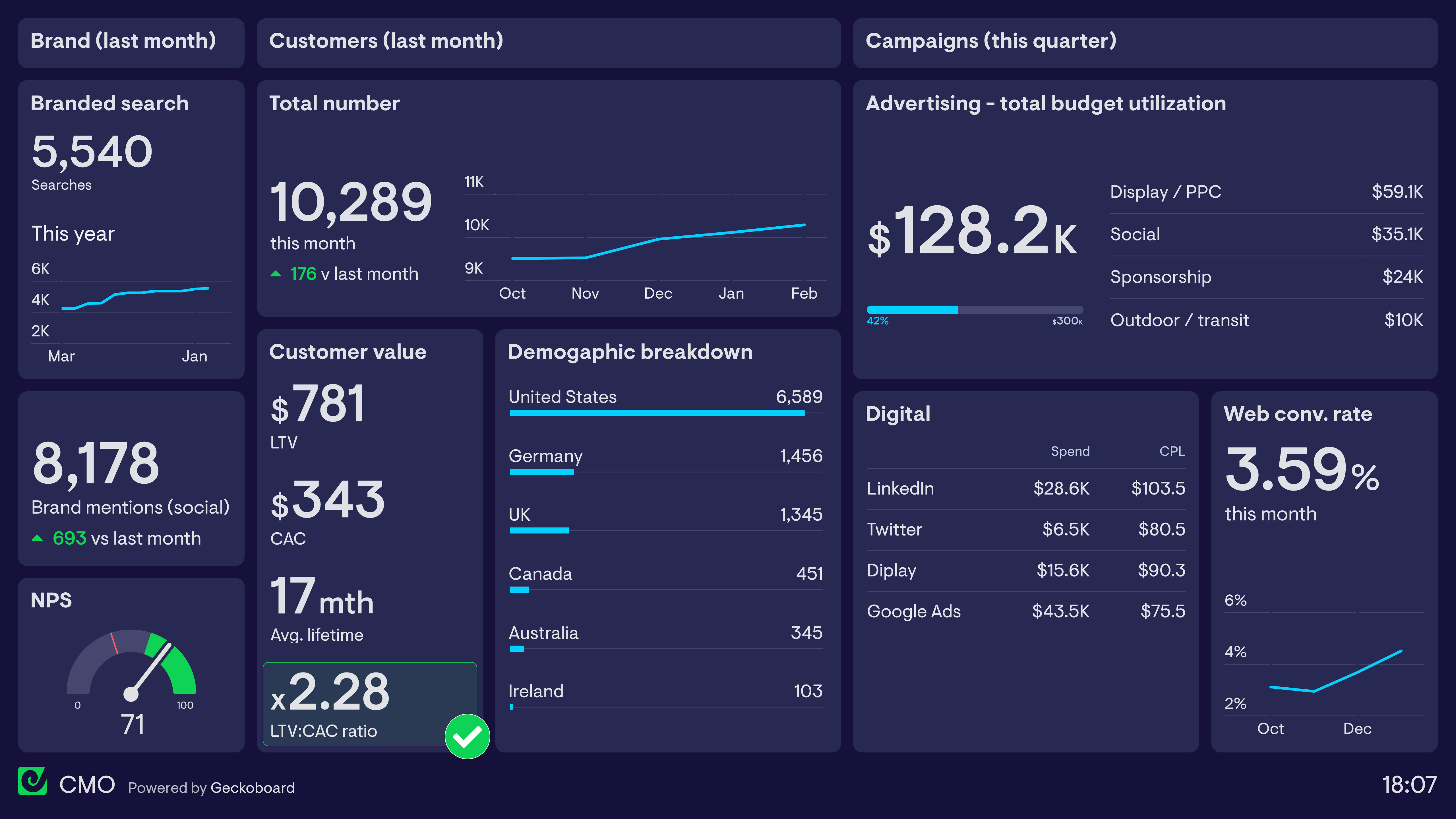
Learn more about this dashboard and how it’s used.
Read moreStartup dashboard
During the early stages of a business, startup dashboards help the team focus on the most important metrics for growth.
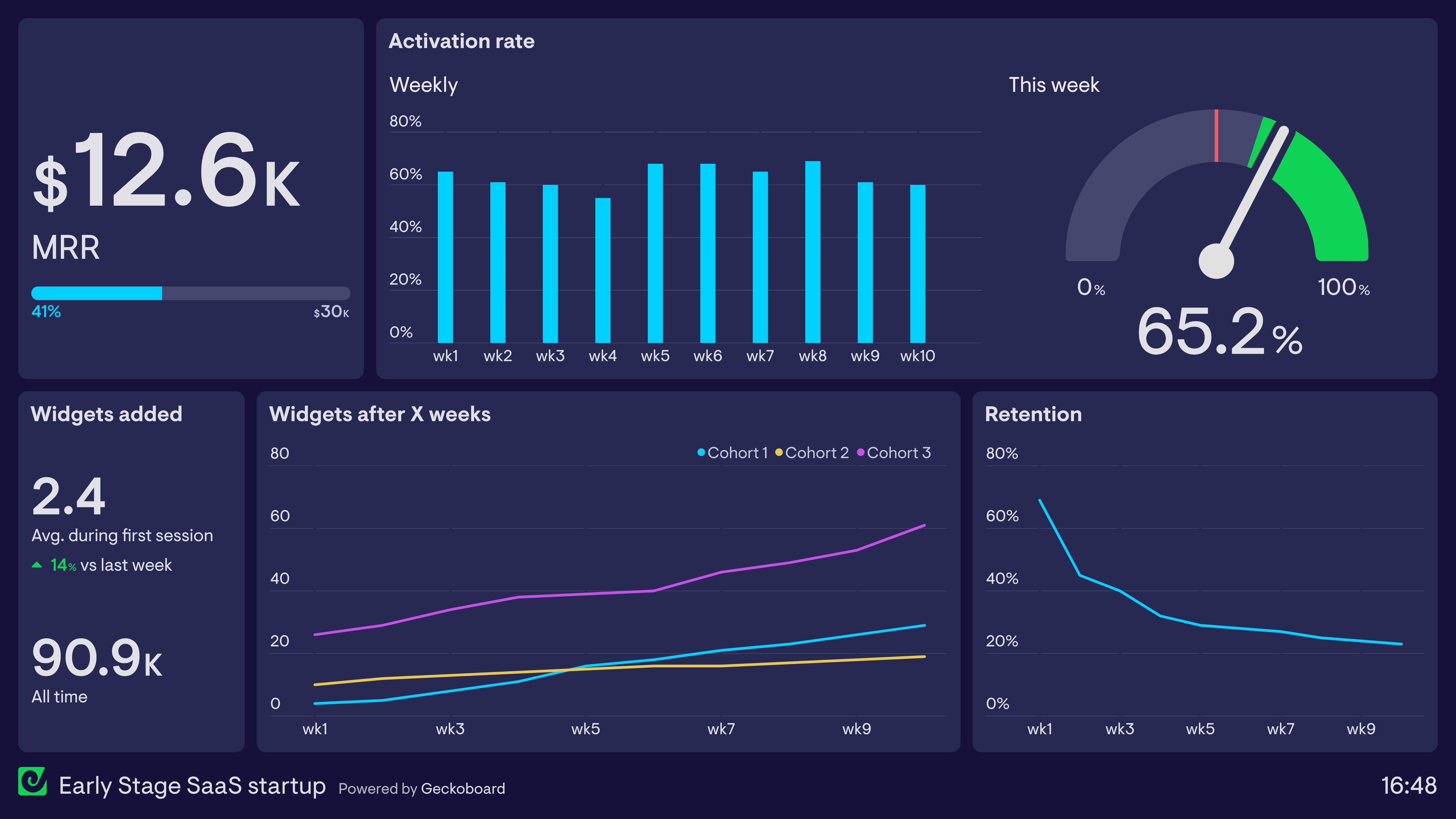
Learn more about this dashboard and how it’s used.
Read morePirate Metrics (AARRR) dashboard
Pirate Metrics are named after the acronym “AARRR”, a framework designed to assess five core areas of the customer journey: Acquisition, Activation, Retention, Referral and Revenue.
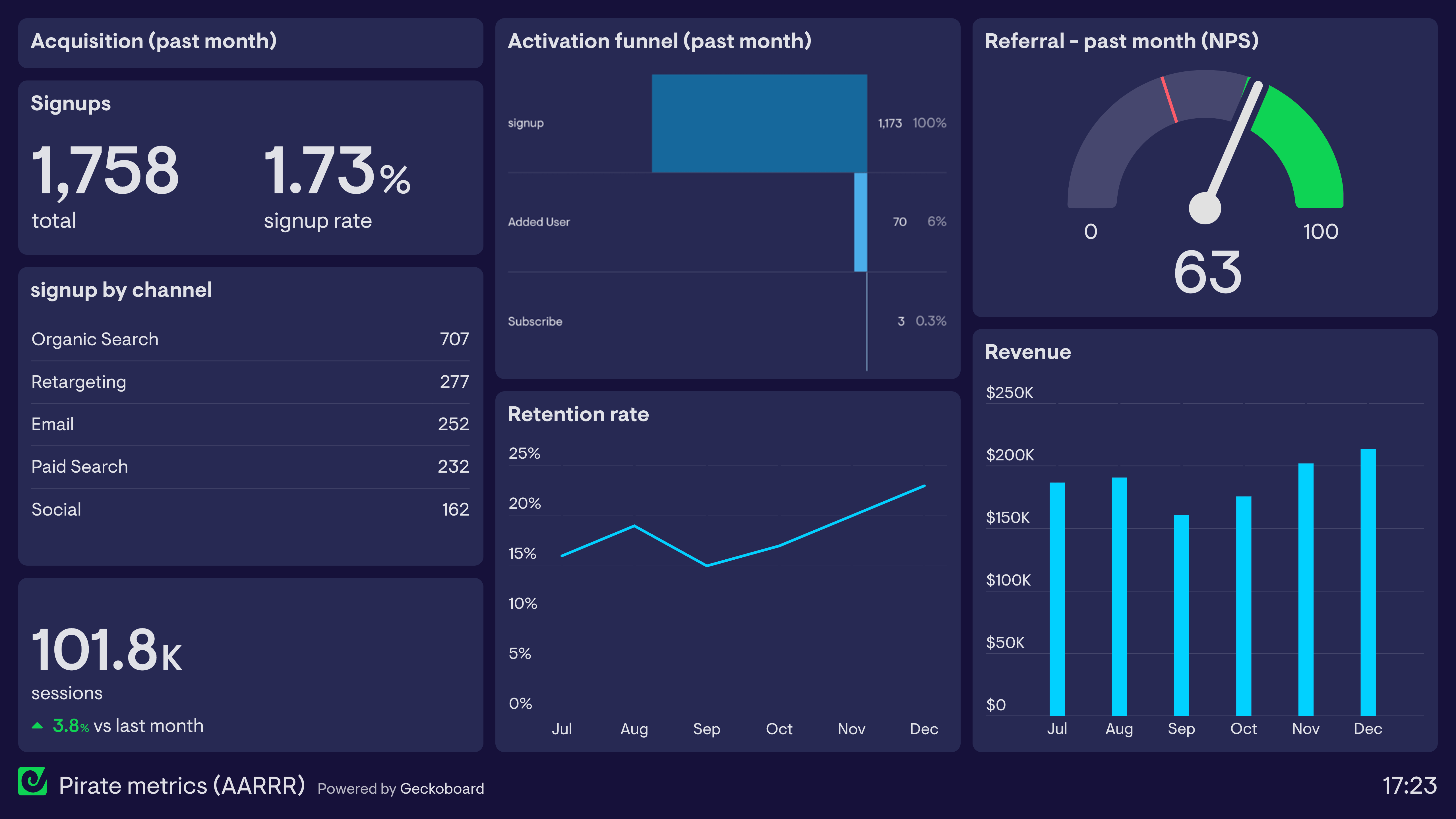
Learn more about this dashboard and how it’s used.
Read moreExcel dashboards
Excel dashboards enable users to visualize their most important Excel data, so KPIs can be viewed by everyone, at a glance.
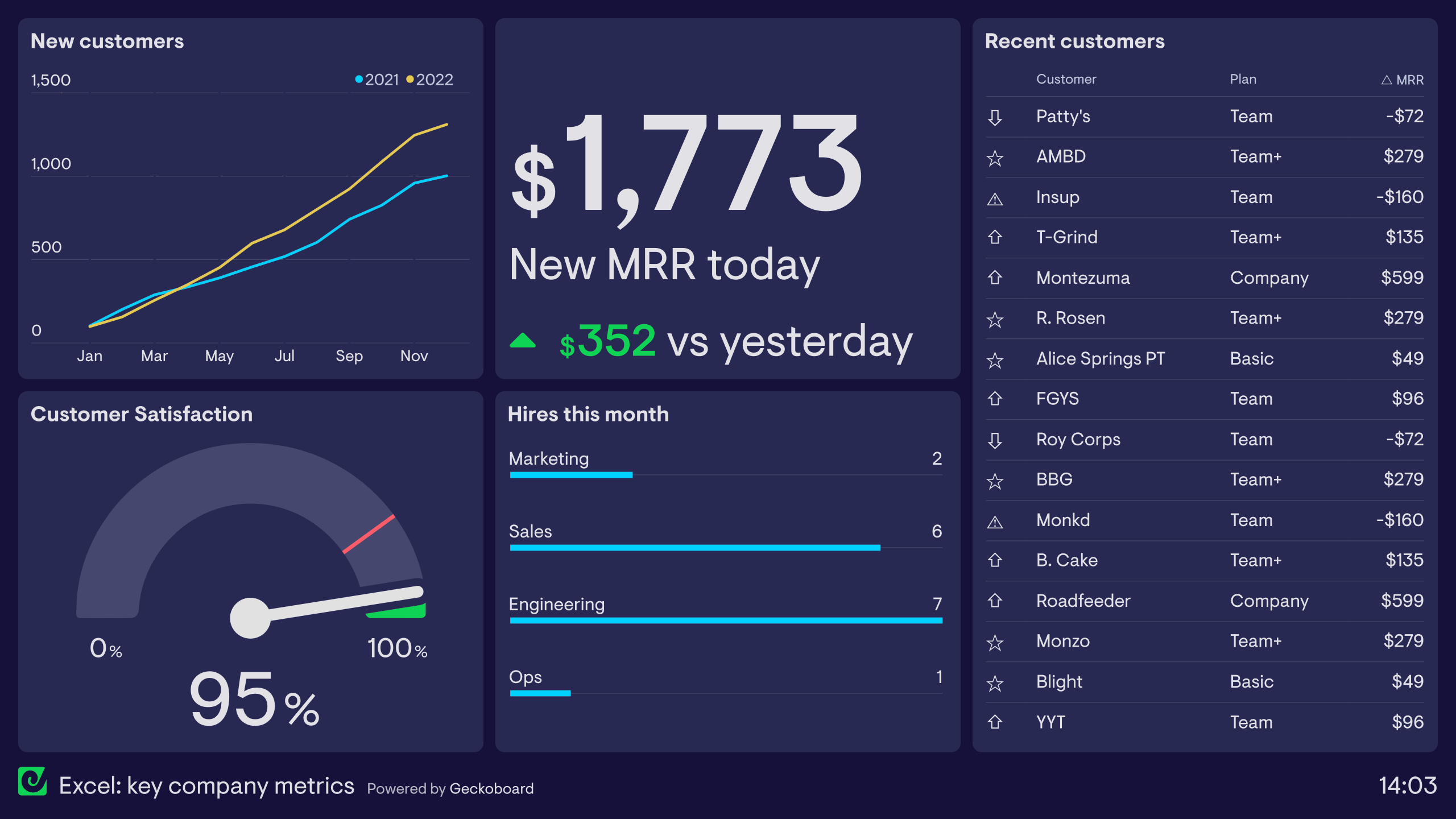
Want to see three more examples of Excel dashboards?
Read moreDigital dashboards
Digital dashboards are used by businesses to visualize their KPIs in an easy-to-digest format.
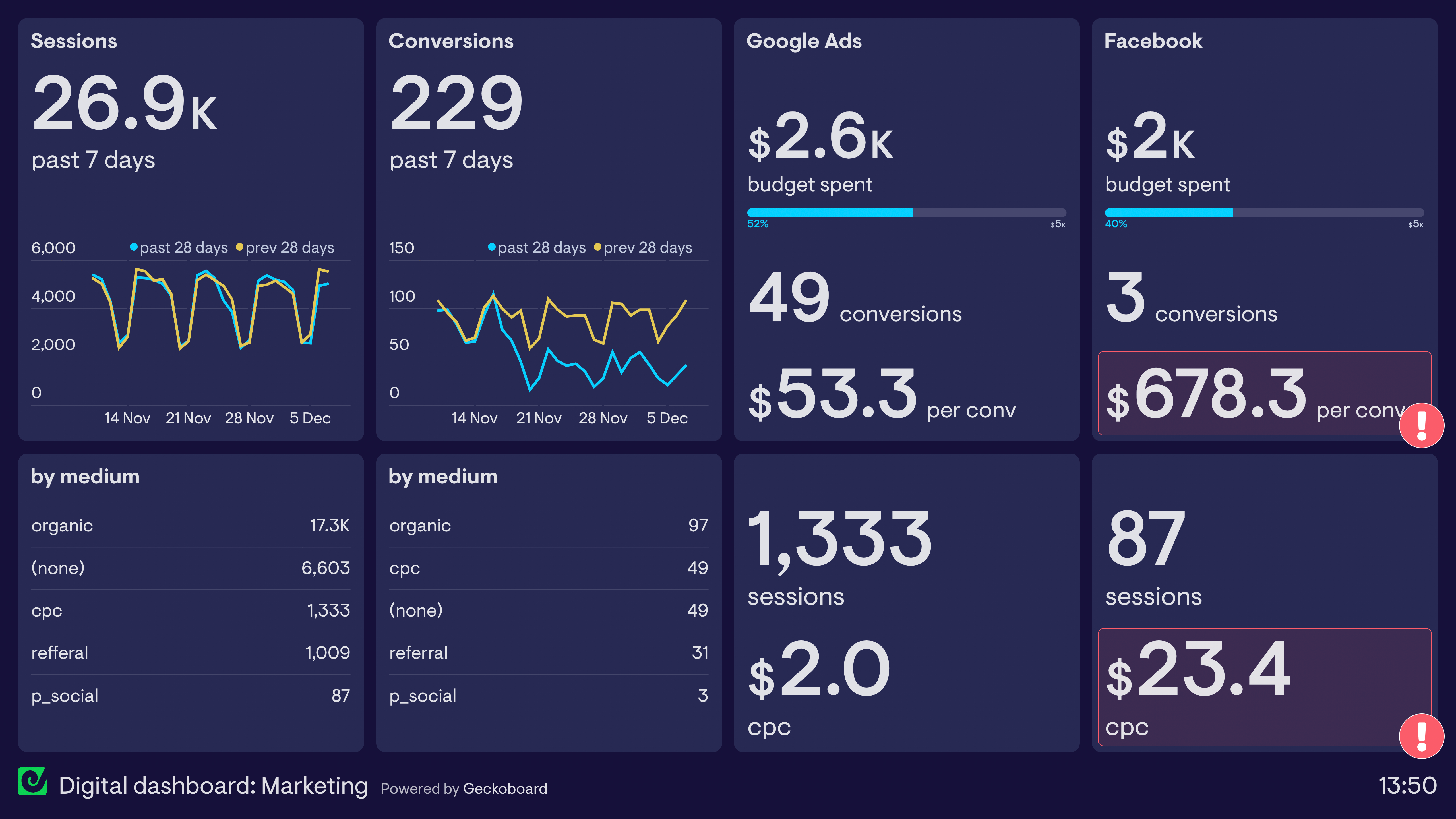
Want to see 5 more digital dashboard examples?
Read moreLive dashboards
A live dashboard displays metrics and data visualizations in real-time.
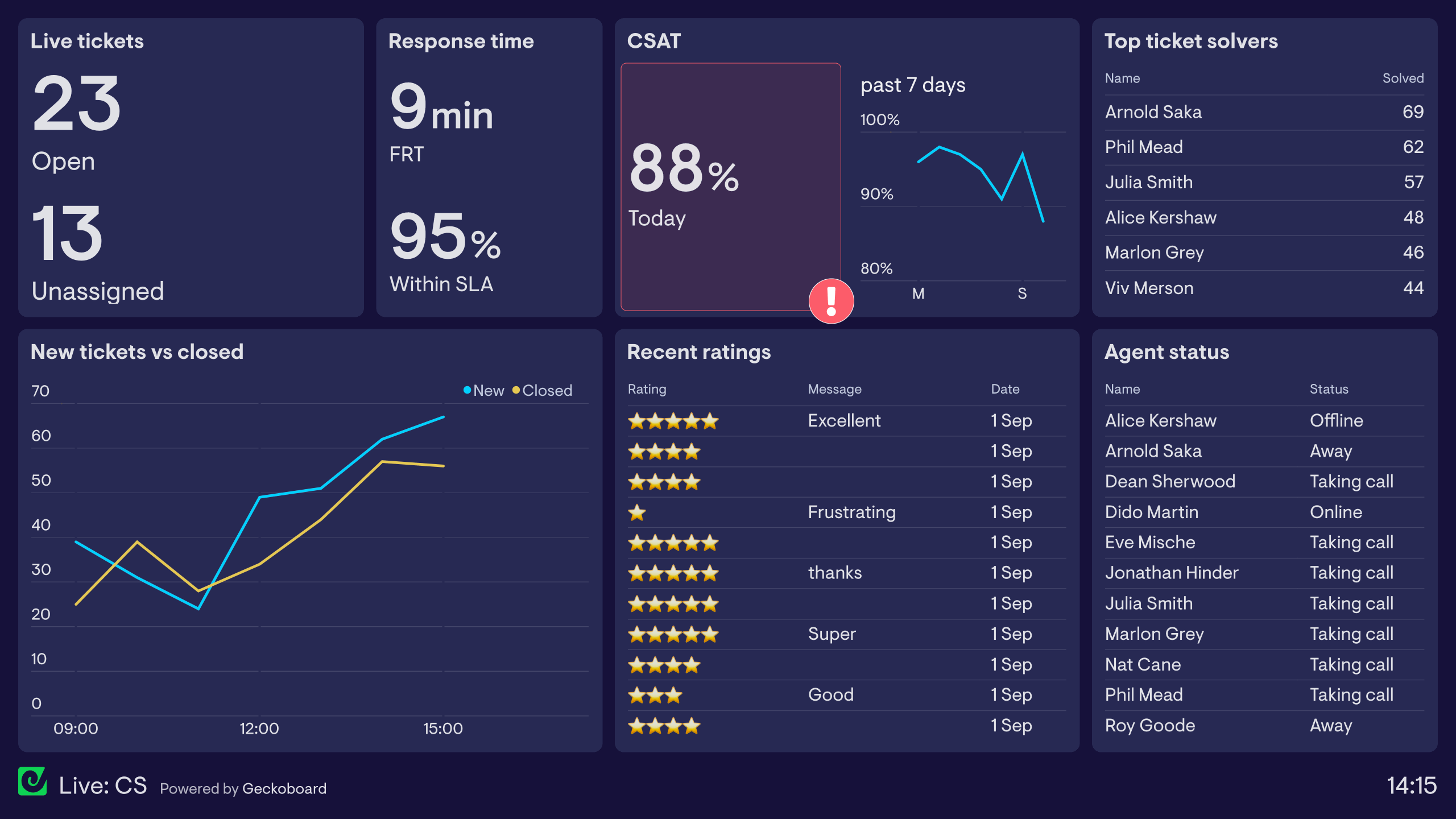
Want to see three more live dashboard examples?
Read moreSQL dashboards
Visualize metrics from databases like MySQL, MSSQL, Amazon Redshift, Snowflake and Maria DB.
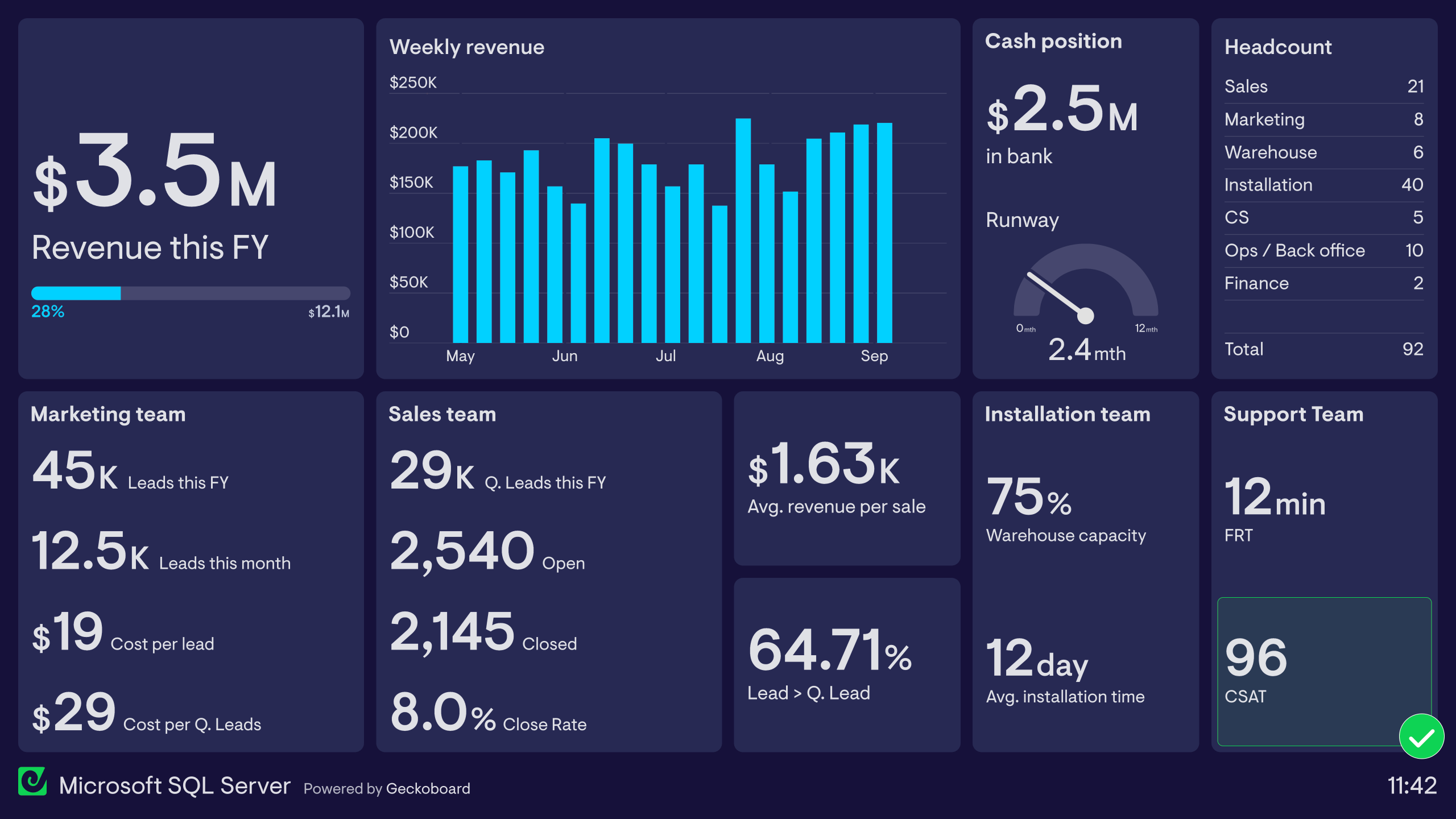
Want to see three more SQL dashboard examples?
Read more