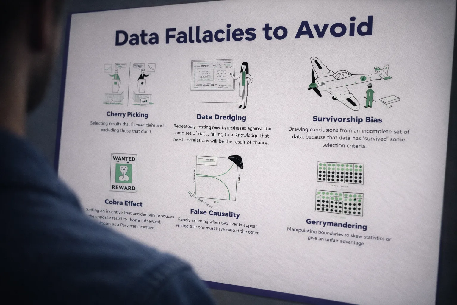
Statistical fallacies are common tricks data can play on you, which lead to mistakes in data interpretation and analysis. Explore some common fallacies, with real-life examples, and find out how you can avoid them.
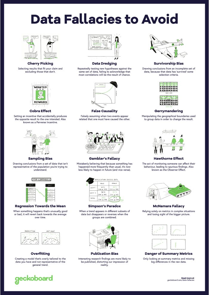
Cherry Picking
The practice of selecting results that fit your claim and excluding those that don’t. The worst and most harmful example of being dishonest with data.
When making a case, data adds weight — whether a study, experiment or something you’ve read. However, people often only highlight data that backs their case, rather than the entire body of results. It’s prevalent in public debate and politics where two sides can both present data that backs their position. Cherry Picking can be deliberate or accidental. Commonly, when you’re receiving data second hand, there’s an opportunity for someone choosing what data to share to distort the truth to whatever opinion they’re peddling. When on the receiving end of data, it’s important to ask yourself: ‘What am I not being told?’.
Related reading
Data Dredging
Data dredging is the failure to acknowledge that the correlation was in fact the result of chance.
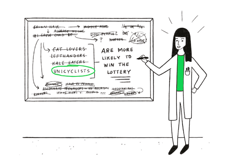
Tests for statistical significance only work if you’ve defined your hypothesis upfront. Historically, this has been a problem with clinical trials where researchers have ‘data-dredged’ their results and switched what they were testing for. It explains why so many results published in scientific journals have subsequently been proven to be wrong. To avoid this, it’s now becoming standard practice to register clinical trials, stating in advance what your primary endpoint measure is.
Related reading
Survivorship Bias
Drawing conclusions from an incomplete set of data, because that data has ‘survived’ some selection criteria.

When analyzing data, it’s important to ask yourself what data you don’t have. Sometimes, the full picture is obscured because the data you’ve got has survived a selection of some sort. For example, in WWII, a team was asked where the best place was to fit armour to a plane. The planes that came back from battle had bullet holes everywhere except the engine and cockpit. The team decided it was best to fit armour where there were no bullet holes, because planes shot in those places had not returned.
Related reading
Cobra Effect
When an incentive produces the opposite result intended. Also known as a Perverse Incentive.

Named from a historic legend, the Cobra Effect occurs when an incentive for solving a problem creates unintended negative consequences. It’s said that in the 1800s, the British Empire wanted to reduce cobra bite deaths in India. They offered a financial incentive for every cobra skin brought to them to motivate cobra hunting. But instead, people began farming them. When the government realized the incentive wasn’t working, they removed it so cobra farmers released their snakes, increasing the population. When setting incentives or goals, make sure you’re not accidentally encouraging the wrong behaviour.
Related reading
False Causality
To falsely assume when two events occur together that one must have caused the other.
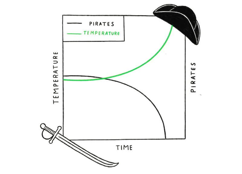
Global temperatures have steadily risen over the past 150 years and the number of pirates has declined at a comparable rate. No one would reasonably claim that the reduction in pirates caused global warming or that more pirates would reverse it. But it’s not usually this clear-cut. Often correlations between two things tempt us to believe that one caused the other. However, it’s often a coincidence or there’s a third factor causing both effects that you’re seeing. In our pirates and global warming example, the cause of both is industrialization. Never assume causation because of correlation alone — always gather more evidence.
Related reading
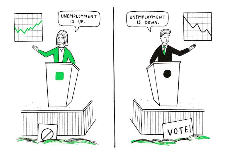
Gerrymandering
The practice of deliberately manipulating boundaries of political districts in order to sway the result of an election.
In many political systems, it’s possible to manipulate the likelihood of one party being elected over another by redefining the political districts — include more rural areas in a district to disadvantage the party that’s more popular in cities etc. A similar phenomenon known as the Modifiable Areal Unit Problem (MAUP) can occur when analyzing data. How you define the areas to aggregate your data — e.g. what you define as ‘Northern counties’ — can change the result. The scale used to group data can also have a big impact. Results can vary wildly whether using postcodes, counties or states.
Related reading
Sampling Bias
Drawing conclusions from a set of data that isn’t representative of the population you’re trying to understand.

A classic problem in election polling where people taking part in a poll aren’t representative of the total population, either due to self-selection or bias from the analysts. One famous example occurred in 1948 when The Chicago Tribune mistakenly predicted, based on a phone survey, that Thomas E. Dewey would become the next US president. They hadn’t considered that only a certain demographic could afford telephones, excluding entire segments of the population from their survey. Make sure to consider whether your research participants are truly representative and not subject to some sampling bias.
Related reading
Gambler’s Fallacy
The mistaken belief that because something has happened more frequently than usual, it’s now less likely to happen in future and vice versa.

This is also known as the Monte Carlo Fallacy because of an infamous example that occurred at a roulette table there in 1913. The ball fell in black 26 times in a row and gamblers lost millions betting against black, assuming the streak had to end. However, the chance of black is always the same as red regardless of what’s happened in the past, because the underlying probability is unchanged. A roulette table has no memory. When tempted by this fallacy, remind yourself that there’s no rectifying force in the universe acting to ‘balance things out’!
Related reading
Regression Toward the Mean
When something happens that’s unusually good or bad, over time it will revert back towards the average.
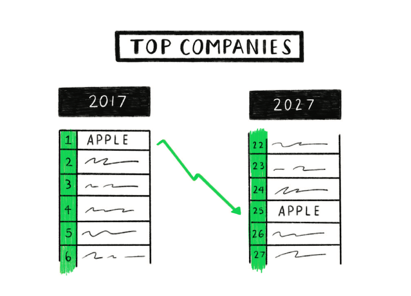
Anywhere that random chance plays a part in the outcome, you’re likely to see regression toward the mean. For example, success in business is often a combination of both skill and luck. This means that the best performing companies today are likely to be much closer to average in 10 years time, not through incompetence but because today they’re likely benefitting from a string of good luck — like rolling a double-six repeatedly.
Related reading
Hawthorne Effect
When the act of monitoring someone can affect that person’s behavior. Also known as the Observer Effect.

In the 1920s at Hawthorne Works, an Illinois factory, a social sciences experiment hypothesised that workers would become more productive following various changes to their environment such as working hours, lighting levels and break times. However, it turned out that what actually motivated the workers’ productivity was someone taking an interest in them. When using human research subjects, it’s important to analyze the resulting data with consideration for the Hawthorne Effect.
Related reading
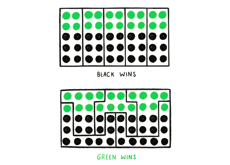
Simpson’s Paradox
A phenomenon in which a trend appears in different groups of data but disappears or reverses when the groups are combined.
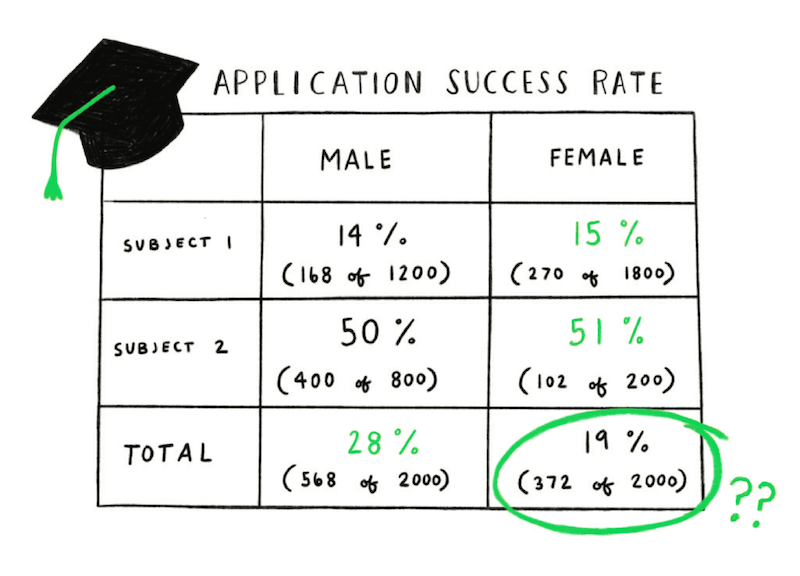
In the 1970s, Berkeley University was accused of sexism because female applicants were less likely to be accepted than male ones. However, when trying to identify the source of the problem, they found that for individual subjects the acceptance rates were generally better for women than men. The paradox was caused by a difference in what subjects men and women were applying for. A greater proportion of the female applicants were applying to highly competitive subjects where acceptance rates were much lower for both genders.
Related reading
McNamara Fallacy
Relying solely on metrics in complex situations can cause you to lose sight of the bigger picture.

Named after Robert McNamara, the U.S. Secretary of Defense (1961–1968), who believed truth could only be found in data and statistical rigor. The fallacy refers to his approach of taking enemy body count as the measure of success in the Vietnam War. Obsessing over it meant that other relevant insights like the shifting mood of the U.S. public and the feelings of the Vietnamese people were largely ignored. When analyzing complex phenomena, we’re often forced to use a metric as proxy for success. However, dogmatically optimizing for this number and ignoring all other information is risky.
Related reading
Overfitting
A more complex explanation will often describe your data better than a simple one. However, a simpler explanation is usually more representative of the underlying relationship.
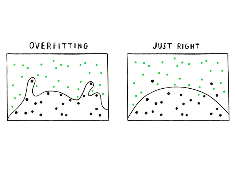
When looking at data, you’ll want to understand what the underlying relationships are. To do this, you create a model that describes them mathematically. The problem is that a more complex model will fit your initial data better than a simple one. However, they tend to be very brittle: They work well for the data you already have, but try too hard to explain random variations. Therefore, as soon as you add more data, they break down. Simpler models are usually more robust and better at predicting future trends.
Related reading
Publication Bias
How interesting a research finding is affects how likely it is to be published, distorting our impression of reality.

For every study that shows statistically significant results, there may have been many similar tests that were inconclusive. However, significant results are more interesting to read about and are therefore more likely to get published. Not knowing how many ‘boring’ studies were filed away impacts our ability to judge the validity of the results we read about. When a company claims a certain activity had a major positive impact on growth, other companies may have tried the same thing without success, so they don’t talk about it.
Related reading
Danger of Summary Metrics
It can be misleading to only look at the summary metrics of data sets.
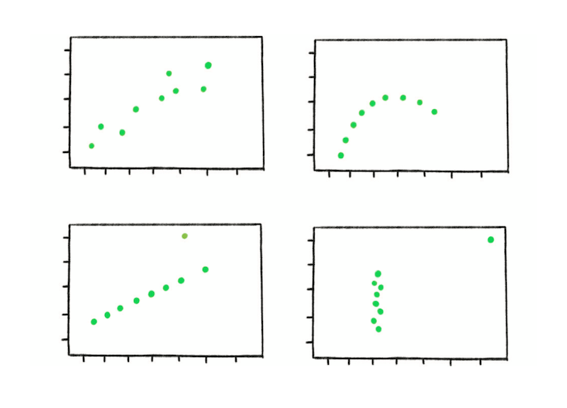
To demonstrate the effect, statistician Francis Anscombe put together four example data sets in the 1970s. Known as Anscombe’s Quartet, each data set has the same mean, variance and correlation. However, when graphed, it’s clear that each of the data sets are totally different. The point that Anscombe wanted to make is that the shape of the data is as important as the summary metrics and cannot be ignored in analysis.
Related reading
Get the poster
Here’s a handy poster with all of our data fallacies.
Download the Data Fallacies Poster (PDF)