We’re constantly bombarded with “data-backed” claims. Whether it’s your colleague claiming a 100% revenue increase from their project or a detergent claiming to make your sheets 10x whiter. The claims are data-backed, so they must be true, right? WRONG!
While data is quantifiable, it’s only quantifying what a human asks it to. This opens the door to human error, misinterpretation and bias. So, how do you channel your inner data-cynic and put these data-backed claims to the test?
This checklist of questions is designed to do just that — helping you see the truth within the data. Whether it comes from a teammate, a client, vendor, or perhaps a political figure, it’s critical to fact check the numbers.
Quick note: As you ask these questions, be mindful of your own preconceptions and biases. We are more likely to dismiss things that don’t conform to our existing view of the world.
1. Does the claim match the data?

Is the headline misleading? Has the data been over-simplified, over-inflated, or otherwise dramatized to become a sensational headline?
Has a generalization been made that doesn’t accurately reflect the data?
What’s the small print? Headlines often omit key details.
Real life example: A 2013 Times article claimed “More people have cell phones than toilets.” However, by looking at the actual data, we find that more people have access to mobile phones than toilets. ‘Access’ is a tricky word because it could mean that dozens of people share a single mobile phone, but the Times headline makes it sound like the number of cell phones exceeds the number of toilets.
“Just because someone quotes you a statistic or shows you a graph, it doesn’t mean it’s relevant to the point they are trying to make.”
Daniel Levitin, Neuroscientist and author of A Field Guide to Lies and Statistics
2. Does the claim seem plausible?

Sanity check the claim. Do some quick back-of-the-envelope math or use your own prior knowledge. Are there other, more plausible explanations for the effect? Could they have made a mistake?
Can you verify the claim in any other way? Perhaps you have access to other data or can pull a report from another source.
The less plausible the claim, the more heavily you’ll need to scrutinize everything else.
Real life example:You’re a customer support rep and your boss claims that “our best customer support rep can resolve 800 tickets via phone a day.” Let’s do some quick math:
- 5 seconds — answer the phone and get the customer’s name
- 5 seconds — pull up account and ask what the problem is
- 10 seconds — customer explains problem
- 30 seconds — verify the problem or find the source
- 40 seconds — fix the problem
= 90 seconds per ticket or 40 tickets per hour. Even if every call were this efficient and no breaks were taken during eight hours, the rep would only resolve 320 tickets a day — nowhere near 800.
3. What comparison needs to be made?

Data is all about ‘compared to what?’ Last week? Last year? Competitor(s)? Revenue?
Real life example:Several years ago Colgate ran an advertising campaign claiming that “80% of dentists recommend Colgate.” The implied comparison is that dentists recommend Colgate over and above other brands. However, the Advertising Standards Authority discovered that in the survey, dentists could recommend more than one toothpaste. In fact, another competitor was recommended almost as often as Colgate was.
4. Who’s saying it?

Are they an expert?
What is their agenda? Combined with the plausibility of the claim, this will affect how heavily you’ll need to scrutinize the data.
Where did the data come from in the first place?
Real life example: In 1998, a research paper published in The Lancet claimed there was a link between certain vaccines and Autism. Several subsequent studies by independent organizations showed the author, Andrew Wakefield, manipulated the evidence to create the appearance of a link in his research. Although he was a gastroenterologist, he wasn’t an expert in toxicology, genetics, or neurology. He also failed to disclose a conflict of interest — he received significant money to prove the vaccine was dangerous. In 2010, the “utterly false” article was fully retracted.
5. How was the data gathered?

How did they arrive at their conclusion?
Often it’s not easy to gather the exact data you need. What was their methodology? Have any approximations been made? Were these done sensibly?
Is there too much extrapolation? Were best practices followed, such as significance tests, sampling biases avoided, etc.?
Example: Suppose you want to know how long it takes a cup of coffee (at 140°F) to cool to room temperature. After observing for three minutes, you find the coffee cools by 5 degrees every minute. If you extrapolate that data, you could end up with the ridiculous conclusion that after 30 minutes, the coffee would freeze — failing to consider that the rate of cooling slows as it approaches room temperature.
6. What’s missing?

Was their sample representative of the whole?
Has the data been ‘cherry picked’ — only using the information that supports a particular view?
Do you have other data that would help put the claim in context?
Real life example: Global warming is an often debated topic where both ‘sides’ have trends to back their claims. This is achieved by cherry picking only the data that supports their position while omitting the rest.
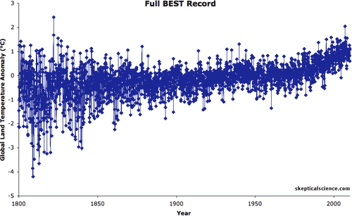
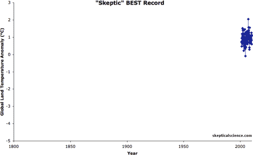
Source: Skeptical Science
“A companion to the cherry-picking bias is selective windowing. This occurs when the information you have access to is unrepresentative of the whole.”
Daniel Levitin, Neuroscientist and author of A Field Guide to Lies and Statistics
7. Is the data being distorted?
In addition to cherry picking, other tactics might be employed. For example, a line chart axis might be cropped or a misleading average shown.
Real life example: In 2012, Fox Business showed a chart visualizing the impact if Bush tax cuts were to expire — the top tax rate would change from 35% to 39.6%. However, the axis was cropped, beginning at 34% instead of 0%, making the increase appear far larger than it actually was.
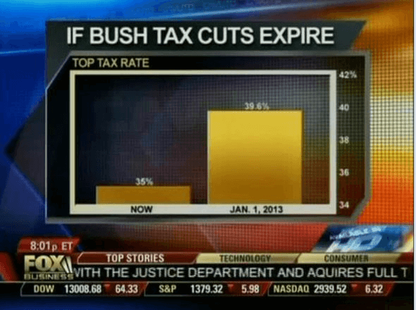
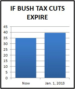
Source: MediaMatters.org
“Curiosity is bad for cats, but good for stats. Curiosity is a cardinal virtue because it encourages us to work a little harder to understand what we are being told, and to enjoy the surprises along the way.”
Tim Harford, Economist, author, and journalist
Further reading
Want to learn more about data and how to evaluate it? Check out our basic data analysis guide, along with these books and resources:
- How To Lie with Statistics by Darrell Huff
- A Guide to Statistics in a Misleading Age by Tim Harford
- A Field Guide to Lies and Statistics by Daniel Levitin