Real-world dashboards used by finance teams and executives to track financial health, revenue, and cash flow.

A CFO dashboard is used by a CFO (Chief Financial Officer) or Finance Director to maintain a high-level overview of their company’s financial health and overall performance. It supports them as they maintain operational oversight and plan for future eventualities.

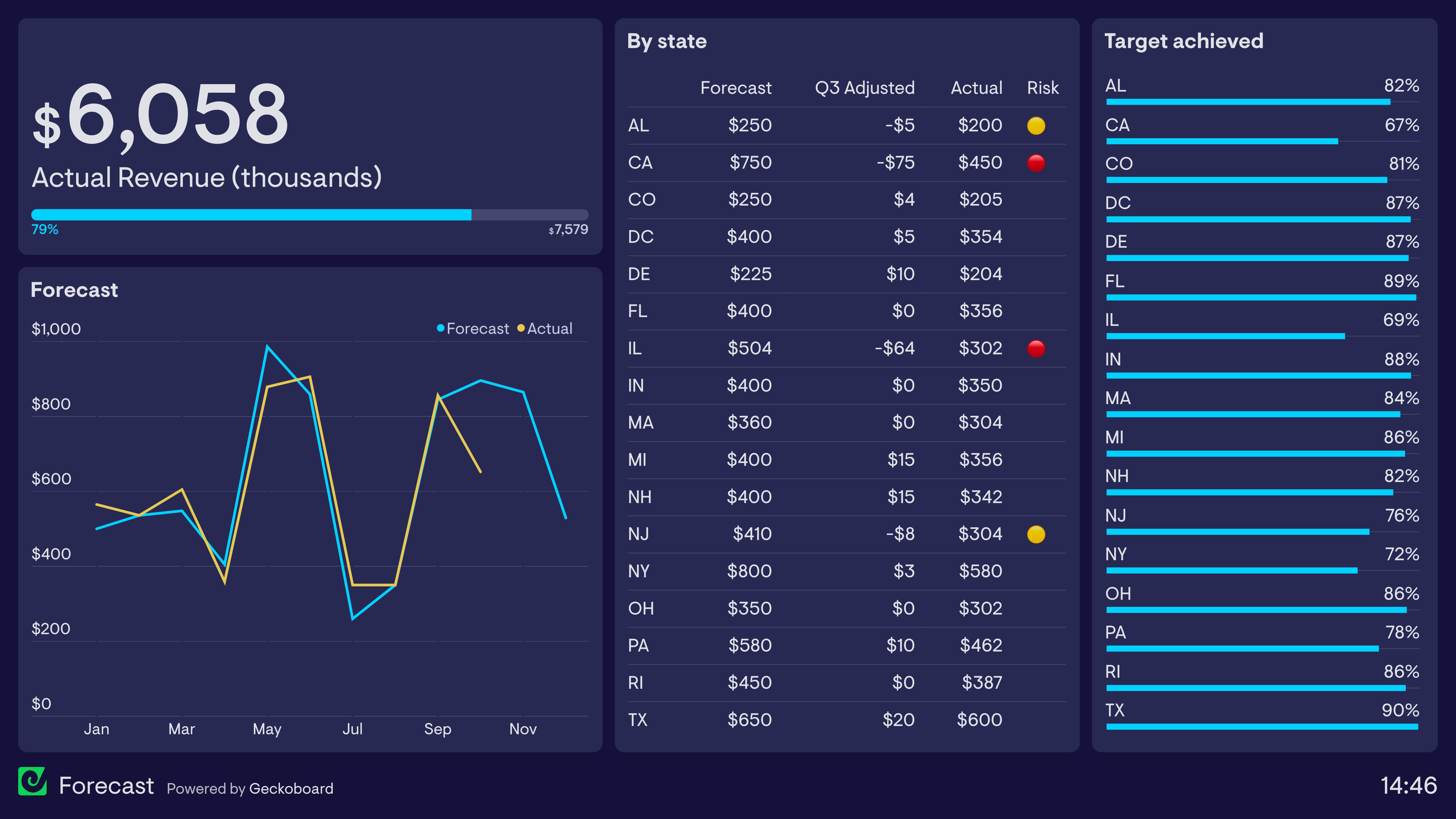
This dashboard is used by the CFO to understand how individual teams (based in different states) are performing against budgeted revenue projections for the year. The total budgeted revenue for the year is $7.579 million and they have so far achieved $6.058 million. (Figures in the dashboard are displayed in multiples of 1000, which is a common practice in accounting.)
In the bottom left corner, we can also see how revenue is tracking against the forecast. Forecasts are created at the start of the financial year and normally updated every quarter. By creating a realistic forecast, a business can better understand if they are ahead or behind budget in relation to where they would expect to be at that time of year.
In the middle section, the CFO is tracking the performance of individual teams in different states. They are using a dot chart system to flag any teams which are at risk of not hitting their target for the year. Two teams are high risk and are looking unlikely to reach their target. Finally, on the right, we can see all teams’ current revenue performance as a proportion of their target revenue for the year.
A SaaS dashboard visualizes the most important metrics related to a SaaS (Software as a Service) company’s overall performance. In particular, it covers data related to financial health, growth, customers and other areas of strategic importance.

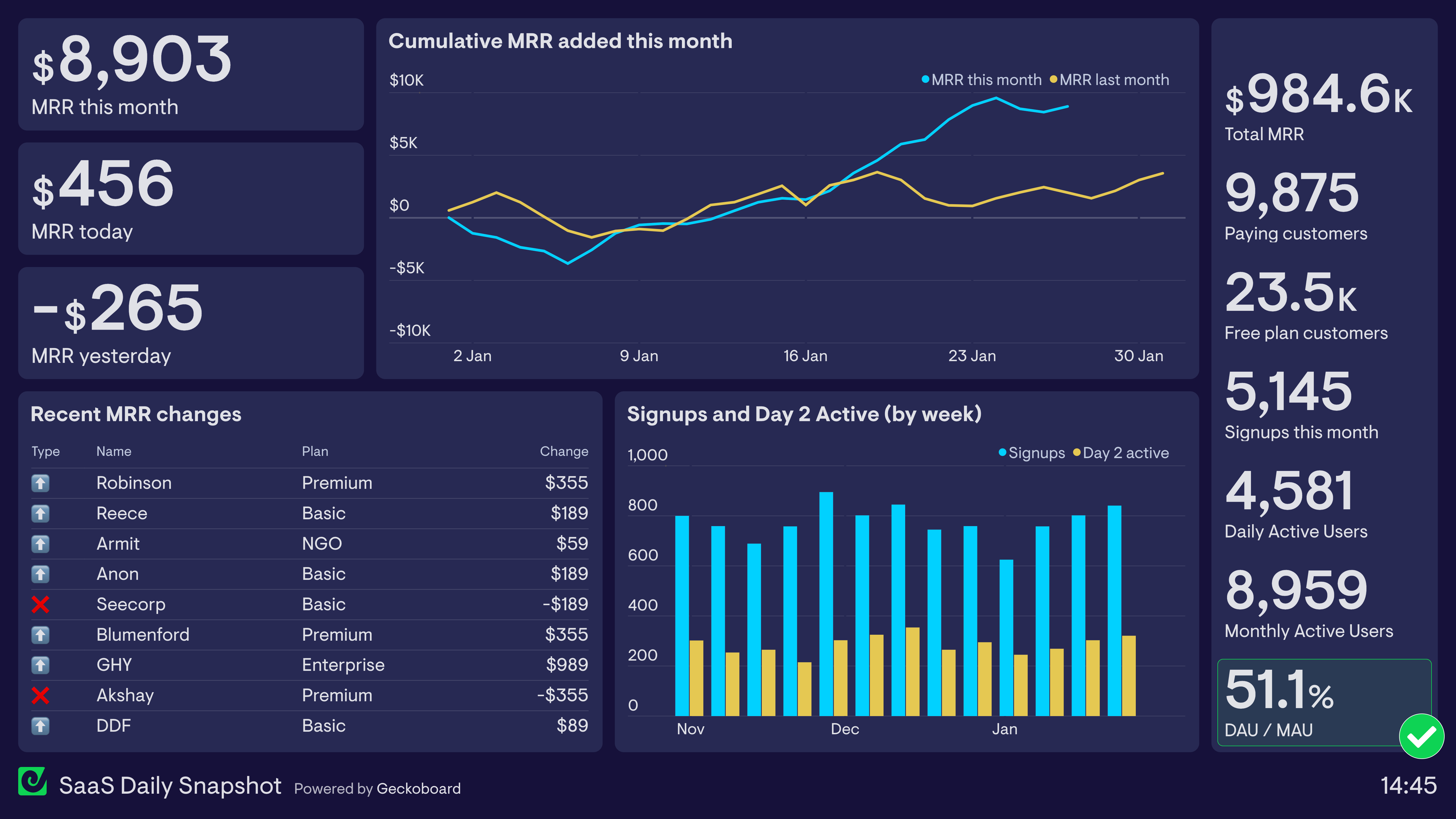
This SaaS dashboard is designed to give all employees a high-level overview of company performance, each day. Chiefly, it focuses on MRR (Monthly Recurring Revenue) — we can clearly see the amount of new MRR this month, the overall MRR figure, and more recent MRR changes. Even though you should expect natural variance in your MRR in the short term, these metrics are helpful because sometimes sudden changes require further investigation (for example: a big customer churns, a payment page breaks, or there is a fault in PPC advertising.)
The other main focus is customers. Not only does this dashboard track potential new customers taking part in a free trial (signups), it also tracks the number of those trialists who are still active on Day 2. This metric helps to understand if new trialists are as engaged as previous customers, helping to qualify their potential. Finally, the dashboard tracks the DAU/MAU Ratio (Daily Active Users / Monthly Active Users) to see how active current customers are — a drop would indicate customers are using the product less frequently and may be more likely to churn.

This dashboard focuses more exclusively on a SaaS company’s financial KPIs. Like the previous dashboard, this company’s main priority is MRR, which they use to track the overall growth of the business. However, this dashboard also tracks cash flow, which is not always in line with revenue figures. The Cash Runway is a health metric that shows how long a company can continue operating based on its current Burn Rate. The dashboard also tracks ARPA (Average Revenue per Account) and CAC (Customer Acquisition Cost).
A revenue dashboard breaks down company revenue so users can see, more clearly, the different factors driving revenue changes.

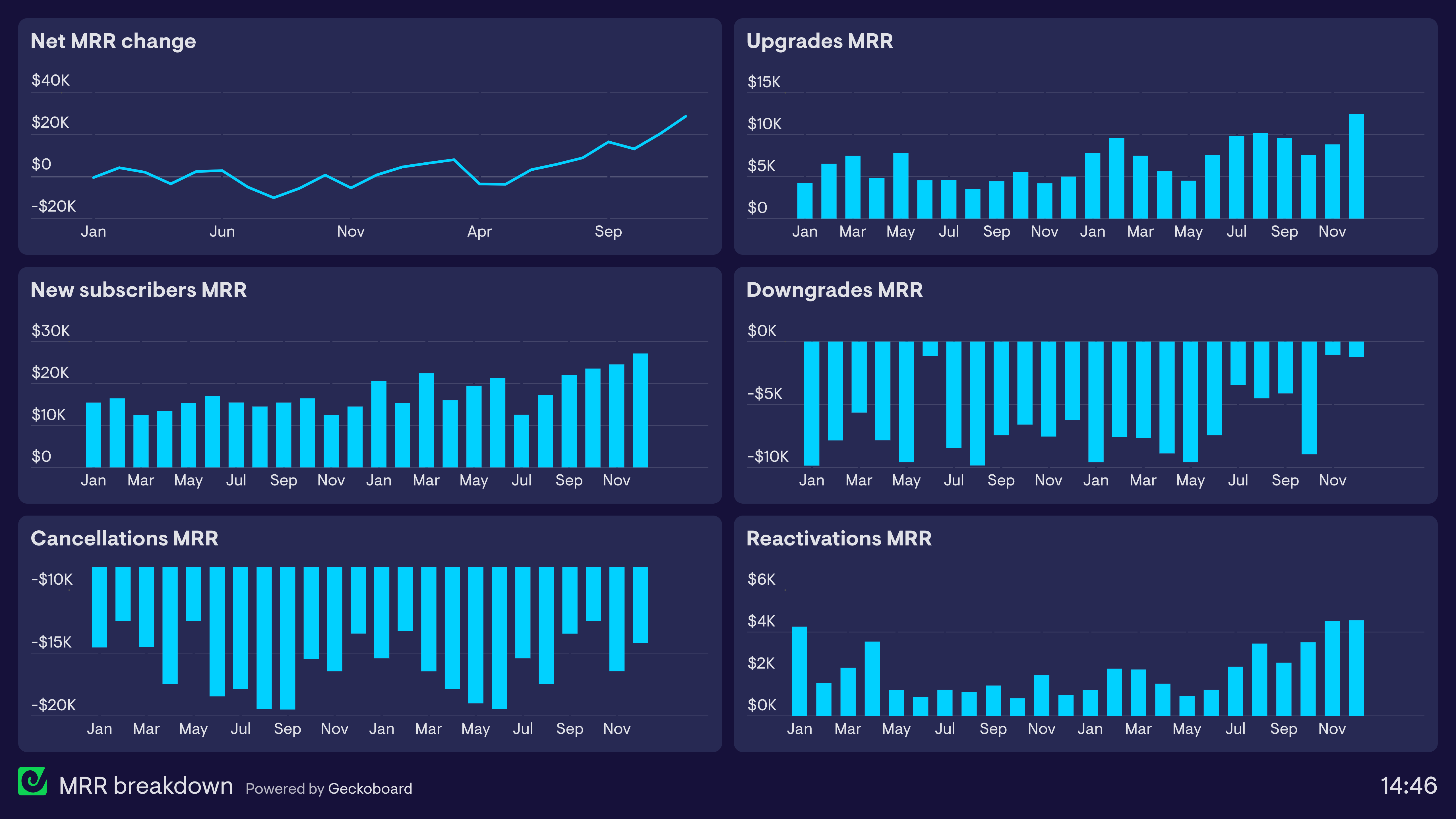
This dashboard tracks MRR (Monthly Recurring Revenue), a metric which many subscription-based businesses use to provide a normalized, high-level view of their revenue performance. On the line chart in the top left corner, we can see the net change to MRR — anything greater than $0 shows growth, whereas anything lower than $0 indicates a shrinkage in overall MRR that month.
Particularly in SaaS companies, there are many factors that can drive revenue change. This includes acquiring new customers, cancellations, upgrades to a higher-priced plan, downgrades to a lower-priced plan, and dormant customers who have reactivated their account. Alongside the net MRR change figure, this dashboard shows each of these metrics separately, so users are aware of the context behind changes to the primary KPI.
A cash flow dashboard specifically monitors a company’s immediate spending power and cash. Company Owners and Finance Directors need to track cash flow separately to revenue — that’s because the timing of income and expenditure means that revenue models do not always reflect a company’s immediate cash position.

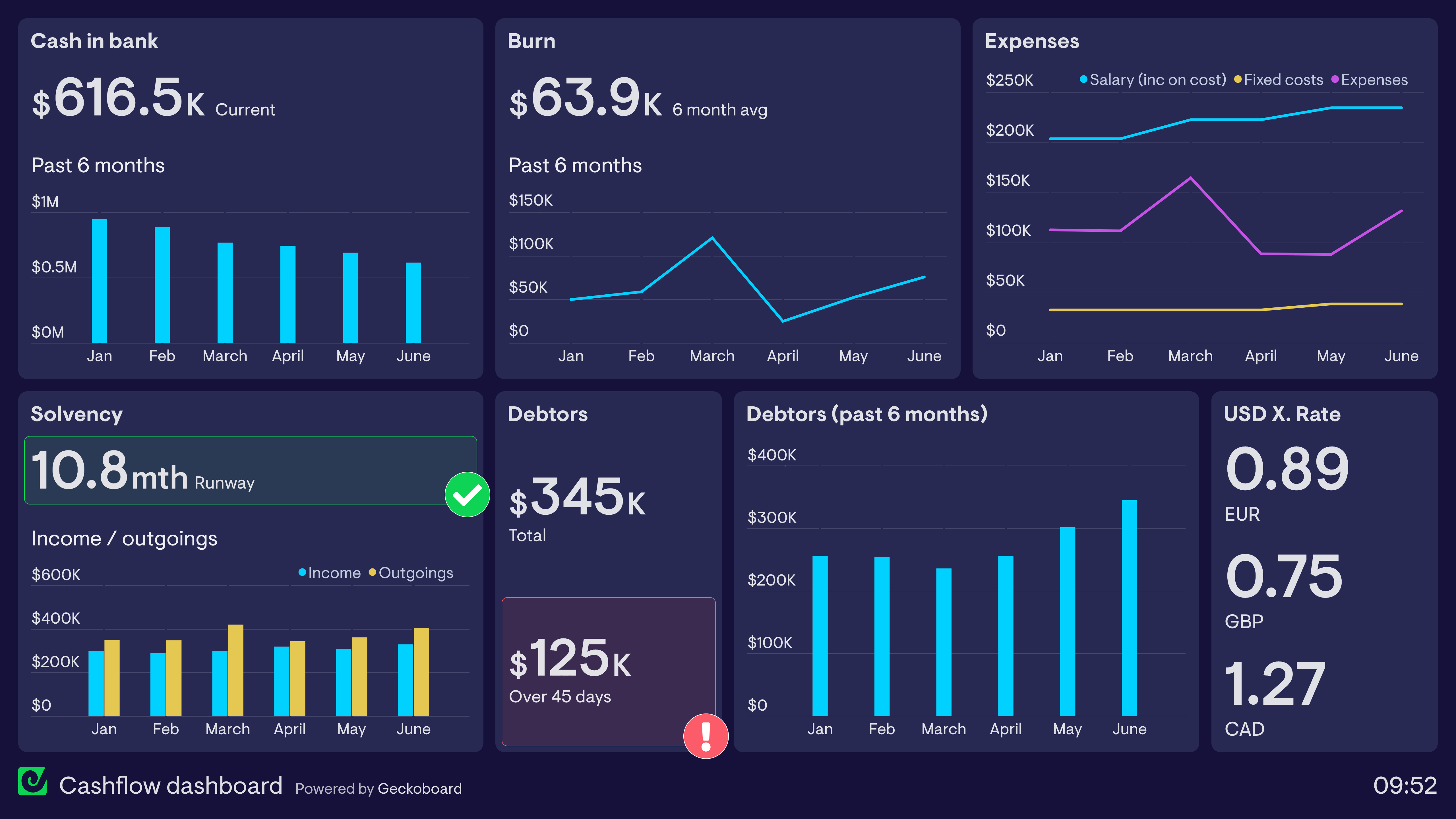
This dashboard tracks several metrics related to cash flow. First, the user tracks total cash in the bank and how this has changed over the past month. Sometimes companies refer to the month-to-month difference as the Burn Rate, which is also being tracked here. Related to this is the Cash Runway, which shows how long the company could operate at its current Burn Rate. The dashboard also breaks down expenses by type so the Finance Director can better understand what contributes to expenditure.
A significant portion of the dashboard is devoted to debtors. Having debtors is not necessarily a bad thing and is common in industries which issue invoices. However, companies need to carefully monitor debts that have not been paid within the agreed terms, as there is always a risk debtors will not pay. That’s why this dashboard has created a status indicator for unpaid debts longer than 45 days — if this gets too high, the Finance Director will likely need to investigate. Finally, because the company trades internationally, they have included current exchange rates against the US Dollar.
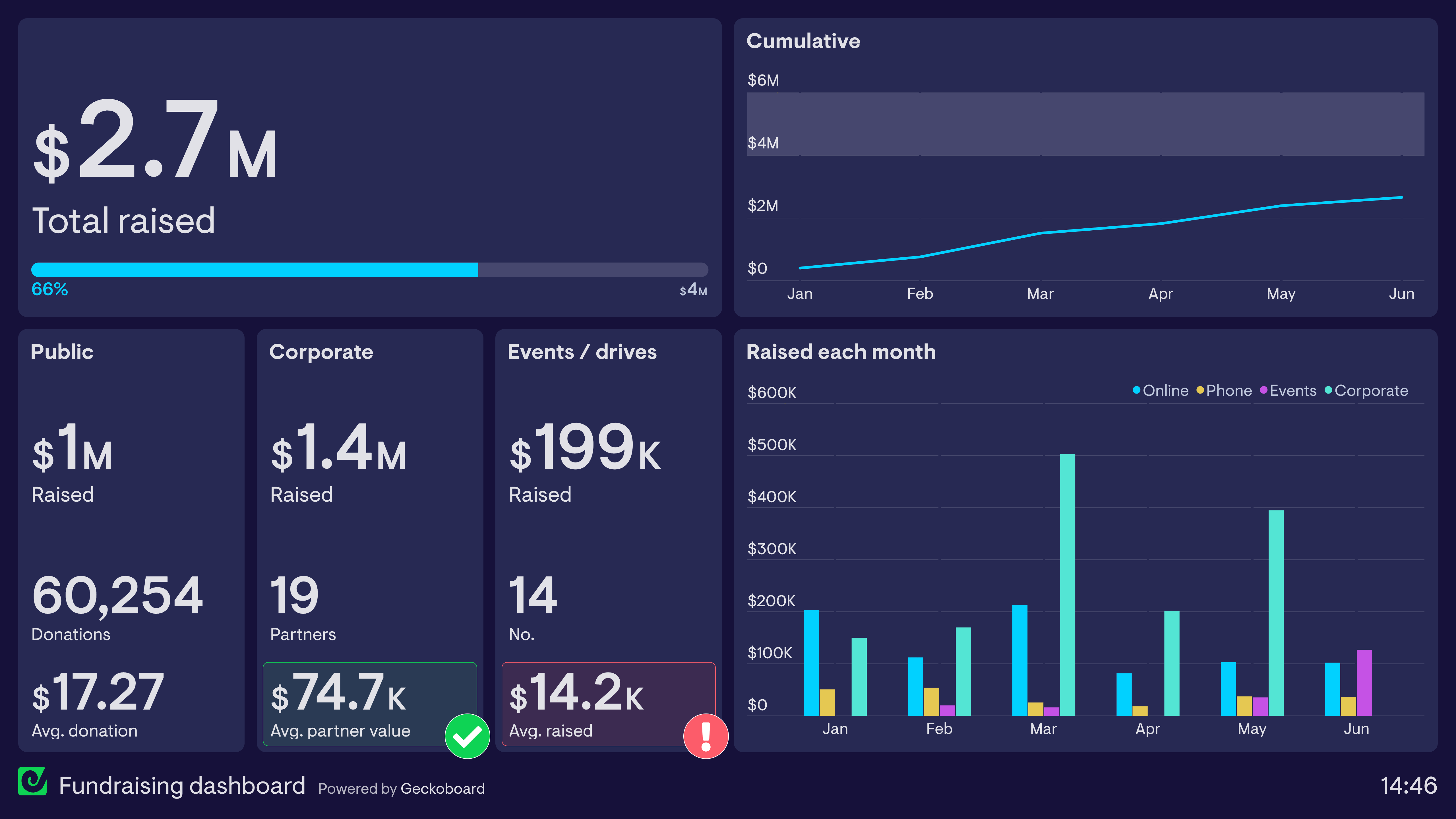
A fundraising dashboard is used by an organization working towards a specific fundraising goal. Often this would be a charity or NGO raising funds via charitable donations, but they are also used by all types of fundraisers — such as new businesses raising equity, political campaigns or crowdfunding initiatives.

This dashboard is used by a charity as part of a fundraising campaign. Their goal is to reach $6m in donations, which they are achieving through a combination of public fundraising (via online and phone donations), physical fundraising drives and corporate sponsorship. The dashboard breaks down the KPIs according to each channel, as well as providing health metrics on the effectiveness of each. Corporate partners are performing above expected, whereas physical events are performing less well than expected.
It’s likely this dashboard would be displayed live on a TV in spaces where the fundraising team are working, as a way of motivating team members and boosting morale.