Column chart visualization
Today we’re rolling out some major improvements to our column chart visualisation. These include:
Better handling of date and time data
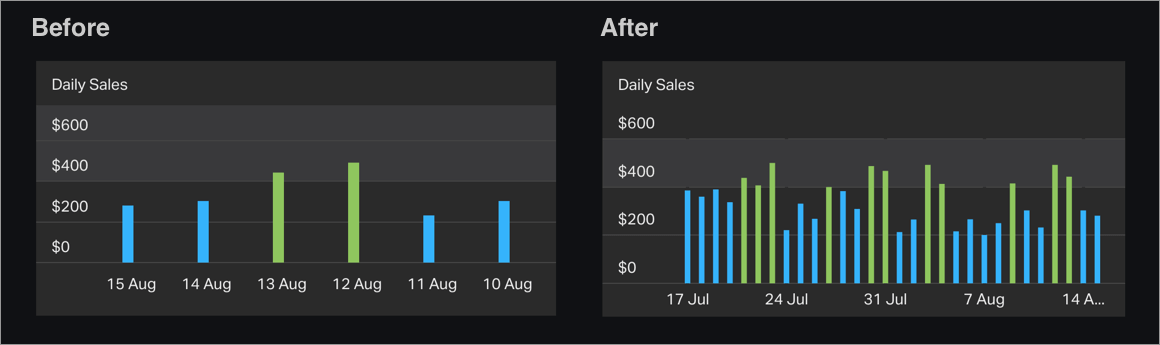
When displaying data plotted against a date or time, column charts will now label axes much more intelligently in order to prevent overcrowding in your widget. For example, if you’re configuring your widget to show weekly data over a year-long period, the column chart may now label each month (rather than every single week), depending on how large the widget is.
In addition, column charts will now handle data points at irregular intervals and missing values much more effectively.
Scaling based on size of data set
When plotting a large set of data, columns within the chart will now scale down to fit within the space available, meaning it’s much easier to display most or all of your dataset within your visualization.
New tooltip
When building a dashboard, hover over a data point on your column chart with your mouse and you’ll notice a new tooltip that displays the exact value that’s plotted.
To begin with just widgets built with our Spreadsheets and Salesforce integrations or our API will be upgraded, with our other integrations following in the coming weeks.