Customer Led Growth dashboard examples
A Customer-Led Growth (CLG) dashboard tracks the stages of the customer journey using KPIs that reflect real value to customers — not conventional funnel metrics like MQL or SQL. It keeps the whole team aligned on the moments that actually drive retention and growth.
How do I build a Customer-Led Growth (CLG) dashboard?
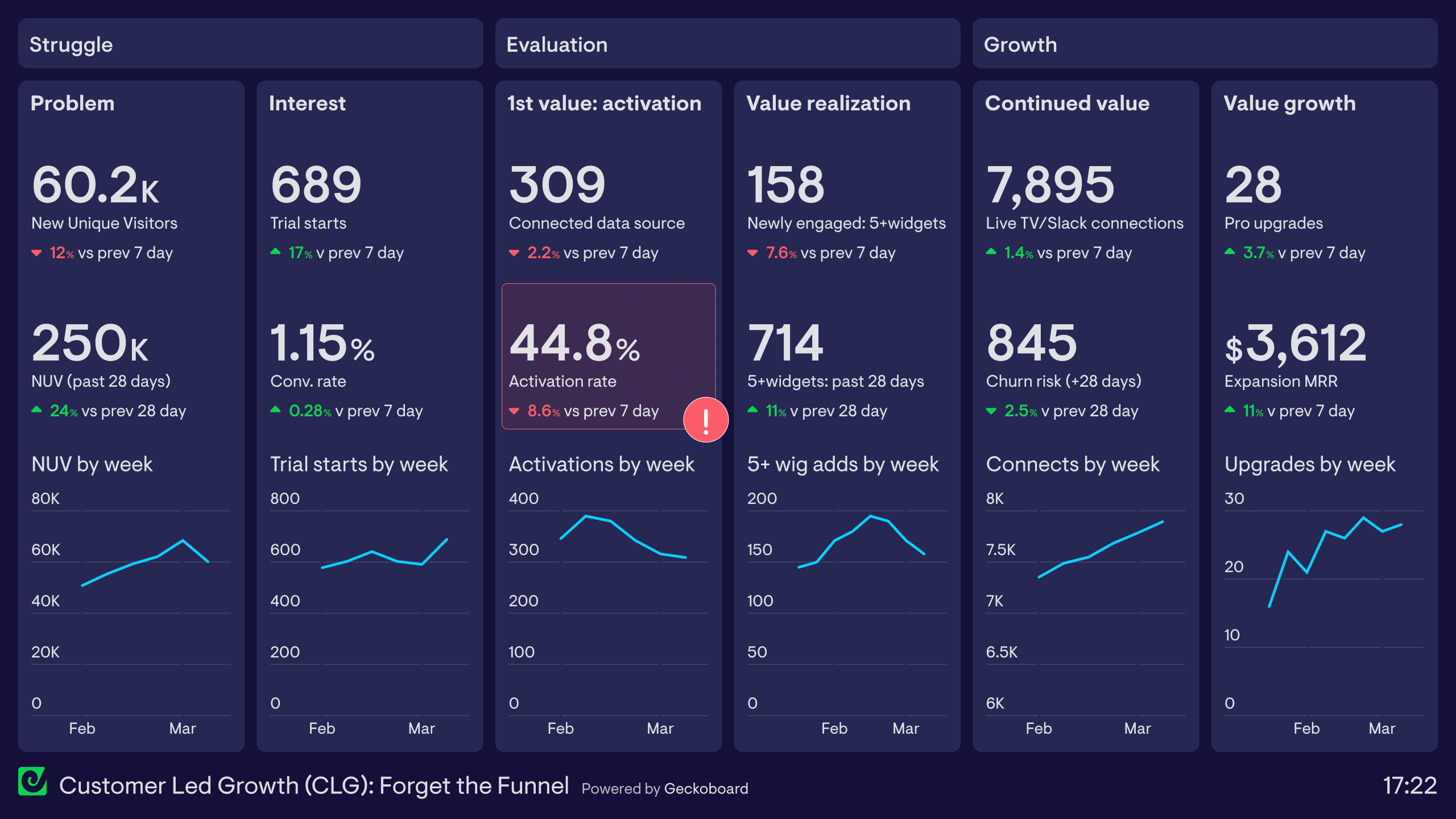
This dashboard shows how you might use a KPI dashboard tool like Geckoboard to track the CLG framework. In this case, we’re using Geckoboard’s own customer journey as an example (with dummy data).
The dashboard is divided into six sections, each representing six different stages of the customer journey.
➡️ Problem – In the first column, we are using New Unique Website Visitors as a KPI to track the Problem stage. How many potential customers are discovering Geckoboard as a potential solution to their problem? Here, the dashboard pulls data directly from Google Analytics. We can track how many new website visitors we have recorded over the past 7 days and the past 28 days.
➡️ Interest – In the second column, we are also using Google Analytics data to track New Free Trial users. In addition to the total number, we can also see the website’s overall conversion rate.
➡️ First Value: Activation – In the third column, we are using Mixpanel data to track First Value (or Activation Rate). Out of the customers who signed up for a trial, how many reached the “aha moment” where they experienced value for the first time? Using insights from customer research, we decided our Activation KPI should be the number of people who connect their first data source. You’ll notice that the activation rate has triggered a red status indicator on the dashboard – that’s because it’s fallen below the 50% threshold we've set for ourselves. Status indicators like these help the team to quickly notice when something has changed for the worse (or the better).
➡️ Value Realization – In the fourth column we’re also using Mixpanel data to track how many people reached Value Realization – where they “solved the problem that they came to us to solve”. Again, based on customer research we know that this is the point where customers have been able to build a dashboard that visualizes multiple data points.
➡️ Continued Value – In the fifth column we are using data from our SQL database to track Continued Value – the point where customers have “established a habit and the product is embedded into their life”. In our case, this is when customers are regularly sharing their dashboard with their team via collaboration channels such as Slack or Microsoft Teams, or by using our Send to TV feature for permanent TV display.
➡️ Value Growth – The sixth column uses SQL database data to track customers who upgrade their plan because they are expanding their usage of the product.
In addition to the data sources we mentioned (Google Analytics, Mixpanel and SQL databases), you can recreate this dashboard using over 90 different data sources including Salesforce, ProfitWell or Google Sheets.
Interested in learning how to build a customer experience map with customer-based KPI? Check out their new book, Forget the Funnel: a Customer-Led Approach to Driving Predictable, Recurring Revenue.
A Customer-Led Growth dashboard tracks the metrics that show whether existing customers are driving new growth — through referrals, expansion revenue, and advocacy. It's used by product-led and community-driven SaaS teams who want to measure whether their customer base is actively contributing to acquisition and retention.
Geckoboard is a live dashboard tool that connects to product analytics, web data, and custom databases to help teams track the metrics that represent real customer value. It's used by growth teams who want performance visible to everyone — not just those who can run SQL.
Key metrics include expansion MRR, referral conversions, product adoption rate, community engagement, NPS, and customer retention rate. Teams combine web analytics and product data to measure how customer behaviour translates into growth.
Building a custom CLG dashboard is straightforward with Geckoboard's dashboard builder. Connect Mixpanel, Google Analytics, and SQL databases and custom data sources to pull product usage and acquisition data, then pick your metrics and build the view you need. Share with your team as a TV dashboard, shared link, or scheduled snapshot. Start a free trial or learn more about how Geckoboard works.
Use it to monitor performance in real time across the metrics that show whether customers are becoming advocates and driving growth. It also helps bring data together from product, web, and CRM tools so you can see the full customer-led funnel in one place.