
Marketing dashboard examples
Real-world dashboards used by marketing teams to track campaigns, website performance, social media, and growth.
CMO dashboards
Chief Marketing Officers (CMOs) use CMO dashboards to maintain a high-level overview of their company’s marketing spending and performance. These will often include long-term measures of brand health, as well as key metrics that indicate the success of current marketing initiatives.
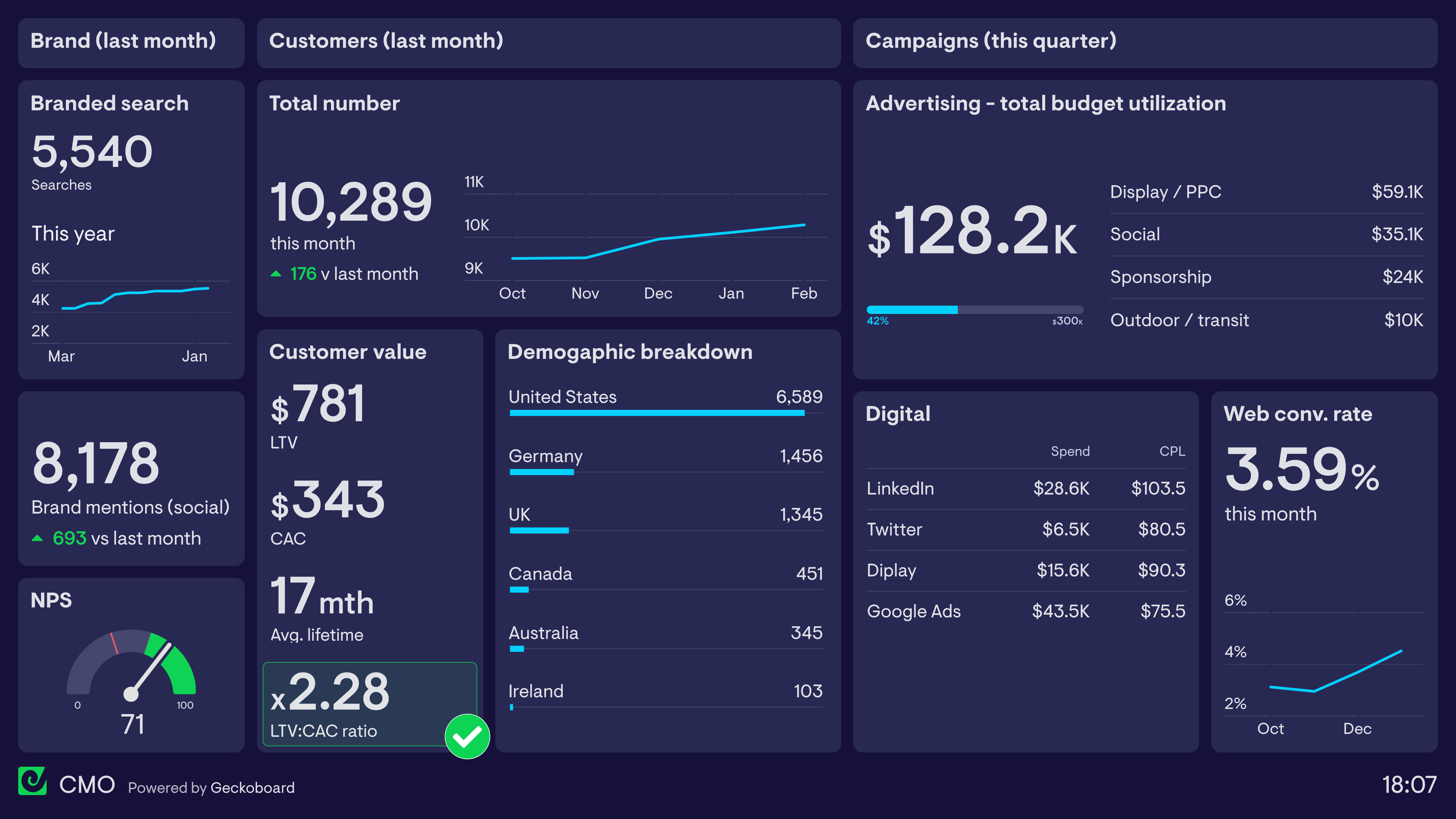
CMO dashboard
This CMO dashboard focuses on three areas. In the first column, the CMO tracks important brand health metrics: the volume of monthly searches for their brand name, the number of mentions of their brand on social media, and their current Net Promoter Score. This gives an indication of both brand awareness and sentiment — both leading indicators of future commercial success. In the central section, the dashboard tracks Customer Lifetime Value (LTV) and Customer Acquisition Cost (CAC). Many CMOs use the LTV:CAC ratio to measure the financial sustainability of their current marketing investment. Finally, the dashboard reports on overall advertising spend this quarter, designed to give a high-level overview while individual campaign performance is tracked by Marketing Managers elsewhere.
Build a dashboard like this with Geckoboard
Try freeDigital marketing dashboards
Although digital marketing is well known for providing advertisers with a huge volume of reporting data, it can often be difficult to determine — and easily access — the metrics that are most important. A digital marketing dashboard provides a single view of the KPIs Digital Marketing Managers need in order to understand their campaigns and take action to optimize performance.
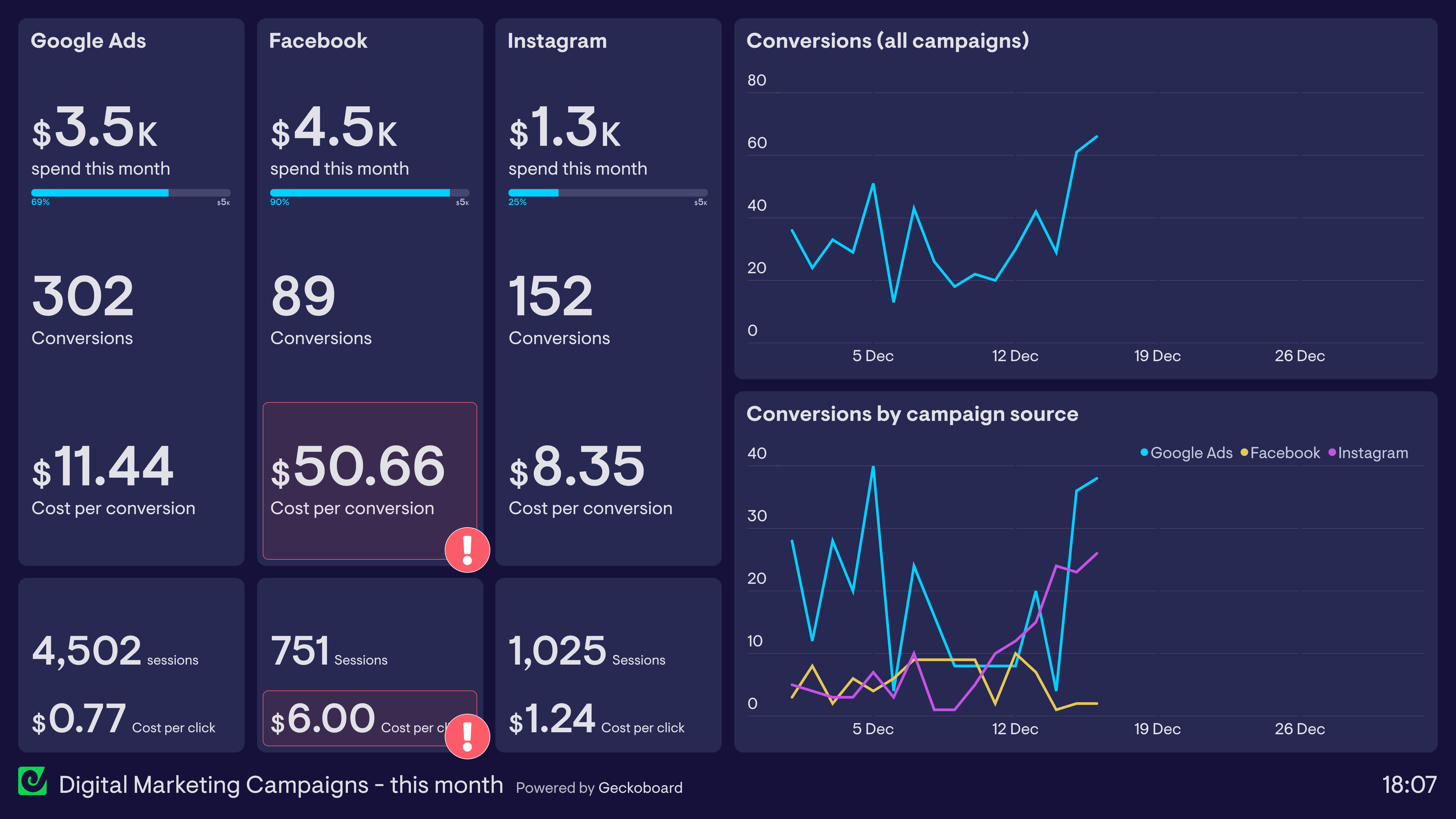
Digital marketing campaign dashboard
In this dashboard example, the Marketing Manager tracks the effectiveness of campaigns running across Google Ads, Facebook and Instagram. The dashboard tracks budget utilization as well as overall website conversions, including Cost per Conversion. Using this dashboard, she can easily see that Facebook Ads have been underperforming at over $50 per conversion. She is also able to track metrics higher up the funnel, such as Cost per Click, to help determine exactly where in the user journey she can be more effective.
Build a dashboard like this with Geckoboard
Try freeWeb analytics dashboards
Webmasters and digital marketers use web analytics dashboards to visualize the performance and health of their website. Although many free tools such as Google Analytics give website owners access to a vast array of information, it’s not always easy to present the most important data in an easy-to-digest format. This is where custom KPI dashboards can be most effective.
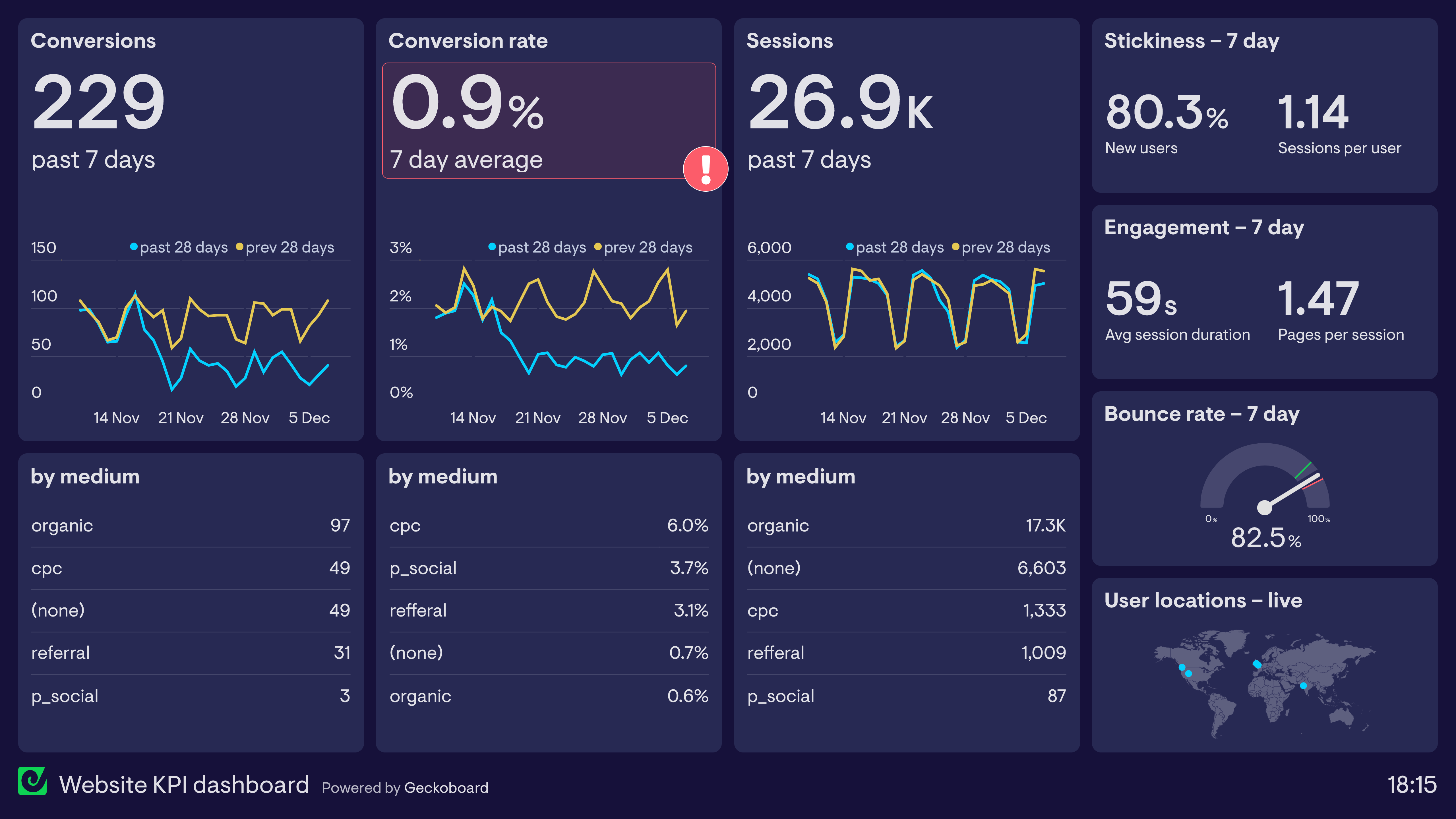
Website KPI dashboard
This dashboard is designed to visualize how effectively a website is converting traffic. A ‘goal completion’ occurs when a user submits a lead generation form. In this example, the Marketing Manager can quickly see that conversions have dropped significantly in the past month, despite the number of website sessions remaining constant. It’s possible that something on the website is preventing users from converting — such as a slow loading landing page or a broken form. The dashboard also tracks engagement metrics such as bounce rate and session duration, to show how effective the site is at maintaining users’ interest.
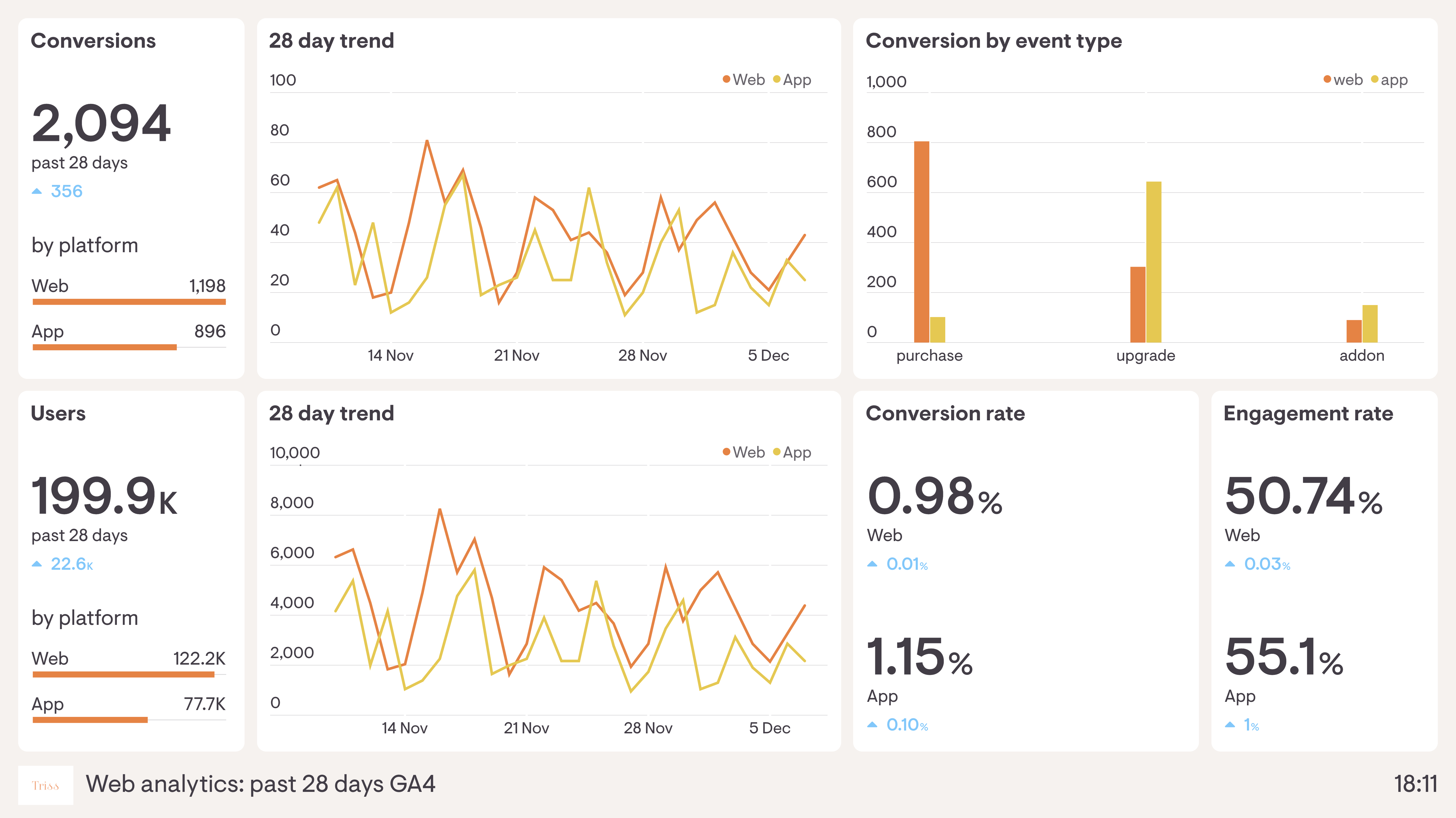
Google Analytics 4 dashboard
Google Analytics 4 made sweeping changes to the data Google Analytics collects, including moving to new metrics such as Engaged Sessions and Engagement Rate. Its structure also makes it easy to measure performance across different platforms, which is especially useful for companies who need to track user behaviour on their apps as well as their website. The dashboard above visualizes GA4 data so the team can quickly monitor user engagement and the performance of their platforms, tracking user metrics concurrently for both app and website.
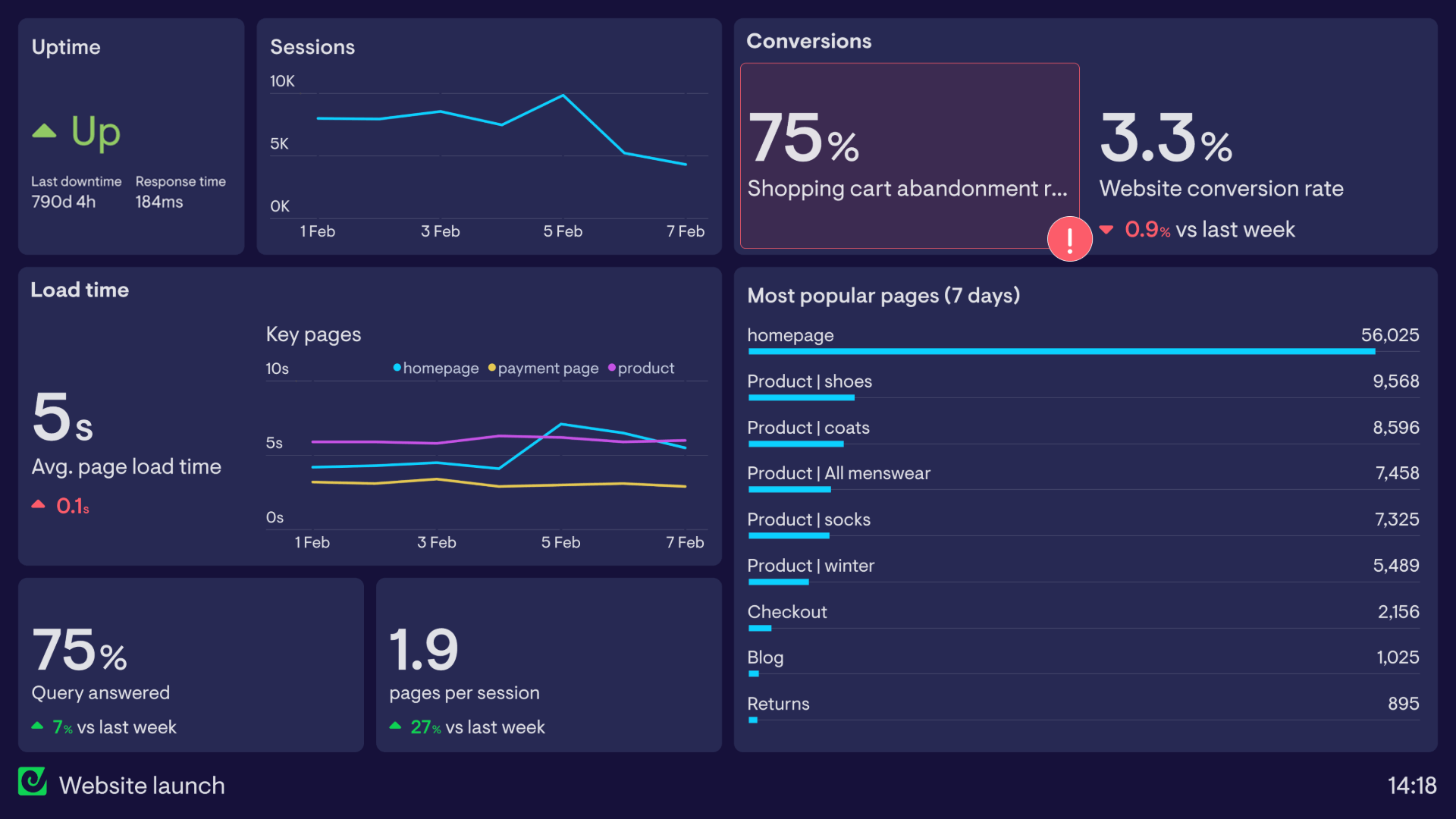
Website launch dashboard
Web analytics dashboards aren’t just used for day-to-day operations. Many dashboards are set up to track one-off or time-limited events. This dashboard has been set up to track the launch of a new, refreshed website. It can quickly highlight any acute problems that would affect visitors’ experience — including tracking website uptime (via Pingdom), load time and general session metrics (via Google Analytics).
Build dashboards like these with Geckoboard
Try freeEcommerce dashboards
Successful ecommerce businesses need to optimize every stage of the customer journey, from first touch to purchase. Ecommerce dashboards aggregate the most important performance metrics so online sellers can track their progress and quickly respond to any changes.
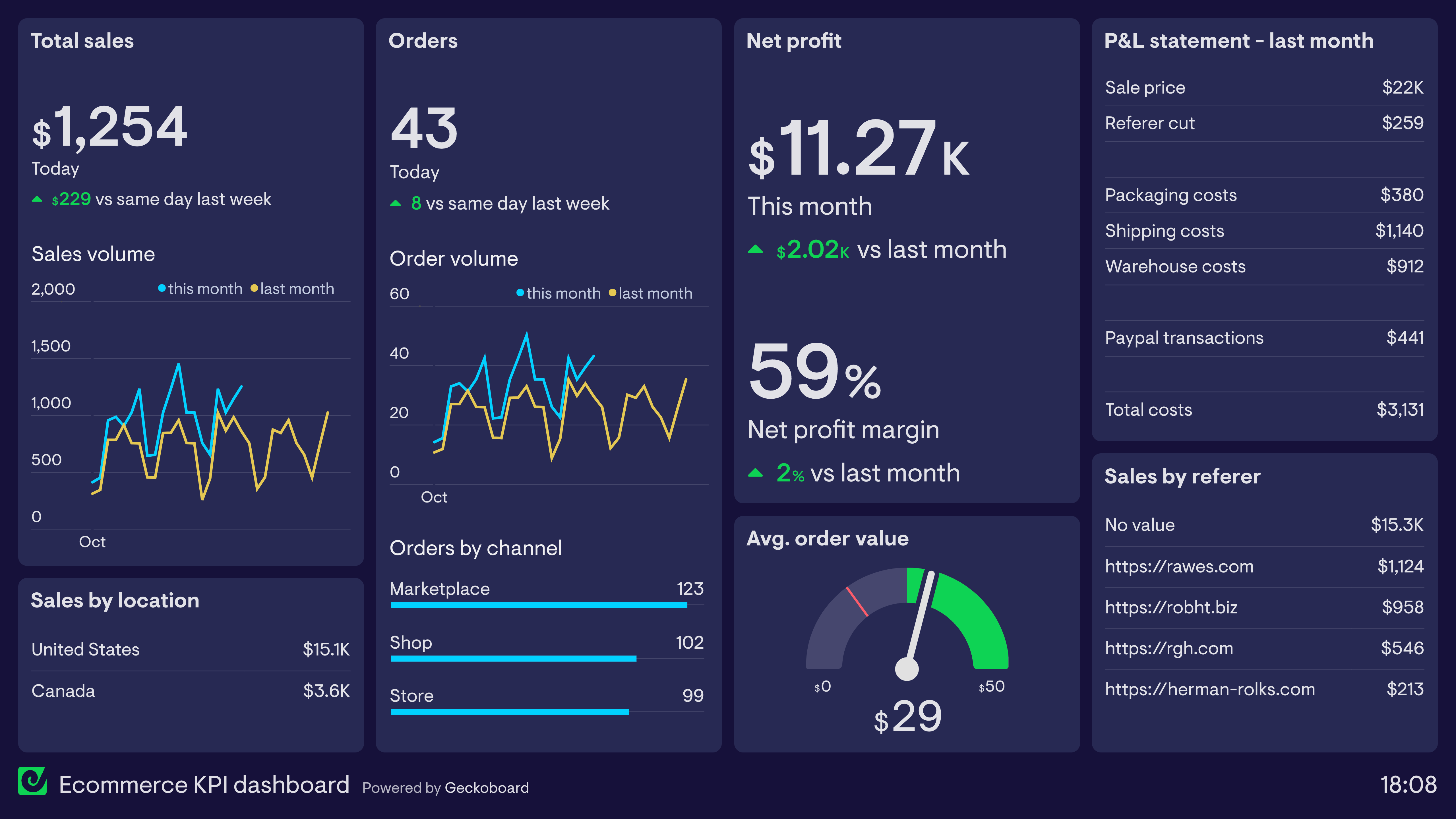
Ecommerce KPI dashboard
This dashboard takes many of its metrics directly from Shopify, which the store owner uses as their primary ecommerce platform. In addition to tracking total revenue and orders, it also shows health metrics such as Average Order Value and Profit Margin. The seller has also included a Profit & Loss statement detailing various business costs incurred last month — metrics not tracked in Shopify. By using a dashboard, they can display these important metrics alongside Shopify data even though they come from different sources.
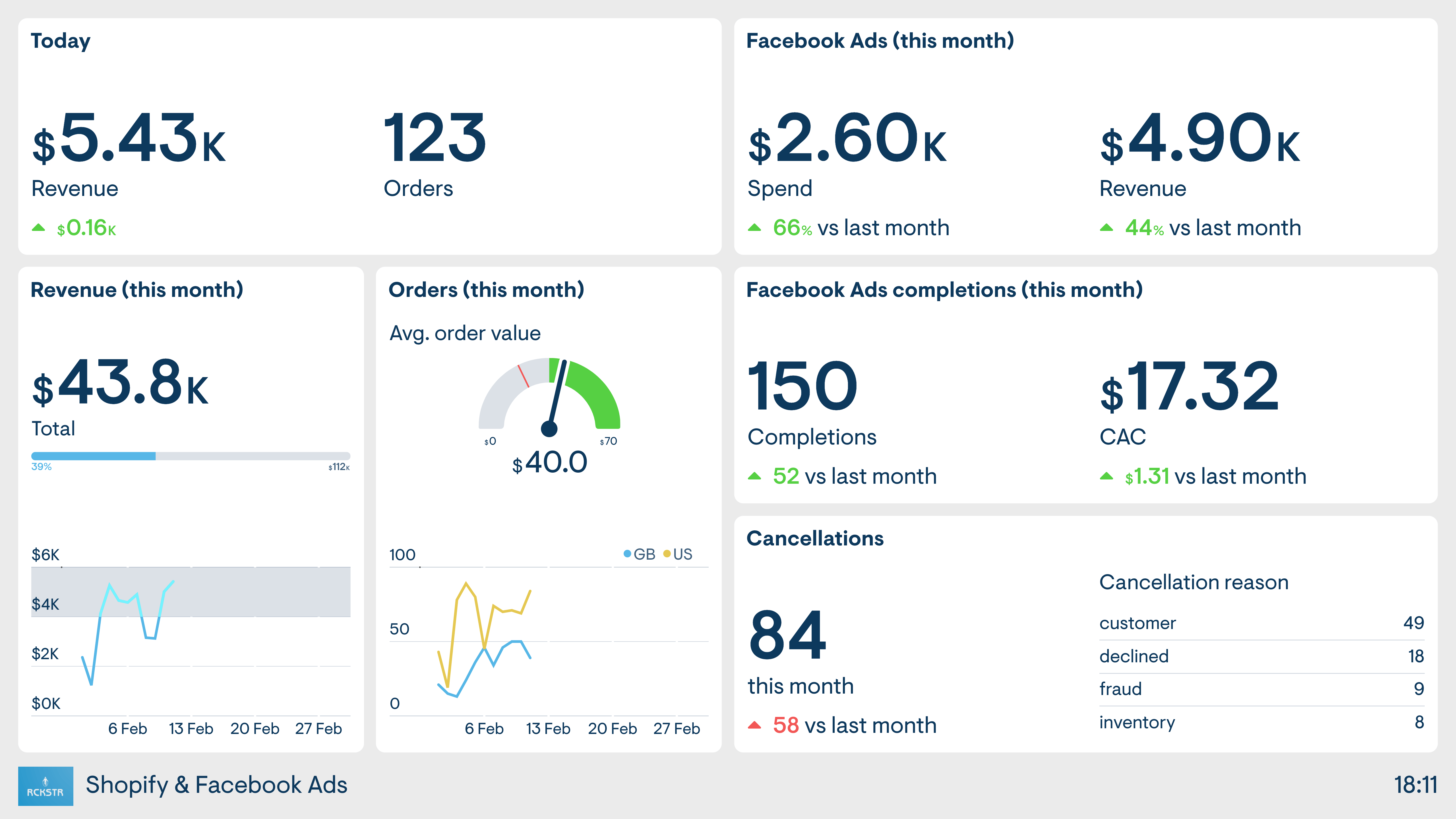
Shopify and Facebook Ads dashboard
This seller’s ecommerce business has a strong focus on Facebook Ads as the driver of new sales. The dashboard takes data from both the online store (Shopify) and Facebook, so the seller has a clear view of the performance of both platforms in one place.
Build dashboards like these with Geckoboard
Try freemonday.com dashboards
If you’re using monday.com to organize and track your team’s work, Geckoboard lets you share real-time dashboards with colleagues who don’t have a monday.com account, display them on a TV, and add data from other sources alongside monday.com data. The examples here show some of what’s possible — but like monday.com itself, the magic is in customizing things to match your team’s own requirements.
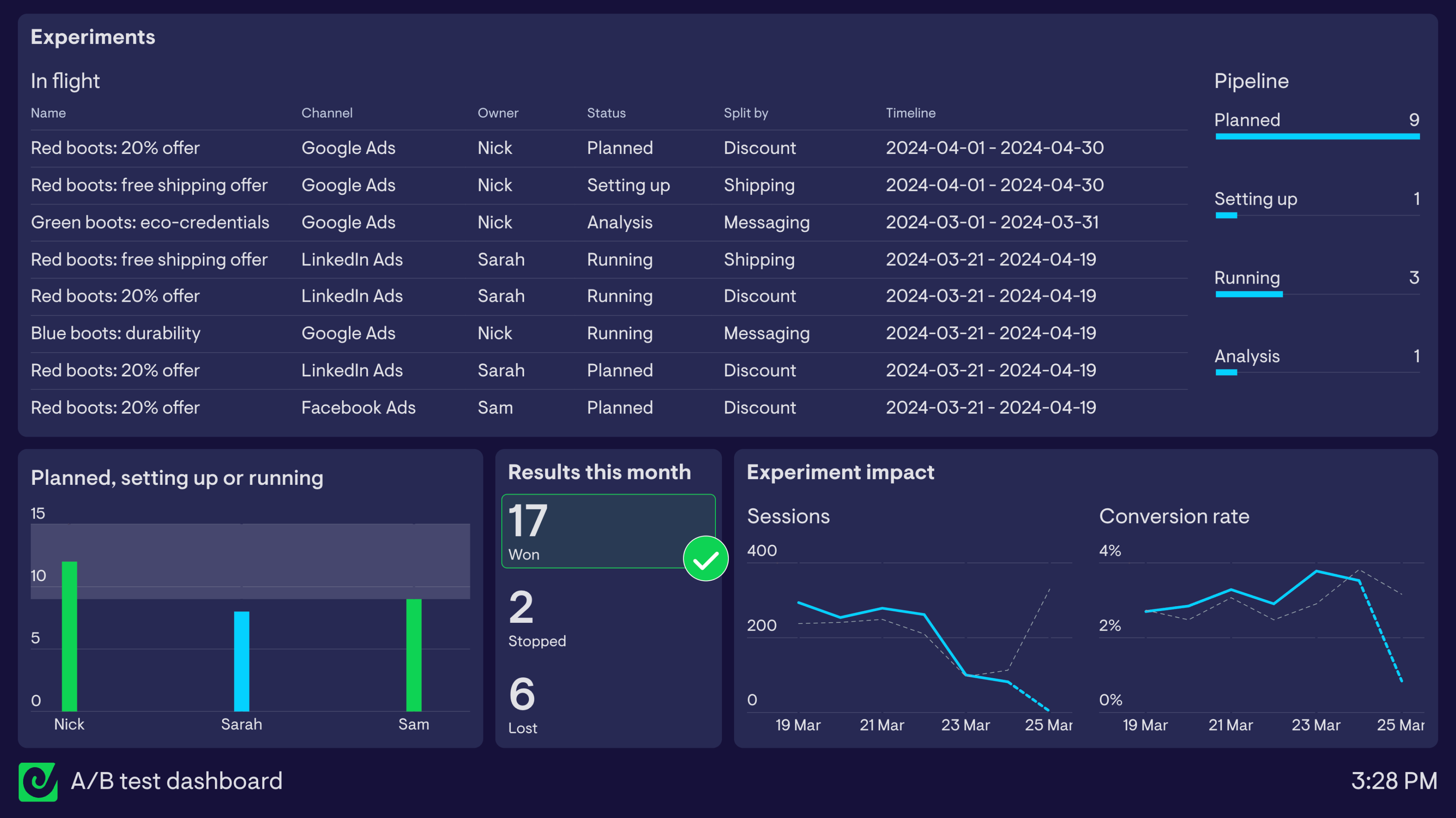
A/B testing dashboard using monday.com
This dashboard is based on monday.com’s A/B testing and planning workspace template — a useful starting point for marketing and growth teams looking to track ongoing split testing efforts. It shows experiments that are ‘in flight’ (planning, being set up, running, or being analyzed), helping everyone stay on top of what’s coming up without having to log into monday.com. A bar chart shows the experiment pipeline at a glance, and a column chart highlights how many in-flight experiments each team member owns — flagging automatically when someone has 9 or more assigned.
The rest of the dashboard shows results generated by the team’s experiments, including a count of tests with a declared winner or loser. Data from Google Analytics also gives a high-level indication of whether experiments are driving more sessions to campaign landing pages at similar or better conversion rates.
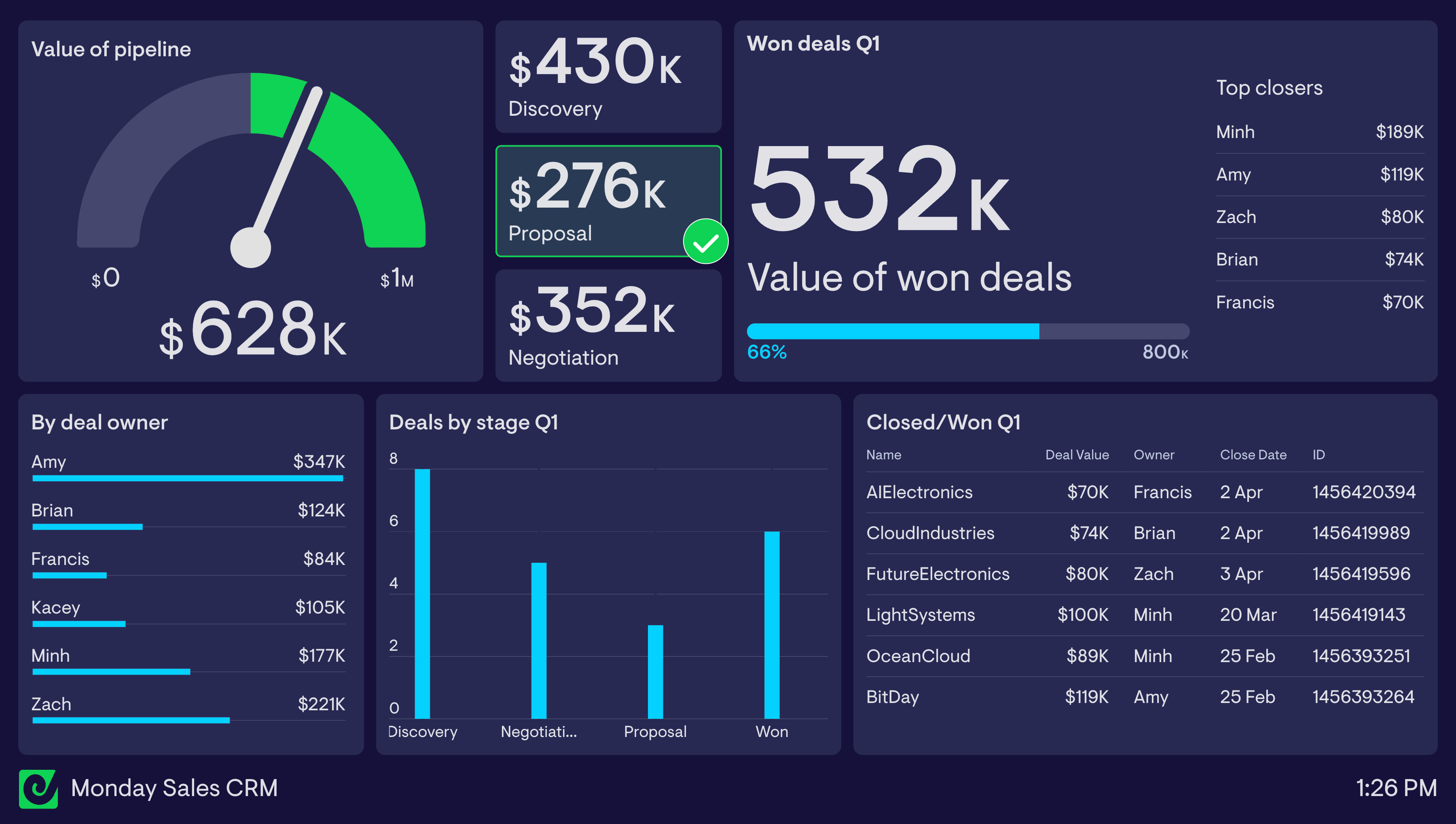
monday.com sales CRM dashboard
This sales dashboard is built on monday.com’s Basic CRM template. It highlights the value of the team’s pipeline in the top left — a status indicator flags when the $500k minimum is met (green) or not (red). Below that, charts break down deals by stage and by sales rep. In the top right, a live leaderboard ranks reps by deal value closed this quarter, while a live feed of recently closed deals in the bottom right keeps the team aware of wins as they happen.
Build dashboards like these with Geckoboard
Try freeGoogle Ads dashboards
Google Ads provides detailed metrics on the performance of paid search, display and video campaigns. However, it’s not always easy to visualize this data in a way that is easy to digest — especially for team members and managers who don’t regularly use the platform. KPI dashboards solve this by visualizing only the most important metrics in a format that anyone can understand.
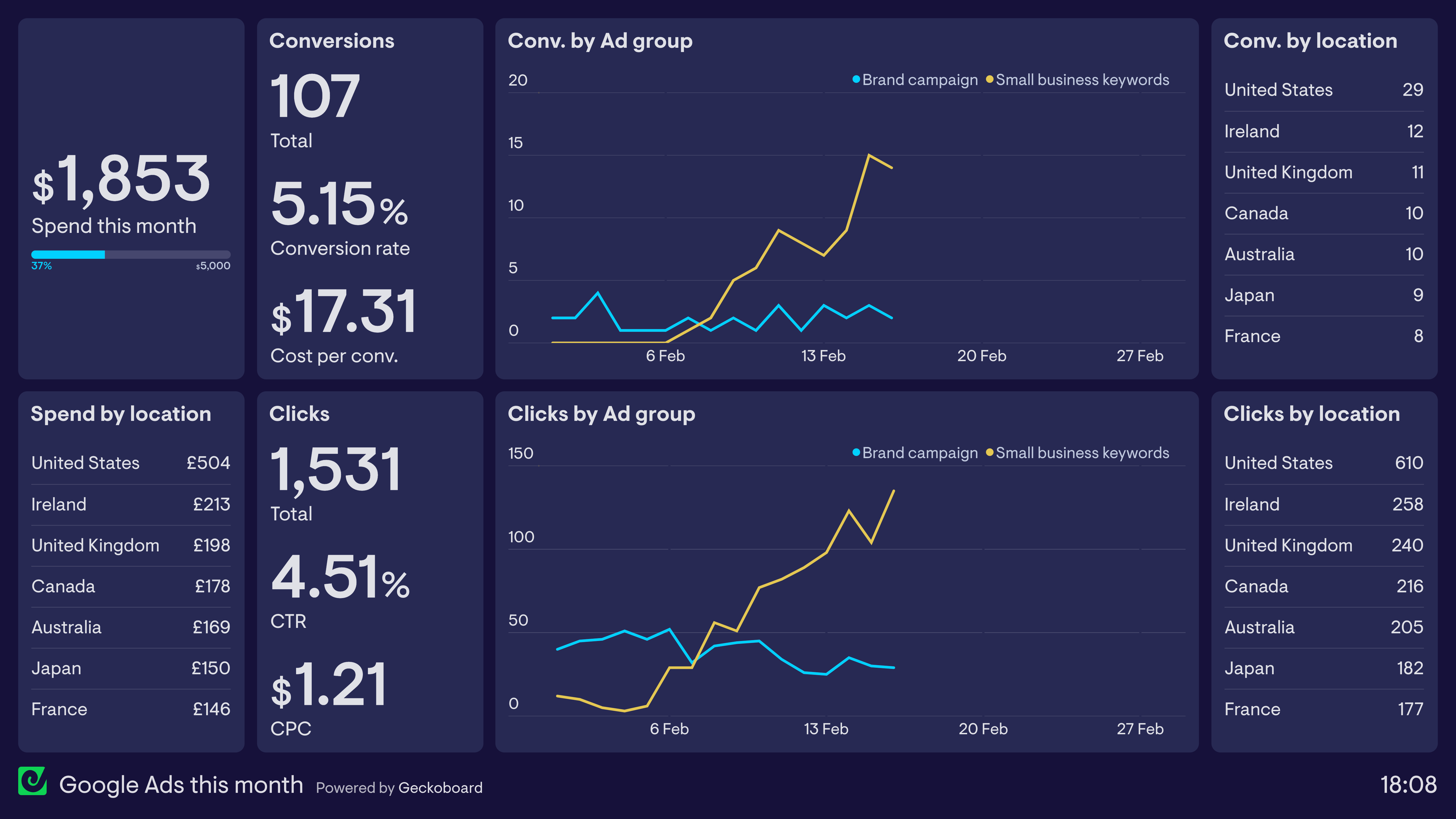
Google Ads this month
This dashboard shows the performance of Google Ads over the past month, making it easy to see how the budget is being utilized and how the campaign is performing overall in terms of clicks and conversions. The line charts in the middle split the campaign by ad group — showing that the ad group targeting branded search terms has been performing consistently, while the ad group targeting generic keywords used by small businesses has seen significant improvement.
Build a dashboard like this with Geckoboard
Try freeEmail newsletter dashboards
Email marketers use newsletter dashboards to track the performance of their email marketing efforts. These dashboards track the performance of individual email campaigns alongside more holistic metrics such as mailing list growth.
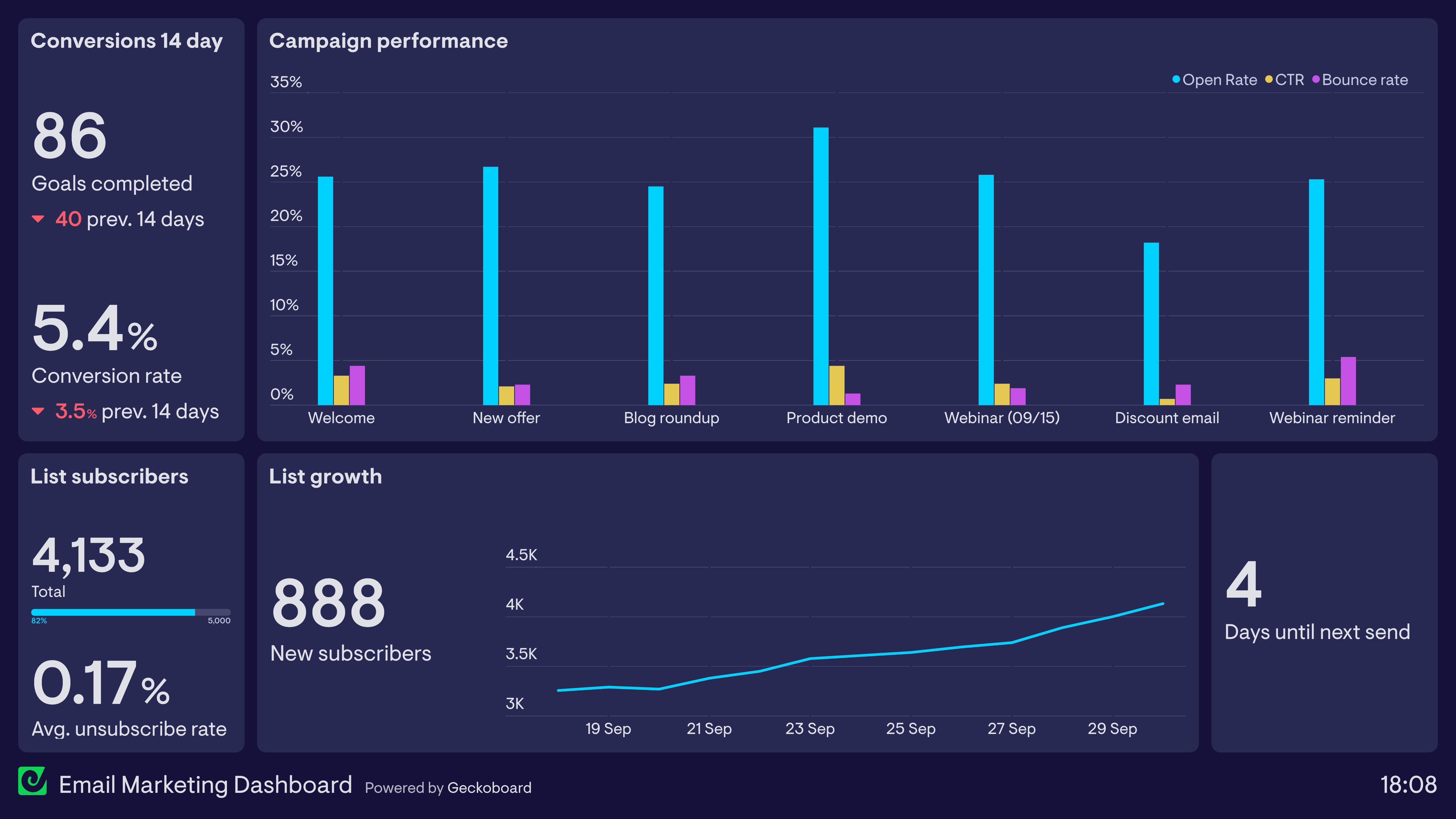
Email marketing dashboard
This dashboard tracks several key metrics related to a brand’s regular newsletter. In the top left, it tracks conversions generated from newsletter sends. The bar chart shows the individual performance of email campaigns in the form of Open Rate, Click Through Rate and Email Bounce Rate. Along the bottom, it tracks new subscribers attracted this month — including a visualization of the maximum subscribers allowed under the current platform plan (5,000). Finally, the number of days until the next scheduled send helps with communicating and coordinating with stakeholders across the business.
Build a dashboard like this with Geckoboard
Try freeSEO dashboards
Search Engine Optimization (SEO) is a highly technical process involving many data points. An SEO dashboard distills and visualizes the most important metrics so marketers can track performance over time and/or monitor vital SEO health metrics.
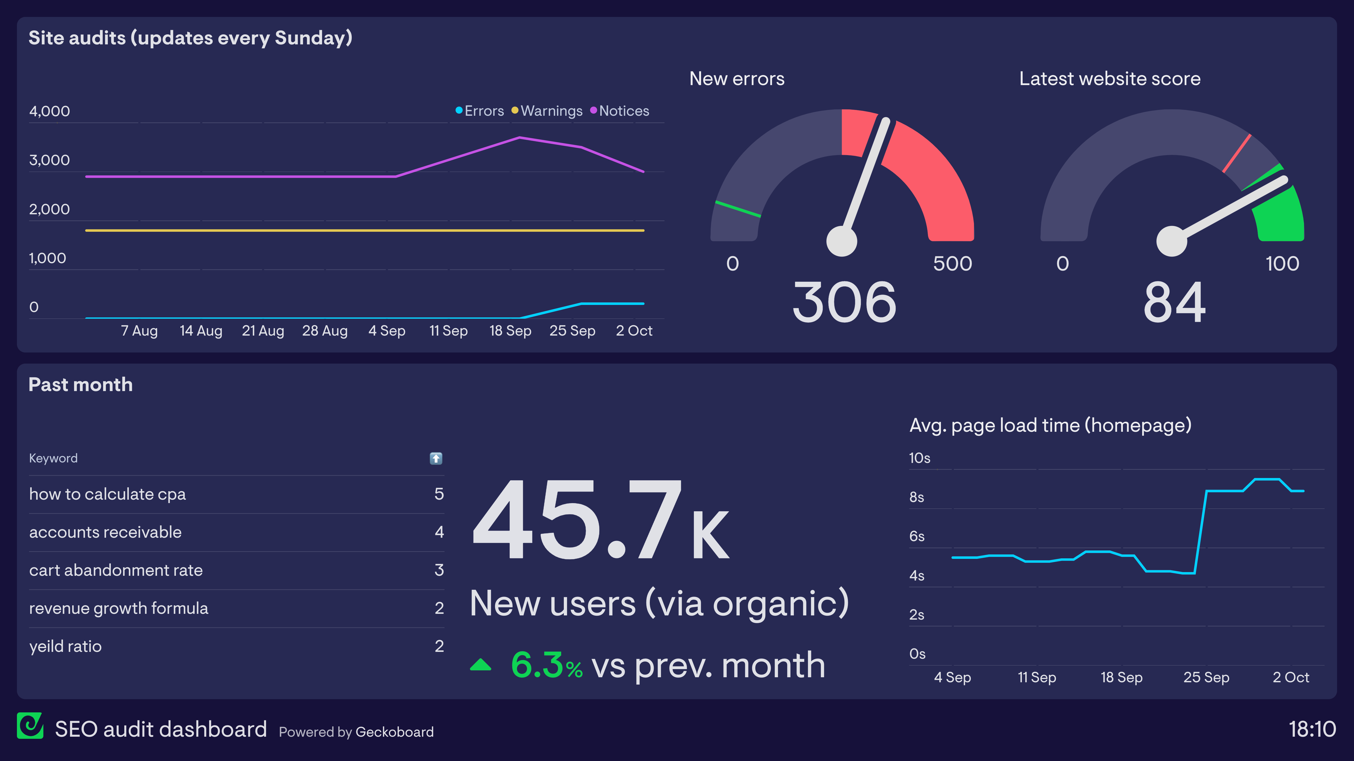
SEO audit dashboard
This dashboard is used in conjunction with a regular SEO audit run via SEMrush. It reports on important monitoring metrics such as site errors, warnings and website score, as well as the biggest keyword ranking changes over the past month. The dashboard also visualizes an important SEO metric from Google Analytics — page load time, which can have a drastic effect on a website’s ranking. Here we can see that the average load time for the homepage has recently spiked, requiring further investigation.
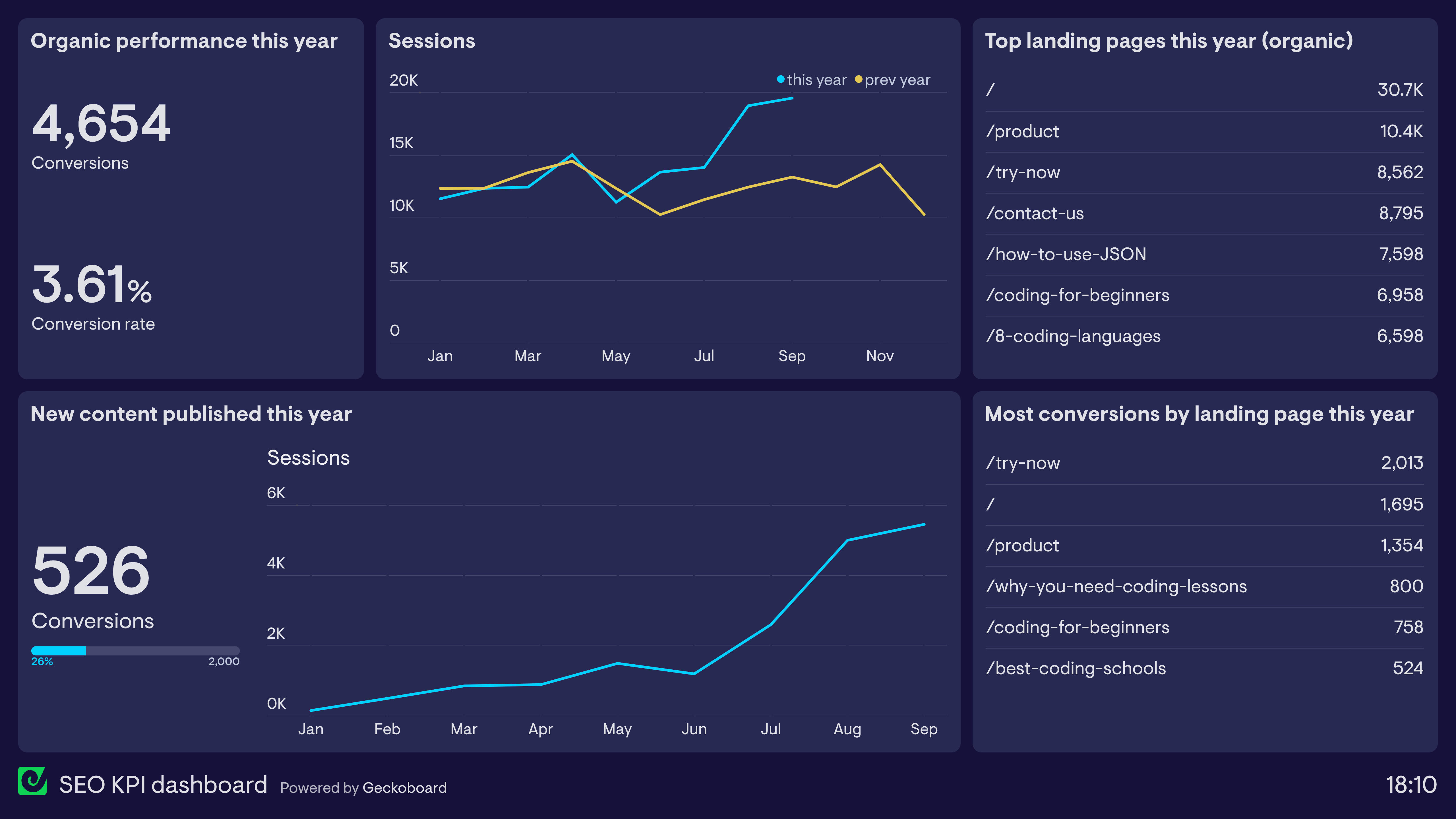
SEO KPI dashboard
SEO can be painstaking work where the impact is often only seen after several months of regular optimization — which is why it’s especially important to visualize performance data in a way that makes sense to the team. This dashboard tracks website traffic from organic search, which landing pages acquired the most traffic, and how those sessions contribute to overall business success. The performance of new content produced this year illustrates a common SEO occurrence: it takes several months for new content to rank, but once it does it can see radical growth — the “hockey stick” effect.
Build dashboards like these with Geckoboard
Try freeLead generation dashboards
A lead generation dashboard visualizes the performance of lead generation tactics used by marketing teams. In particular, it allows marketing teams to understand the effectiveness of different aspects of their demand generation funnel, and identify any areas that require further or urgent attention.
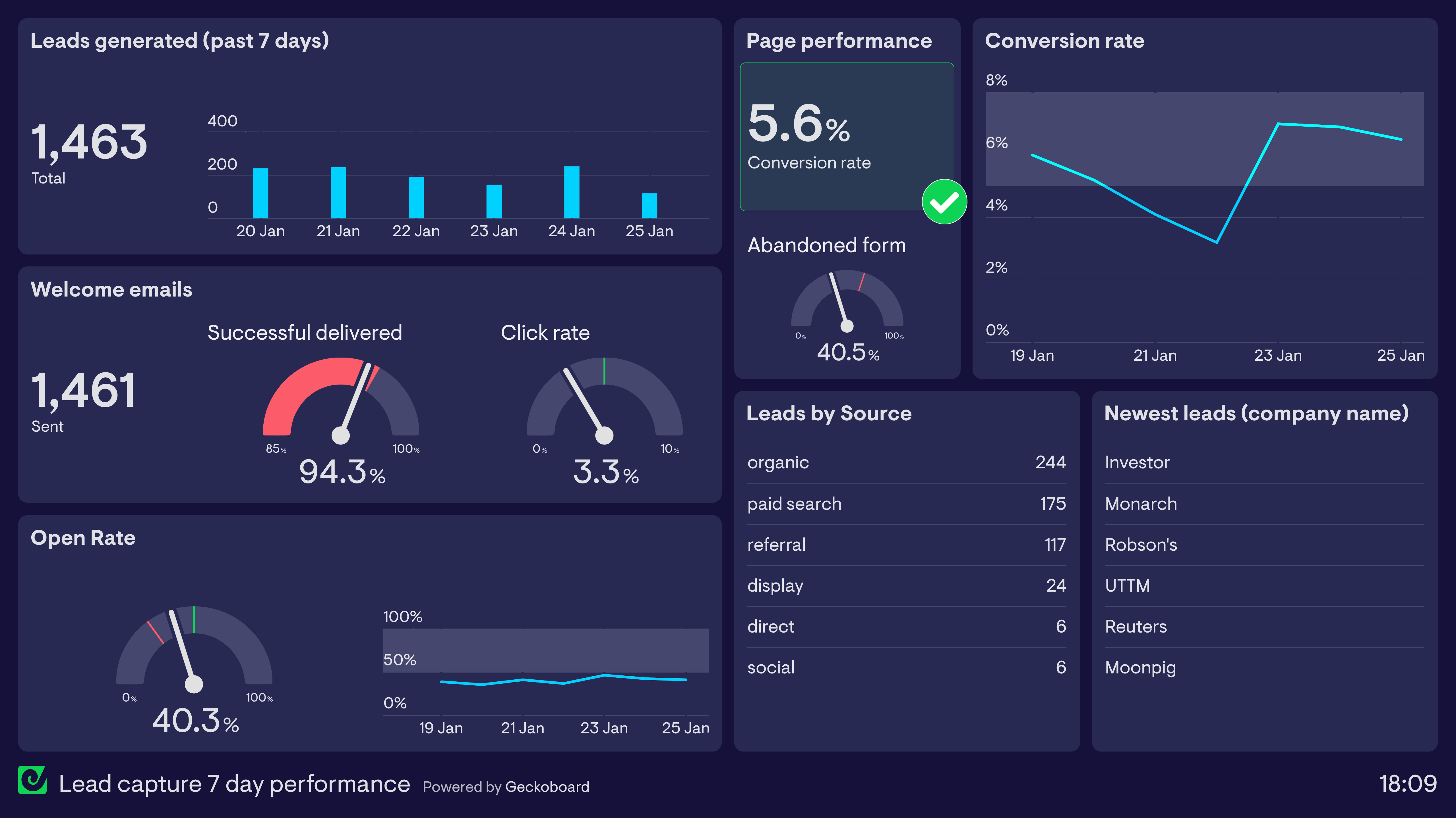
Lead capture — 7-day performance
This dashboard provides a snapshot of the company’s lead generation performance over the past seven days, showing how many leads have been generated each day. The dashboard sets thresholds for when different parts of the funnel are performing above or below target — for example, the landing page is converting leads above the 5% goal, but the welcome email has dropped below the 95% target for successful deliveries, which may require further attention.
Build a dashboard like this with Geckoboard
Try freeA/B test dashboards
Many digital marketers use a Test & Learn approach to optimize user experience and overall marketing effectiveness. This often takes the form of A/B tests where samples of users are given different content in order to see which iteration is more effective. An A/B test dashboard visualizes and compares the performance of each iteration, allowing marketing teams to track how experiments are progressing in real time.
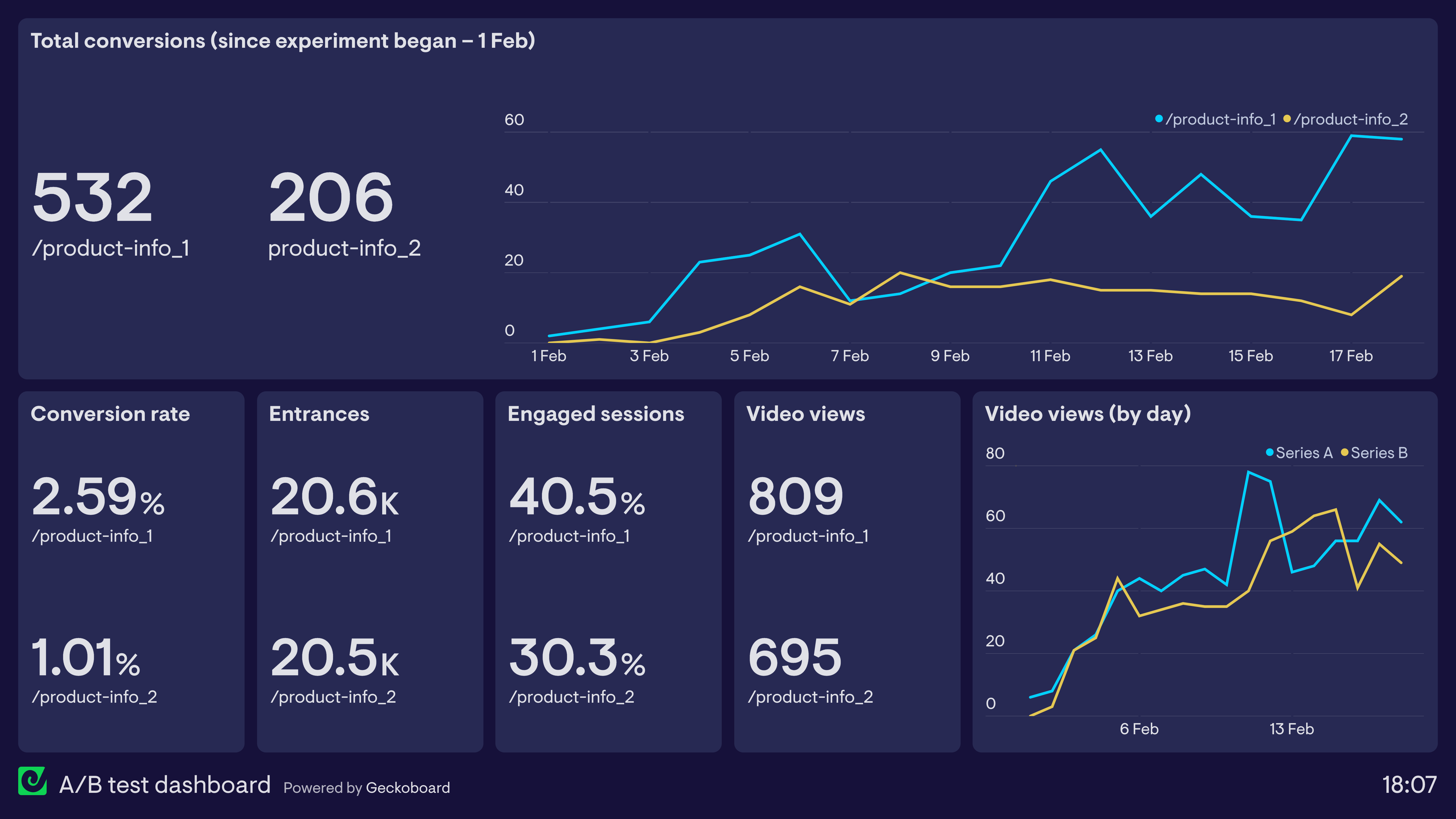
A/B test dashboard
This dashboard shows the performance of two different product information pages in order to understand which is more effective. The experiment has been set up in Google Optimize and the data is pulled directly from Google Analytics. Version 1 has clearly performed better in terms of both conversions and engagement.
Build a dashboard like this with Geckoboard
Try freeCustomer-led growth (CLG) dashboards
Customer Led Growth (CLG) is a strategic framework that helps companies — particularly B2B SaaS businesses — use customer research to identify their best customers and better understand the value their company provides for them. A CLG dashboard tracks the different stages of the customer journey using KPIs that represent value to customers.
Crucially, a CLG dashboard does not use conventional business metrics like New Subscribers, MQL or SQL. Instead, it uses customer insights to develop bespoke KPIs that track customer value across six key stages of the customer journey: Problem, Interest, Activation, Value Realization, Continued Value, and Value Growth.
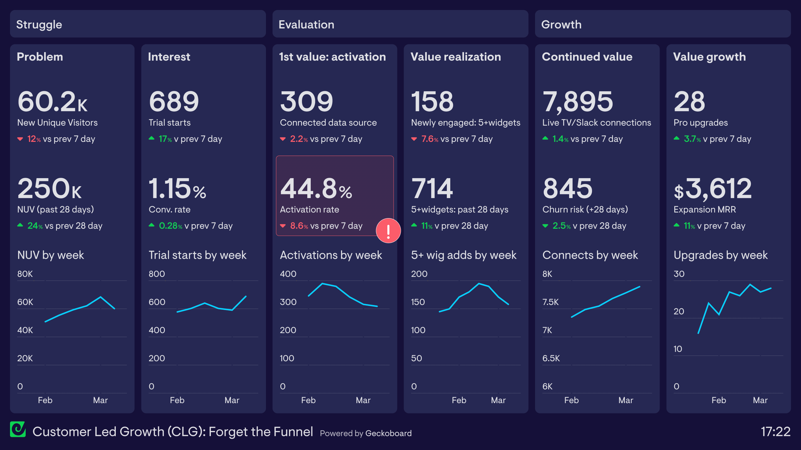
Customer-led growth (CLG) dashboard
This dashboard shows how to track the CLG framework using Geckoboard, using our own customer journey as an example. It is divided into six sections, each representing a stage of the customer journey:
Problem — New Unique Website Visitors from Google Analytics tracks how many potential customers are discovering Geckoboard as a solution. Interest — New Free Trial users and overall conversion rate, also from Google Analytics. Activation — From Mixpanel, the number of users who connect their first data source (their ‘aha moment’). A red status indicator fires when this drops below 50%. Value Realization — Mixpanel tracks how many customers have built a dashboard visualizing multiple data points. Continued Value — SQL data tracks customers who regularly share dashboards via Slack, Teams or TV display. Value Growth — SQL data tracks customers who upgrade their plan due to expanding usage.
Build a dashboard like this with Geckoboard
Try freeBuild your own marketing dashboard
Connect your data sources and create a live marketing dashboard in minutes — no coding required.
Start free trial
Social media dashboards
Social media monitoring dashboards visualize important performance metrics for a brand’s marketing efforts on social media. This includes followership, organic performance, the performance of paid advertising, and the visibility of the brand through third-party content and discussions — otherwise known as social listening.
Social media overview dashboard
This dashboard shows how a KPI dashboard can bring together performance data from multiple social media channels. It tracks the number of followers on each platform, how advertising campaigns have performed over the last seven days, and — via Google Analytics — the traffic acquired from different social platforms this month.
- Focus area
- Followers, traffic from social
- Who uses it
- Social Media Manager, Marketing Manager, Marketing Director
- How often
- Several times a week
- Data sources
- Facebook, Instagram, LinkedIn, Google Analytics
View live dashboard →Instagram dashboard
This dashboard focuses on Instagram performance, displaying metrics such as followers and website traffic alongside the performance of the most recent post. The Marketing Manager also tracks the success of influencer campaigns in the form of revenue generated from promo codes — a popular way to provide influencers with an exclusive incentive for their followers while also tracking the ROI for each individual campaign.
- Focus area
- Instagram performance, influencer campaigns
- Who uses it
- Social Media Manager, Marketing Manager
- How often
- Every day
- Data sources
- Instagram, Shopify, Google Analytics
View live dashboard →LinkedIn dashboard
This dashboard focuses on LinkedIn marketing, a popular platform for B2B marketers. It tracks the brand’s organic content and paid advertising performance, as well as the effect that activity generates further down the funnel. The North Star metric — signups — is placed prominently in the top left corner, making clear what all LinkedIn activity ultimately needs to drive.
- Focus area
- LinkedIn advertising, organic performance
- Who uses it
- Marketing Manager, Social Media Manager, Sales Director
- How often
- Several times a week
- Data sources
- LinkedIn, LinkedIn Ads, Google Analytics
View live dashboard →Build dashboards like these with Geckoboard
Try free