
Sales dashboard examples
Real-world dashboards used by sales teams to track performance, manage pipelines, and close more deals.
Sales Manager dashboards
Sales Manager dashboards are designed to give Sales Managers a complete overview of the metrics they need to be effective in their role. The content of these dashboards can vary depending on the type of company they work for, or the product or service they are selling. Generally, these dashboards reflect the fact that Sales Managers have wide ranging responsibilities, such as achieving revenue targets and managing teams.
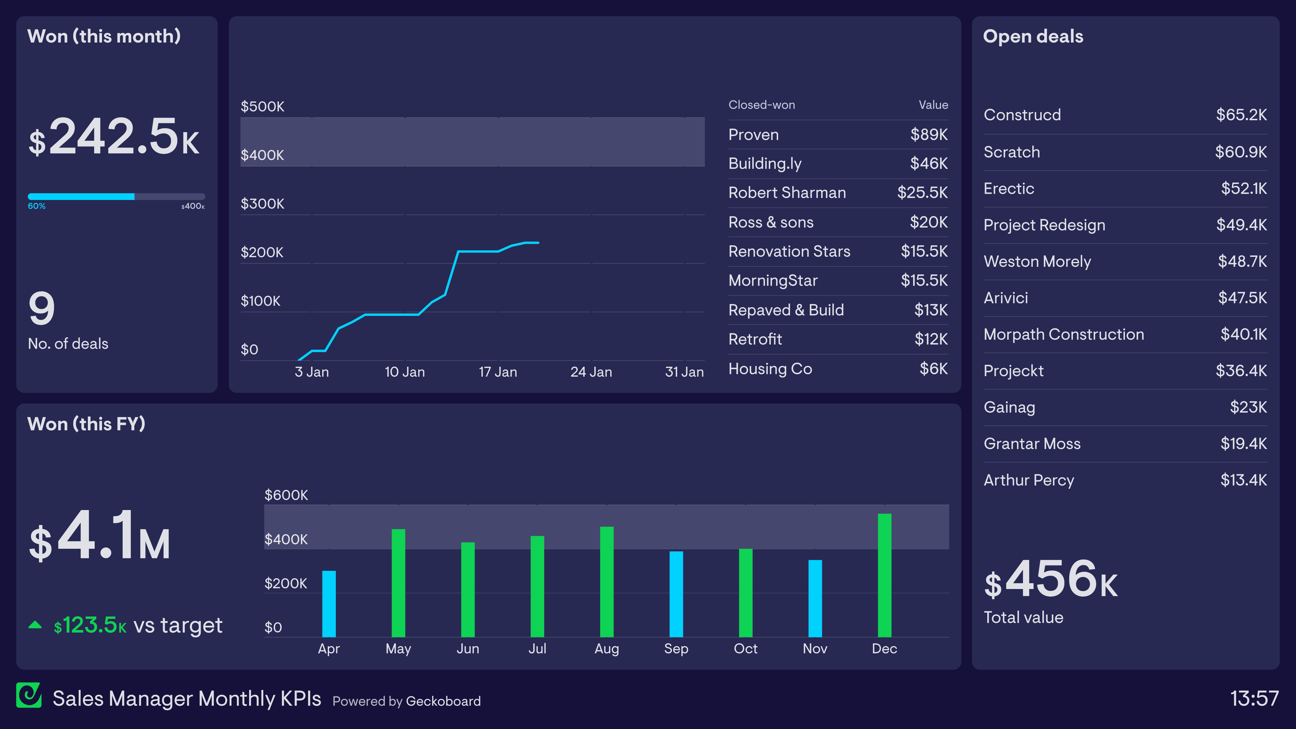
Sales Manager: Monthly KPI dashboard
This dashboard focuses on the Sales Manager’s progress toward their monthly revenue targets. They can quickly track performance so far, including the deals that have been closed. The dashboard also shows the total value of the immediate pipeline, including the accounts that make up the pipeline. This helps them to calibrate how likely it is they will hit their monthly targets, or if they need to take a different course of action. For added context, the dashboard also includes revenue figures from previous months, including a green status indicator showing the months where the target has been achieved.
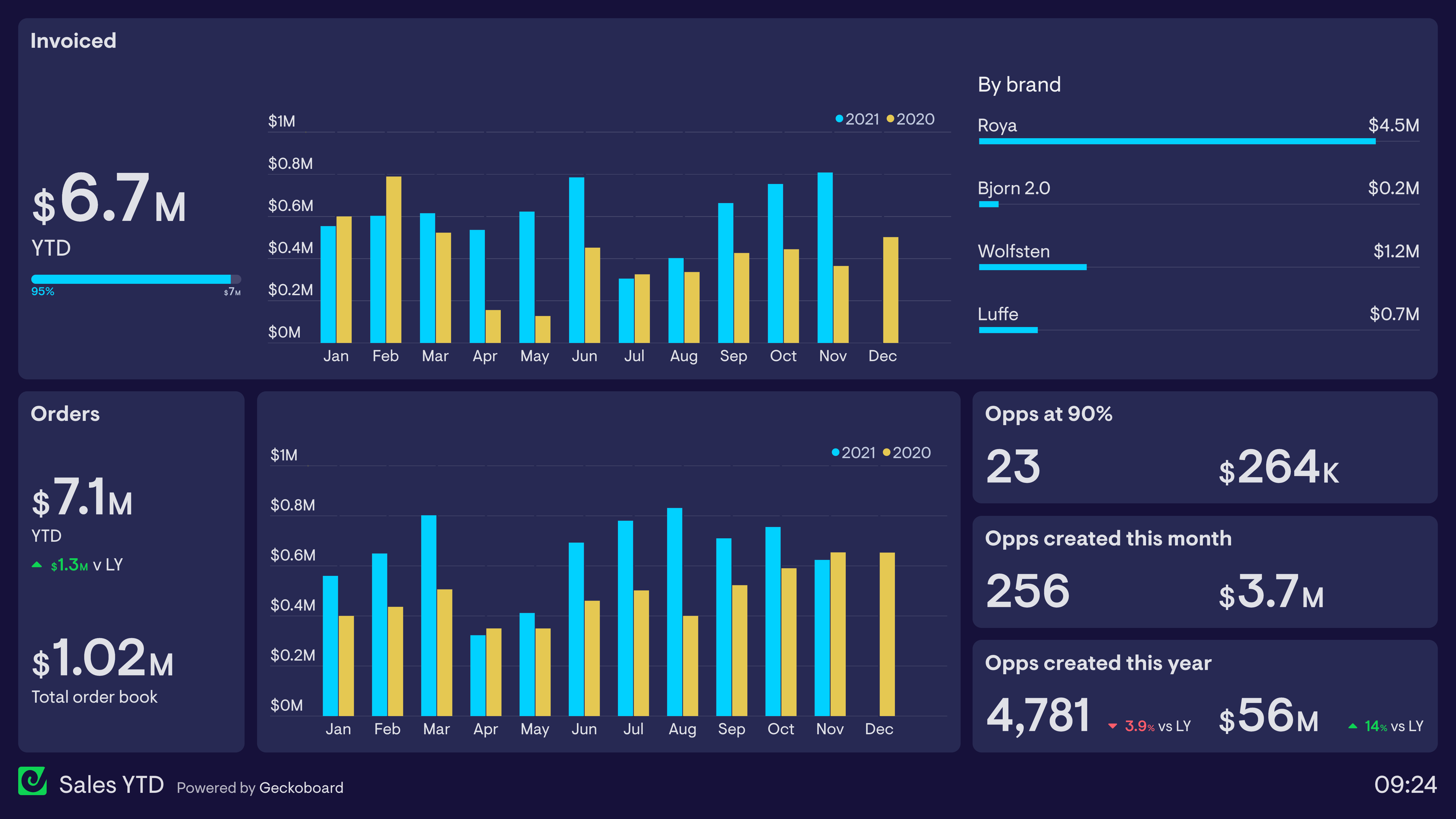
Tracking orders vs invoices
Many Sales Managers need to track metrics at multiple points of the sales process. The dashboard above is used by a company which supplies new offices and buildings with designer furniture. As a result, there is normally a 2–3 month gap between orders being placed and the actual installation of the product, at which point the invoice is issued. This means their dashboard needs to track both invoices issued and orders completed each month. The ’total order book’ refers to orders which have been placed which have not yet been invoiced.
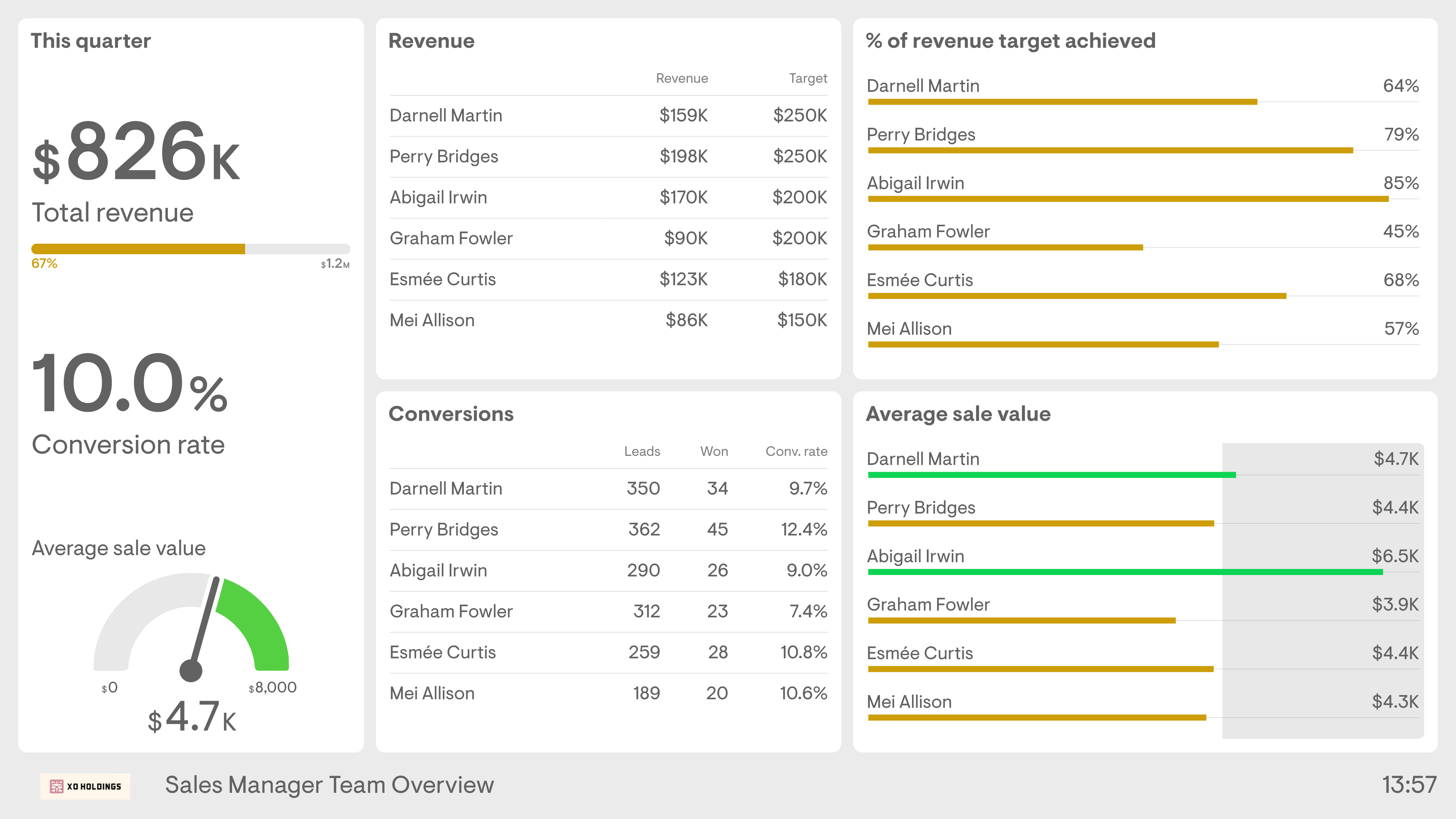
Sales Manager: team overview dashboard
This dashboard focuses on the Sales Manager’s responsibility to manage and support their direct reports. It gives a clear overview of how individuals are progressing towards their targets, meaning the Sales Manager can quickly identify issues and provide extra support when needed. In addition to overall revenue targets, this dashboard shows secondary metrics such as conversion rate and average order value. This Sales Manager has decided to create a benchmark for what they consider to be a good Average Sale Value ($4.5k), perhaps to focus the team’s attention on upselling and/or high-value customers.
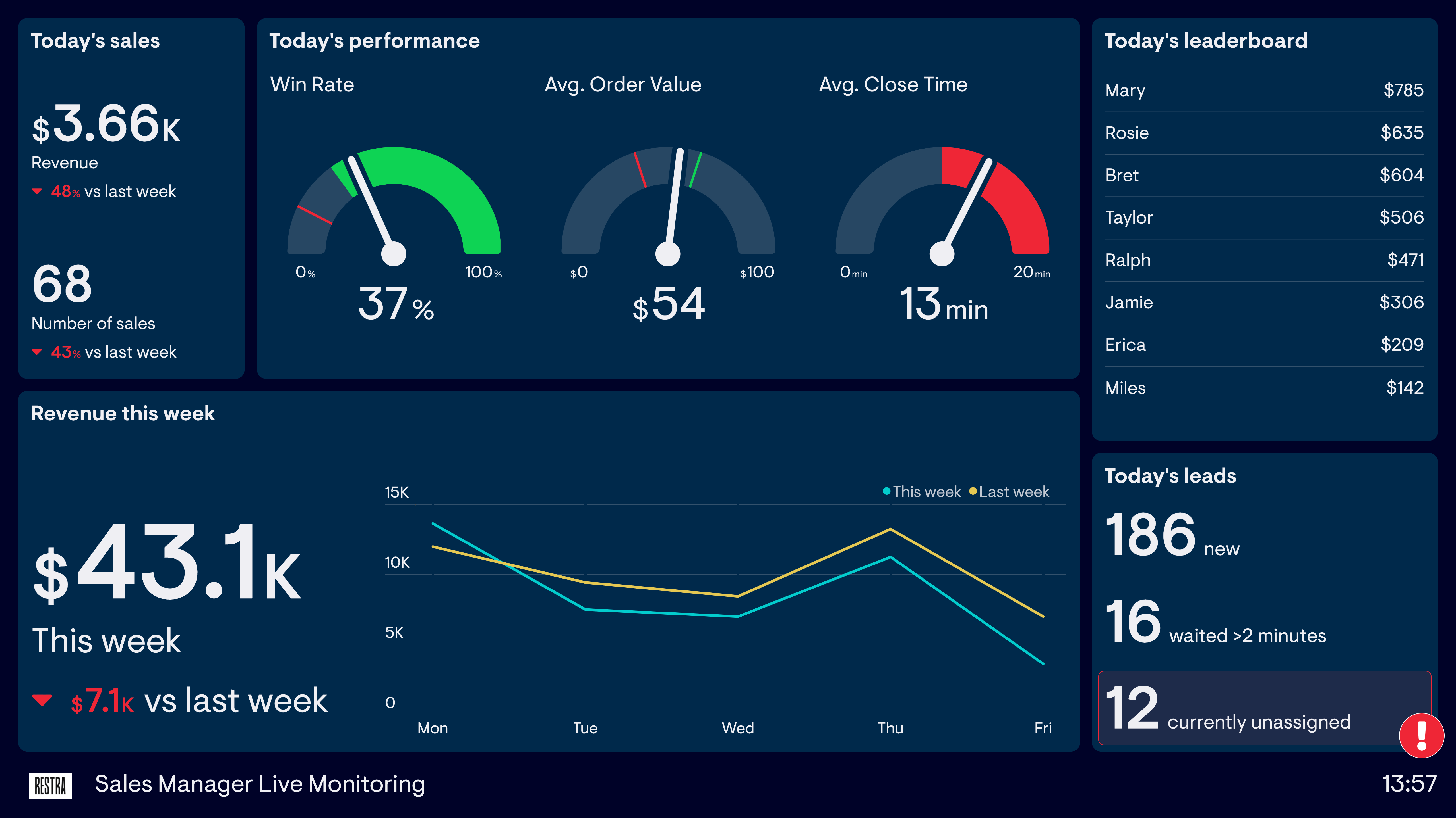
Sales Manager: live monitoring dashboard
This dashboard is used by a Sales Manager who manages a sales team set up to process a high volume of inbound leads. In a fast-moving environment, there’s a much greater need to monitor the status of current performance and respond to issues as they arise. As a result, this dashboard focuses on important real-time metrics such as average close time and currently unassigned leads.
Build dashboards like these with Geckoboard
Try freeSales pipeline dashboard
A pipeline dashboard allows sales teams to get an overall view of their sales activity metrics and KPIs. Used by both the sales team and the Sales Manager, a pipeline dashboard shares how deals are progressing through various stages of the buyer journey. By sharing metrics around sales activities, the Sales Manager is able to identify which activities are more likely to contribute to sales reps closing deals. For the Sales Reps, having activity broken down into specific activity-based KPIs allows them to focus on the tasks that will help them close more deals. A sales pipeline dashboard can also contribute to healthy competition among Sales Reps when it includes individual performance.
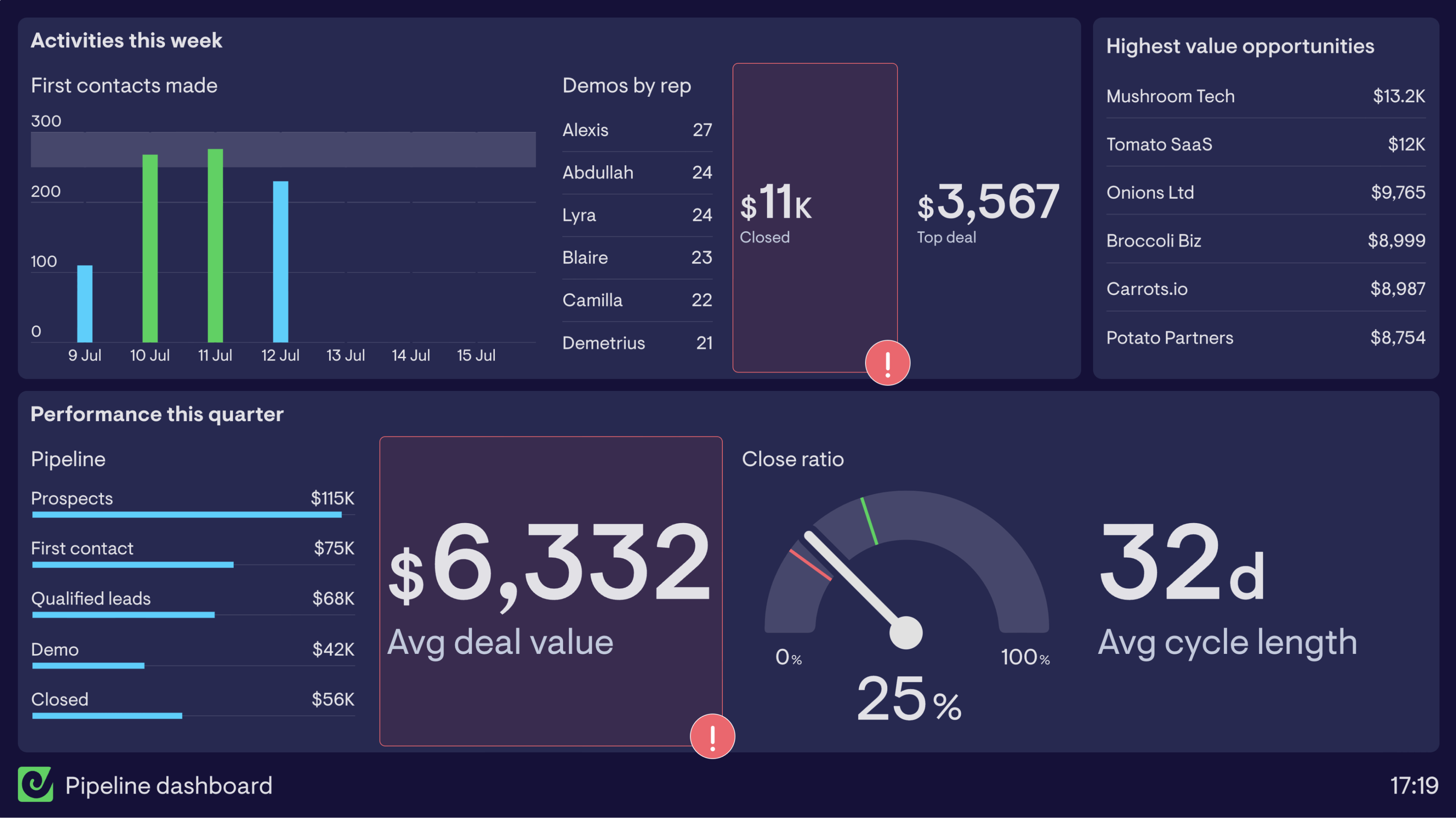
Sales pipeline dashboard
This sales pipeline dashboard breaks activity down into two timeframes. The top half focuses on activities the sales team has undertaken in the past week. By including metrics such as first contacts made, demos by rep and closed deal performance, the Sales Reps are able to see when they’re going to hit target, or when they need to up their game.
The lower half of the dashboard focuses on performance over the quarter and specifically breaks down the pipeline into a bar chart. This is a good way of visualizing how deals are moving through the various stages in the purchasing process. It allows the Sales Manager to see if any stage is slowing down or blocking deals moving forward.
By using status indicators on closed deals this week and average deal value, you’re able to highlight critical changes to KPIs before they impact the quarterly target.
Build a dashboard like this with Geckoboard
Try freeSales competition dashboards
A sales competition dashboard provides a real-time update of any competitions you are running in your sales team. Sales competitions (a type of ’gamification’) are a great way to boost team morale and motivate your team by bringing out their competitive side. Some Sales Managers run regular, rolling competitions like Salesperson of the Month. Others bring in one-off competitions when they need to give their team’s morale an extra boost.
Whatever the competition, a live dashboard makes sure everyone knows what they have to do — and who they need to beat. Sales competitions work best when they’re tied to meaningful outcomes and update throughout the day.
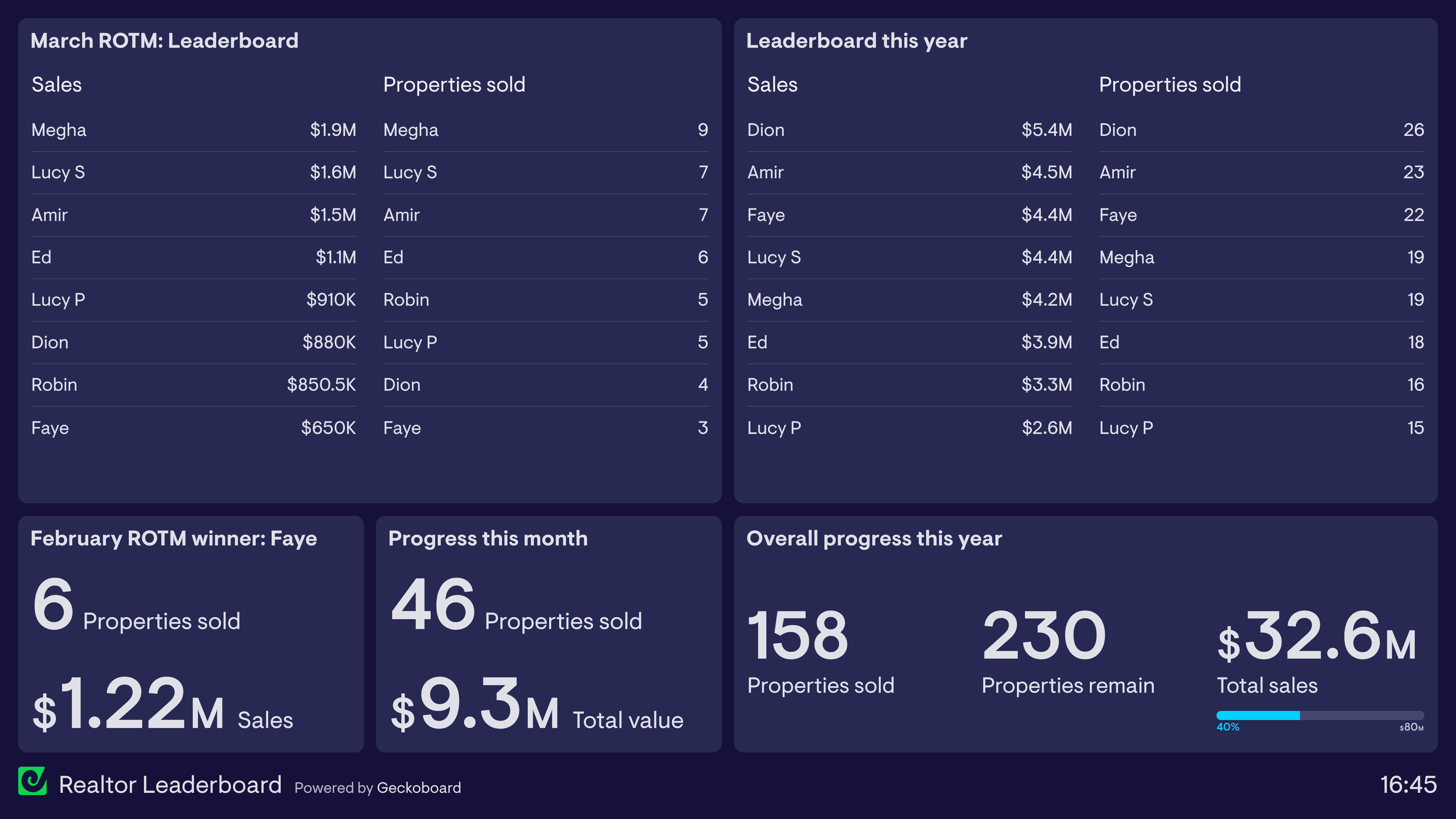
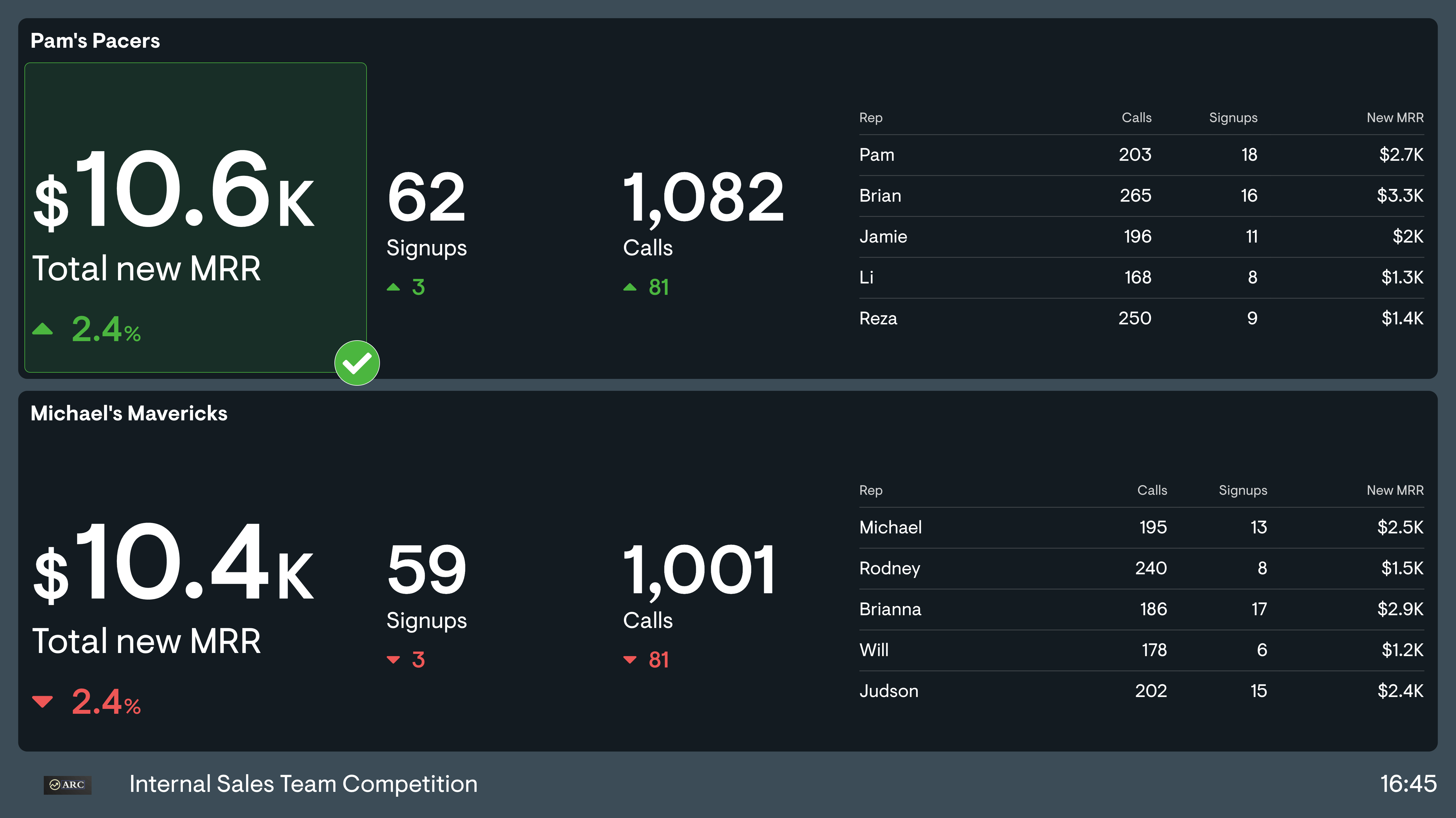
Sales leaderboard
Perhaps the most common form of sales competition is the basic leaderboard. In the dashboard example above, a team of realtors are responsible for selling properties in a new housing development. In addition to the usual financial incentives, the team leader has created a sales dashboard to encourage healthy competition between the team. Especially for longer projects, this creates more regular opportunities for recognition — in this case, a Realtor of the Month competition.
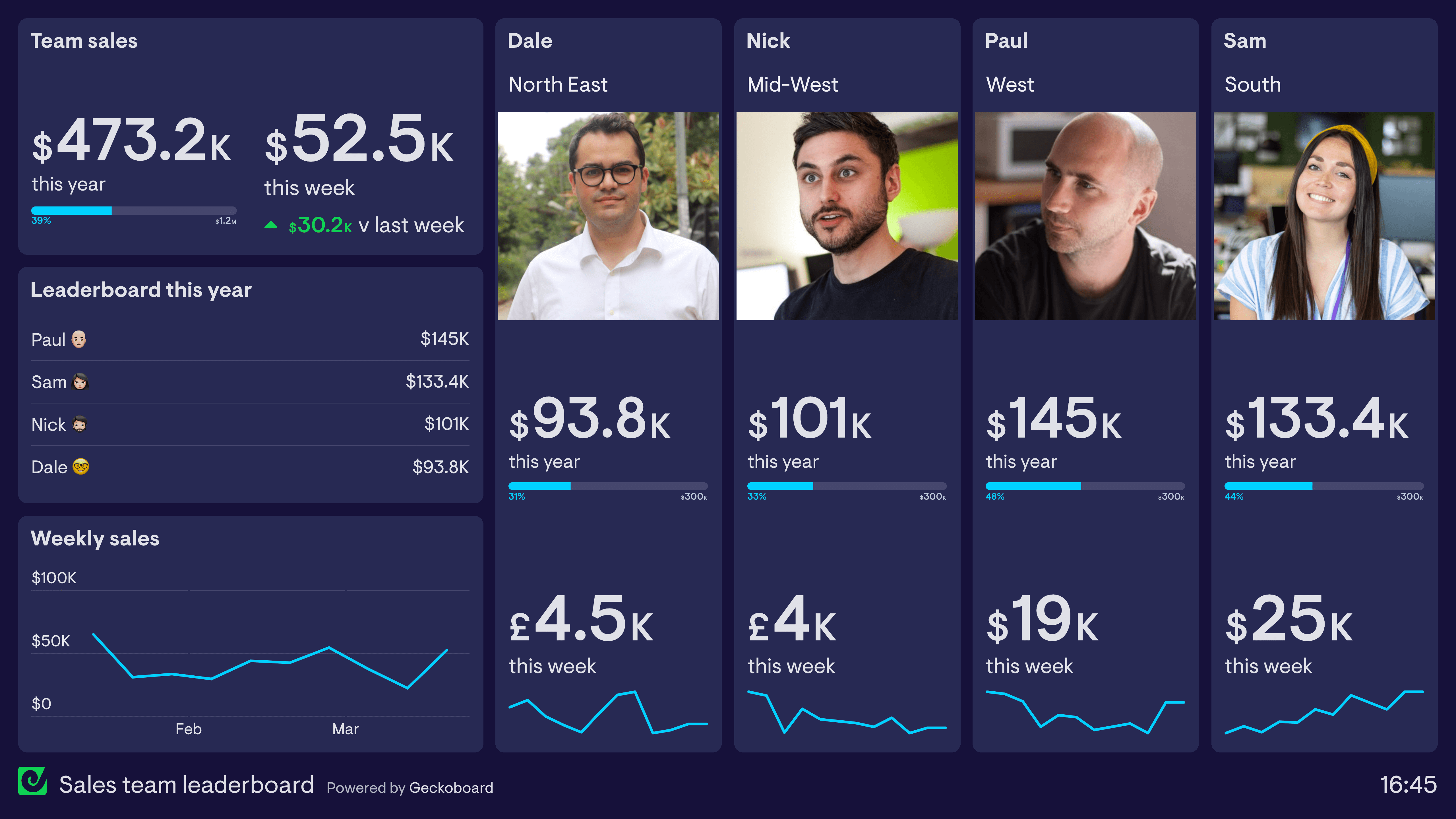
Individual performance
Some sales teams take the competition dashboard one step further, using images and visual elements to create a stronger sense of ownership and competition. In the example above, the sales team is tracking both cumulative and weekly performance. They have also devoted a large proportion of the dashboard to highlighting the individual performance of each salesperson. The sparklines help you see how individual performance is changing over time.
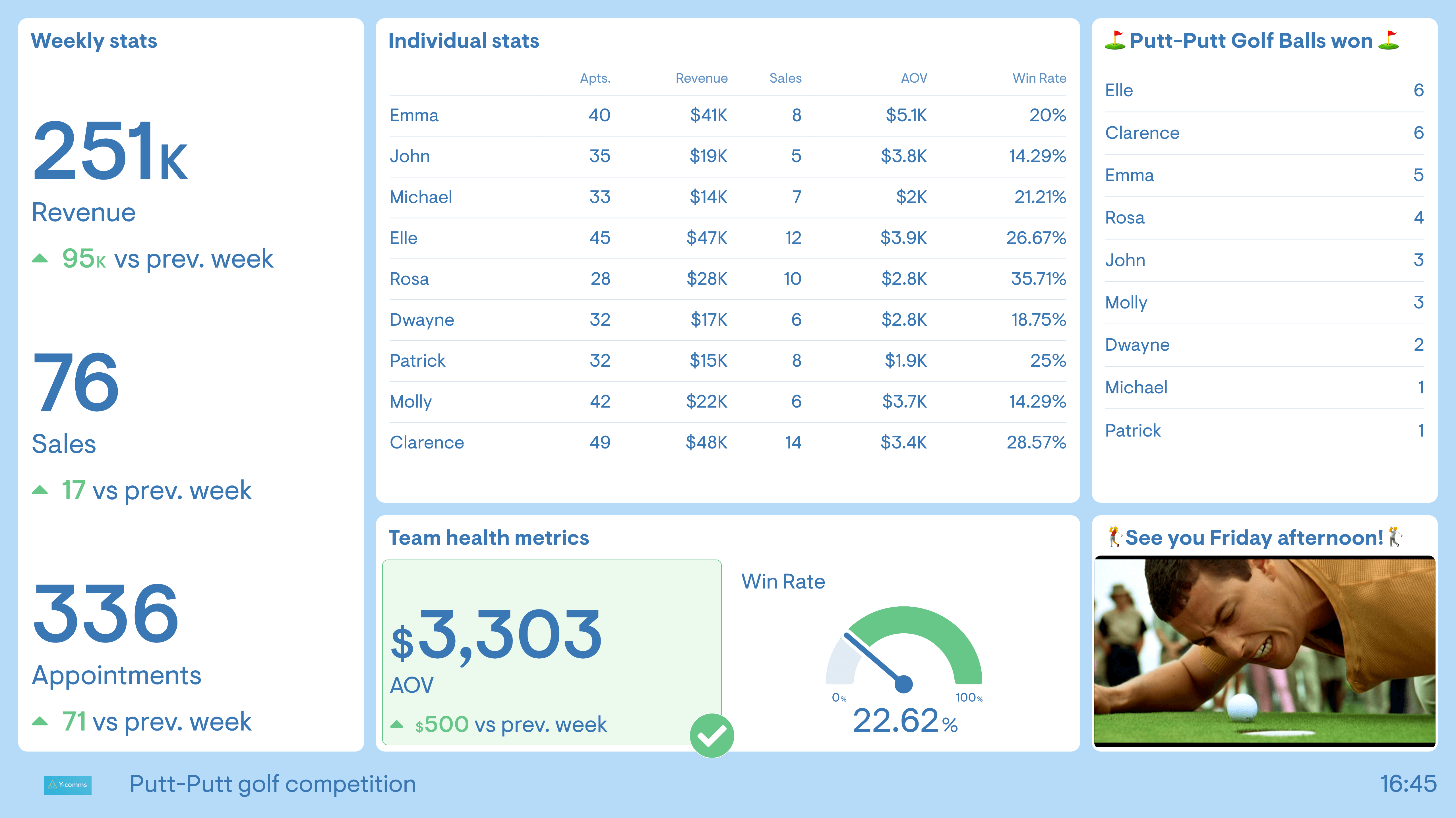
The raffle
Not all sales competitions need to be a straightforward leaderboard. Introducing an element of chance can make sales competitions even more engaging. One way to do this is by creating a competition where good performance — such as a sale, a new lead, or even a positive customer review — wins a ticket in a raffle, entered into a prize draw at the end of the week.
In the dashboard above, the Sales Manager has taken it one step further: every sale above $5k wins a golf ball. At the end of the week, the team plays one hole of office putt-putt golf. These competitions lift morale and keep a team motivated, and chance elements mean everyone has a shot at winning — even the less experienced team members.
Team A vs Team B
Splitting your salesforce into two and pitting them against each other for a one-off competition is another fun way to shake things up. You can draw teams out of a hat or even assign captains to pick teams, draft-style. As well as challenging your team to approach work differently, it involves all members — including more junior staff — and gets different people working together.
Build dashboards like these with Geckoboard
Try freeSales activity dashboards
A sales activity dashboard is designed to monitor the quantity and quality of the day-to-day activities used by sales people, such as calls, emails, social selling and product demos. One reason companies use these dashboards is to support productivity — sales people know that the best use of their time is to be with customers, helping them solve problems, but other things often get in the way. Dashboards help keep the whole team focused on how they prioritize their time.
Sales activity dashboards are usually presented in the context of the sales pipeline. Tracking sales activity helps you understand the link between new leads and new business. Spotting issues early means you can resolve them before they affect more important metrics further down the funnel, such as revenue.
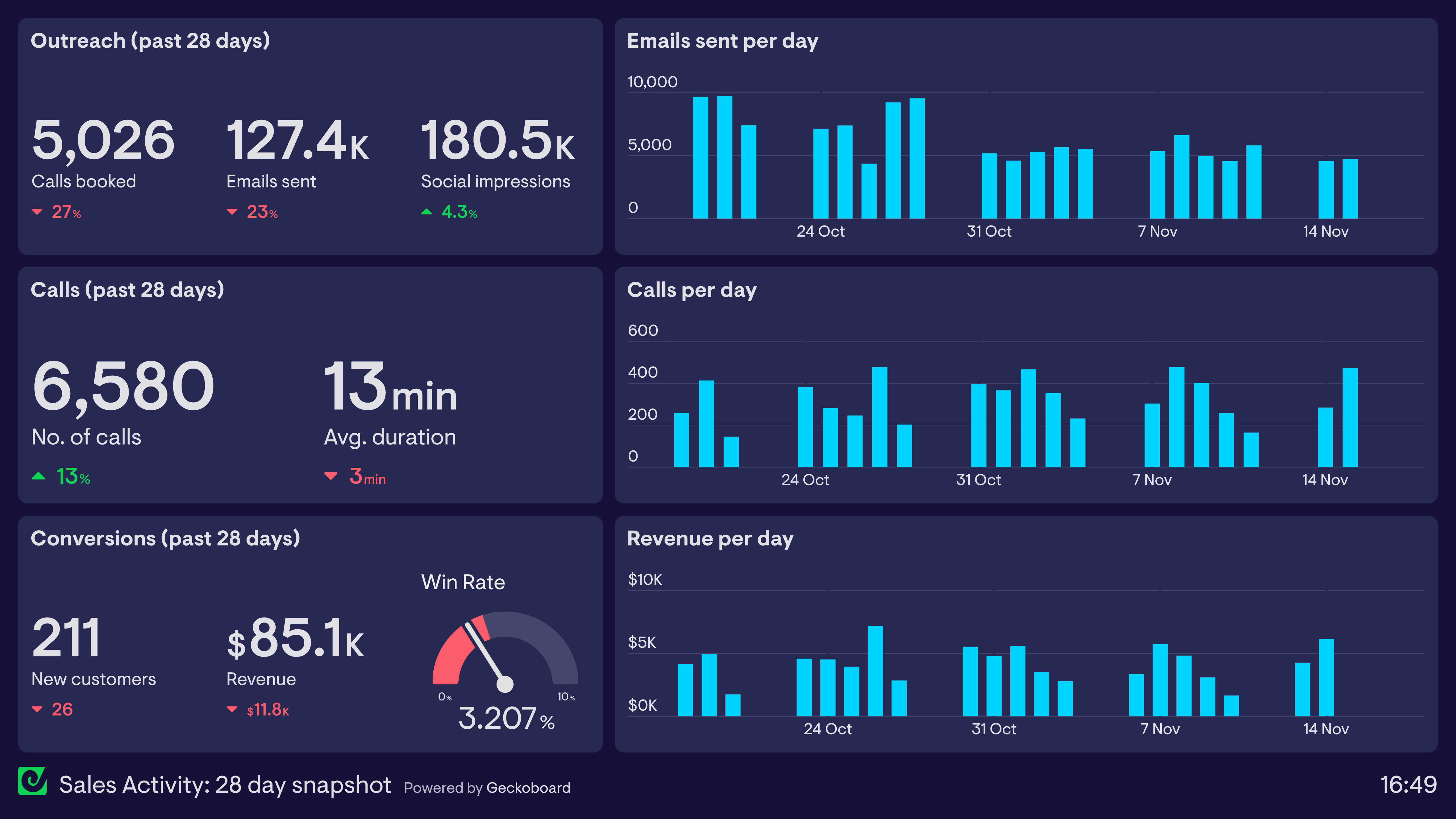
Sales activity: 28-day snapshot
This dashboard displays a snapshot of the company’s sales activity over the past 28 days, structured in the form of a sales funnel: lead generation at the top, lead nurturing in the middle, and lead conversion at the bottom.
Increased revenue is the ultimate goal, but tracking sales activity helps the team understand how and why that revenue is changing. In this case, even though they are completing more calls than last month, those calls are proving less effective — potentially related to a drop in average call duration. By using this dashboard, they can anticipate a decrease in activity further down the funnel and start to address it now.
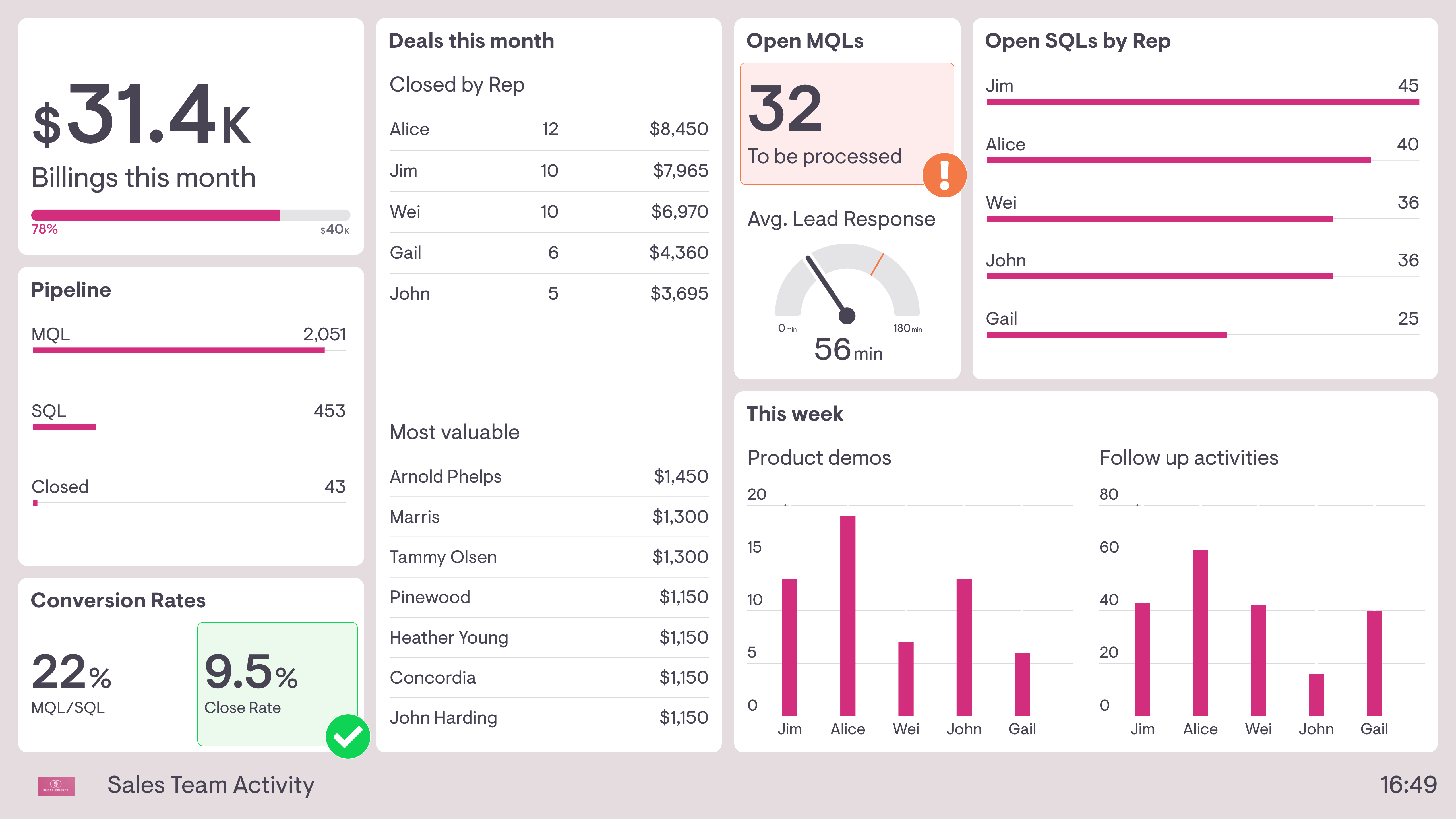
Sales team activity
This dashboard also shows sales activity in the context of the overall sales funnel, but with two notable differences. First, this sales team is not responsible for lead generation — it’s their responsibility to process Marketing Qualified Leads (MQLs), take forward Sales Qualified Leads (SQLs), and convert them into new business. As a result, this dashboard includes useful live status updates, such as average time to respond to new leads and how many new MQLs have yet to be processed.
Second, this dashboard breaks sales activities down by individual team member. In addition to deals closed this month, it shows activities such as product demos given and follow-up activity. This helps the Sales Manager understand how the team is spending its time, especially if other tasks are getting in the way.
Build dashboards like these with Geckoboard
Try freeSales opportunities dashboard
A sales opportunities dashboard is designed to provide a quick snapshot of your prospective customers. An ’opportunity’ generally refers to a customer who is more qualified than a ’lead’ or a ’prospect’ (though these terms do differ from place to place). As such, they tend to be used in more high-touch sales roles where the sales team has a good sense of how well opportunities are progressing. These dashboards can cover how many opportunities you have, how you acquired them, how valuable they are, and at what stage they sit in the pipeline.
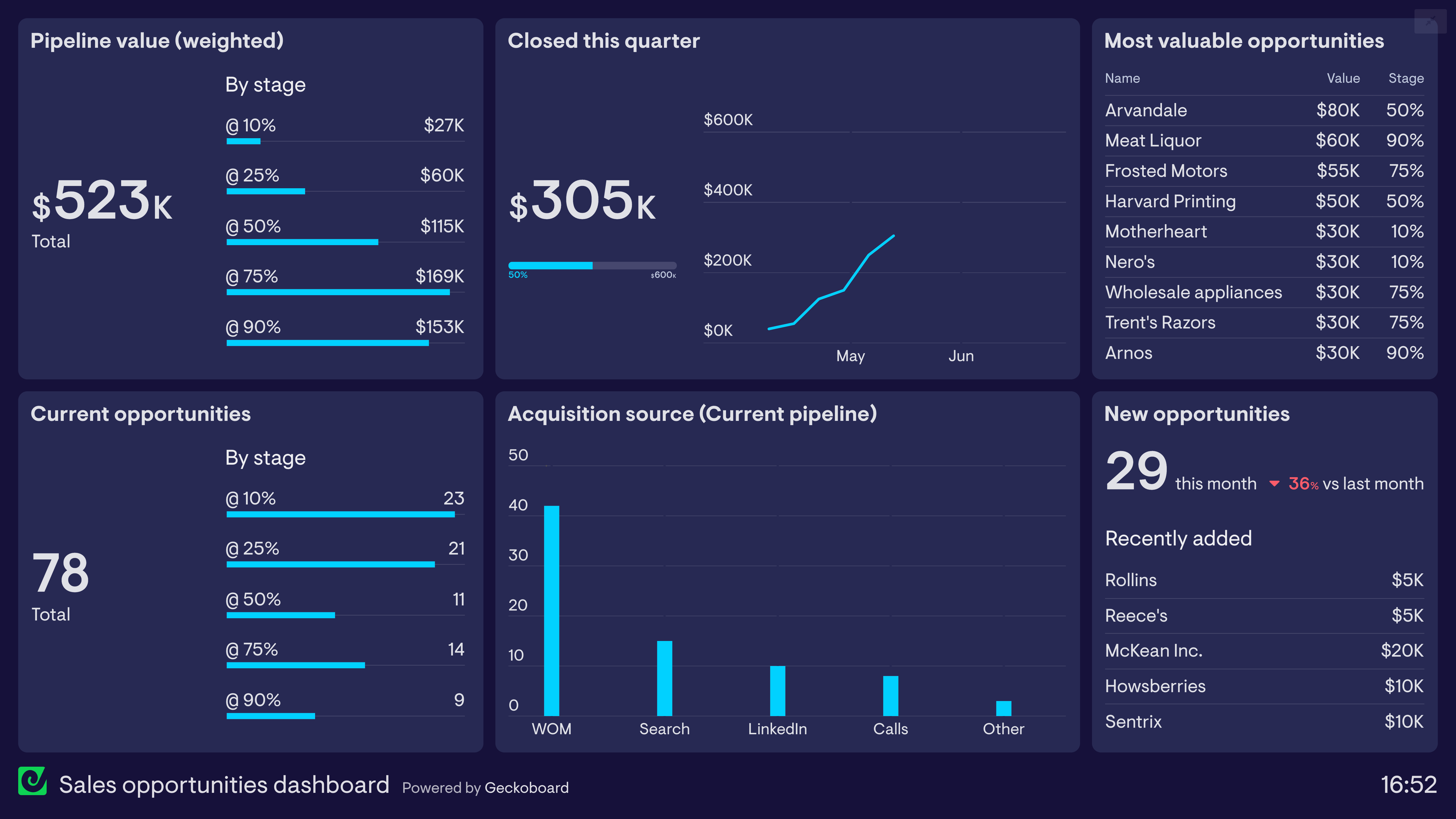
Sales opportunities
This dashboard focuses on the movement of sales opportunities through the pipeline. The members of the sales team use a CRM to record and keep track of their own opportunities, but they also use this live dashboard to make sure the entire team is regularly up to date on the full picture.
This dashboard uses pipeline weighting to give a more accurate picture of expected revenue conversion. For example, $230k worth of opportunities at the 50% stage will be weighted at $115k. In this example, it’s looking likely they’ll hit their quarterly target based on late-stage opportunities, but the lack of early-stage pipeline will be a concern — at least the team is now aware and can prioritize accordingly.
Build a dashboard like this with Geckoboard
Try freeAccount Manager dashboard
Account Managers (sometimes called Client Services) are responsible for building relationships with customers, helping to solve their problems and presenting them with the full range of solutions their company has to offer. Their focus on the overall commercial value of the customer — in particular through upselling and cross-selling — separates them from other customer-facing functions like Customer Support. Account Manager dashboards are likely to focus on metrics such as overall account value, customer engagement, upselling, and retention.
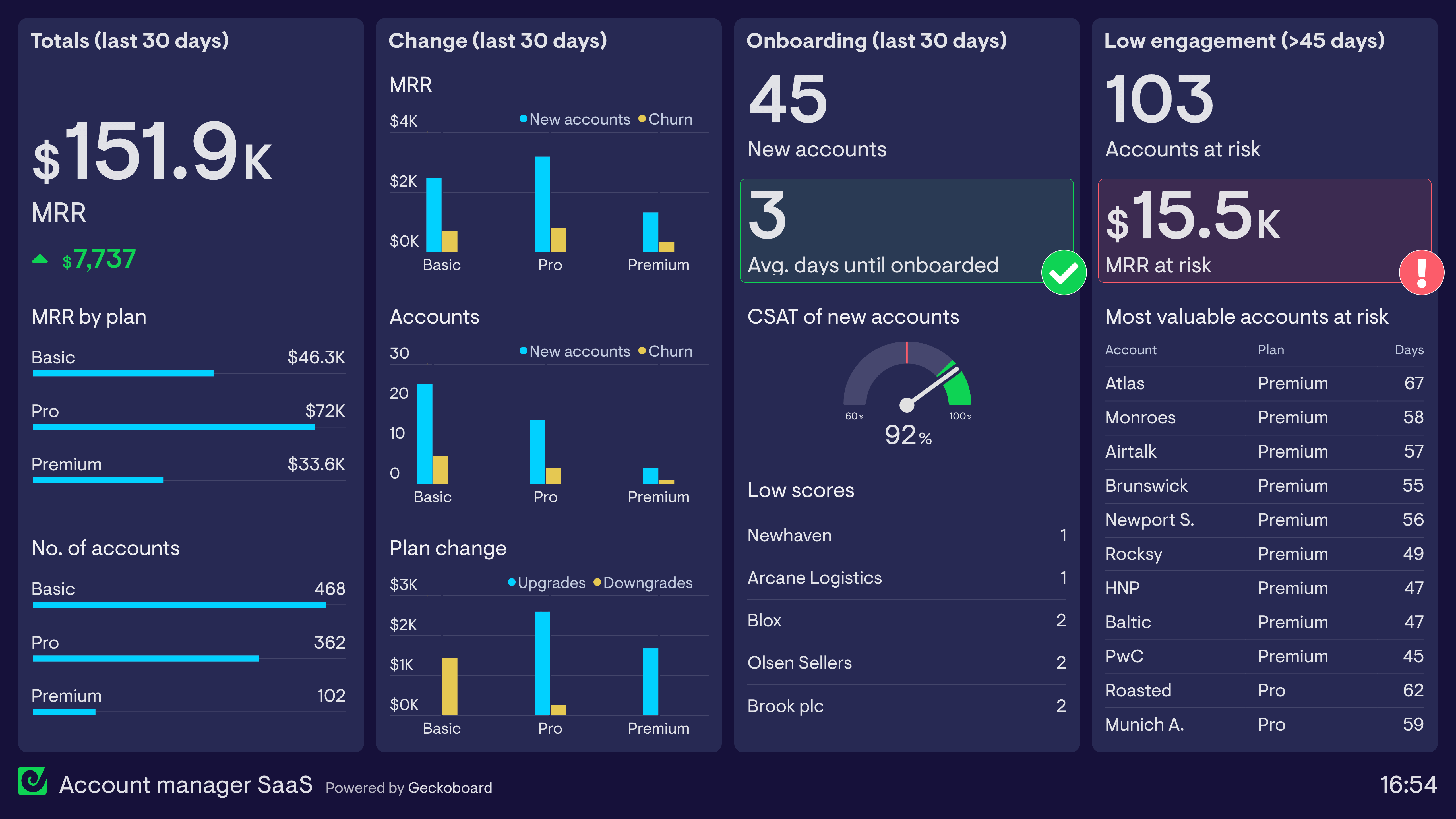
Account Manager dashboard (SaaS company)
This dashboard is used by an Account Manager at a SaaS company. They are responsible for successfully onboarding new customers, encouraging existing customers to upgrade their plan, and working with accounts at risk of cancelling their subscription.
On the whole, this dashboard shows things are going well. New accounts, upgrades, and low churn are contributing to an increase in MRR. The onboarding process has also gone smoothly this month, hitting the target for average days to fully onboard and achieving a CSAT score of over 90%.
However, the dashboard is also highlighting a potential risk to future MRR: over 100 accounts have not engaged with the platform in over 45 days — a sign they are likely to churn — including several premium accounts. The total MRR at risk from these accounts is over $15k. Fortunately, this Account Manager is now aware and able to take pre-emptive action.
Build a dashboard like this with Geckoboard
Try freeSales product performance dashboard
A sales product performance dashboard helps salespeople understand how individual products or brands are contributing to overall revenue targets. It helps them understand which products are performing best, which are struggling, and which might be affected by seasonal trends. They can use this insight to plan their sales more effectively and understand the best way to hit their targets. These dashboards are also used to communicate with operations and warehouse teams so they can manage the supply chain more effectively.
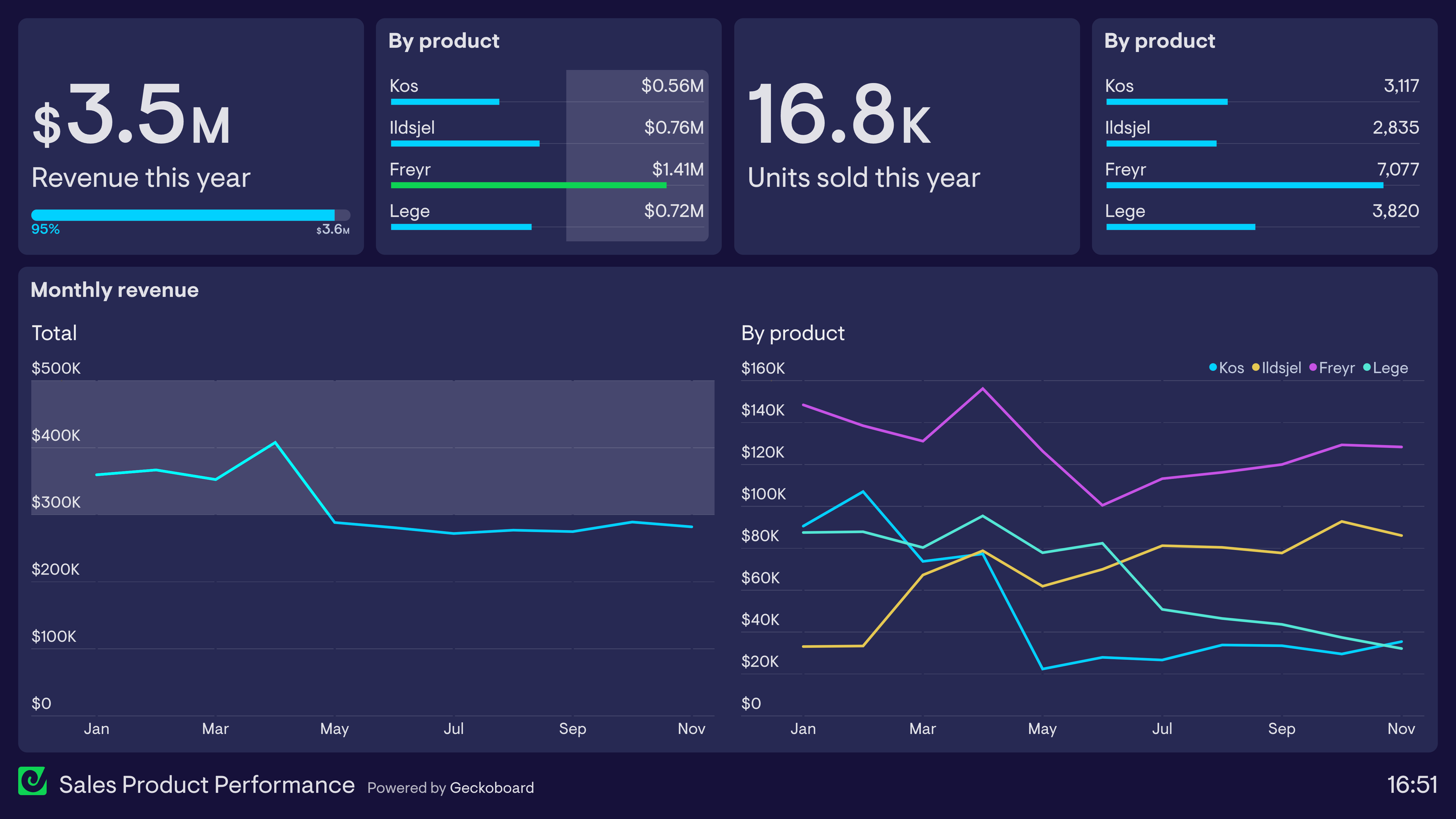
Product performance
Here we have a classic example of a product performance dashboard from a boutique home appliances company. Like most sales dashboards, this still tracks total revenue — in this case, against an annual target of $3.6 million. However, this dashboard also breaks down how the performance of each product is contributing to that revenue figure. As we can see, the Freyr product has been outperforming all others this year. And in what would otherwise look like a relatively stable year for revenue, we can see there has actually been a huge decline in two products, with an emerging product making up the shortfall.
Build a dashboard like this with Geckoboard
Try freeSales rep dashboards
A sales rep dashboard provides individuals in the sales team an overview of their performance towards their goals. Sales rep dashboards can be helpful tools for Sales Managers to create a sense of ownership among their sales reps — when using them, individuals are able to be more accountable for their workload, more focused on results, and ultimately improve their overall performance.
Metrics included depend on the work the sales rep completes as part of their role, but often there’s a view of closed deals, activities, and pipeline with clear goals attached for each area.
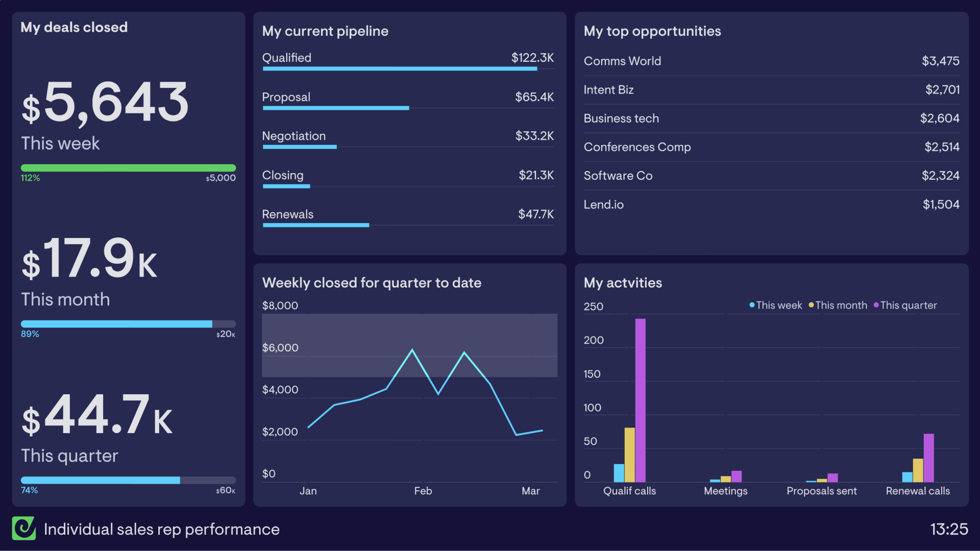
Sales rep dashboard
This individual sales rep dashboard visualizes key data that allows this rep to optimize their performance and meet their goals. The most important metric is the value of deals closed, with weekly, monthly, and quarterly goals to hit in order to receive their bonus.
Also included is their current pipeline, so they can see what they have moving through various stages of the buying journey, alongside their top opportunities as motivation to stay on top of key prospects. Activity data has been included to build awareness and accountability for the actions needed to close deals — when activities in one area drop, the effect is visible across the pipeline stages.
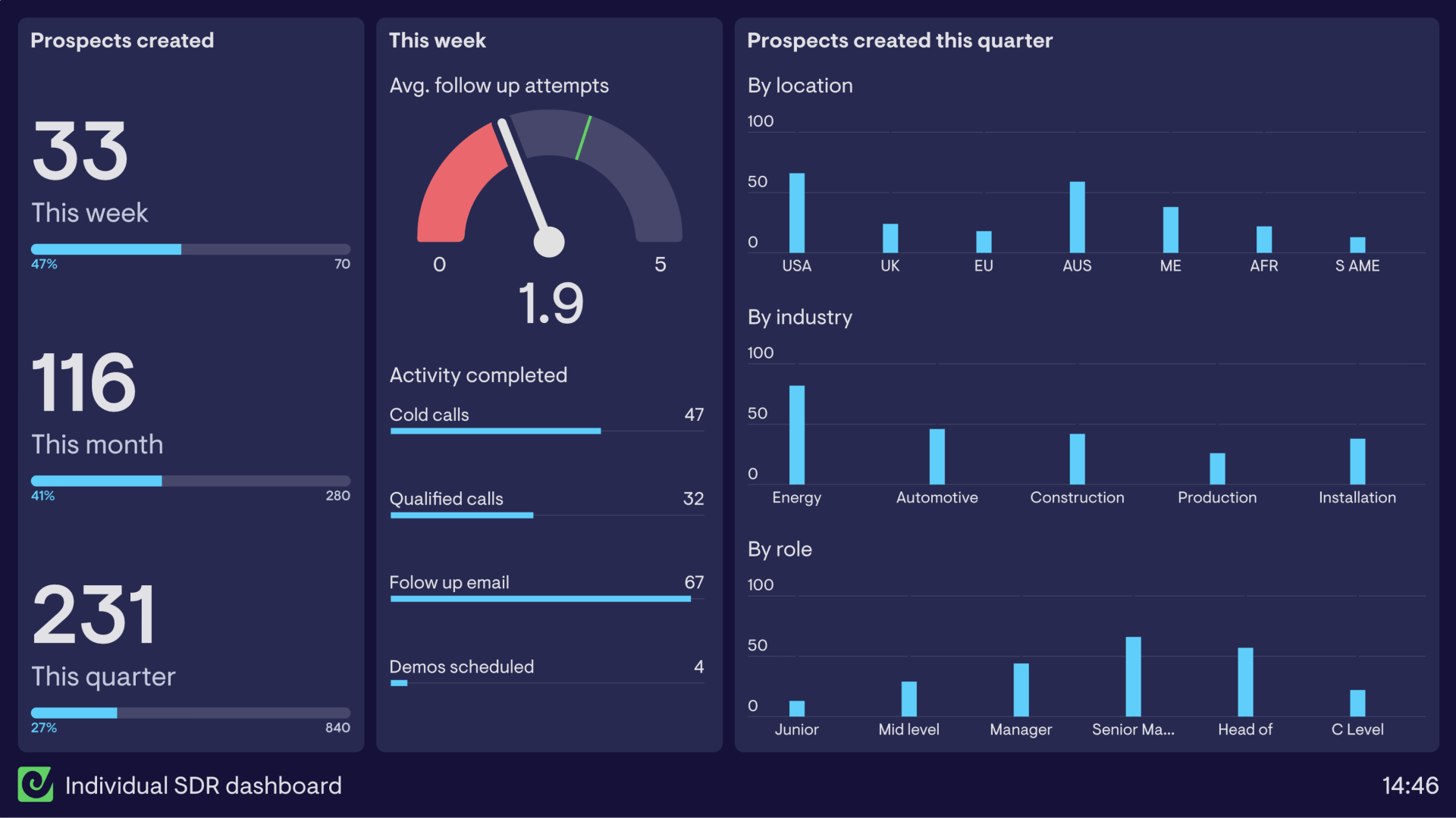
SDR dashboard
This dashboard has been created for an individual SDR to monitor their prospect creation performance. On the left are the key metrics the SDR is focused on — total prospects created — monitored over the week, month, and quarter in order to hit their targets.
The middle section covers activity for the week, including the average number of follow-up attempts made to prospects and the total number of each activity completed. On the right, three column charts break out prospect data by ideal customer profile — showing the SDR where they need to invest more attention when building prospect pools.
Build dashboards like these with Geckoboard
Try freeSalesforce dashboards
Many Salesforce users choose to conduct much of their reporting within the Salesforce platform itself. However, there are also many instances where teams find it necessary to use an external dashboard tool like Geckoboard to visualize their Salesforce metrics — for example, when you need a live TV dashboard, when you want to display Salesforce data alongside metrics from other sources like Google Analytics or Shopify, or when you need to share dashboards with team members who don’t have a Salesforce licence.
Geckoboard makes it easy to turn your Salesforce reports into visually engaging dashboards that are easy to understand and share.
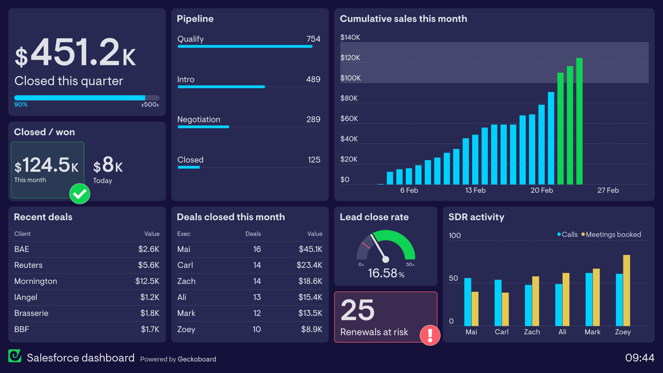
Salesforce dashboard
This dashboard is designed to provide a clear overview of company business KPIs, from revenue figures to activity in the sales pipeline. It pulls data from several Salesforce reports and visualizes those metrics in a way where it’s easy to see the company’s progress — and it’s the perfect dashboard to display on a TV in the office. In the top left, quarterly revenue against target keeps the entire team focused on their main goal. Pipeline data, biggest deals, and top-performing sales executives help everyone stay aware of how their work is positively impacting the business.
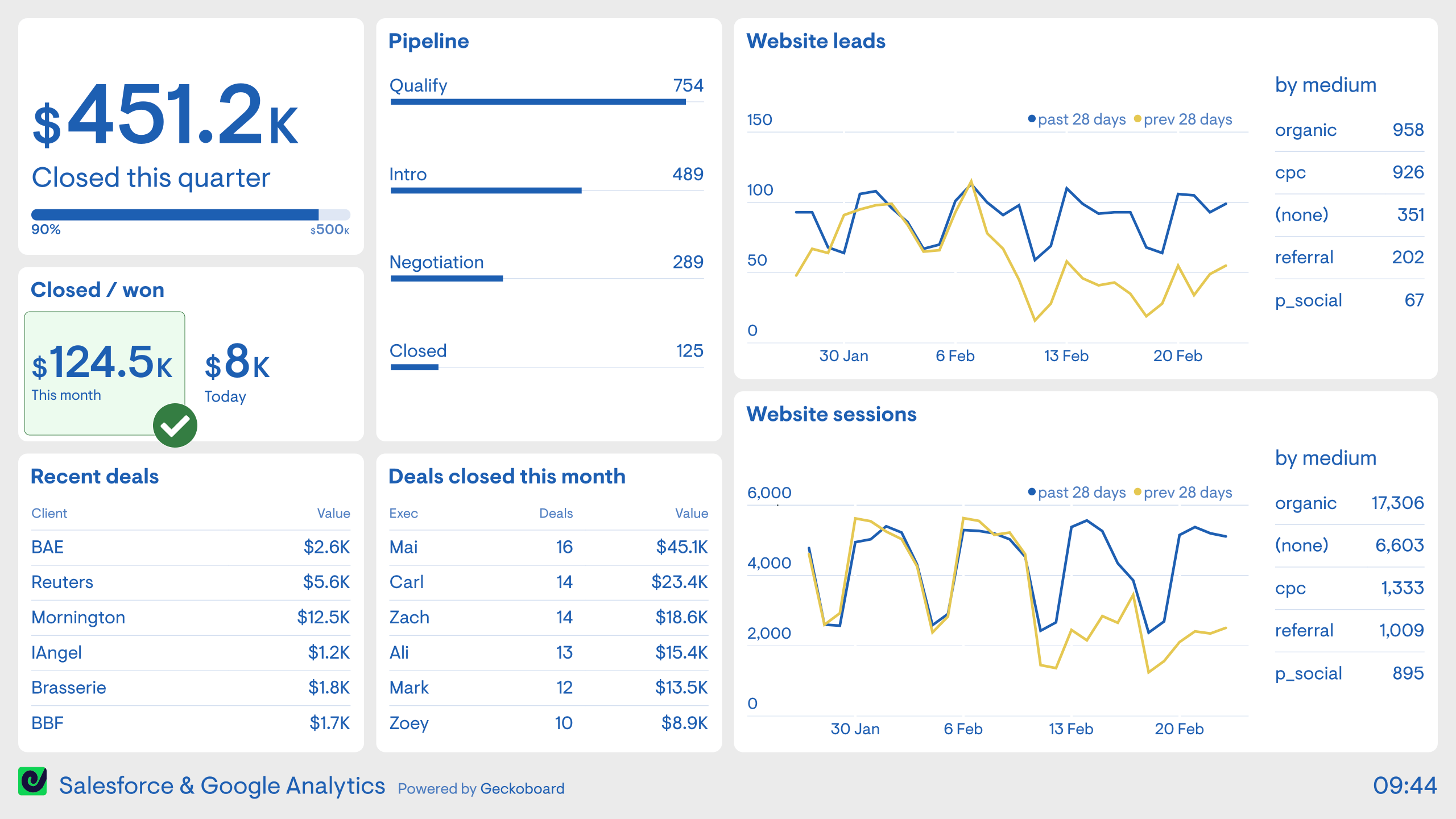
Salesforce and Google Analytics
This dashboard shows how Geckoboard lets you display Salesforce data alongside metrics from other sources. Here, Salesforce metrics sit alongside website analytics from Google Analytics, giving both sales and marketing teams a shared view of performance at every stage of the funnel. Without a dashboard like this, it’s common for sales people to have no access to Google Analytics and marketers to have no access to Salesforce — this view breaks down that silo.
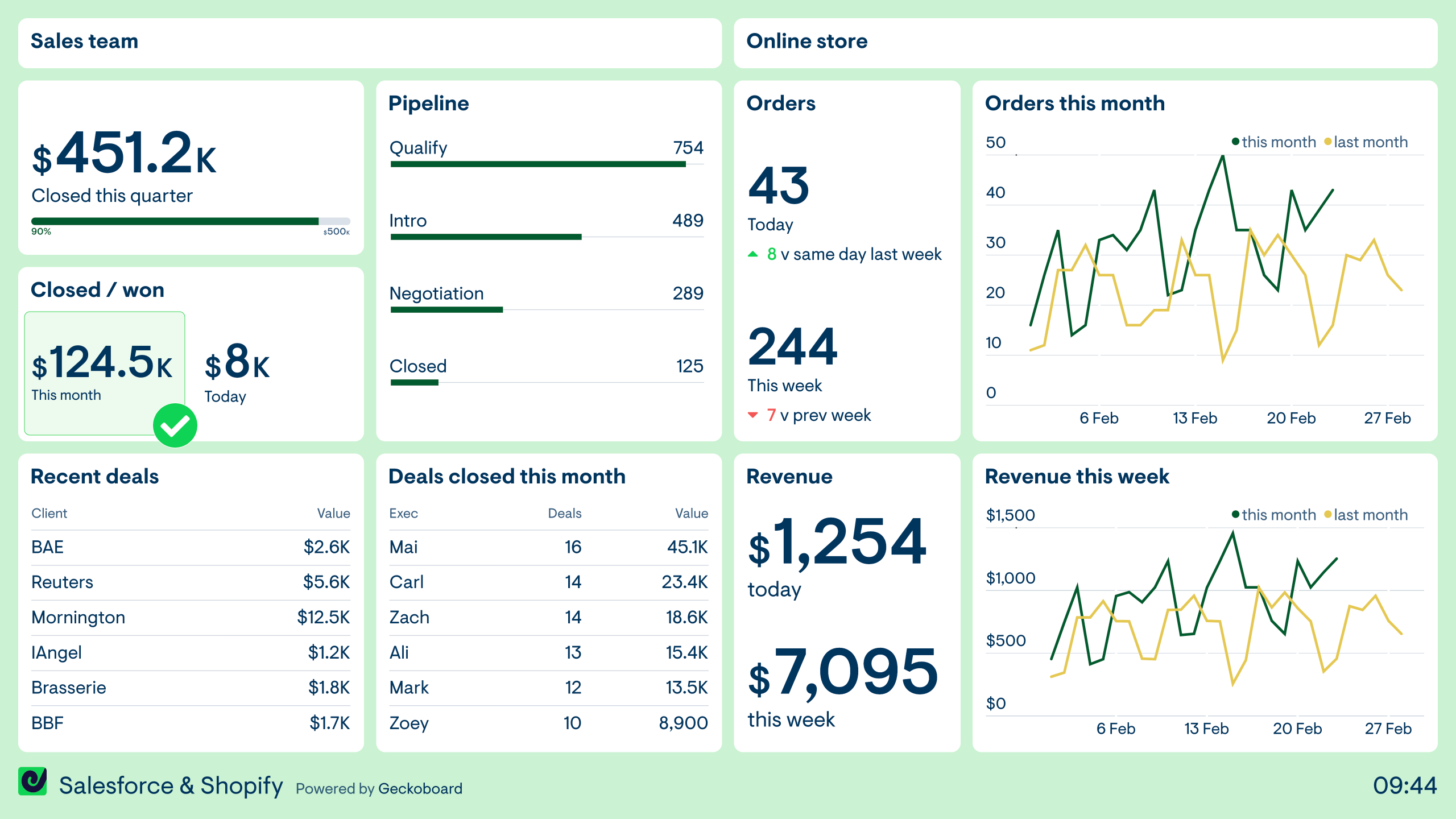
Salesforce and Shopify
Like the previous dashboard, this example shows how you can visualize metrics from different data sources in one place. Here, the company is combining metrics from their sales team who use Salesforce with their online store running on Shopify — two separate revenue streams in a single view. Being able to see key metrics from both sources helps teams develop a more holistic understanding of how the business is performing over time.
Build dashboards like these with Geckoboard
Try freeBuild your own sales dashboard
Connect your data sources and create a live sales dashboard in minutes — no coding required.
Start free trial