Aircall dashboard examples
An Aircall dashboard brings live call metrics — volume, wait times, and agent performance — into a single view the whole team can see. On a screen in the office, it keeps agents aware of how the queue is moving and gives managers an early warning when something needs attention.
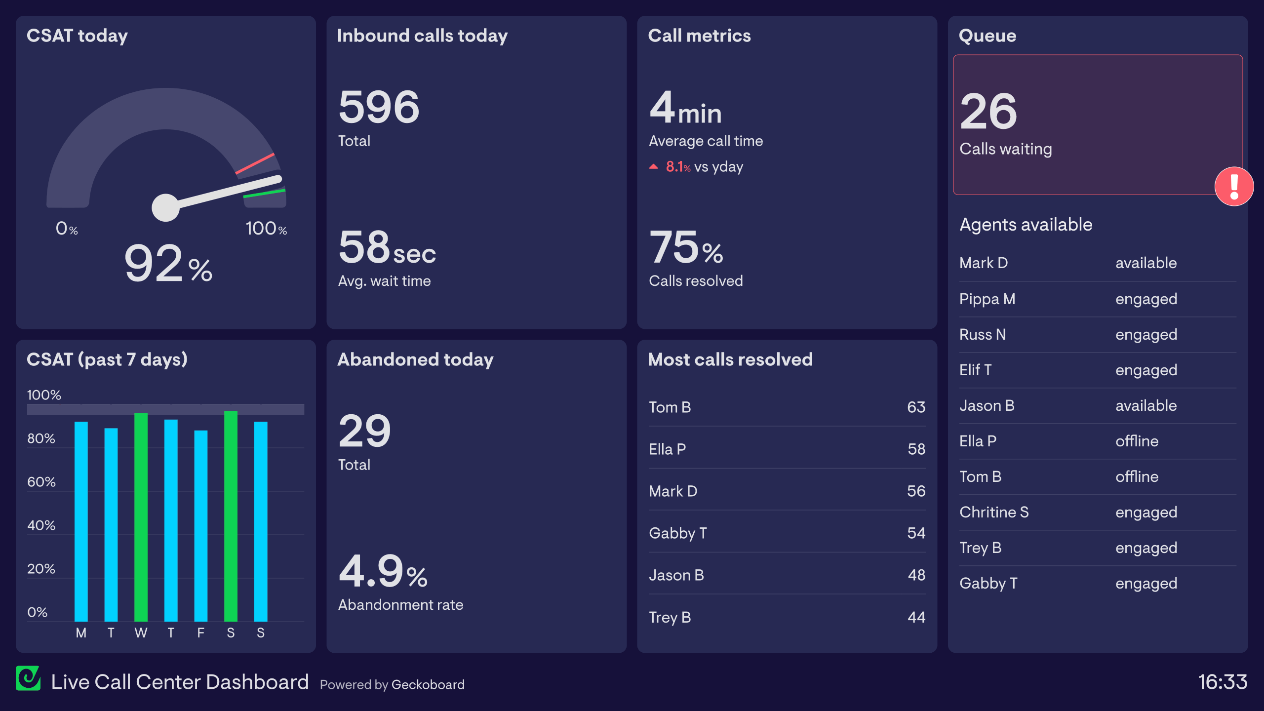
Aircall dashboard
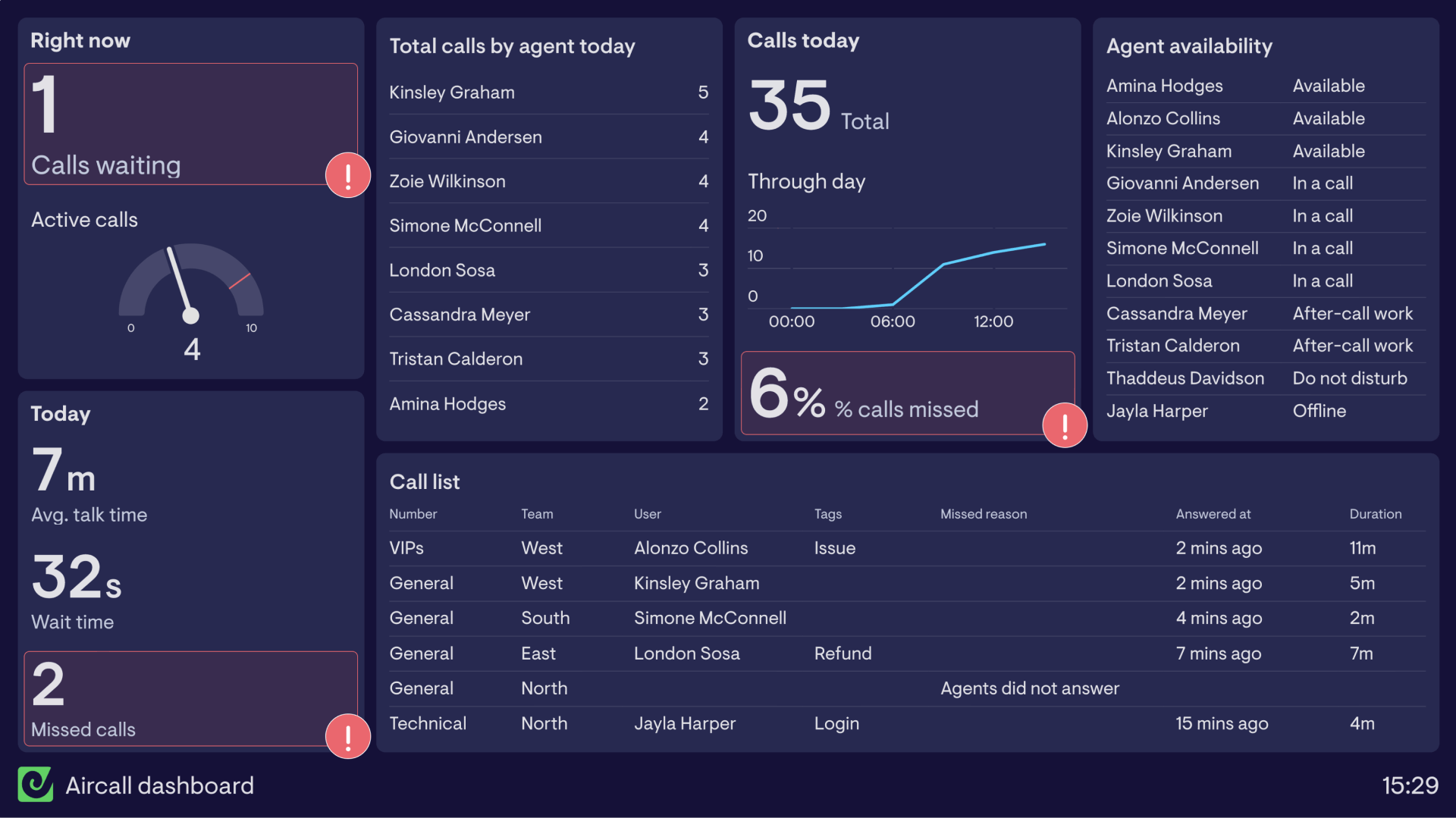
This Aircall dashboard brings key call data together, giving the manager an overview of what’s happening in the call center, as well as giving agents visibility of the call queue and their individual performance.
In the top left corner, Calls Waiting and Active Calls are grouped together so that everyone can see exactly what’s happening on the phone lines right now.
Beneath this are the key call metrics for the day; Average Talk Time, Wait Time and Missed Calls. This section of the dashboard is most useful to agents who have goals around each of these metrics. By maintaining a lower wait and talk time and reducing missed calls the customer experience overall is much better.
Also important for the agents is their individual performance when it comes to answering calls, so a leaderboard has been included to motivate agents to move through calls efficiently.
To help the manager monitor and organize workflows, we’ve included a group of metrics around the calls received today as well as agent availability and a detailed call list. The call list is particularly helpful to see more information around the types of calls coming in and where calls are being missed.
Aircall & Zendesk call center dashboard
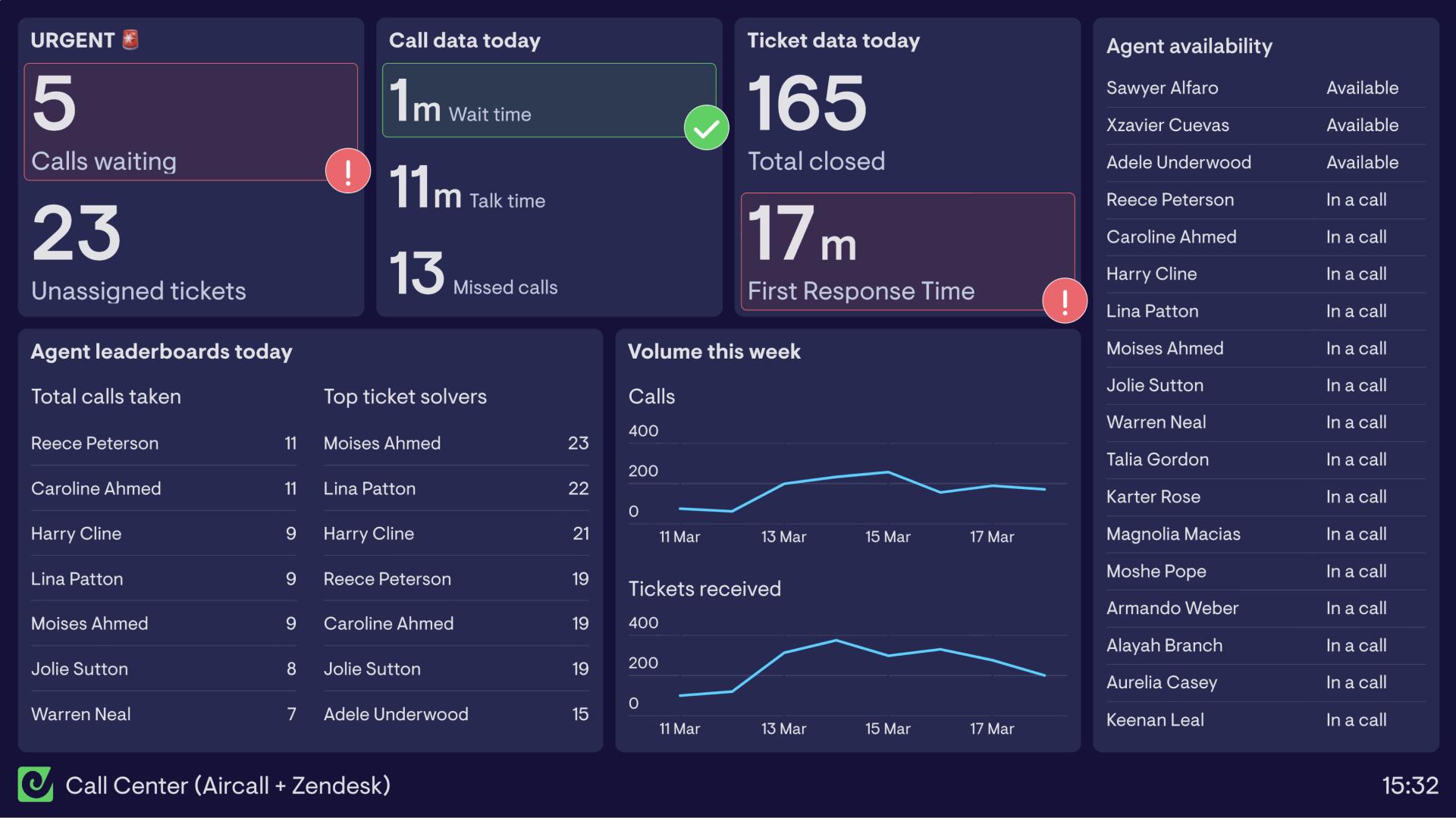
This call center dashboard visualizes data from Aircall and Zendesk, to give the whole team an overview of their daily performance in real time.
Including a mix of call metrics from Aircall and ticket metrics from Zendesk, agents are able to see a combination of team and individual data to let them know how they’re performing against targets.
Starting on the left side of the dashboard, the urgent metrics are highest priority, and most in need of attention if they increase above a set level. Calls waiting and unassigned tickets should be kept as low as possible at all times in order to provide their customers with great service.
Following this in the top row, we have call data based on today’s performance on the phones including Wait Time, Talk Time and Missed Calls.
Beside the daily call data are two metrics focused on tickets, Total Closed and First Response Time (FRT).
Tracking this data around calls and tickets allows the team to know if they’re meeting expected levels of service.
Along the bottom are two leaderboards for the agents to see how they are performing in terms of the wait time between calls and number of tickets solved. These help encourage friendly competition and motivate the team to top the charts.
In order for the agents to have an understanding of the volumes they’re working with, the number of calls and received tickets are outlined in a line chart. This allows everyone to know what to expect in terms of workload throughout the week.
Finally, the agent availability table outlines everyone’s status to help always know who’s available and to streamline shift handovers for the team leaders.
Aircall & Salesforce dashboard
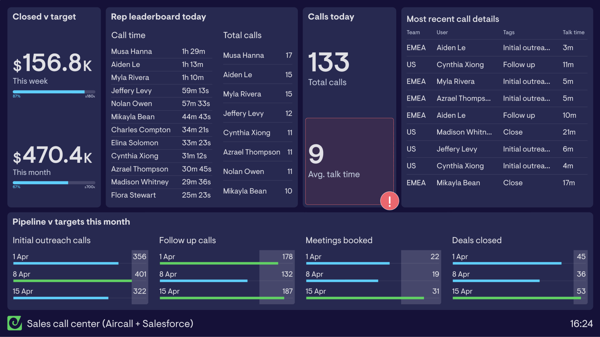
This sales call center dashboard combines data from Aircall and Salesforce to bring key metrics together onto a TV dashboard for the sales team.
Drawing on a combination of KPIs around pipeline and deals closed from Salesforce as well as call metrics from Aircall, the sales team are able to get a true picture of how their daily workload translates into hitting their monthly sales targets.
The dashboard clearly outlines the targets around deals closed for the week and month, as well as weekly pipeline goals which enable them to meet these.
This sales team is based within a call center where they spend a lot of time outbound calling to build their pipeline. Using leaderboards with call time and total calls helps encourage friendly competition and gamifies the process of making large volumes of calls each day.
Sharing this dashboard on a TV screen within the call center makes the whole team aware of their progress towards goals on a daily basis.
Live call monitoring dashboard
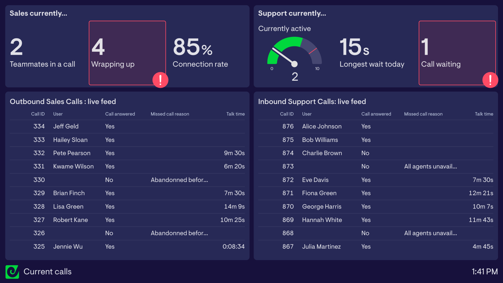
Stay on top of your team’s live call activity with a real-time dashboard designed for fast decision-making. Instantly see recently completed and current calls, who’s on a call, and where queues are building, all in one clear, consolidated view.
What this dashboard shows
Sales currently: Get a pulse on outbound performance with live stats showing how many teammates are actively on calls, how many are wrapping up, and your current connection rate. Spot slowdowns or spikes as they happen.
Support currently: Monitor real-time queue pressure with active call counts, longest wait today, and any waiting callers. Perfect for keeping response times on track and jumping in before service levels dip.
Create custom live call feeds
Monitor activity on Aircall the way you want. In this dashboard, two separate call feeds give an at-a-glance view of two very different workflows.
Outbound Sales Calls
Track every outgoing call in progress, including:
- Who’s calling
- Whether the call was answered
- Any missed or abandoned reasons
- Live talk time
Great for coaching, spotting stuck calls, and keeping reps focused.
Inbound Support Calls
See incoming support calls as they happen. Each row shows:
- Current call status
- Who’s handling it
- Whether it was answered
- Why it was missed
- Live duration
This helps teams quickly rebalance workloads and maintain SLAs during busy periods.
Why this dashboard works
- Gives Sales and Support teams & leaders instant visibility into what’s happening right now.
- Highlights bottlenecks early, whether that’s call waiting time, abandoned support calls, or a stack of sales reps wrapping up at once.
- Helps teams react fast, redistribute work, and maintain great customer experience.
- Ideal for TV wallboards, shift handover, or daily stand-ups, keeping the whole team aligned on real-time performance.
Browse other popular examples
An Aircall dashboard gives call center and sales teams a live view of call volume, agent activity, and team performance pulled directly from Aircall. Teams use it to monitor queues in real time, spot missed call trends, and hold agents accountable against targets — without logging into Aircall's native reporting.
Geckoboard is a live dashboard tool that connects to Aircall, Zendesk, Salesforce and more to give call teams a real-time view of performance. Dashboards are designed to run on a TV in the office so the whole team can see what's happening at a glance — without needing to check a platform.
Typical metrics include inbound and outbound call volume, missed calls, average handle time, wait time, calls per agent, and call outcomes. Teams connecting Salesforce or Zendesk can also layer in CRM pipeline or ticket resolution data.
Building a custom Aircall dashboard is straightforward with Geckoboard's dashboard builder. Connect Aircall as your primary source, then add Salesforce or Zendesk Support to bring in outcome data alongside call metrics. Pick your metrics and build the view you need, then share with your team as a TV dashboard, shared link, or scheduled snapshot. Start a free trial or learn more about how Geckoboard works.
Use it to monitor performance in real time so supervisors can see live queue status and reassign agents when volume spikes. It also helps make team performance visible by putting individual and team call stats on a shared screen that drives accountability.