You don’t need to be a designer to build a dashboard that clearly communicates your key goals and metrics. Whether you’re just getting started or have a dashboard in need of a rethink, our dashboard design checklist will help you achieve the results you’re looking for.
Be clear about what you’re trying to achieve

The first step to designing any dashboard is to clearly define what you’re trying to achieve. What’s the purpose of your dashboard? Who’s it for? What do you want them to do differently because of it?
Perhaps you’re trying to focus your team on a specific goal, or show them how they contribute to the bigger picture. Or maybe you want to make sure a particular type of problem gets noticed quicker. These are all good purposes to keep in mind.
For inspiration, explore these examples: Executive | Finance | Marketing | Sales | Support
Include only the most important content
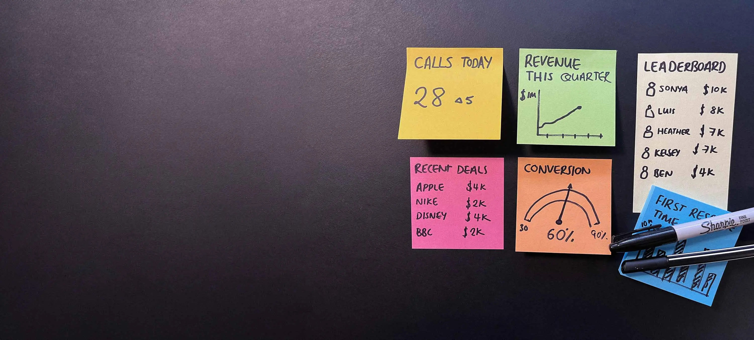
Content is key when it comes to dashboarding. If you’re not showing useful metrics then it doesn’t matter how you arrange them.
Often you’ll already have some goals and KPIs defined, and adding those is a great starting point. Just remember, everything should tie back to the purpose of your board.
Every inch on your TV dashboard is valuable real-estate. Adding too much information can detract from what’s important and make everything harder to find. If you’re really struggling to fit everything in then you may need more than one dashboard.
When putting any metric on your dashboard you should make sure they:
- Match the purpose of your board
- Can be influenced by your team
- Can be easily understood
- Change reasonably often (you don’t want to be staring at numbers that never change)
- Don’t vary so much that you can’t easily detect trends
Consider data ink ratio
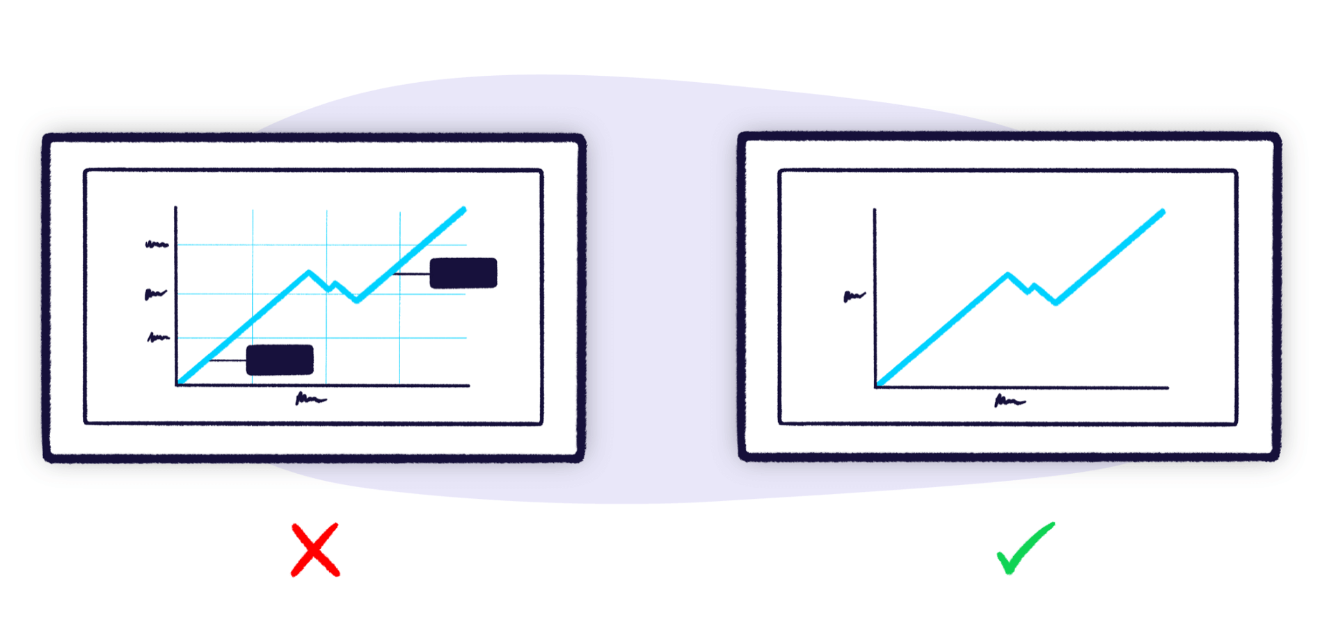
Another way to improve your dashboard design is by reducing the amount of visual noise. The American statistician, Edward Tufte coined a term for this: data ink ratio.
The term comes from a pre-digital age when data visualizations were nearly always printed with ink. Data ink is quite literally the ink on the page that communicates data, whereas non-data ink does not. Well designed dashboards (and other data visualizations) aim to use as little non-data ink as possible — in other words, they have a good data ink ratio.
That means removing unnecessary grid lines, icons, color, labels, or anything else that doesn’t actually communicate data. Dashboards with a poor data ink ratio are hard work for the user, because the non-data ink is distracting and gets in the way.
Decorative elements like colorful backgrounds or quirky illustrations may grab your attention the first time you look at a dashboard, but the novelty very quickly wears off, and eventually it just gets in the way.
Round your numbers
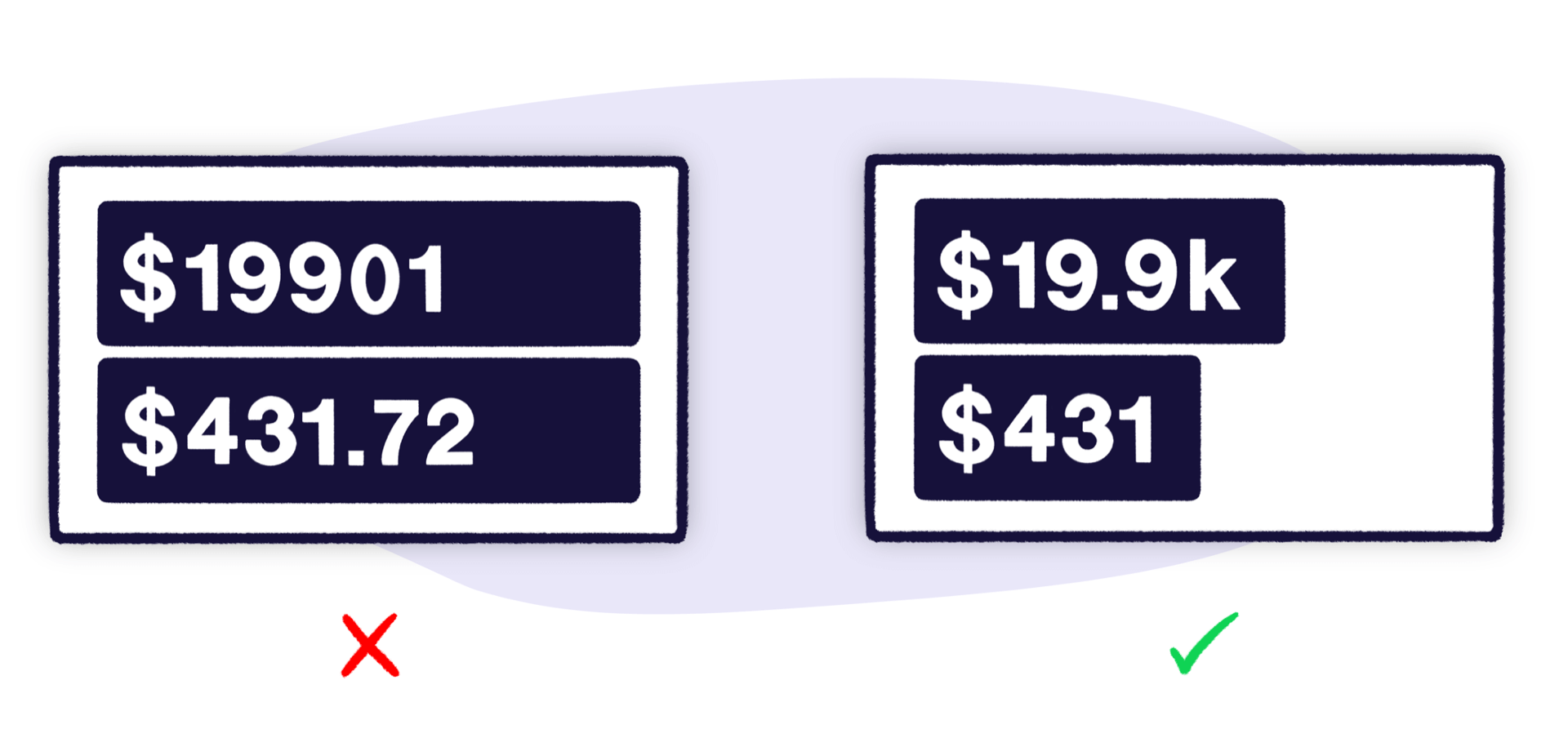
When displaying numbers, try not to be overly precise. Showing your conversion rate to 3 decimal places or your revenue to the nearest cent when you only care about much bigger changes just distracts from what’s important. Plus, including too much detail can make a mountain out of a molehill.
Use the most efficient visualization
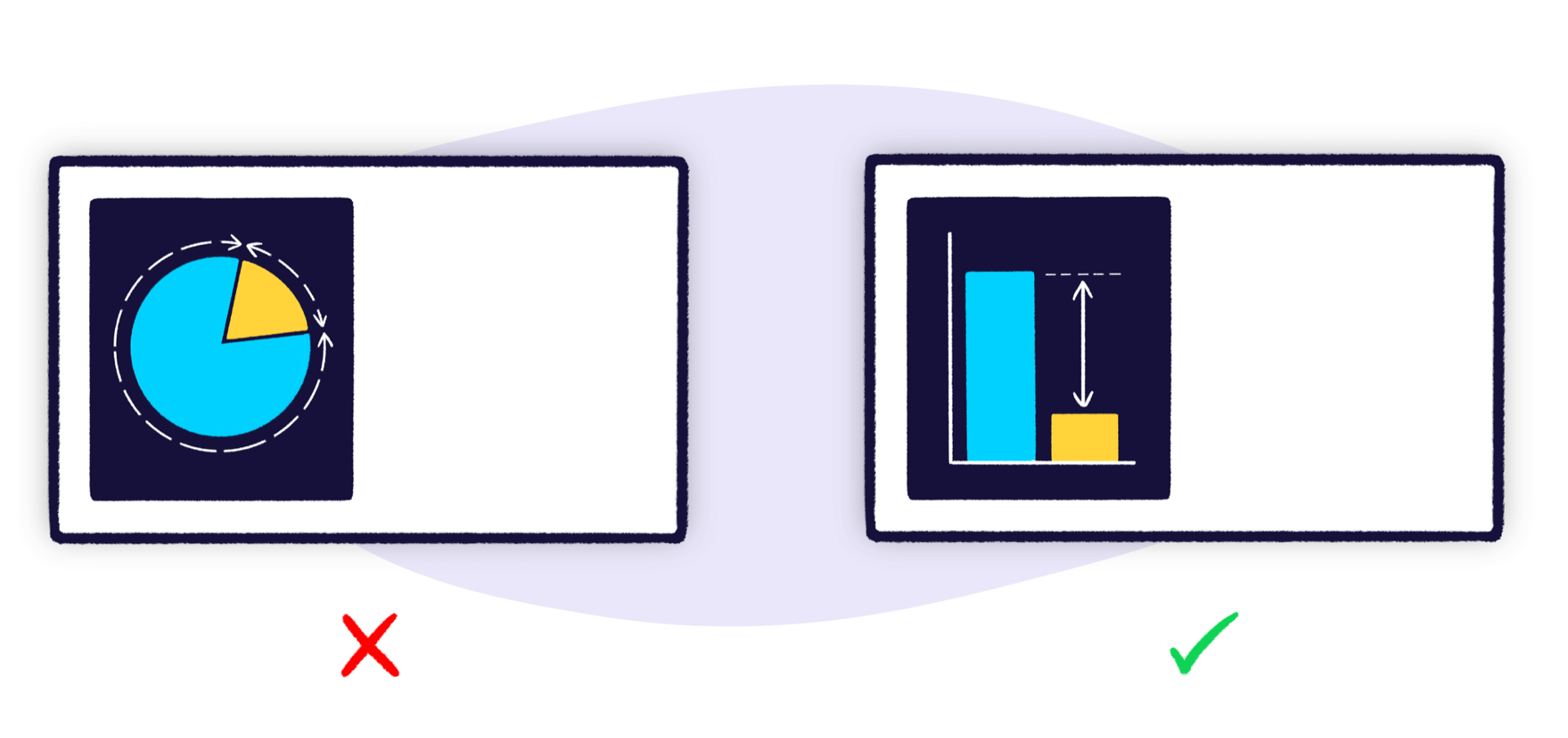
When selecting a visualization, you should choose the one which most clearly and efficiently communicates your data.
That means, it should take as little time as possible to understand.
In general, people aren’t very good at comparing and contrasting spatial area. This means pie charts and area charts are rarely the best choice of visualization.
Also, it can be tempting to change a visualization just for the sake of variety. Don’t do this. If choosing the right visualization means choosing the same visualization, then that’s fine. Most of the time, you’re going to be using a combination of numbers, bars, lines and tables and not much else.
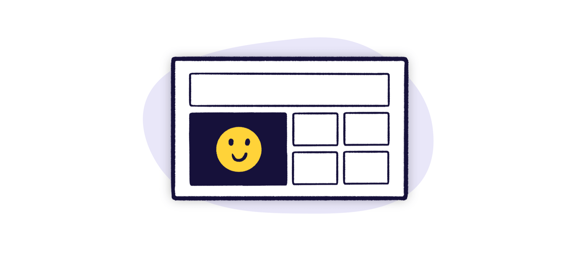
Group your related metrics
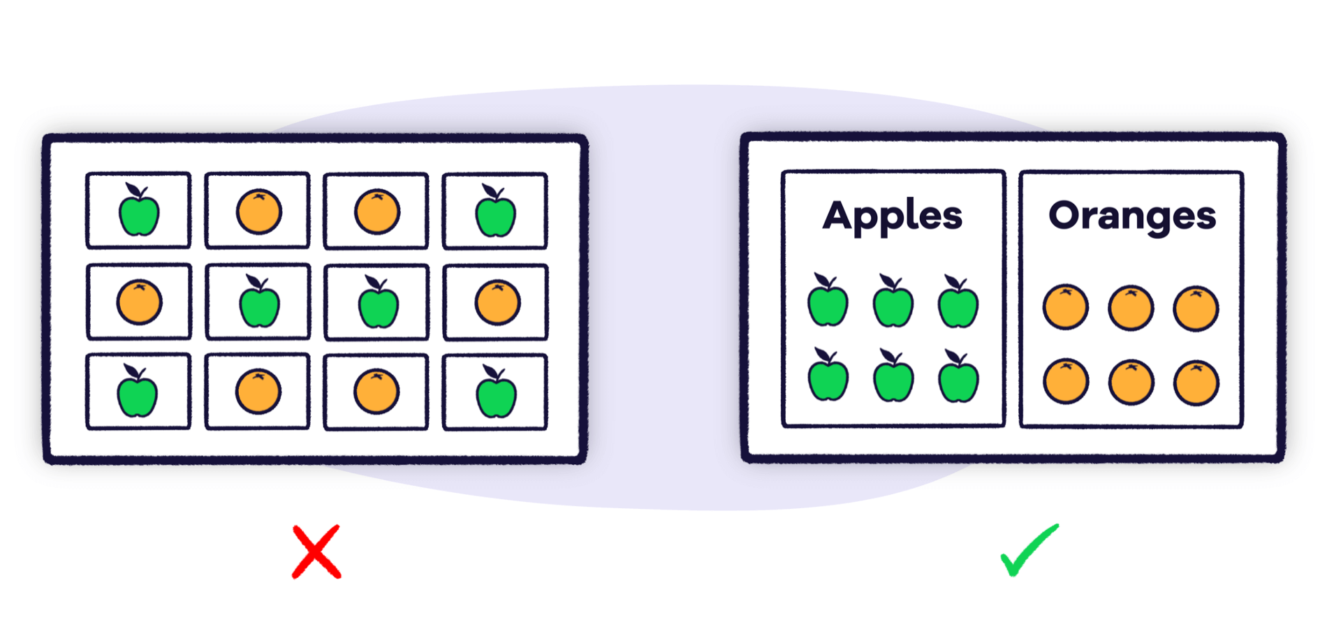
It’s important to position the information on your dashboard logically. Grouping related metrics next to each other makes them easy to find — and makes your dashboard’s design more attractive.
There are many different ways to group e.g. by metric, product, brand, campaign, region, team or even time period. You may need to experiment with which is most appropriate for your board.
Giving groups a title makes them easier to spot.
Be consistent
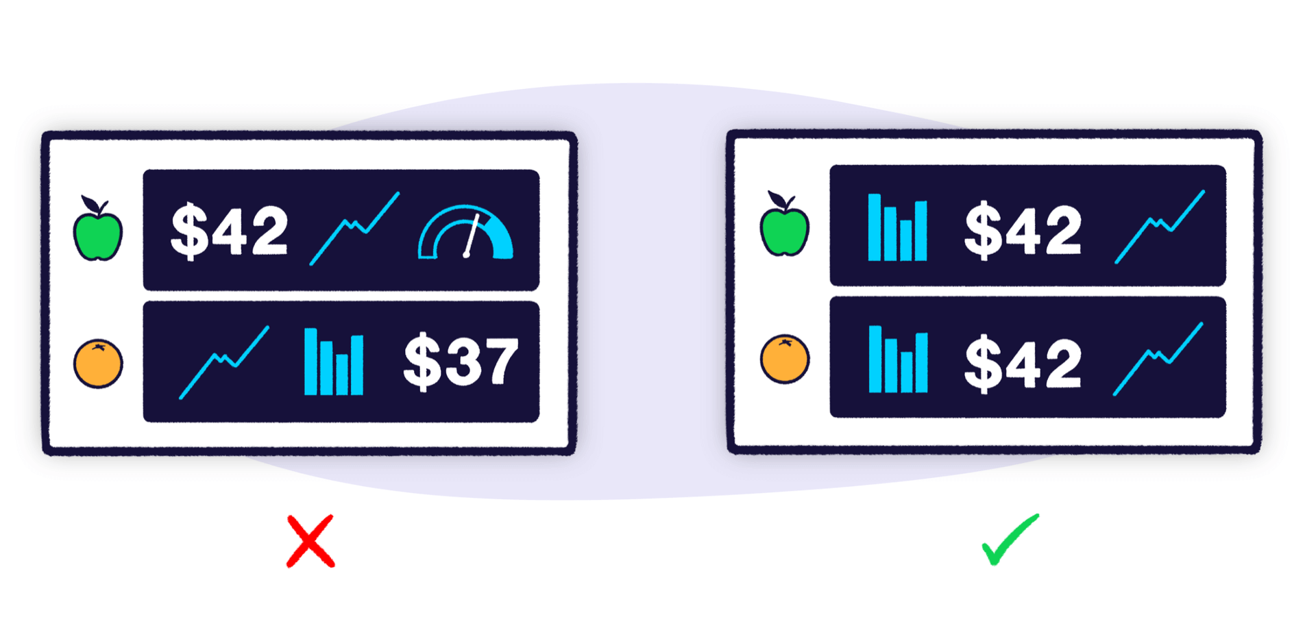
With dashboards, it’s often necessary to be repetitive, especially when you’re showing the same set of metrics for multiple things. Your dashboard will be far easier to read if you use the same visualizations and layouts between groups. It will also look far more pleasing, so avoid the temptation to use a line chart instead of a column just to spice things up.
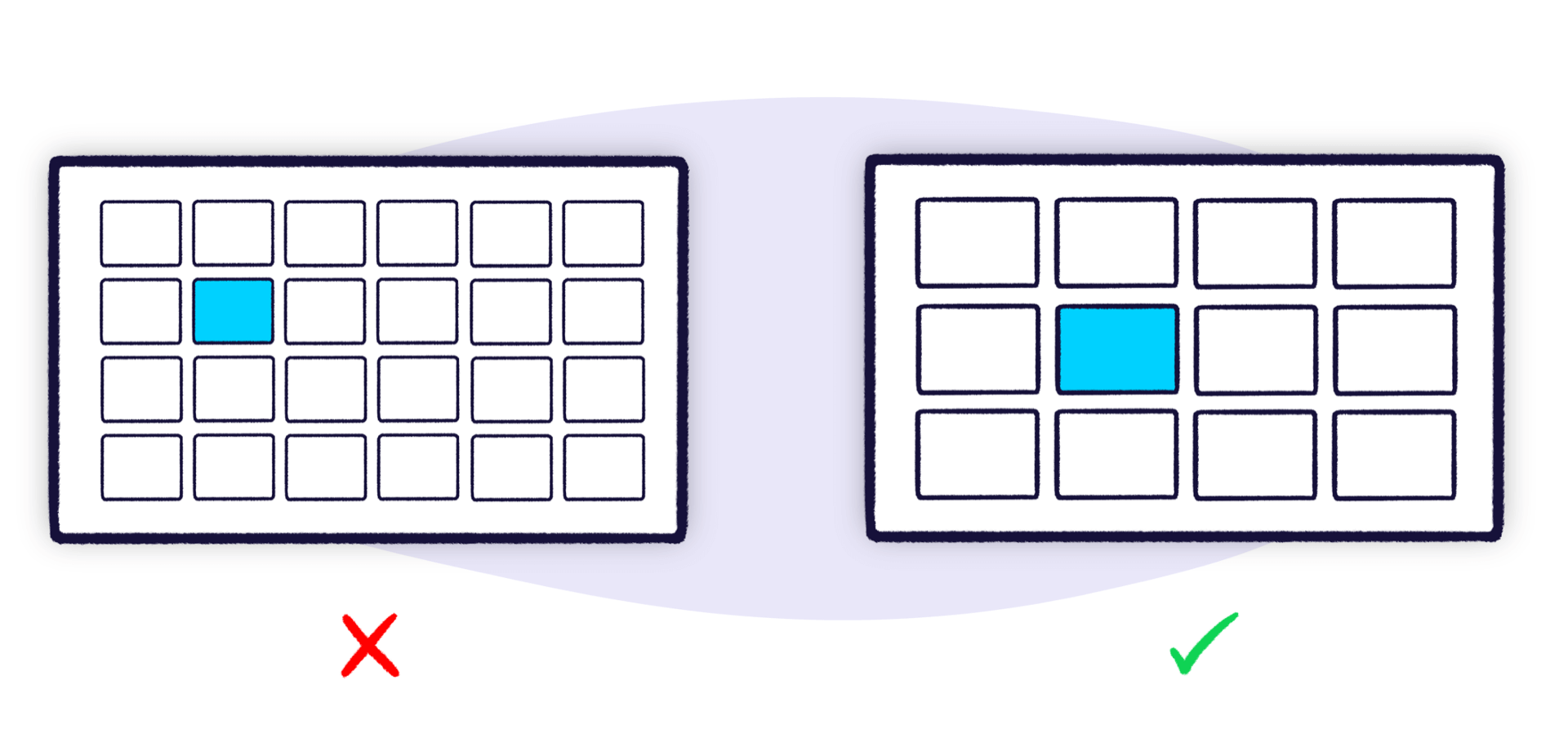
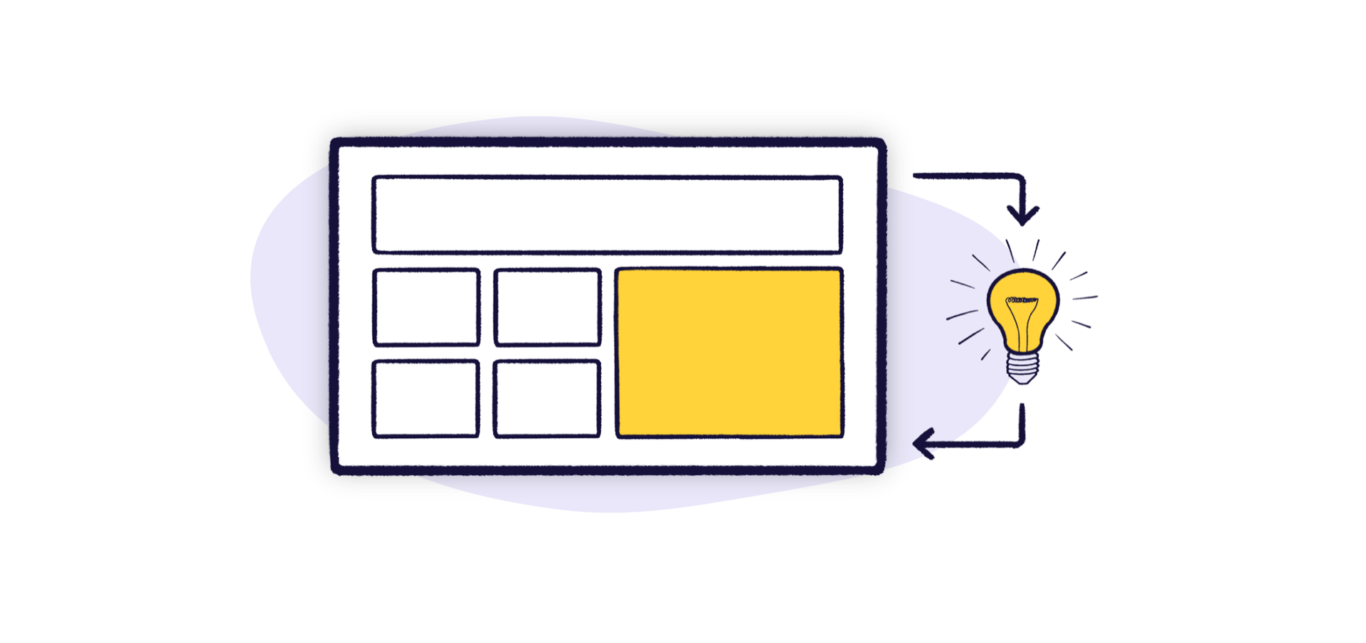
Use size and position to show hierarchy
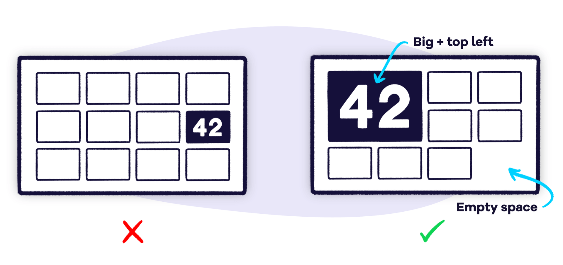
Introducing a sense of hierarchy makes your dashboards easier to scan. Use size and position to emphasize the most important information and downplay metrics that need to be looked at less frequently. Consistent sizes and clear relationships between elements will help create patterns and visual flow.
In terms of positioning, the top left corner of your dashboard is the best location as that’s where your eyes are naturally drawn to first.
Don’t be afraid of empty space. It’s better to leave a gap than to make something bigger just to fill it.
Give your numbers context
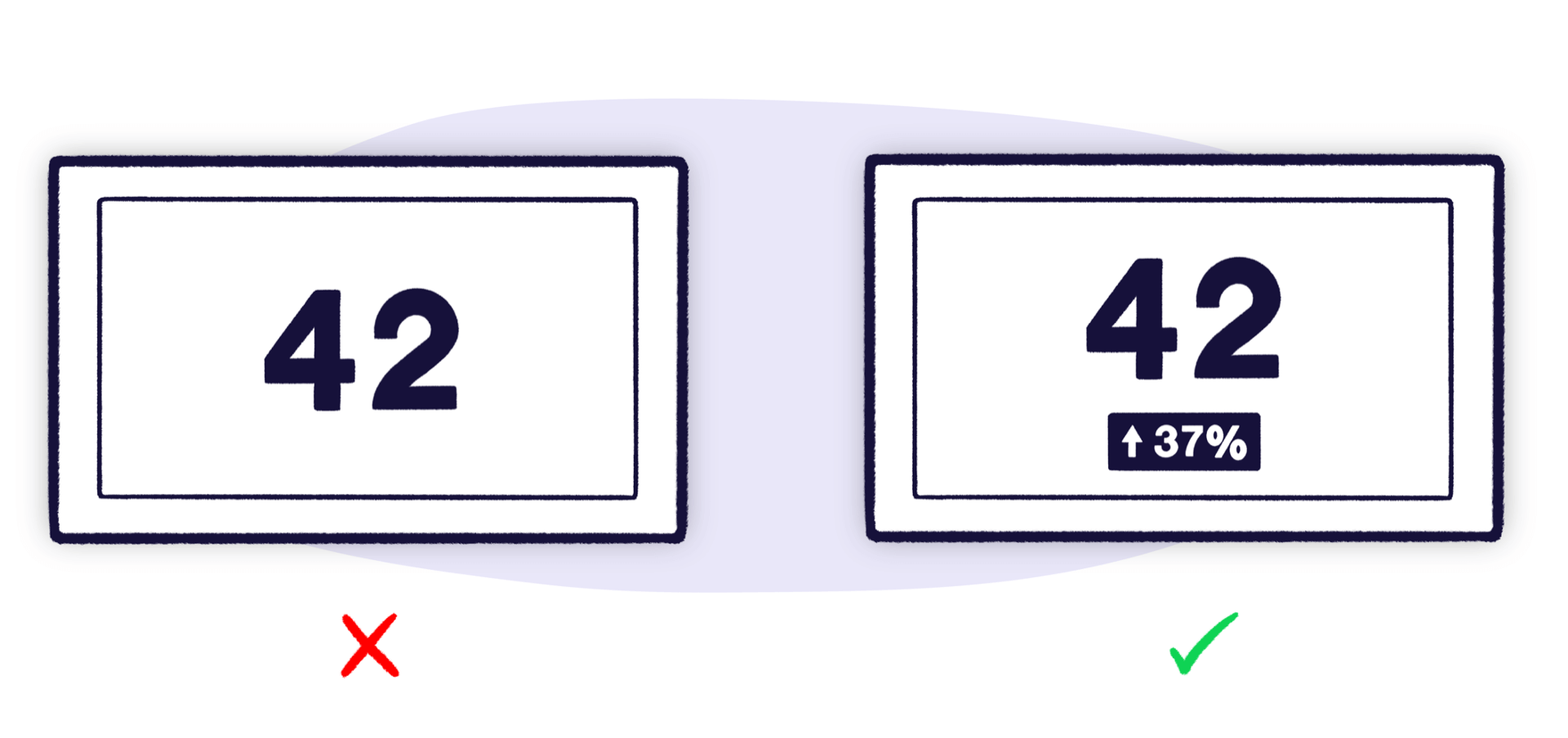
To know if a number’s good or bad your viewers need context. Would they know, for instance, that 42 new leads today is out of the ordinary?
One of the easiest ways to do this is to include past data. You could include the same metric for the previous day, or even a line or column chart showing how the metric tracks over a longer period of time. Another technique is to include the average or previous highs and lows.
If you’re working towards a goal, include the target as well as your current progress.
You can also add warnings for when a metric is above or below a certain threshold to make it easier to spot problems.
Use clear labels your audience will understand

A key part of your dashboard are the labels that describe each metric or chart. They should be self explanatory, and unambiguous for your viewers. At the same time, you should try and keep them as short as possible to avoid cluttering up your board and getting in the way of the data.
Abbreviations can be helpful too (as long as your audience understand them) e.g. "7d" instead of "7 days". Symbols like '%' can replace the word. You may also get away with a shorter definition for a metric if people are already familiar with it.
Headings can also be used to reduce repetition. Imagine you have the same metric for different time frames e.g. signups today, signups this month etc. If they’re all grouped under a heading called "Signups" you don’t need to repeat it each time.
Remember it’s for people
So far, we’ve covered several rules for designing the perfect dashboard. But the thing about rules is they’re made to be broken.
Dashboard design is about more than just how efficiently you can lay out data. Ultimately, it’s about getting people to engage with the information. And sometimes, the most engaging dashboards break the rules.
So whether it’s a Twitter feed, new deals, or a daily cat gif, remember it’s ok to break the rules sometimes if it means people engage with your dashboard. Just don’t go too wild.
Keep evolving your dashboards
Once you’ve built your dashboard don’t just leave it. Ask your team for feedback.
- What do they look at most often or find most useful, and why?
- What do they never look at or find least useful, and why?
- Is there anything missing that they’d find useful?
- Has it changed anything about the way they work?
Use this feedback to iterate your dashboard. Check your dashboard is driving the behaviour you intended. Step back from your board every now and then and look at how all the elements work together. Remind yourself what information you’re primarily trying to get across and how effectively those important elements stand out.
As your goals and priorities change, make sure you update your board so it acts as the heartbeat for whatever you’re doing.
Other resources
Download the Full Dashboard Design GuideOr why not see these dashboard design tips in action in this article: Dashboard design principles in practice, with real dashboard examples