monday.com dashboard examples
A monday.com dashboard takes your project and team data further than monday's built-in views — letting you share live dashboards with people who don't have an account, display them on a TV, and combine monday data with metrics from your other tools.
A/B testing dashboard using monday.com
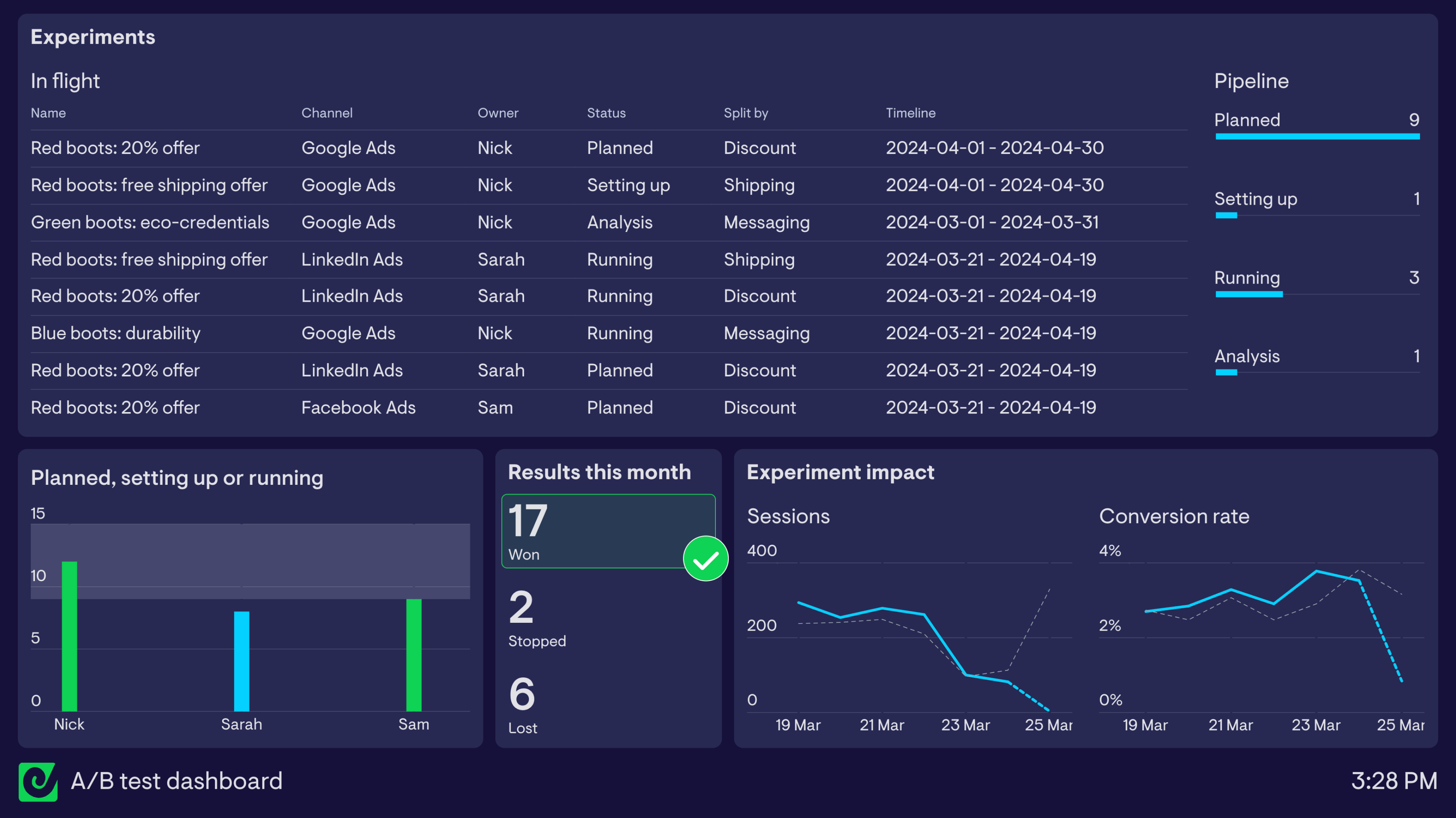
This dashboard is based off monday.com’s A/B testing and planning workspace template - a useful starting point for marketing and growth teams looking to track ongoing split testing efforts.
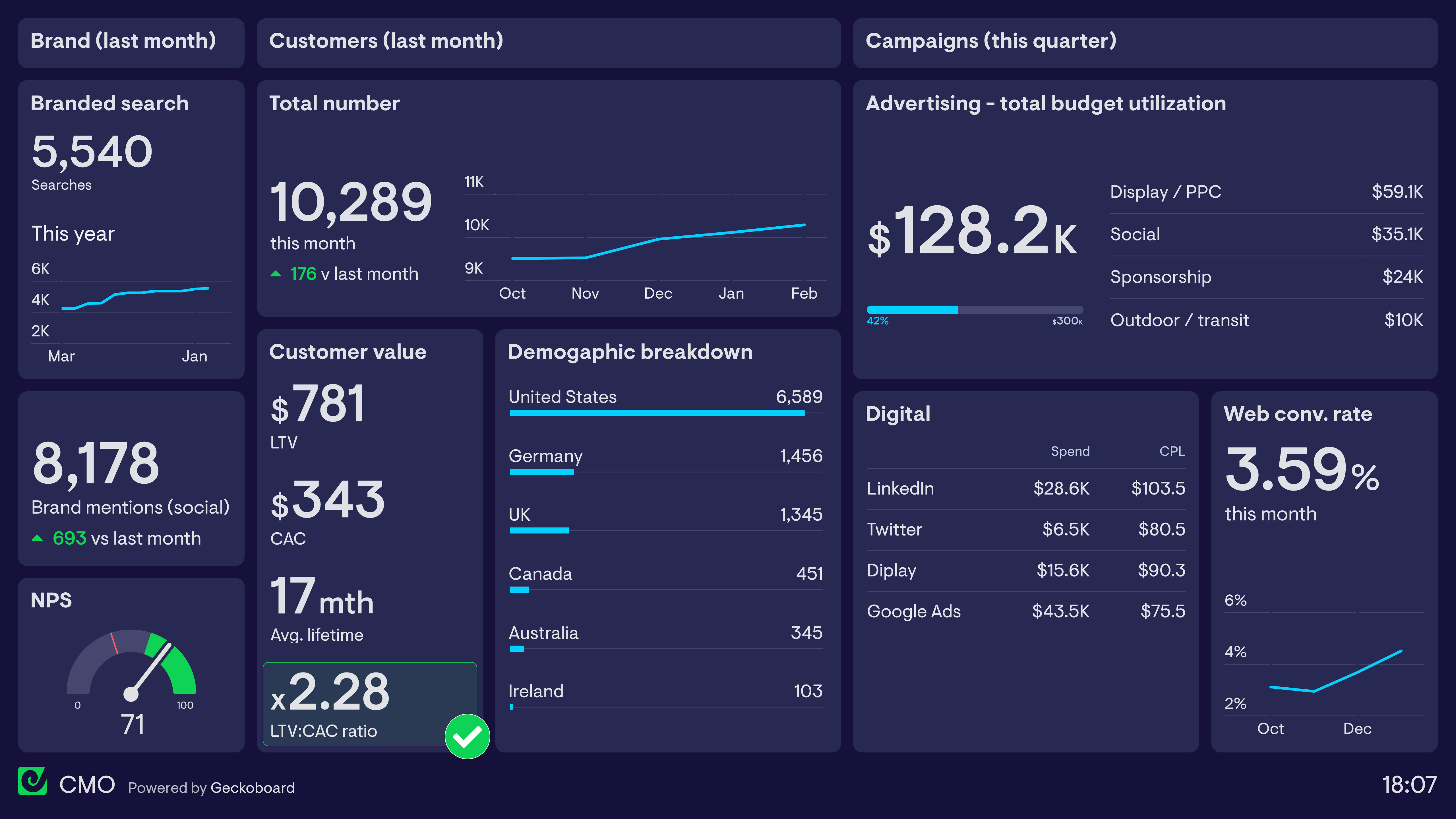
We use a variation of this ourselves at Geckoboard, and naturally we have a custom dashboard that pulls out key information from monday.com to help us keep track. On it we have a list of experiments that are ‘in flight’ - in other words, experiments that are at the planning stage, being set up, currently running, or being analyzed to determine if there’s a winner. It’s a great way for keeping on top of what’s coming up, particularly for others outside of our marketing team who can’t (and wouldn’t want to) log in to monday to check our workspace from time to time.
To the right of this is a bar chart that represents the pipeline of experiments in a more visual way, making it easier to see at a glance if there’s enough planned, how many experiments are running and if anything’s currently being set up or analyzed.
To further help with workload balancing, a column chart in the bottom left of the dashboard gives an easy way to see how many in flight experiments each team member owns. This widget highlights automatically when a team member owns 9 or more in-flight experiments, making it easier to spot if everyone’s got a sensible amount of work assigned to them.
The rest of the dashboard shows some of the results generated by the team’s experiments. A count of how many A/B tests have a declared winner or losing variation, or have been stopped, helps everyone see the progress the experiments are generating over the time period. In this case, the team set a goal of finding 15 clear winners amongst their testing with paid ads, which highlighted in green automatically when they achieved this.
The final visualizations in the bottom right show off one of Geckoboard’s most useful features - the ability to visualize live data from other sources. As we’ll see in some of the other examples below, this is very handy for bringing key metrics together into one view which can be easily shared or displayed on a TV. In this case, data comes from Google Analytics, giving the team a high-level indication of whether their experiments are driving more sessions to their campaigns’ landing pages, with a similar or better conversion rate.
monday.com sales CRM dashboard
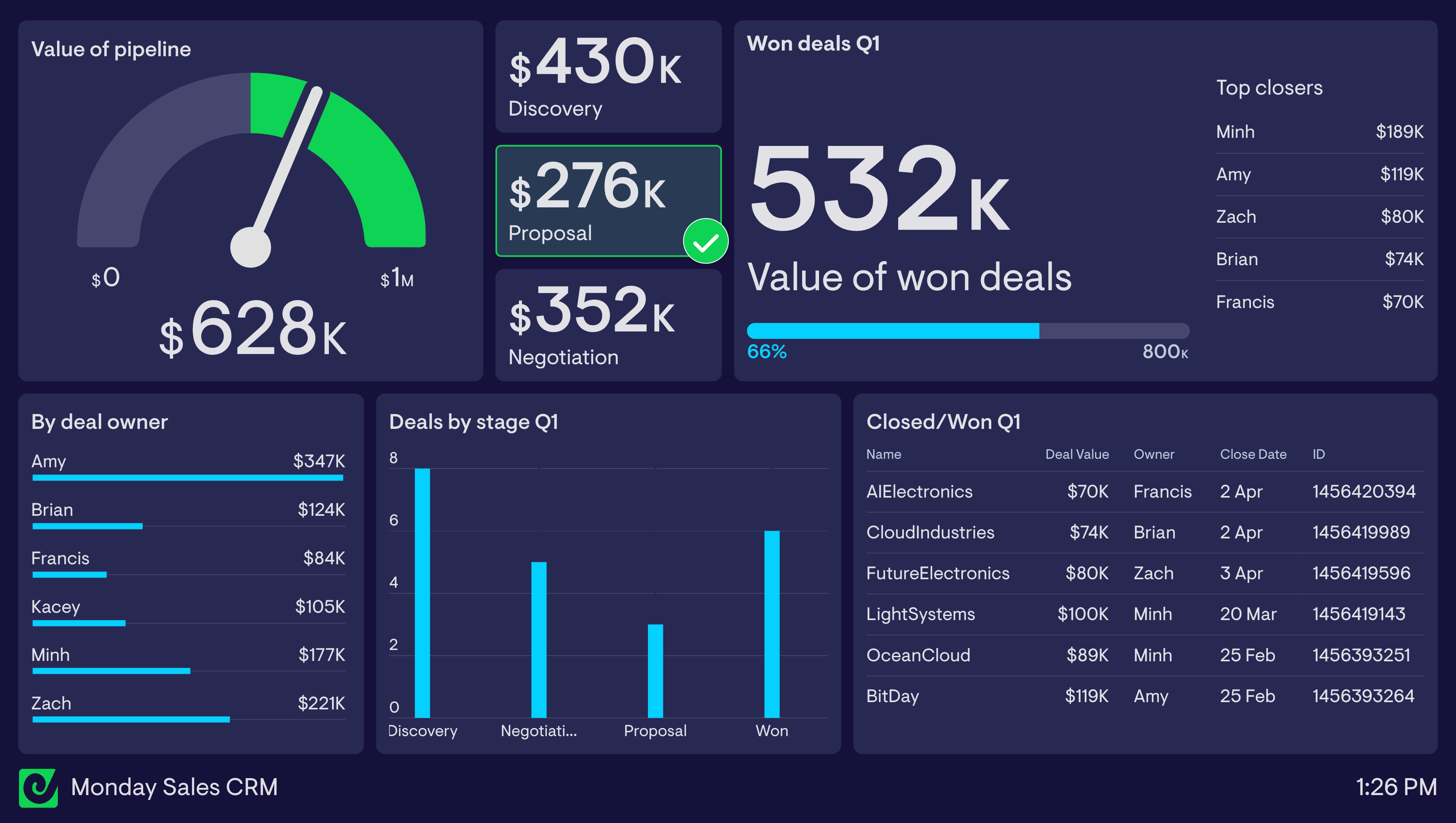
Sales leaders in need of a quick but flexible CRM tool for managing deals could do a lot worse than using monday.com’s 'Basic CRM' template. Out of the box it includes all the data fields and properties a small sales team might need to keep track of pipeline volume, manage contacts and monitor workload and performance between reps.
Connected to Geckoboard, it’s possible to create a range of sales performance dashboards for monitoring performance and motivating teams with live data.
This sales dashboard highlights the value of the team’s pipeline (everything at the proposal and negotiation stage) in the top left. The team needs to ensure they’re working deals worth at least $500k in value at all times in order to meet their targets so a status indicator is being used to highlight when this target is met (the green area) and flag, in red, when it’s not.
The visualizations below in the bottom left offer some more detail around how many deals are are currently at each stage, and the value of deals owned by each sales rep. For competitive sales teams, this breakdown of performance by individual can be highly motivating, especially when the dashboard is displayed on a TV for everyone to see. The data in the top right of the dashboard leans into this form of ‘extrinsic motivation’ by showing a live leaderboard that ranks reps by the most deal value closed during the quarter, as well as the team's overall total for that period.
Finishing off the dashboard in the bottom right is a live feed of closed/won deals, updating every few minutes so the team can keep a close eye on what’s been closed recently, and by who.
Browse other popular examples
A Monday.com dashboard brings work management data from Monday.com into a live display — tracking project progress, task completion, and team activity in real time. Teams use it to make their Monday.com boards visible to the wider organisation without requiring everyone to have a Monday.com login.
Geckoboard is a live dashboard tool that connects to monday.com and lets you share dashboards with people who don't have an account, display them on a TV, and combine monday.com data with metrics from your other tools. It extends what monday's built-in dashboards can do without replacing them.
Typical metrics include tasks by status, overdue items, project completion percentage, items assigned per team member, and sprint progress. Marketing teams also combine Monday.com project data with Google Analytics to connect campaign delivery to performance.
Building a custom Monday.com dashboard is straightforward with Geckoboard's dashboard builder. Connect Monday.com for project and task data, and add Google Analytics if you want to link campaign delivery to website performance, then pick your metrics and build the view you need. Share with your team as a TV dashboard, shared link, or scheduled snapshot. Start a free trial or learn more about how Geckoboard works.
Use it to make team performance visible by surfacing Monday.com data on a shared screen so the whole team can see project status at a glance. It also helps bring data together — combining project management data with other business metrics so you get a fuller picture of team output and its impact.