Sales pipeline dashboard examples
A sales pipeline dashboard shows how deals are moving through every stage of the buyer journey — so Sales Managers can see where things are stalling and reps can focus on the activities that move deals forward. It connects activity to outcomes, which is where most pipeline problems become visible first.
Sales pipeline dashboard
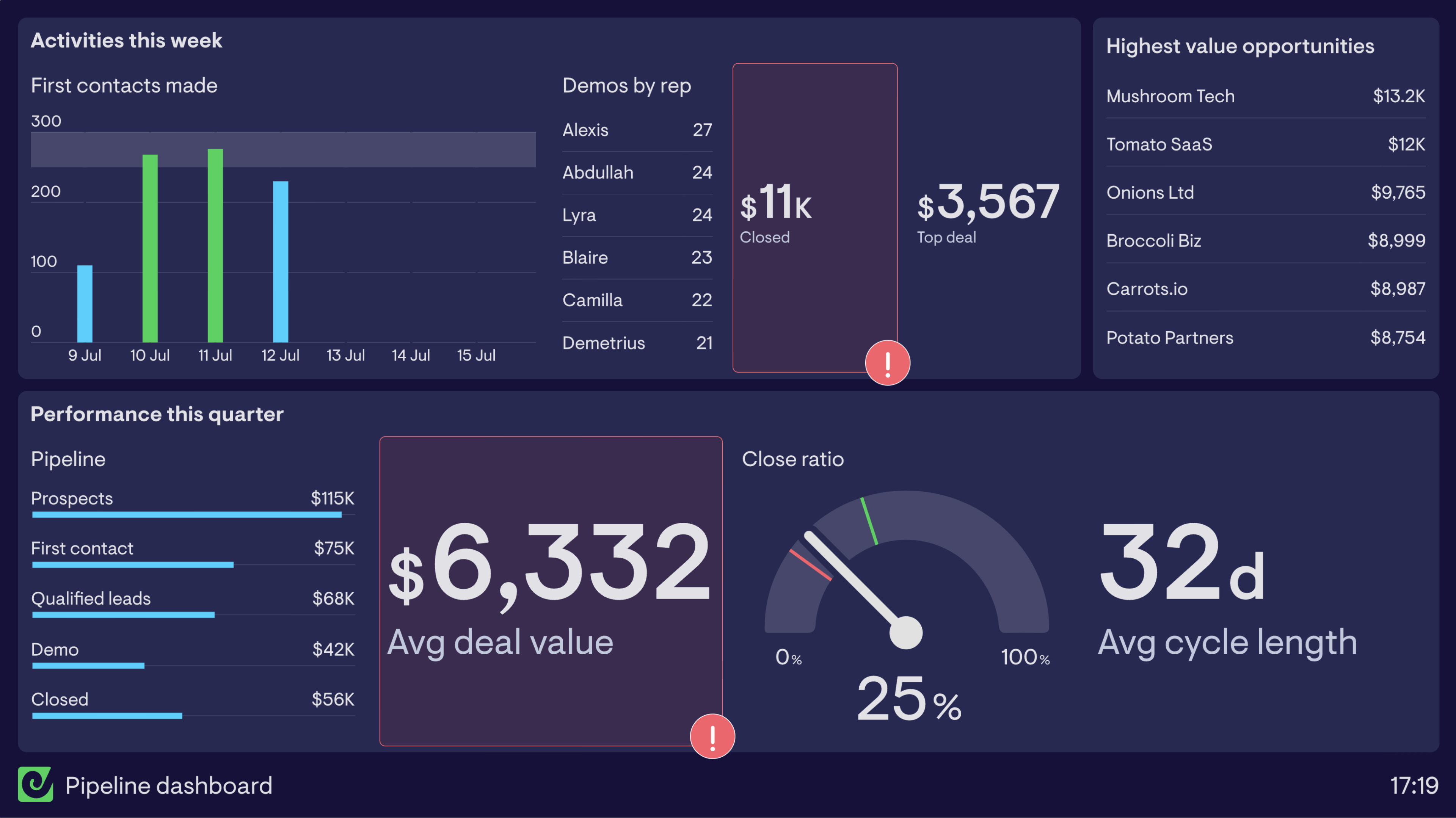
This sales pipeline dashboard breaks activity down into two timeframes. The top half of the dashboard focuses on activities the sales team has undertaken in the past week. By including metrics such as first contacts made, demos by rep and closed deal performance the Sales Reps are able to see when they’re going to hit target, or when they need to up their game.
Using a leaderboard for demos by rep is a great way to motivate team members to complete a sales activity that’s known for increasing conversion rate. Leaderboards are a helpful tool for healthy competition; everyone will be vying for the top spot!
The lower half of the dashboard focuses on performance over the quarter and specifically breaks down the pipeline into a bar chart. This is a good way of visualizing how deals are moving through the various stages in your purchasing process and buyer journey. It allows the Sales Manager to see if any stage is slowing down or blocking deals moving forward.
Including longer term metrics such as close ratio and average cycle length remind the whole team of their goals. When focused on day to day activity, it can be easy to forget that you’re aiming to keep certain metrics with specific boundaries.
By using status indicators, seen on the closed deals this week and average deal value, you’re able to highlight critical changes to KPIs. In this case, ‘deals closed for the week’ isn’t hitting their goal of $15,000 (yet) and the average deal value needs to increase in order for them to exceed their quarterly sales target.
Browse other popular examples
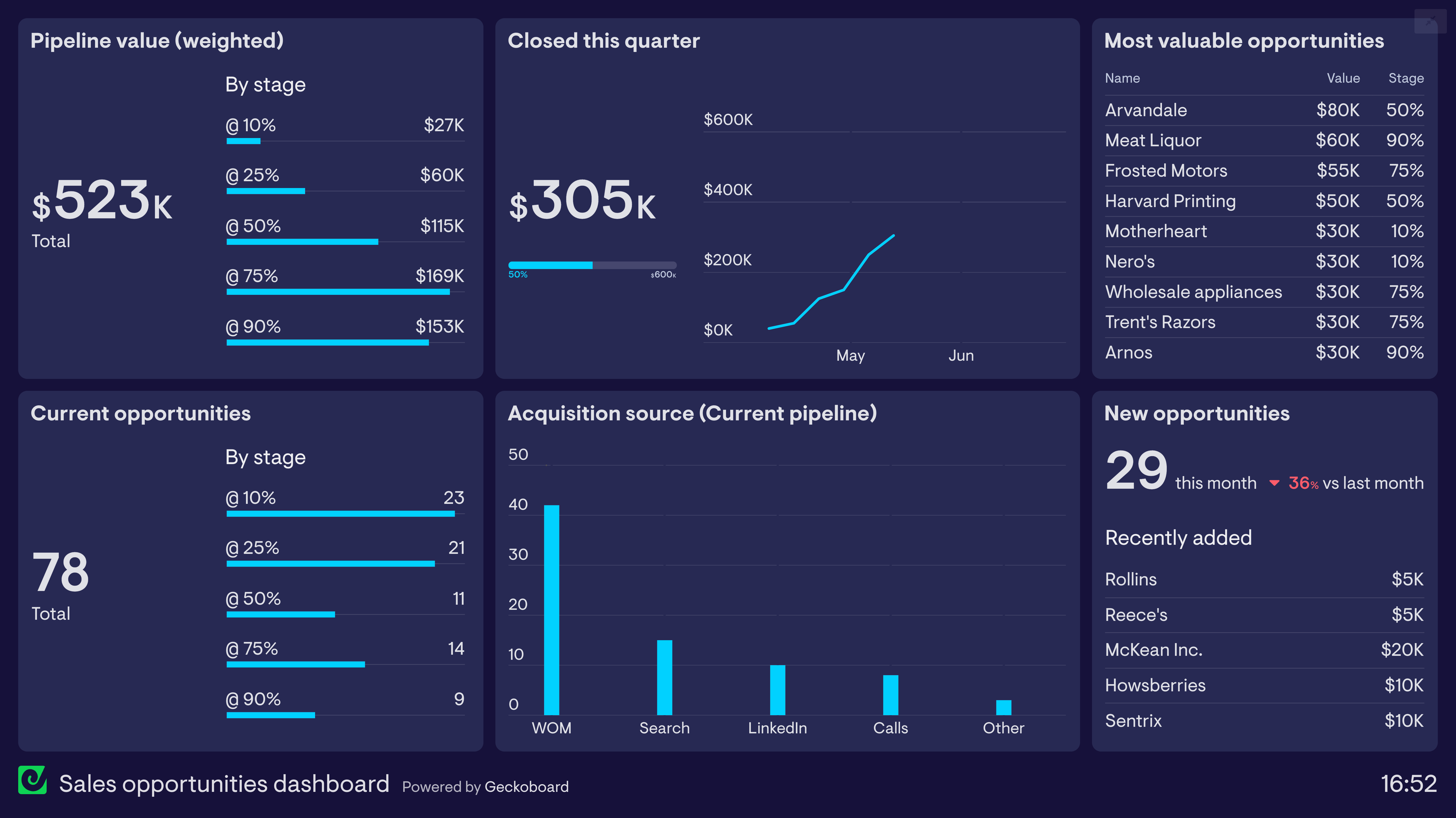
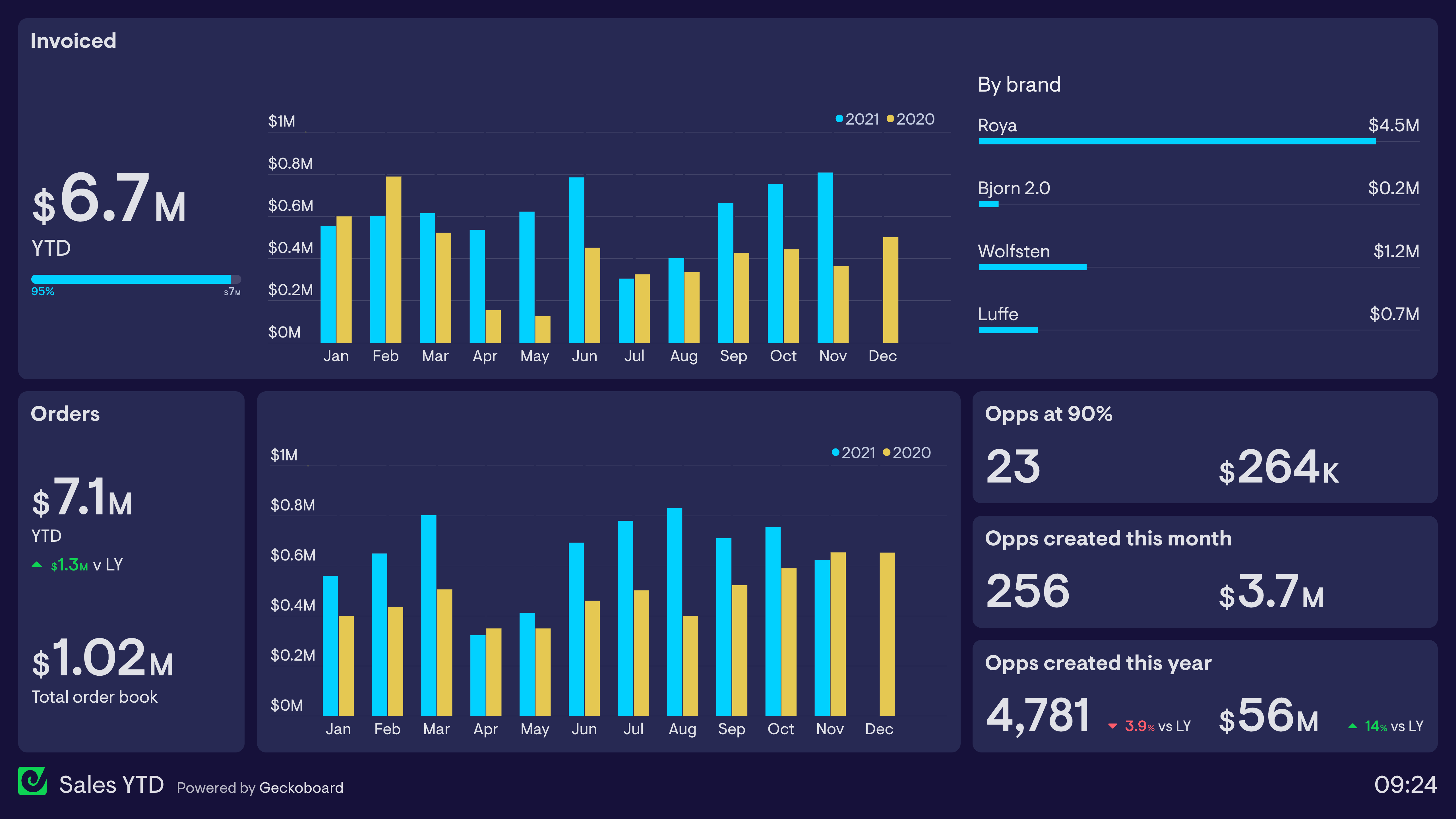
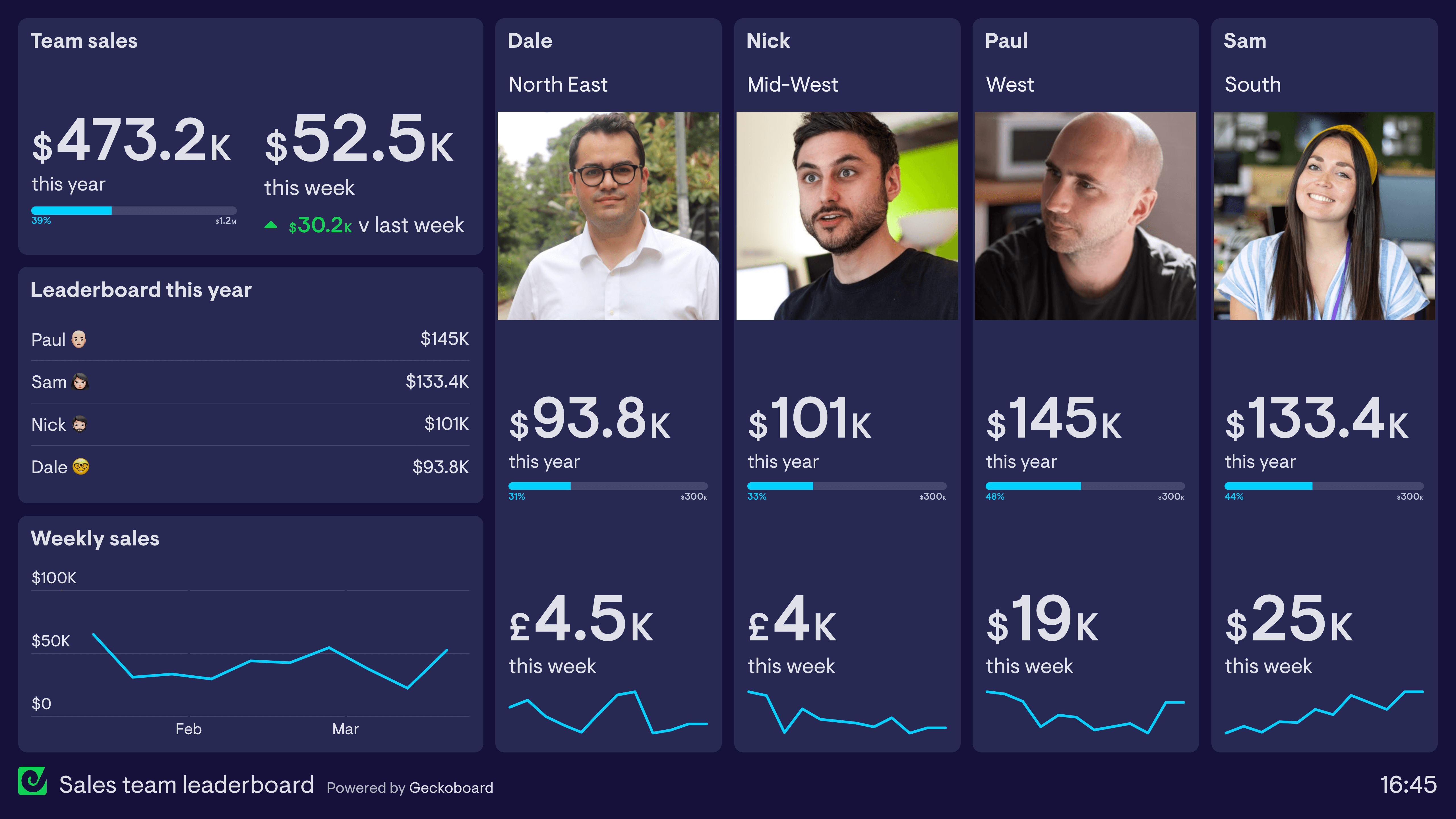
A sales pipeline dashboard gives sales managers a real-time view of how deals are moving through each stage of the pipeline — from first contact to closed won. It helps teams track pipeline health, identify bottlenecks, and forecast revenue based on current deal flow.
Geckoboard is a live dashboard tool that connects directly to Salesforce and Google Sheets to pull pipeline data into a view the whole sales team can see. It keeps deal movement and stage progression visible throughout the day — not just in weekly pipeline reviews.
Key metrics include deal count and value by stage, conversion rate between stages, average deal size, pipeline velocity, and deals created vs. closed this month. Teams often compare current pipeline to the same period last quarter.
Building a custom sales pipeline dashboard is straightforward with Geckoboard's dashboard builder. Connect Salesforce or Google Sheets to pull deal stage data and pipeline values into a live view, then pick your metrics and build the view you need. Share with your team as a TV dashboard, shared link, or scheduled snapshot. Start a free trial or learn more about how Geckoboard works.
Use it to monitor sales performance in real time so sales managers can spot a thin pipeline stage before it creates a revenue gap further down the line. It also helps share a live, accurate picture of the pipeline with leadership without waiting for a weekly forecast call.