Executive dashboard examples
Real-world dashboards used by executives and teams to track company performance, align on goals, and drive better decisions.
CEO dashboards
A CEO dashboard is designed to provide the Chief Executive Officer with a high-level overview of company metrics. However, the focus of these dashboards can vary. For example, some CEOs only want to see metrics related to business performance. Whereas other CEOs use dashboards to keep in touch with areas of the company which they have been less able to devote time to as the business has grown. CEO dashboards often serve a dual purpose. In addition to communicating data from the business to the CEO, they also indirectly communicate the CEO’s priorities to everyone in the business. As the Peter Drucker saying goes — “What gets measured gets managed.”
CEO overview dashboard
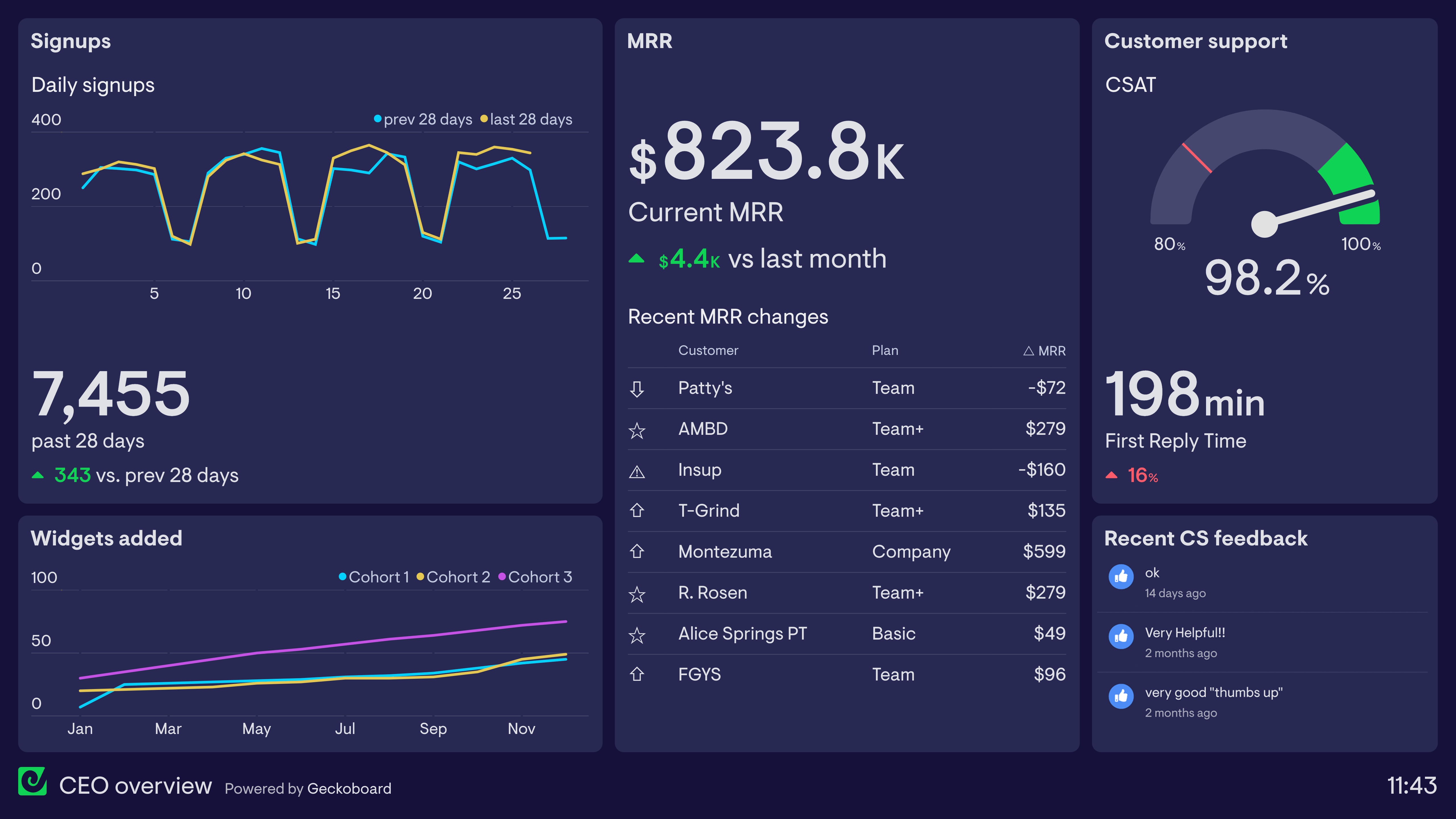
When your business starts to grow and the founder takes on responsibility for building the organization, it can be hard to stay rooted in the customer experience. Although this CEO dashboard isn’t a substitute for true customer insight, it helps to build a customer-centric view of their SaaS business across many different functions and touchpoints. The CEO can easily see how many new customers are signing up to a trial, as well as important high-level metrics on product usage, account changes, and customer service. Furthermore, it provides valuable contextual information which the CEO might otherwise miss — such as the types of customers who are buying, changing or canceling their plans, as well as the general tone and content of customer feedback.
Executive summary dashboard
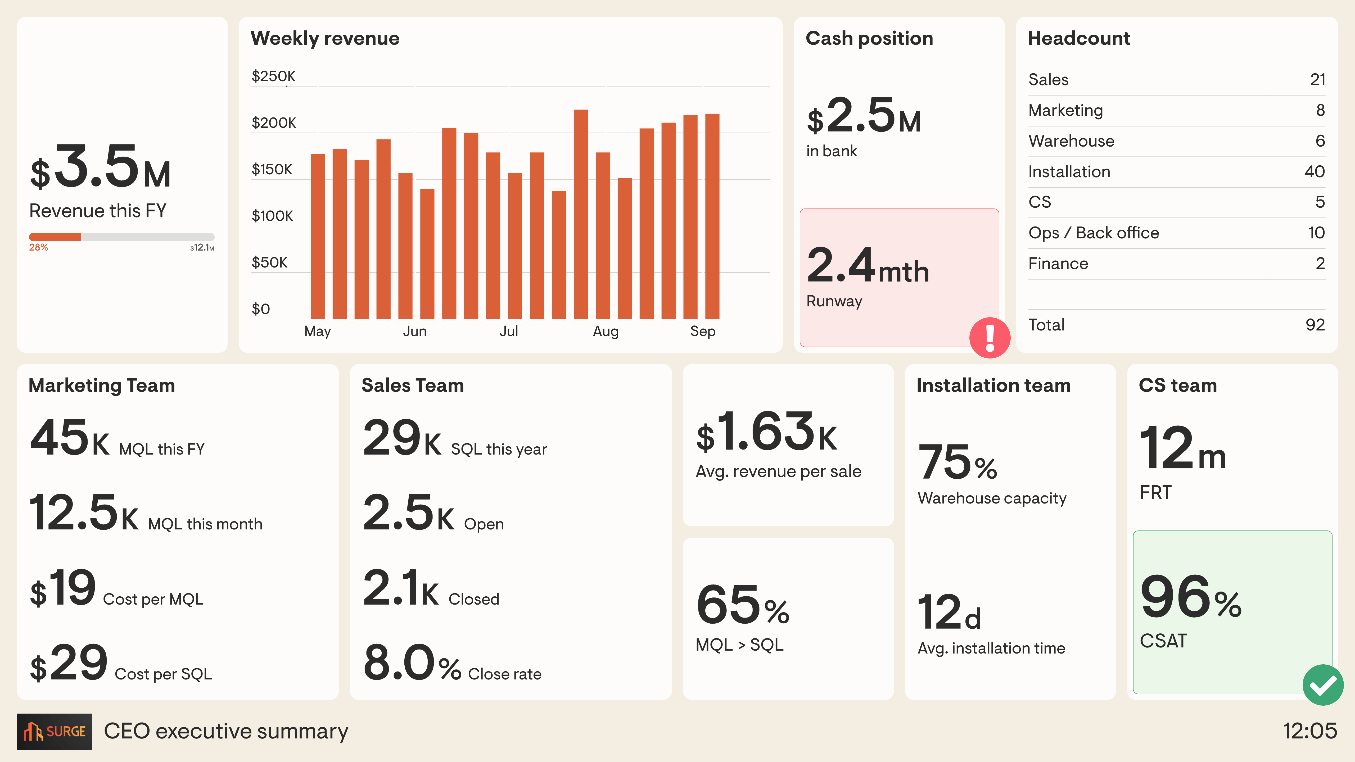
In a fast-moving business, it can be difficult to keep track of how each team is handling their work. That’s why executive summary dashboards take high-level KPIs from each team and put them together in one place. This dashboard helps the CEO understand if any one team is struggling with their workload or has spare capacity. It makes it easier to spot any potential bottlenecks in the customer journey. For example, this company — which sells and installs electrical appliances — has created a dashboard that takes KPIs from the marketing, sales, installation and customer service teams, alongside company finance metrics. Because all of the information is in one place, it’s easier to develop a full picture of what’s going on in the business. The CEO can easily see if a sudden increase in sales is likely to affect the demands on the installation team. They can also easily see the interdependent relationship between Marketing, who generate Marketing Qualified Leads (MQLs), and the Sales team who further qualify those leads (SQLs) before working to convert them into sales.
Management dashboards
Management dashboards are used by managers and team leaders to track both project and team performance. Unlike performance reviews, which tend to take place infrequently, a management dashboard can help a manager spot performance issues as they occur. This means they can quickly get to the root of the problem and provide support and guidance to team members who are struggling.
Team leader dashboard
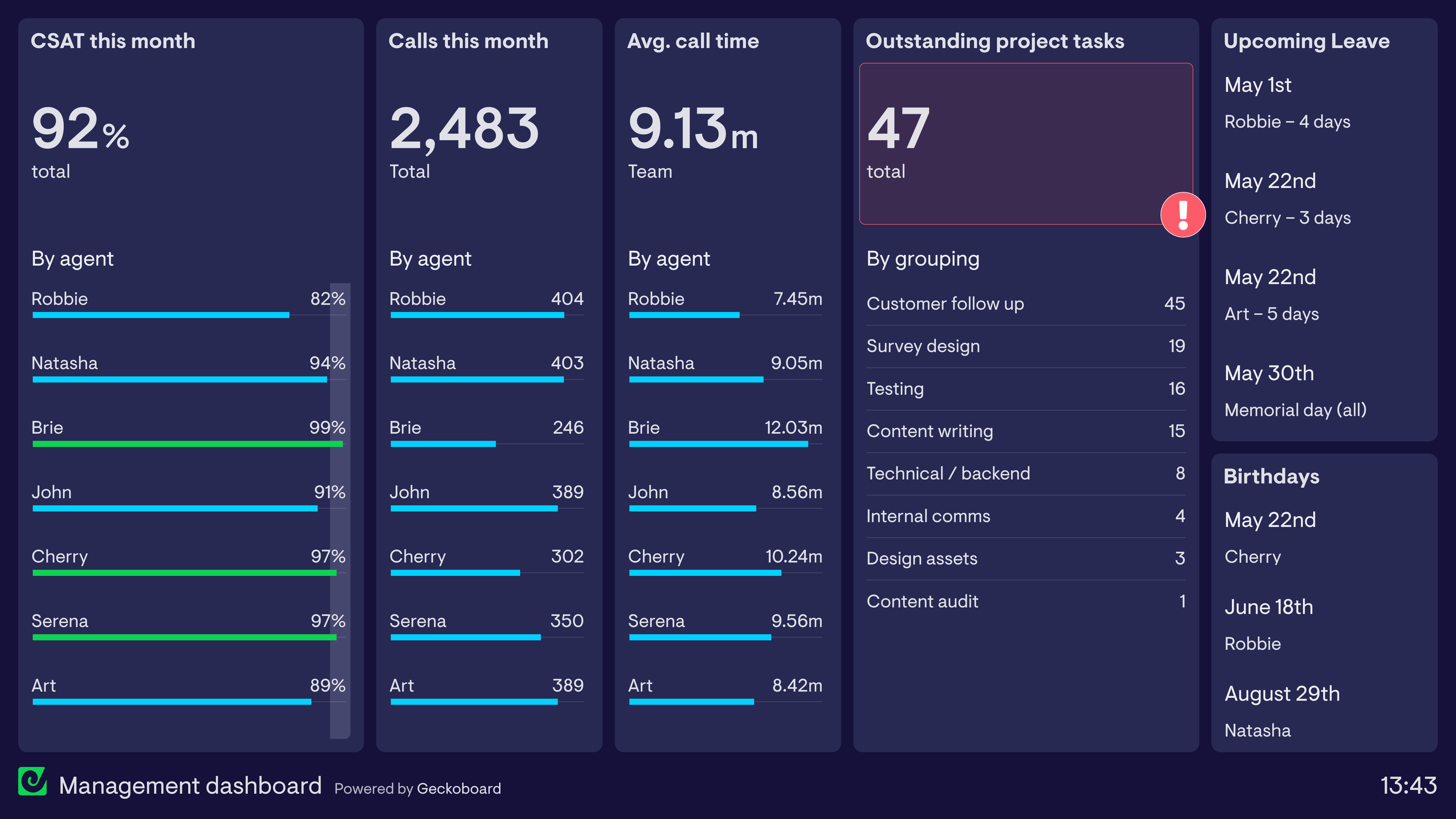
This dashboard is used by a Customer Service Director to track the performance of her Customer Service team. Their primary KPI is CSAT (Customer Satisfaction), which is taken from a customer survey delivered after each call. This allows the CS Director to track overall team performance as well as individual performance. The dashboard also tracks projects directly from Monday.com, their project management tool, and links to Google Calendar so she can easily keep track of upcoming birthdays and annual leave. Good managers don’t rush to immediate judgment — the dashboard surfaces the data so they can investigate further and address issues as part of informal catch-ups and one-to-ones.
Company dashboards
Whereas some dashboards are designed to support a specific team or individual, company dashboards are designed to be seen by everyone in the organization. These dashboards are a great way of creating a sense of common purpose and shared understanding of company performance. They can be used to reinforce the company’s mission, vision and strategic priorities.
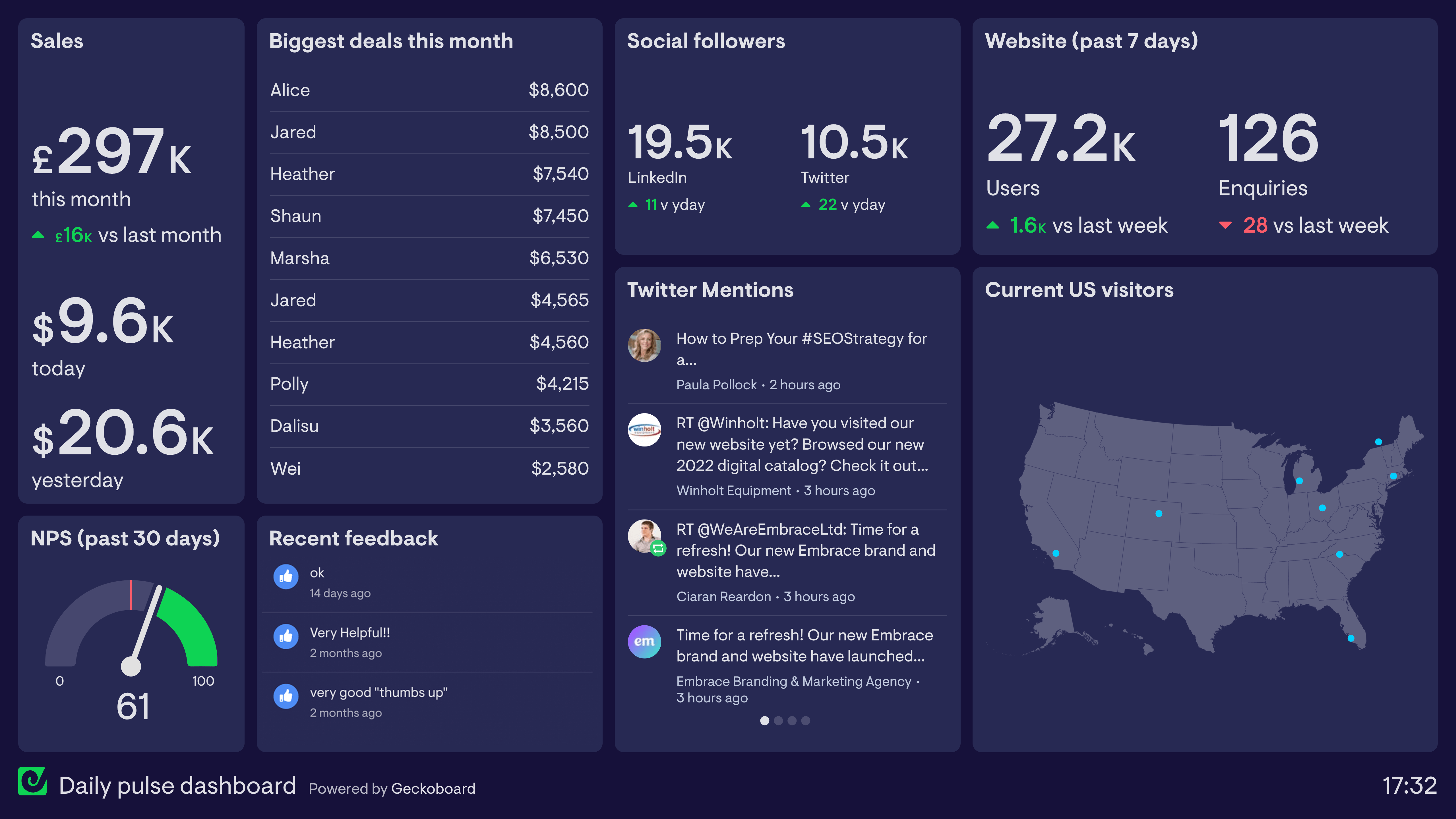
Daily pulse dashboard
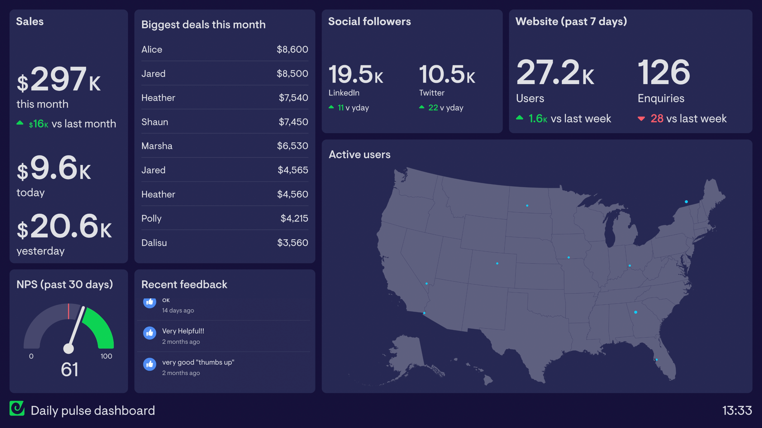
This daily pulse dashboard is designed to be placed in a prominent part of the office where everyone can see it. Remote workers are also sent a daily snapshot via Slack, Microsoft Teams and/or email. It focuses the company’s attention on important developments in sales and customer satisfaction. Many elements of this dashboard are designed with the watercooler effect in mind — it’s a conversation starter. This includes recent social media mentions and customer feedback. The ‘biggest deals’ leaderboard is also a nice way of recognizing great performance and encouraging friendly competition.
Vision dashboard
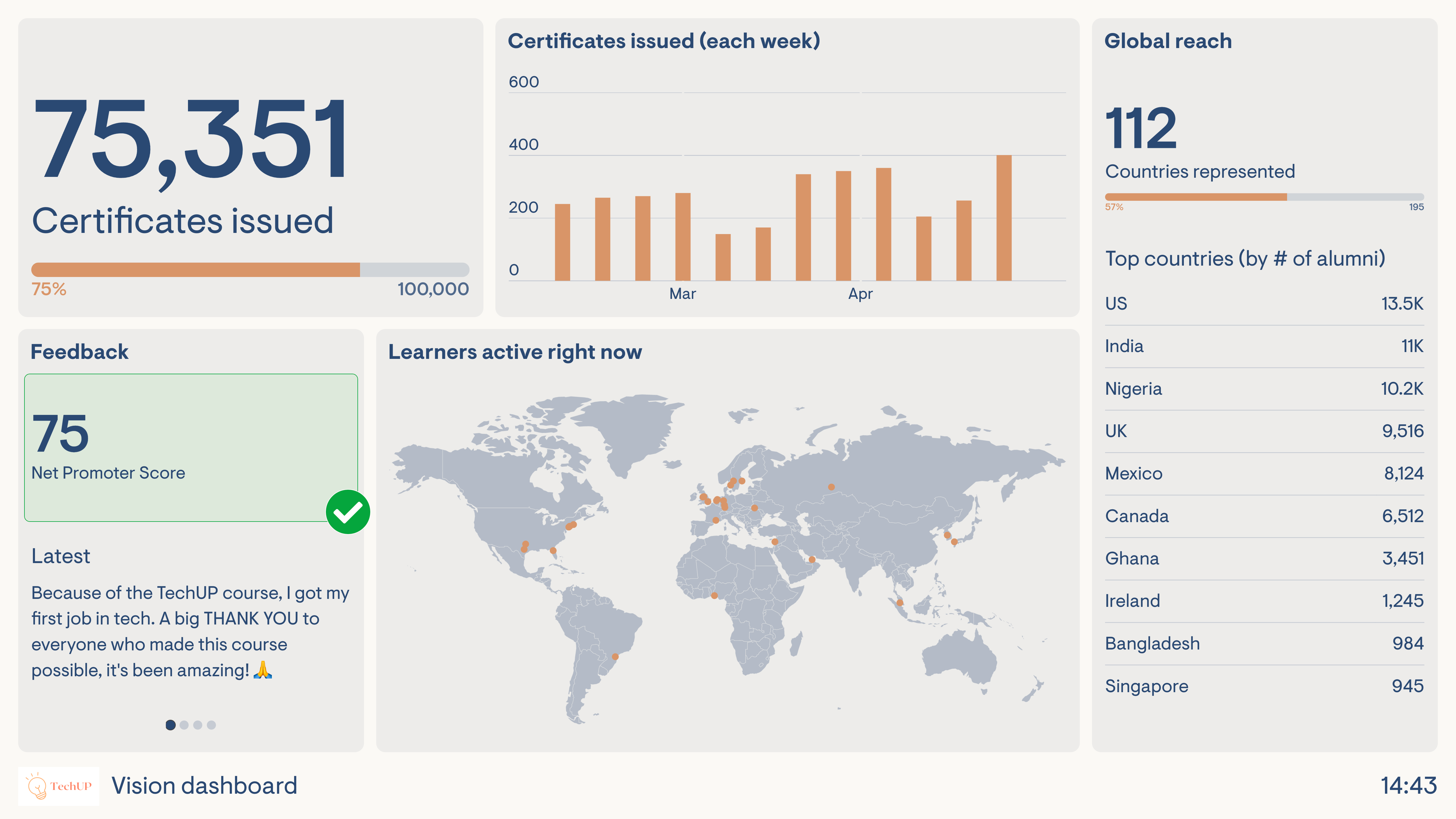
This dashboard is used by an EdTech company whose mission is to train as many young people as possible via their online course. It goes to show that not all company KPIs need to be financial. This dashboard focuses on the number of certificates issued (the goal is to achieve 100,000) and their global reach (the goal is to create alumni representing every country of the world). By aligning their dashboard with the company mission and purpose, it creates a motivational effect — a constant reminder of why team members do what they do, regardless of which team they’re in. This is further helped by the stream of recent customer feedback.
Startup dashboards
With limited resources and big ambitions, many startups can’t afford to get distracted by things which don’t support immediate growth. Startup dashboards are designed to help these businesses stay laser-focused on the metrics that matter.
Early-stage SaaS startup
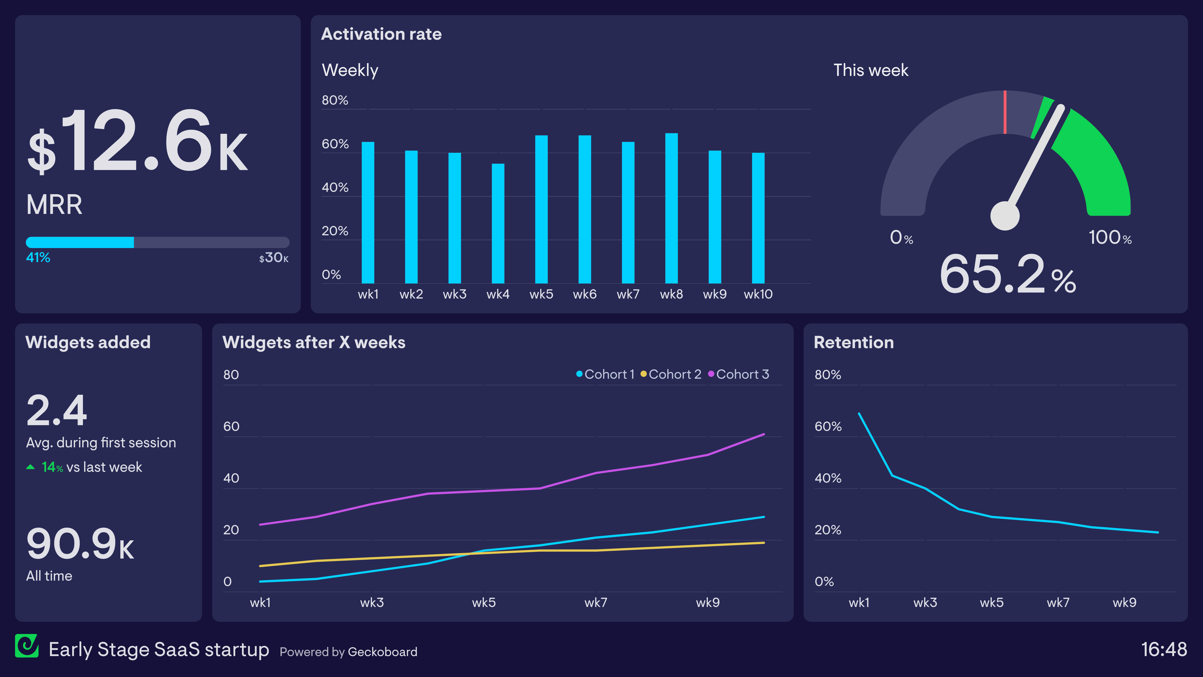
This dashboard is used by an early-stage SaaS company. It’s there to focus everyone’s efforts on what’s most valuable to the business, early on. By asking the question “what do we most need to influence?”, this startup has settled on revenue (MRR), product usage and retention. They want to know: out of the people who are using the product, how much are they using it? They know that if they develop the product so that customers want to use it more, they will improve retention and eventually improve revenue as more people learn about their product. The dashboard keeps them focused on this aim.
Pirate Metrics (AARRR) dashboard
The Pirate Metrics framework is a simple way to focus attention on the areas of your business that are key to growth. The name “Pirate Metrics” comes from the acronym “AARRR”, which covers each of these core areas: Acquisition, Activation, Retention, Referral and Revenue.
Pirate Metrics (AARRR)
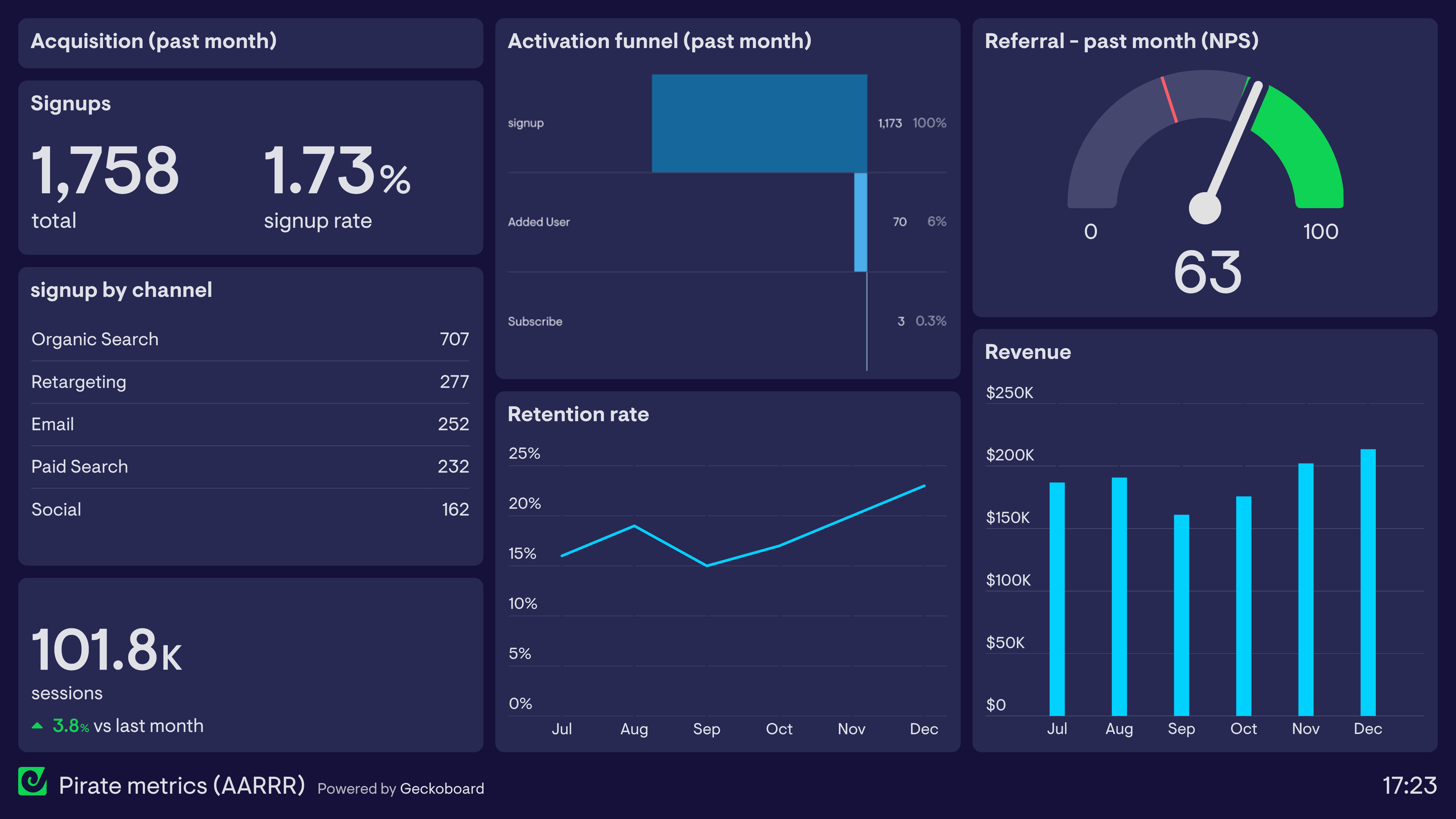
Here we see how Pirate Metrics can be tracked using a single dashboard. The acquisition section focuses on the number of signups, signup rate, signups via digital channel, and total web sessions. In the center, the team tracks activation via a funnel — how many people who signed up went on to use the product and subscribe? Below this, retention rate measures the number of trialists using the product two weeks after the free trial begins. On the right, referral is measured via Net Promoter Score (NPS), a survey-based metric that measures how likely customers are to refer the business to a colleague or friend. Finally, revenue is measured monthly in the bottom right corner.
Live dashboards
A live dashboard displays metrics and data visualizations in real-time. This enables teams and decision makers to react to changes in status and performance as quickly as possible. Live KPI dashboards are particularly useful in situations where important metrics are otherwise difficult to access, or when the team’s attention is focused on more immediate tasks.
Because live dashboards are usually used to support a specific task or process, the design of the dashboard is especially important. Unlike an interactive dashboard, a live dashboard needs to be able to be understood quickly and at a glance.
Live customer support dashboard
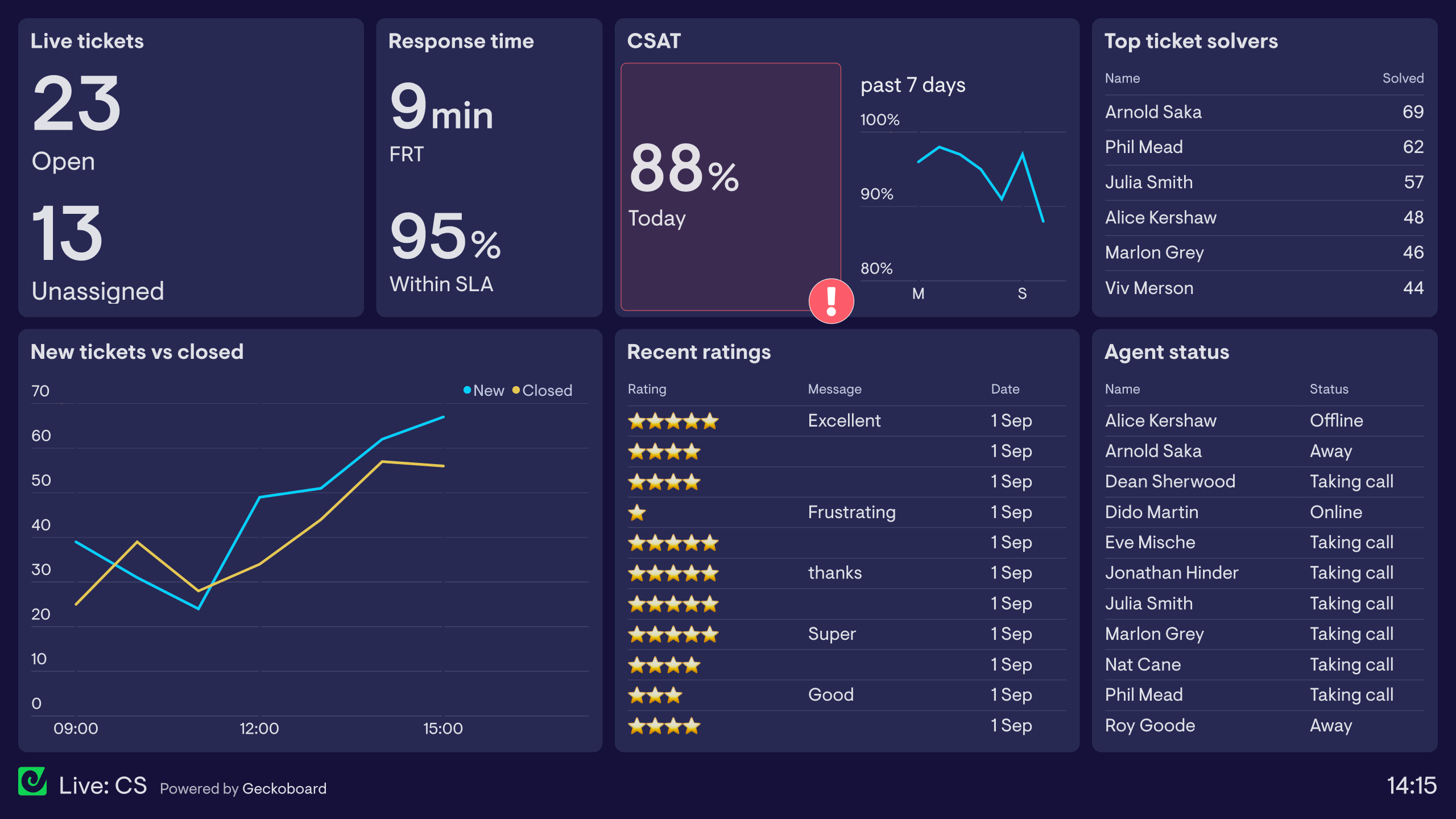
This dashboard surfaces live data from a customer support platform such as Zendesk. The focus is on metrics the team needs to access and understand in the moment — for example, how many tickets are open and how many are yet to be assigned. The dashboard also monitors First Response Time and how many tickets have been answered within the Service Level Agreement. Status indicators highlight critical changes before they become serious problems. On the right, a leaderboard showing who has solved the most tickets today adds a fun, competitive element to work culture.
Live online store dashboard
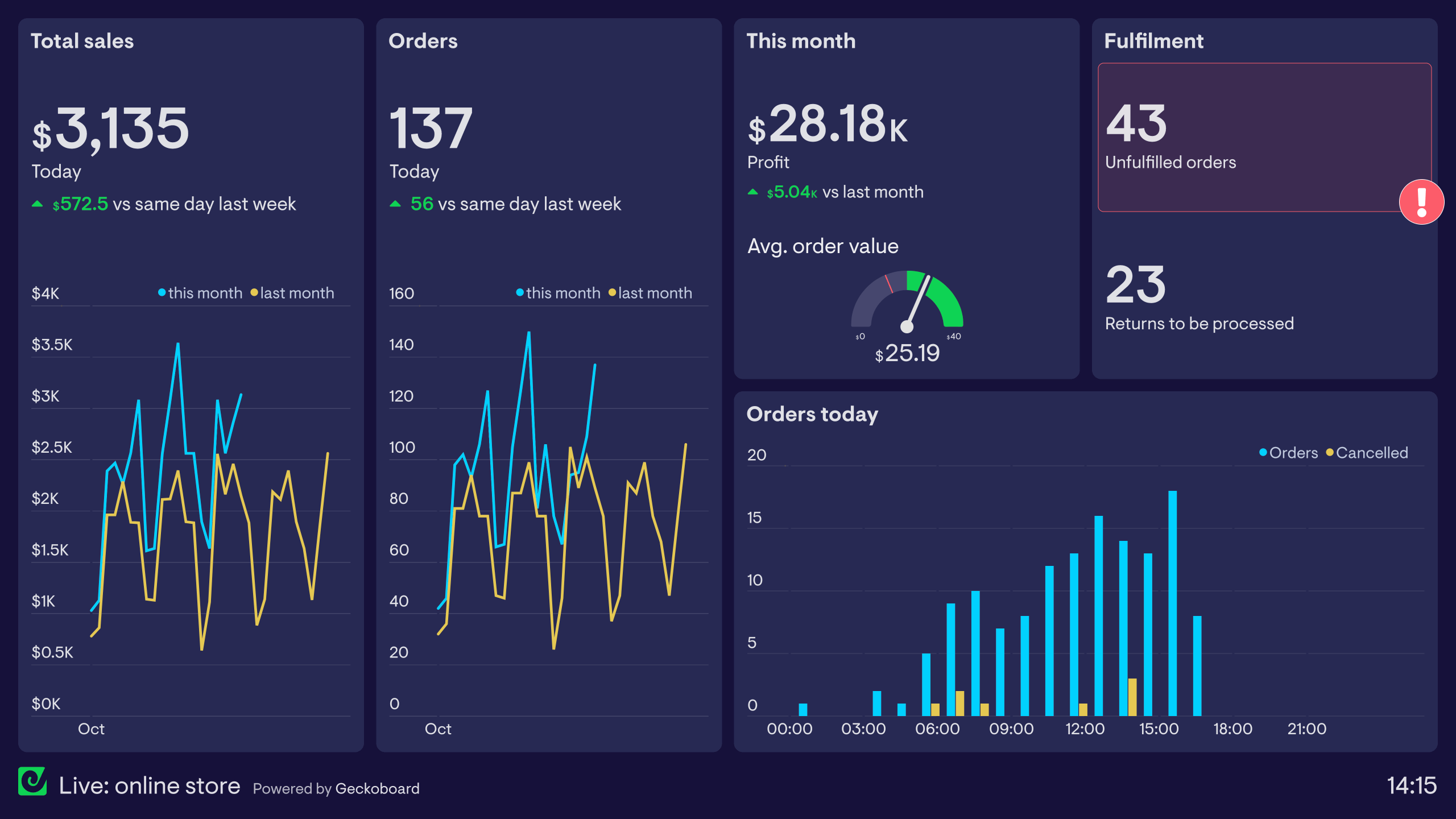
This dashboard is used by an online store and visualizes metrics related to different operational stages, including revenue, orders and fulfillment. It helps different members of the team — from marketing to operations — stay on the same page. This is especially important during busy periods such as Black Friday and the holiday season where systems can become strained under high demand. On the left, live Shopify data shows how the store is performing overall. On the right, fulfillment KPIs help the warehouse team see if they’re keeping up with demand.
Live sales dashboard
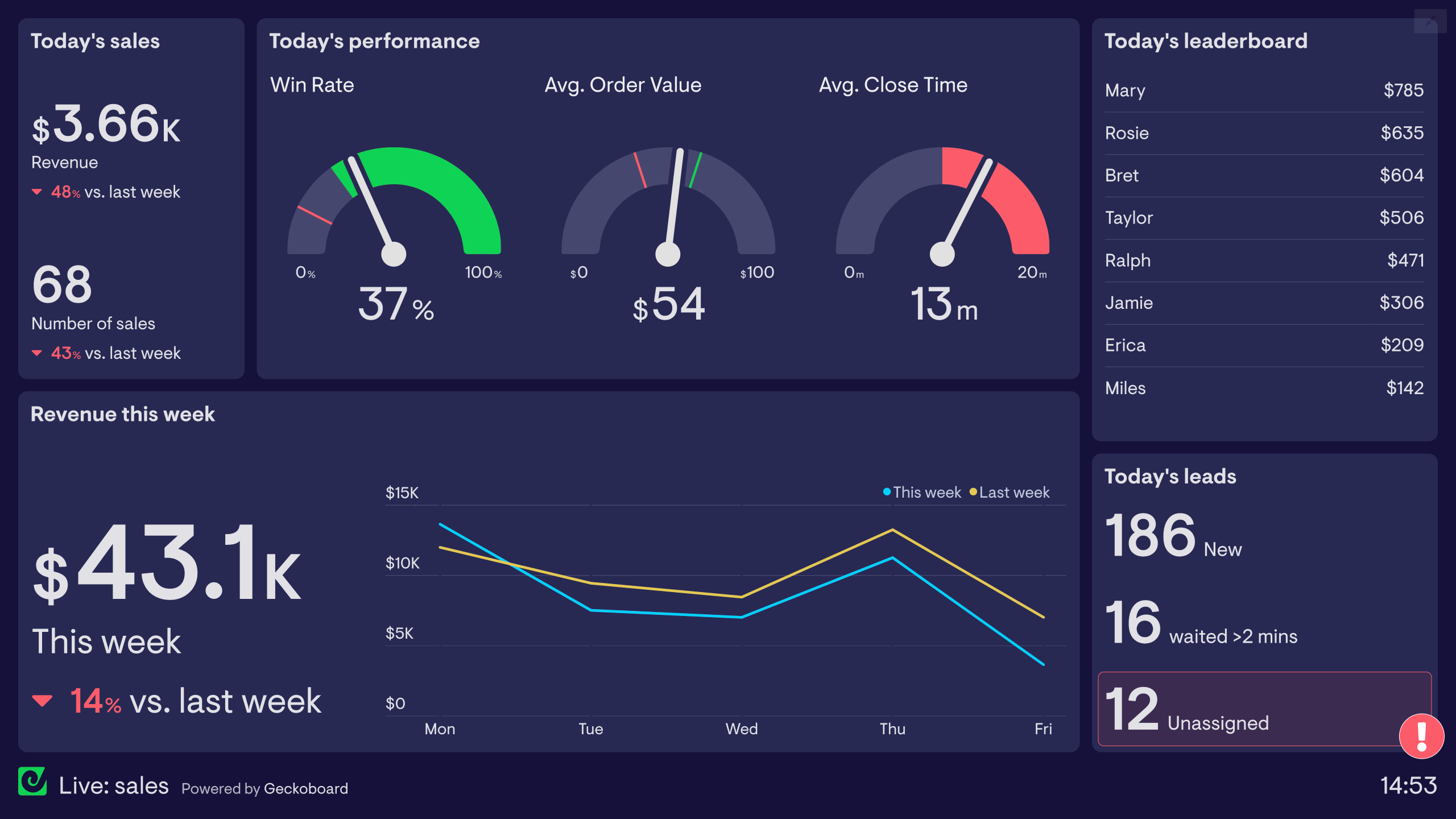
This dashboard is used by a sales team processing a high volume of inbound leads. It helps them stay on top of their key performance indicators in a fast-paced environment. The top left shows the most important metrics — revenue generated today and number of closed sales. Next to this, health metrics such as win rate, average order value and average close time provide important context. Below, the dashboard contextualizes today’s performance by comparing it to previous days. A leaderboard encourages friendly competition between sales reps.
Digital dashboards
Digital dashboards are used by businesses to visualize their KPIs in an easy-to-digest format. They reduce the need for teams to log into different platforms, create new reports or run data analysis each time they simply want to check their key metrics.
Digital dashboards are powerful because they cause teams and organizations to become more aware of data they already have. They create a constant feedback loop: increased awareness of data informs decision making, and the effects of decision-making can be seen on the dashboard. A dashboard’s design and accessibility is essential to its success — it should be understood quickly and at a glance, without the need for any action or further explanation.
Digital marketing dashboard
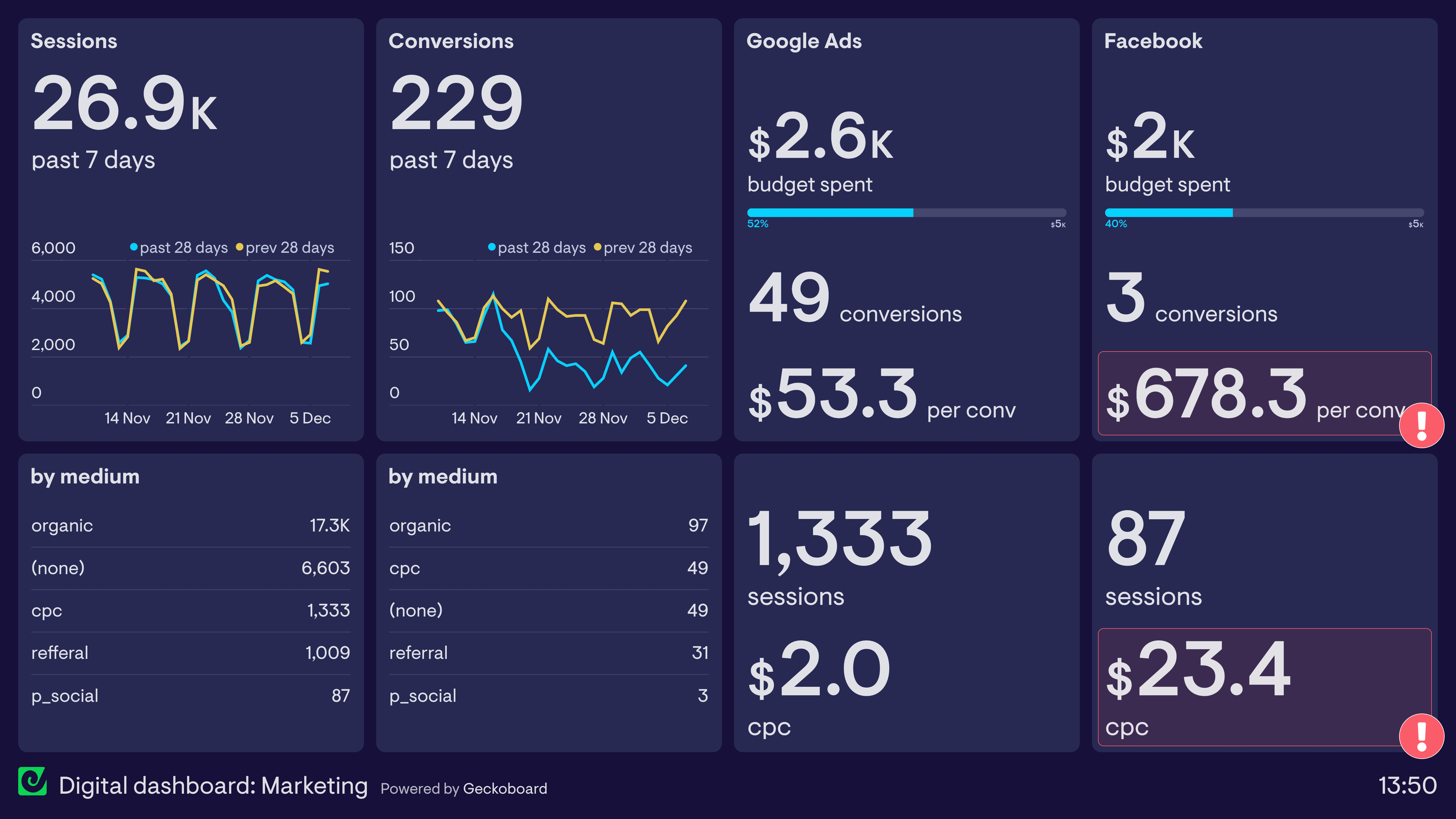
This dashboard visualizes live data from Google Analytics, Facebook and Google Ads. Using it, the marketing team can monitor a variety of metrics related to their digital marketing, website performance and advertising campaigns. On the left half, the team tracks sessions and conversions — and can see that conversions have dropped off despite sessions staying the same, indicating a decrease in conversion rates that needs investigating. On the right, two digital advertising channels are tracked. Red status indicators alert the team to underperforming Facebook campaigns before they become a bigger problem.
Ecommerce digital dashboard
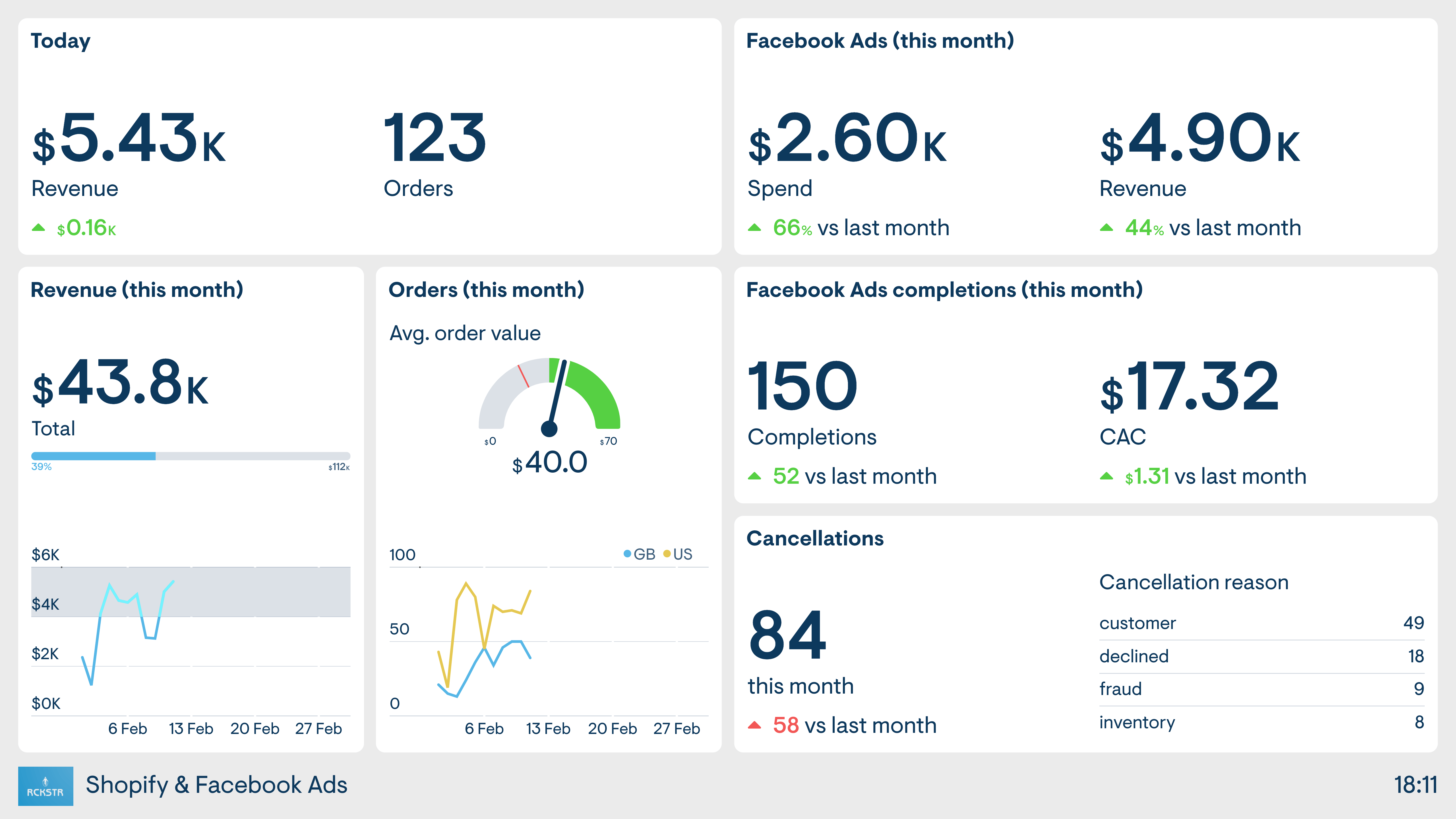
This dashboard is used by an ecommerce business. Many of the metrics are pulled directly from Shopify, allowing the user to track important ecommerce metrics like revenue, orders, order value and cancellations, alongside digital advertising KPIs from Facebook Ads. Without the dashboard, anyone interested in these metrics would need to log into both platforms separately. These manual steps create friction that results in KPIs going unseen.
Sales digital dashboard
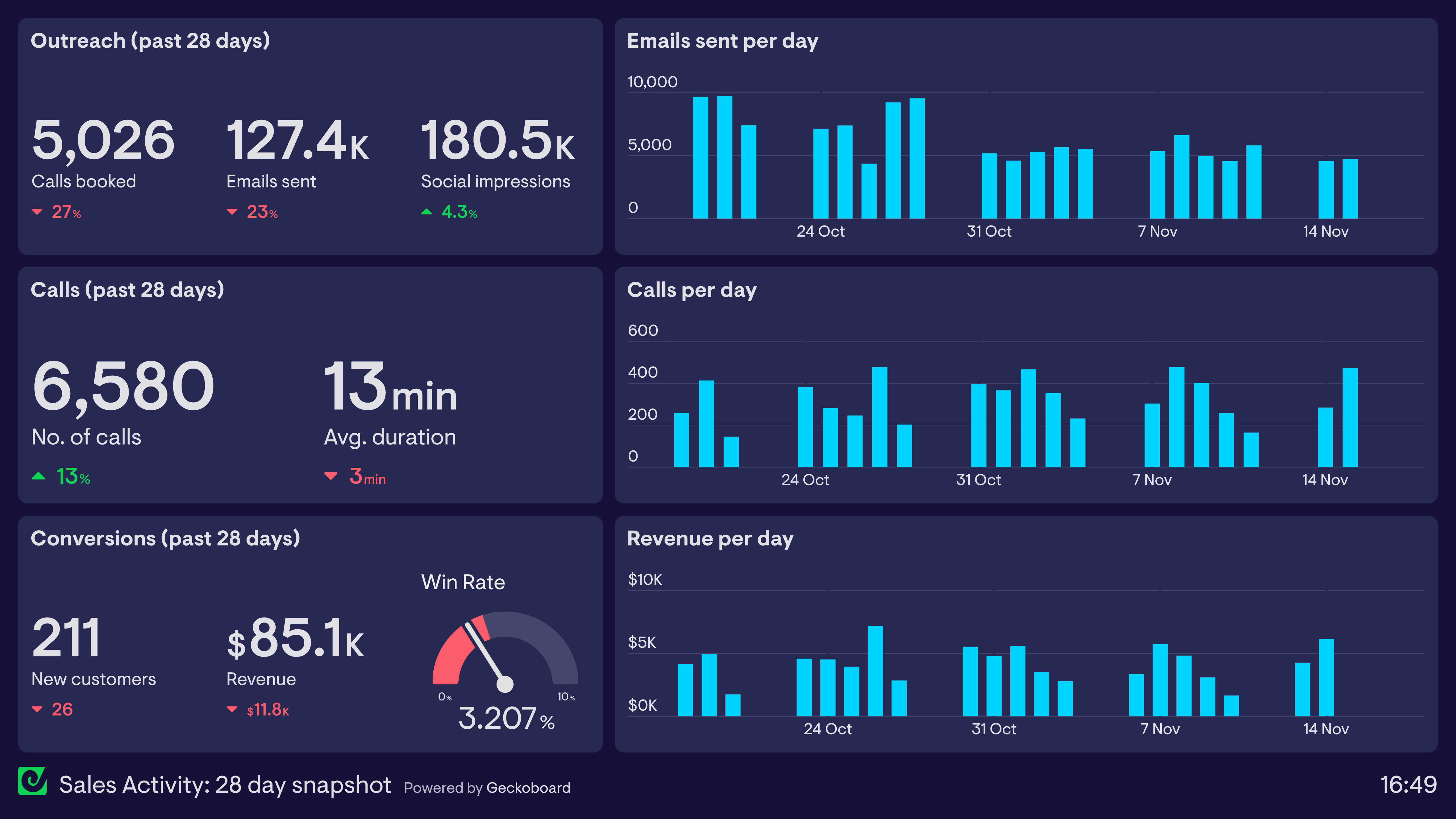
Dashboards are particularly helpful for sales teams working towards a shared goal, helping the whole team understand overall performance so they can stay on track. This example is taken from a sales team who monitor sales activity — outreach emails, calls and the ultimate goal, new business. The team leader can gauge the quantity and quality of overall sales activity taking place, and if the team starts to fall behind, she can examine workload and priorities and support the team to manage their deliverables.
Finance digital dashboard
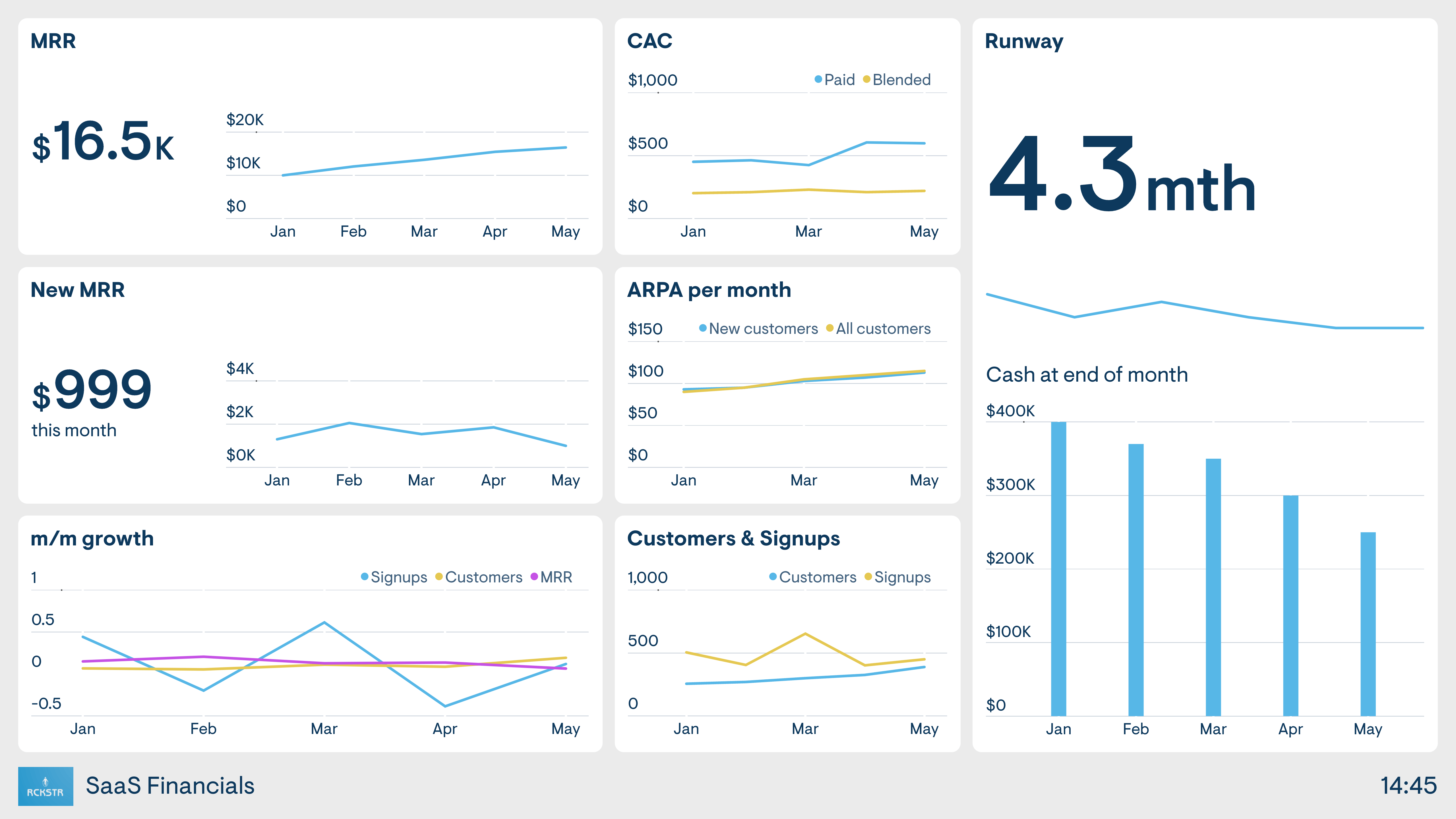
When it comes to communicating high-level financial information to the rest of the organization, it can be challenging to present data in an easily digestible way. This dashboard visualizes the company’s most important financial KPIs so that the rest of the organization can build up a familiarity and understanding of the company’s financial health. By regularly seeing the company finances, everyone becomes more aware of how and when they change — leading to a more nuanced understanding of company finances at every level of the business.
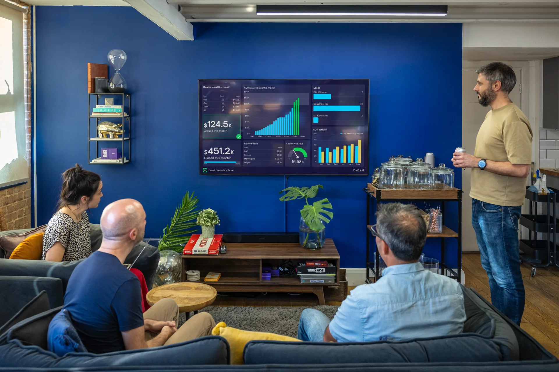
Company digital dashboard
This digital dashboard is designed to be used by the whole company and is displayed on a large TV in the office where everyone can see it. It tracks important metrics from different areas of the business including sales, customer support and marketing. It also includes real-time customer feedback and social media mentions. Dashboards like these can help to create a sense of common purpose within a company and promote a more data-oriented culture through the watercooler effect, where team members spot new developments and discuss them informally.