Live dashboard examples
A live dashboard displays metrics as they change — not as a snapshot taken hours ago. It's built to be understood at a glance, which is why they're often on a screen in the office rather than in a tab: when something shifts, everyone in the room sees it at the same time.
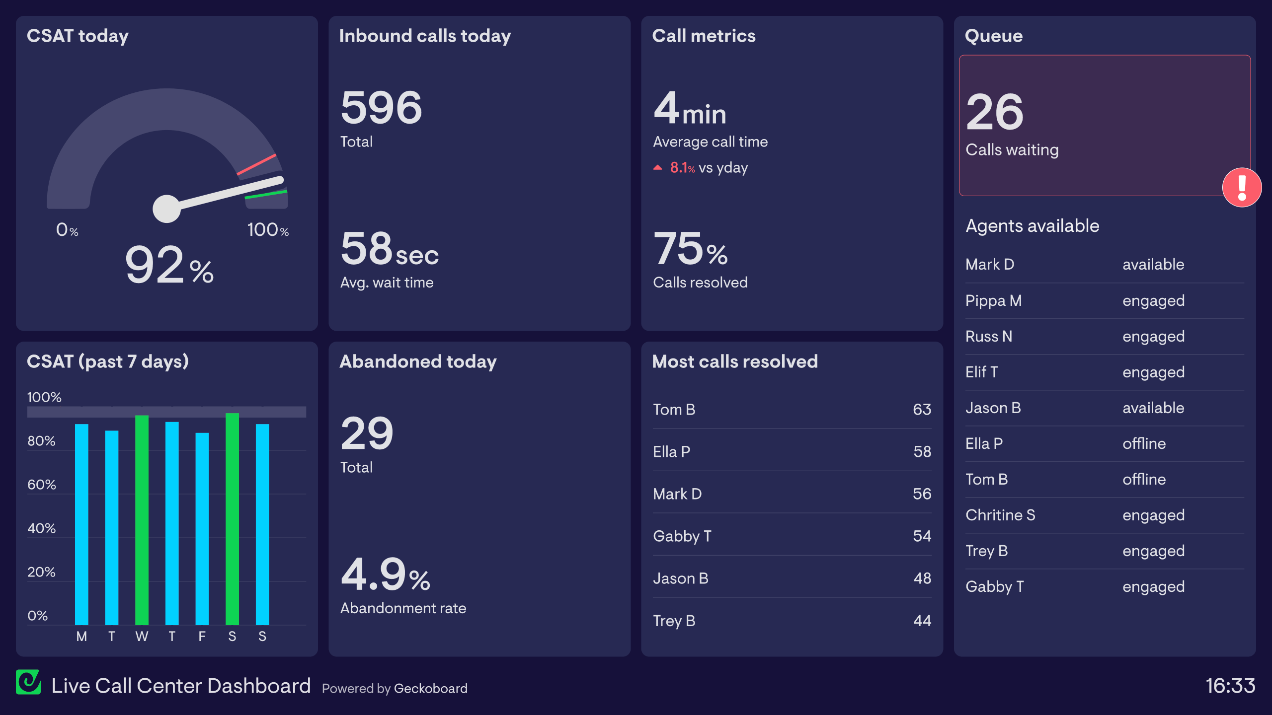
Customer Support dashboard
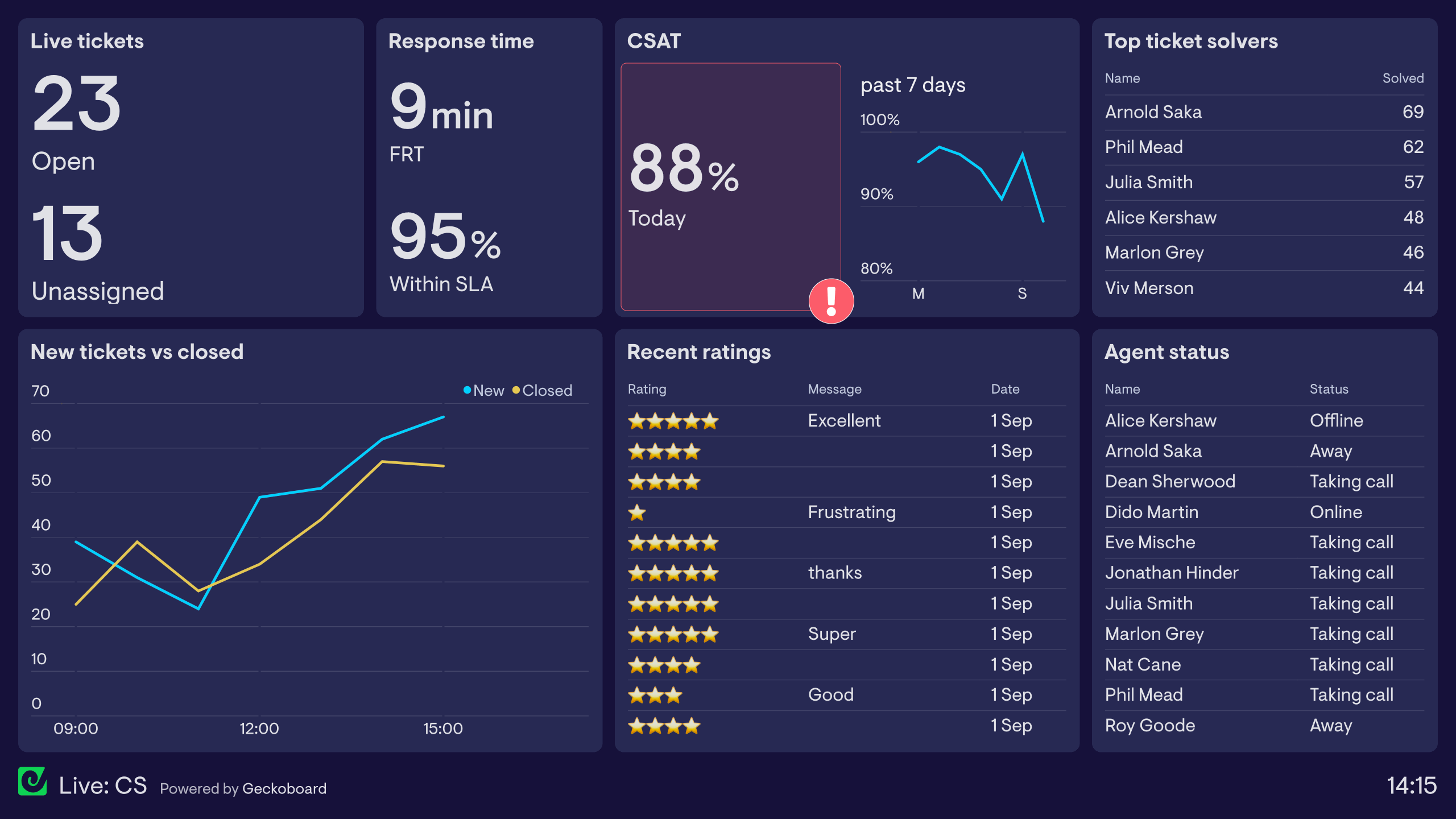
This dashboard surfaces live data from a Customer Support platform, such as Zendesk. The focus is on metrics, which the team needs to access and understand in the moment.
For example, in the top left hand corner, the team can see how many tickets are open and specifically how many are yet to be assigned. A sudden influx of tickets is potentially something that will result in a longer response time, causing a poor experience for their customers.
The dashboard also monitors the First Response Time (the average length of time each customer is waiting for a response) and how many have been answered within a set limit (Service Level Agreement).
In the bottom left corner, the dashboard shows how many tickets are being opened and closed throughout the day. This helps the team to know if they are keeping on top of tickets and resolving them efficiently. It also helps the team to become more generally aware of how demand increases and decreases throughout the day, so they can better allocate resources in the future.
In the middle third, the dashboard is monitoring Customer Satisfaction scores including an overall score and the most recent ratings. The overall score has dropped below an acceptable level and has triggered a red status indicator. Status indicators like these make important changes even more visible for the team.
On the right, we can see the status of each agent, as well as a leaderboard showing who has solved the most tickets today. Live dashboards like these provide a fun, competitive element to work culture.
Online store dashboard
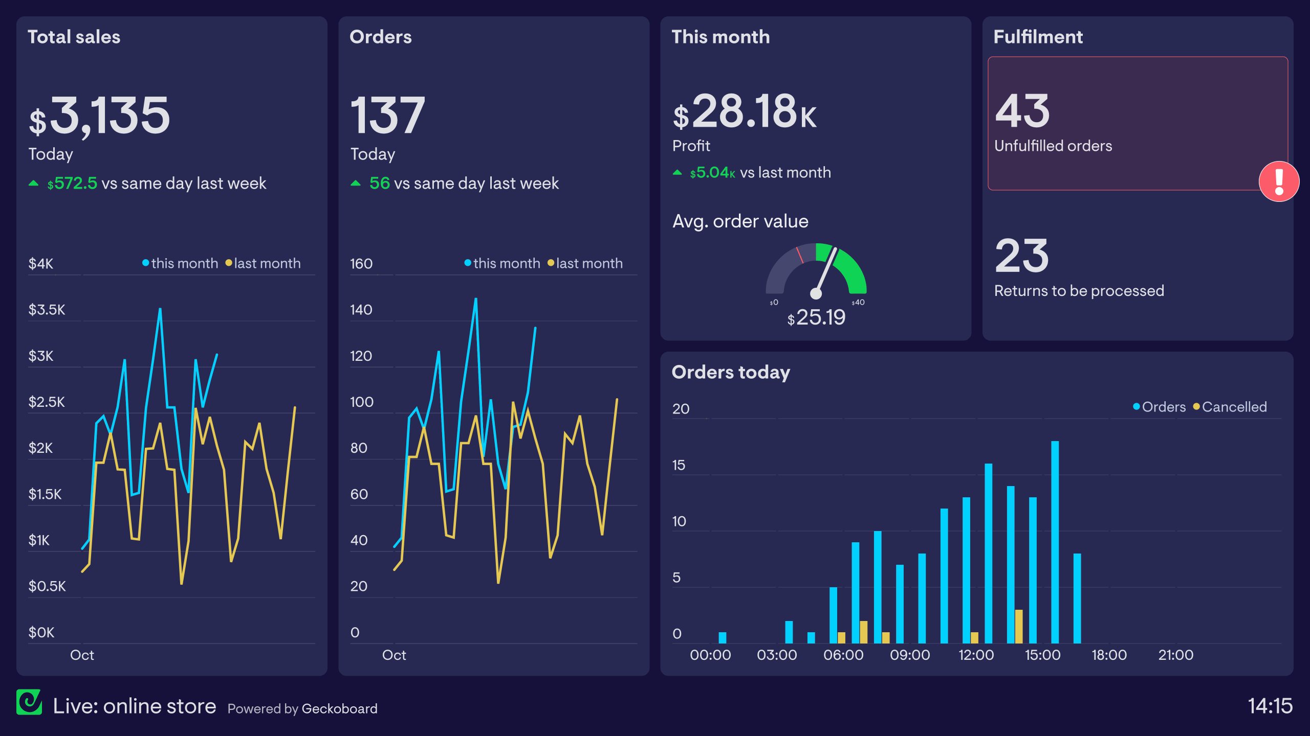
This dashboard is used by an online store. It visualizes metrics related to different operational stages, including revenue, orders and fulfillment. As a result, it helps different members of the team, from marketing to operations to stay on the same page. This is especially important during busy periods such as Black Friday and the Holiday Season where systems and processes can become strained and confused due to high demand.
On the left, the dashboard is visualizing live ecommerce data from Shopify. We can see how the store is performing overall, including how much revenue has been generated today, and how many orders have been placed. If something were to go wrong in the store, which prevented customers from placing orders, the team would be able to see this quickly and investigate.
On the right, the dashboard is visualizing fulfillment KPIs which are relevant to the warehouse team. Here the team can see if they are keeping up with demand or if there is any kind of backlog.
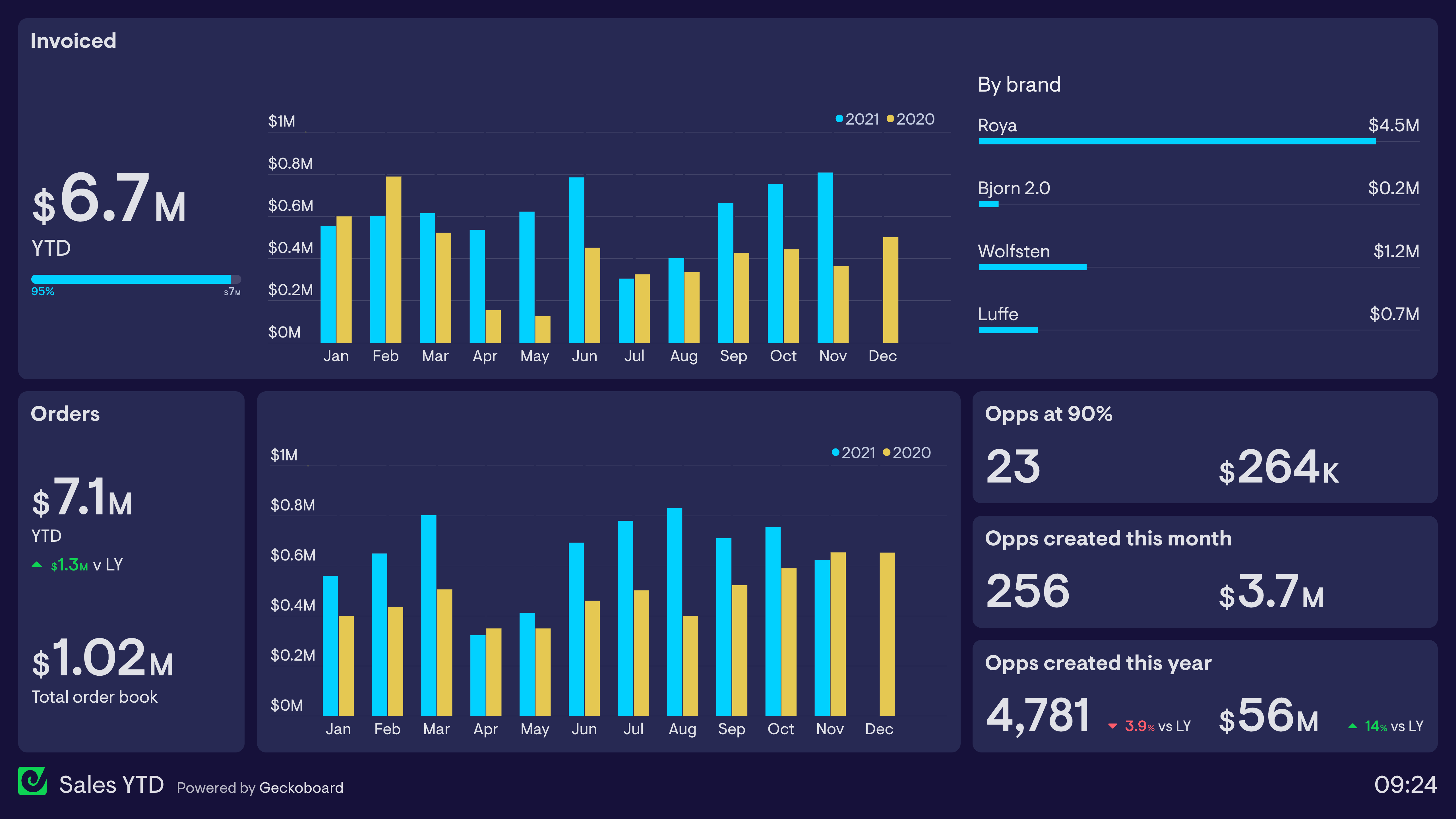
Sales dashboard
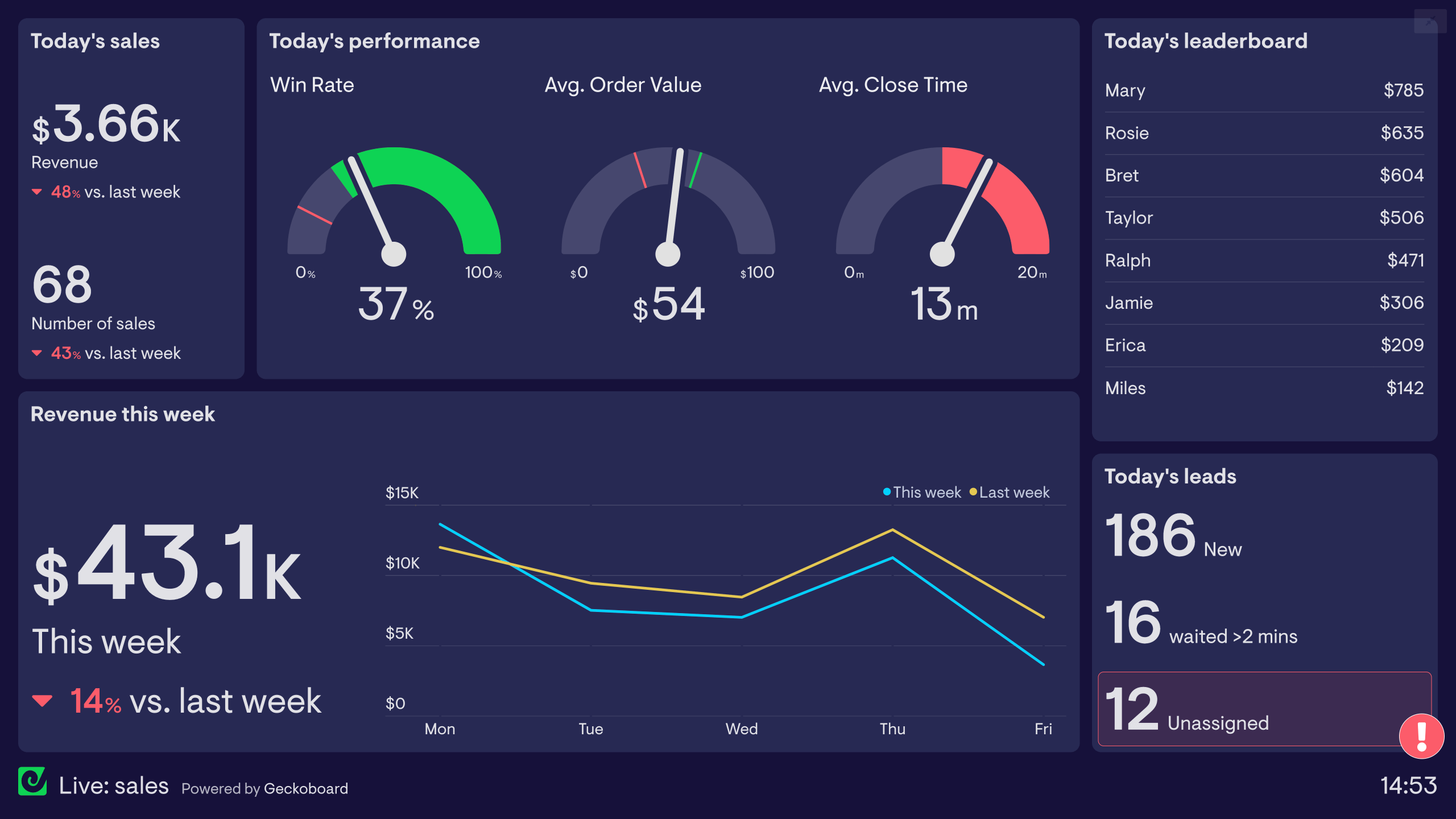
This dashboard is used by a Sales team who are processing a high volume of inbound leads. It helps them stay on top of their key performance indicators in their fast-paced work environment.
In the top left corner, the dashboard is visualizing the most important metrics for the team – revenue generated today, and number of closed sales. Next to this on the right, the dashboard is qualifying this success with some health metrics – win rate, average order value and average close time.
Below this, the dashboard is contextualizing today’s sales performance by showing how it compares to this and the previous week.
On the right, we also have a leaderboard, which helps to encourage friendly competition between sales reps.
Browse other popular examples
A live dashboard displays business metrics that refresh automatically — so the data you're looking at reflects what's happening right now, not an hour ago. Teams use live dashboards on office TVs or shared screens to keep everyone aligned on real-time sales, support, or operations performance throughout the day.
Geckoboard is a live dashboard tool that connects to 90+ data sources and displays metrics that update in real time. It's built to stay on a screen — in an office, a contact centre, or a warehouse — so performance is always visible without anyone needing to open a tool or run a report.
Live dashboards are built around time-sensitive metrics: tickets in queue, calls waiting, today's revenue, orders placed, and sales vs. target. The goal is to show what's happening now — not historical trends.
Building a custom live dashboard is straightforward with Geckoboard's dashboard builder. Connect the tools that hold your most time-sensitive data — popular choices include Salesforce, Zendesk Support, Shopify, and HubSpot, then pick your metrics and build the view you need. Share with your team as a TV dashboard, shared link, or scheduled snapshot. Start a free trial or learn more about how Geckoboard works.
Use it to monitor performance in real time — putting always-current data in front of the people who need to act on it. It also helps make team performance visible by giving everyone in the office a shared, live view of how the team and business are performing against today's targets.