Operations dashboard examples
Real-world dashboards used by operations teams to track IT, OKRs, health and safety, sustainability, inventory and warehouse performance.

IT dashboards
An IT dashboard is any type of data dashboard used to support the work of an IT team. This includes dashboards used to monitor technical systems and processes, such as server capacity, as well as dashboards that track day-to-day operations — such as how effectively an IT team is providing support to the rest of the organization.
IT team dashboard
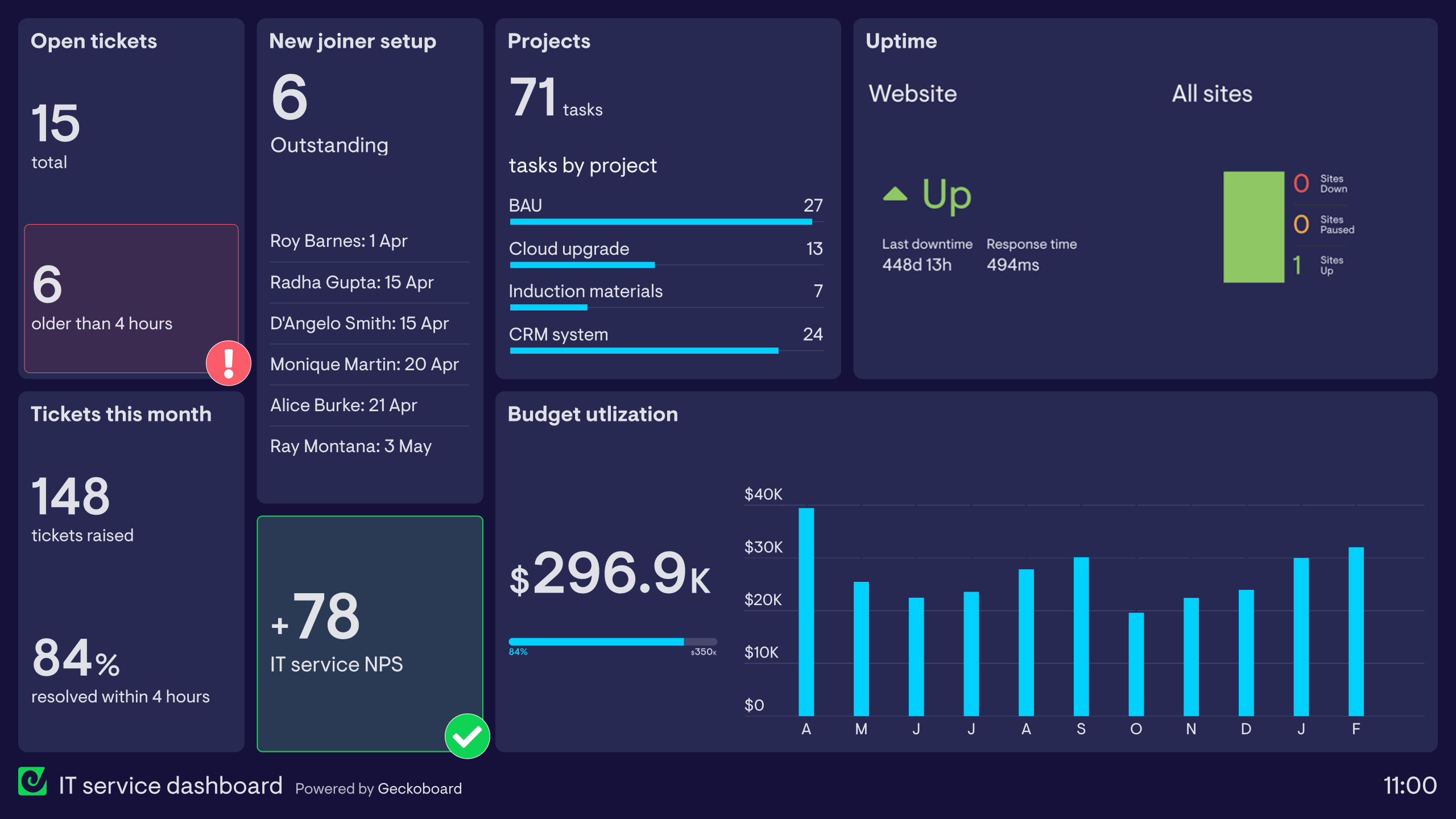
This dashboard monitors various metrics related to the IT team’s day-to-day operations, goals and responsibilities. The first two rows visualize metrics related to internal support: how many tickets have been raised by colleagues requiring urgent help, and how quickly and efficiently they are being resolved. In this case, a backlog has built up, triggering a red status indicator.
The team can also see how many new people are joining the organization, ensuring they have been set up on the company system before their first day. A Net Promoter Score from a mini survey measures colleague satisfaction with IT support. On the right, the team tracks project status updates, budget utilization and website uptime — showing how these dashboards can be entirely customized to the team’s needs.
Amazon Web Services expenditure dashboard
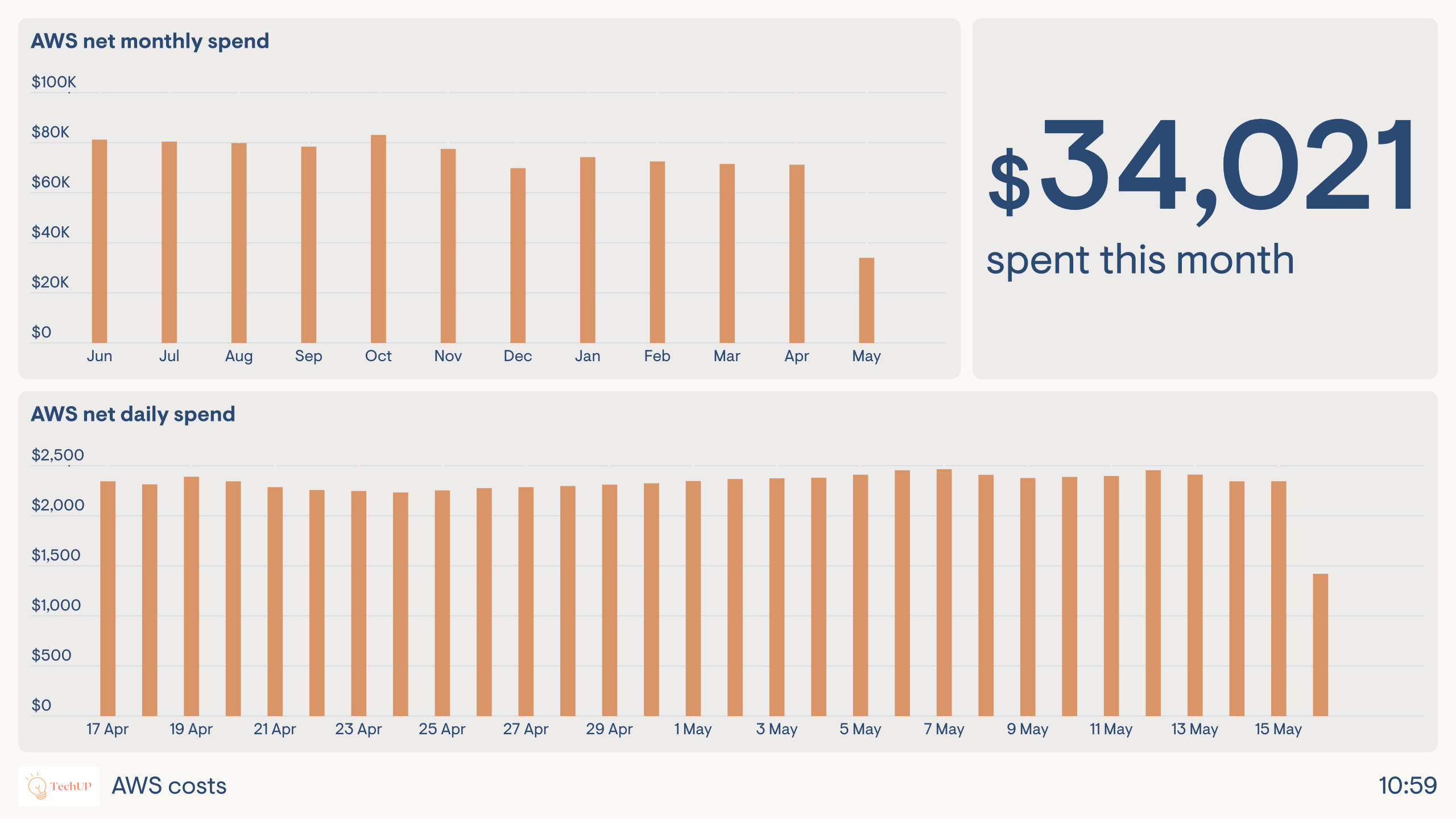
This dashboard has one purpose: to monitor the company’s expenditure with Amazon Web Services (AWS). For this EdTech company, AWS spend represents a significant proportion of their overall IT budget. Without a dashboard, billing information updates are both infrequent and only accessible to account admins — meaning developers could cause a significant increase in daily spend without anyone noticing. More eyes on these metrics, more frequently, reduces the likelihood that expenditure will ever get out of control.
OKR dashboards
OKR dashboards track progress against the OKR (Objectives and Key Results) goal-setting methodology. The basic principle is that you set one high-level Objective along with 3–5 supporting, measurable Key Results. OKRs are popular with organizations who favor an agile-style approach to work — most famously, Google.
OKR dashboards keep the entire team focused on their goals because they are constantly visible, and provide a clear way of showing whether progress is being made. This feedback loop helps teams quickly evaluate whether their current actions are sufficient and, if necessary, change their approach.
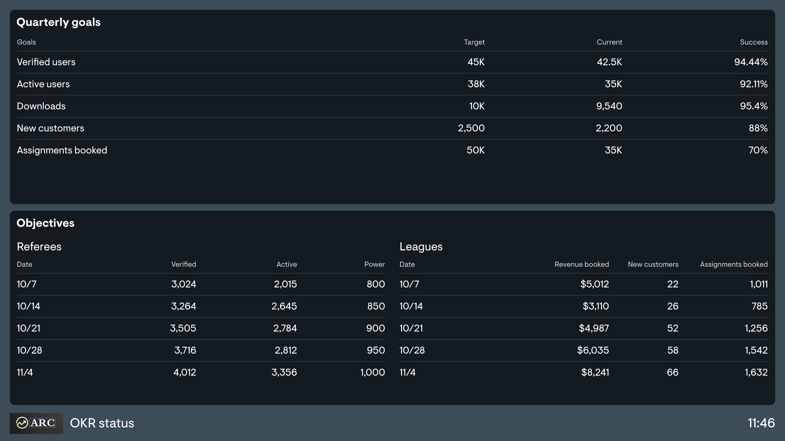
OKR dashboard
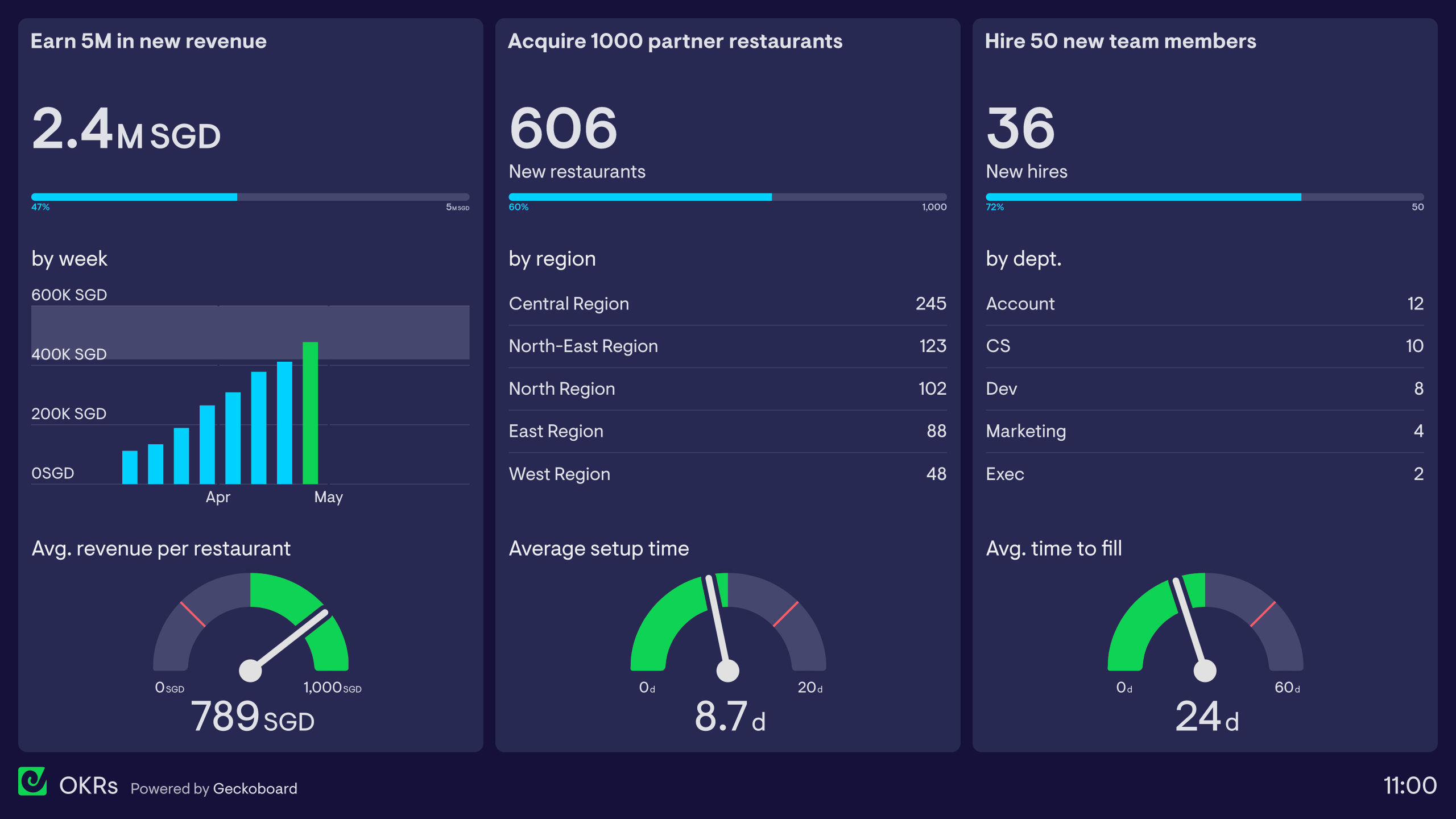
This OKR dashboard has been designed by a restaurant booking company setting up operations in Singapore. Their quarterly objective is to become the third-biggest restaurant booking app in the city, with three Key Results: earn 5 million SGD in new revenue, acquire 1,000 new partner restaurants, and hire 50 new team members. Each section of the dashboard visualizes metrics related to one Key Result — including related KPIs that help the team put their numbers in context and better judge whether they’re on track.
Cascading OKRs dashboard
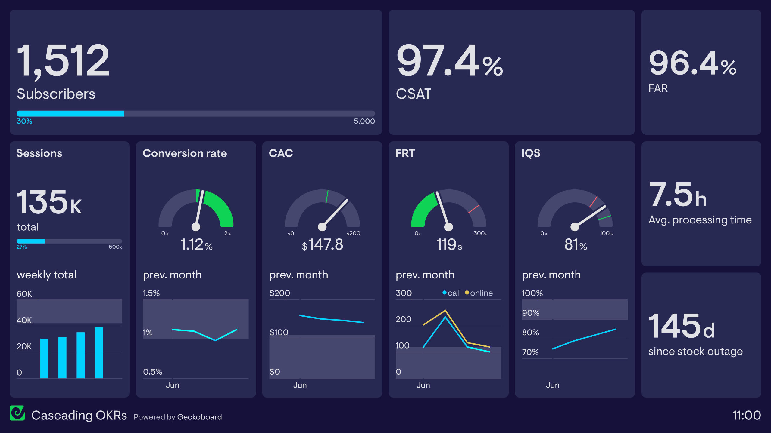
Many companies set OKRs at multiple levels — not just organizationally, but at team and individual level too. The general principle is that lower-level OKRs feed into higher-level ones, ensuring the entire company is aligned and pulling in the same direction. This dashboard contains Key Results from OKRs set in the Marketing team (Customer Acquisition, CAC, New Subscribers), Customer Support team (CSAT, First Response Time, IQS) and Operations team (Fulfillment Accuracy Rate, Processing Time, stock outages).
OKR status dashboard
This dashboard represents a simpler way of visualizing OKRs. The team has set five Key Results, with progress updated each week by the team leader in a spreadsheet. The dashboard makes this information visible to team members who would not otherwise open a spreadsheet, keeping it top of mind and giving it prominence in weekly standup meetings.
Health and Safety dashboards
Health and Safety dashboards visualize various metrics related to a company’s Health and Safety practices in one place. These dashboards help those responsible for Health and Safety to understand how effective their initiatives have been and take a more data-driven approach to risk management.
A Health and Safety dashboard might monitor anything from the volume of accidents to more preventative areas such as training participation or drills, as well as operational processes like the timely completion of risk assessments.
Health and Safety dashboard
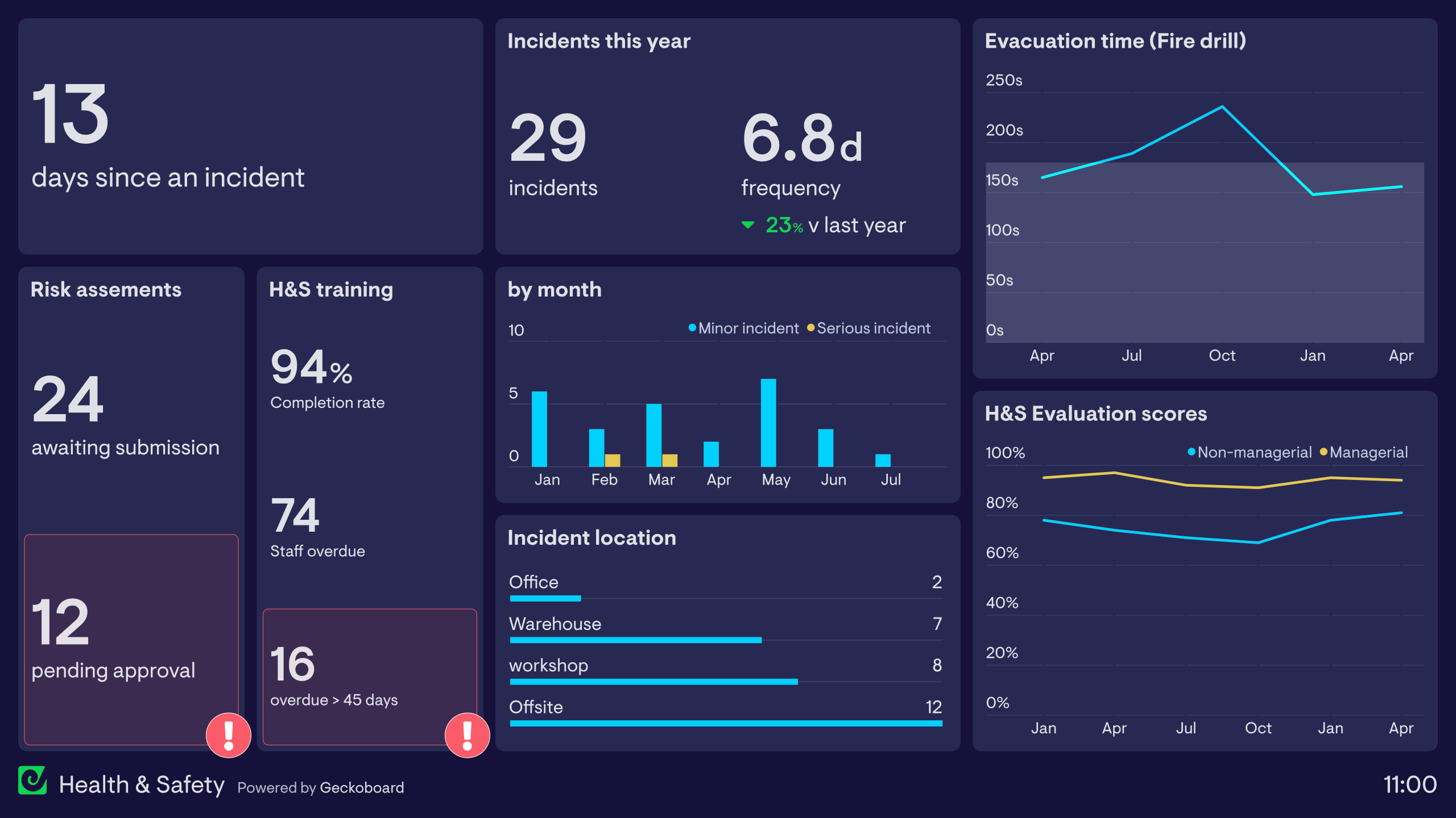
This dashboard monitors a variety of Health and Safety metrics. It tracks how many incidents have occurred, where they happened, and how long it has been since the last incident — helping the organization understand when and where accidents occur and prioritize prevention efforts. It also tracks whether important procedures are being followed, such as risk assessments being submitted and approved and training being completed. Finally, the right-hand side tracks long-term performance goals, including fire drill evacuation times and scores from a regular, company-wide Health and Safety evaluation.
Sustainability dashboards
Sustainability dashboards help organizations track and communicate their progress towards sustainability goals. More companies than ever have made commitments to become more sustainable — many aligning with the UN’s 2030 Sustainable Development Goals or working towards ESG compliance.
Data dashboards are a useful and efficient tool for tracking and communicating progress on these initiatives, both internally and to wider stakeholders.
Sustainability dashboard
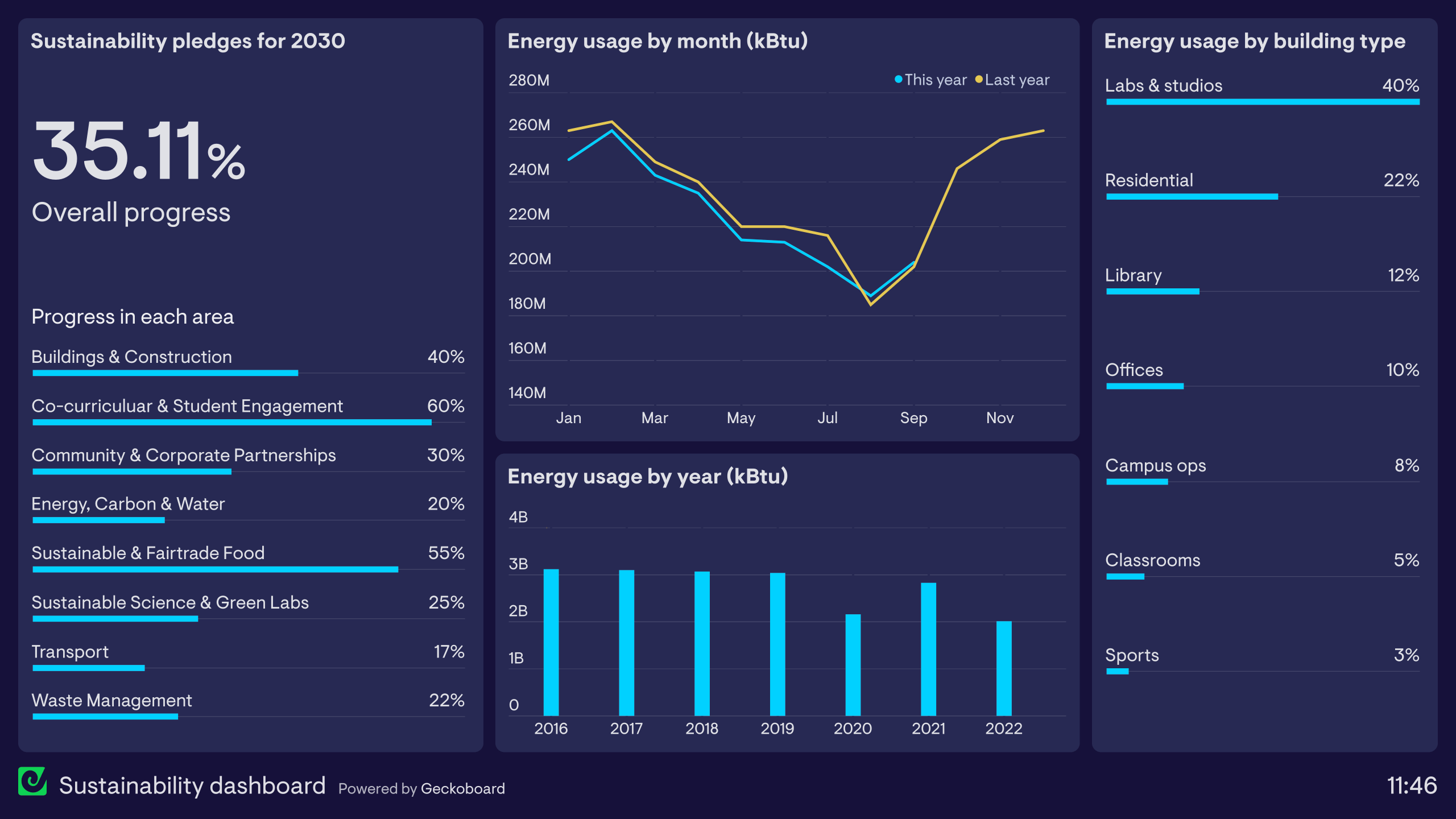
This dashboard has been created by a university with several sustainability goals to complete by 2030. With a wide stakeholder community including students, staff and local organizations, they needed a simple way to communicate progress online. The left-hand side aggregates their 2030 goals into eight major areas, showing progress in each and overall. The remainder of the dashboard breaks down energy consumption by time and building type — not only communicating progress on energy reduction, but also creating awareness that helps the wider university population understand how they can contribute.
Inventory dashboards
Inventory dashboards provide a real-time view of how much stock a business currently holds. This helps operations teams and warehouse managers better manage product availability and plan new orders.
Inventory dashboards also help sales teams, who can use this information to promote products with greater availability or inform customers about the scarcity of a particular product — without having to leave the shop floor to check a storage room.
Inventory dashboard
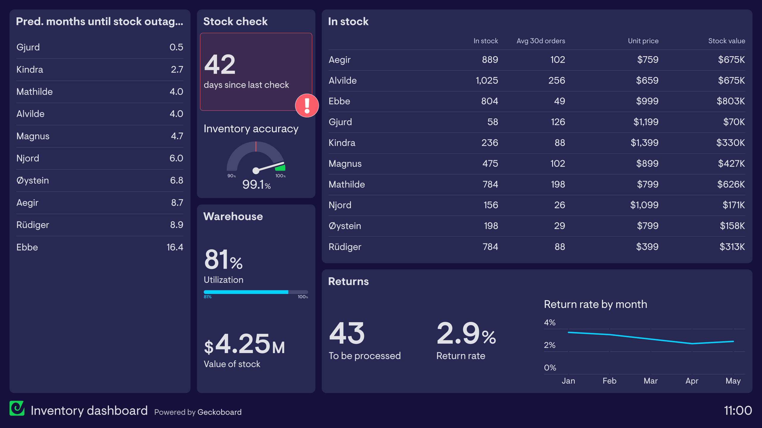
This inventory dashboard is taken from a furniture company. The data combines sales and delivery information with the latest stock check, showing clearly how much of each item is in stock and how many months the supply is likely to last at current sales rates. Supporting metrics include inventory accuracy rate, the number of days since the last full stock check (a useful reminder to schedule the next one), warehouse space utilization and the overall value of stock held.
Warehouse dashboards
Warehouse dashboards display live order information so that team members can anticipate busy periods, respond to demand and meet their fulfillment goals. Because warehouse teams are usually on their feet with no immediate access to a computer, these dashboards are typically displayed on TV screens around the warehouse, giving everyone clear sight of new developments at all times.
Warehouse dashboard
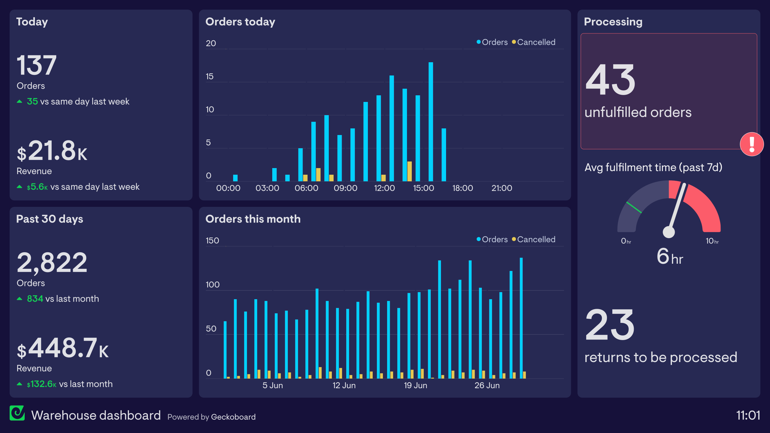
This warehouse dashboard is taken from an ecommerce company and displays live data from Shopify. It helps fulfillment teams keep track of particularly busy periods and adjust their approach to meet demand. Over time, the team builds up a familiarity with the metrics, developing an intuitive understanding of when busy periods are likely. The dashboard also visualizes overall revenue — not strictly a fulfillment metric, but one that helps the warehouse team feel a sense of shared ownership for the company’s overall success.